Shape template stencils come in a variety of formats, including drafting templates which are designed to help engineering students speed up the process of making complex technical drawings but also as children's stencils for those who want to be able to make drawings, even if they can't draw recognisable images. I introduced them briefly when we were looking at French Curves but once you begin looking, you will find an amazing variety, including letter forms in a wide range of typographic styles, people, animals, objects and of course emojis.
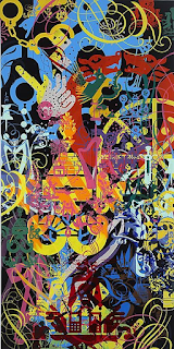
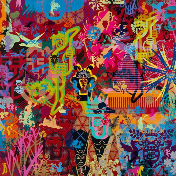
Artists have often used them and there is a territory that sits somewhere between hand cut stencil graffiti art (Bansky, Blek Le Rat etc.) and a type of 'pop' gallery art that tends to use ready made stencils; Ryan McGinness, being a typical example.
Ryan McGinness
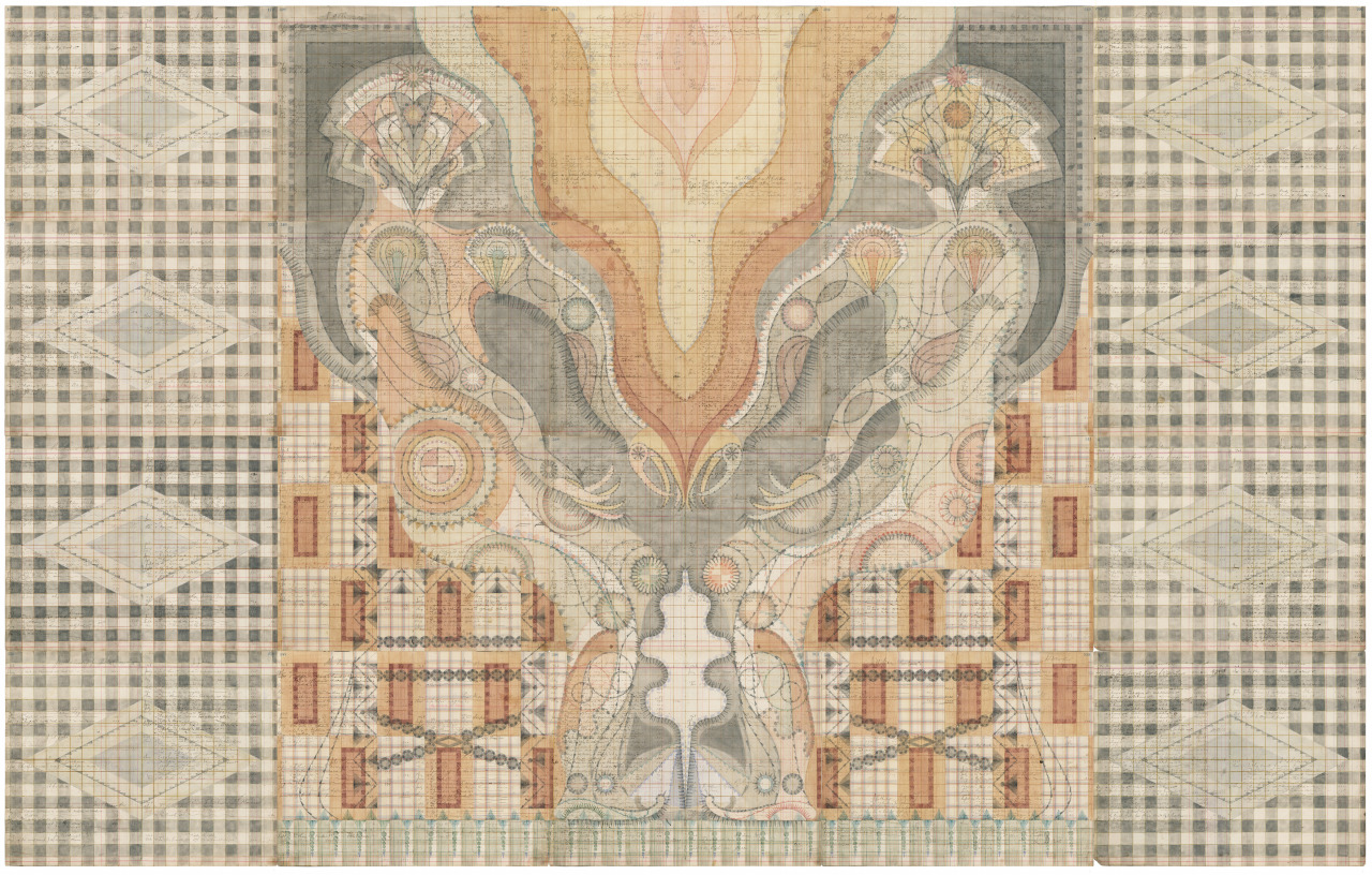
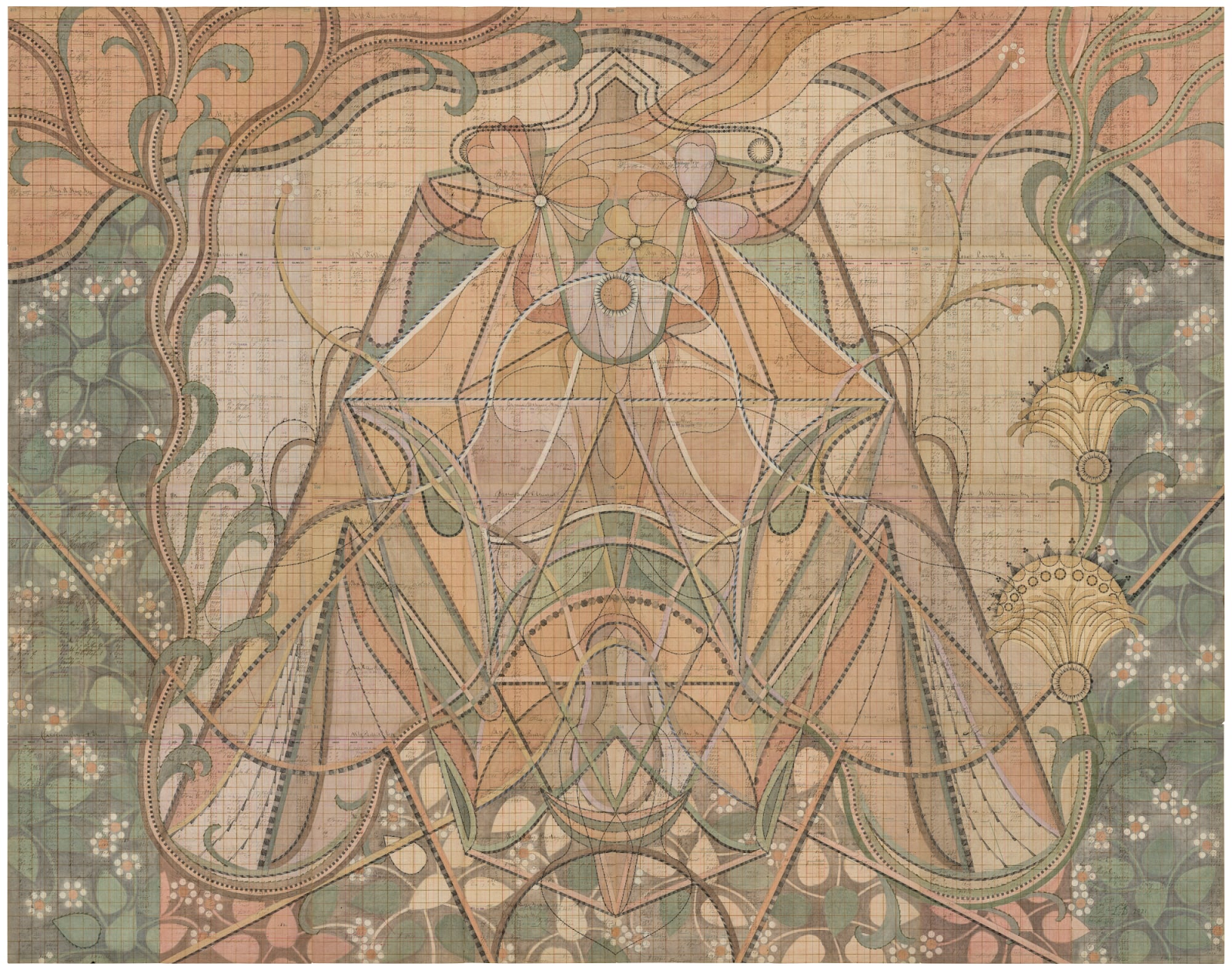
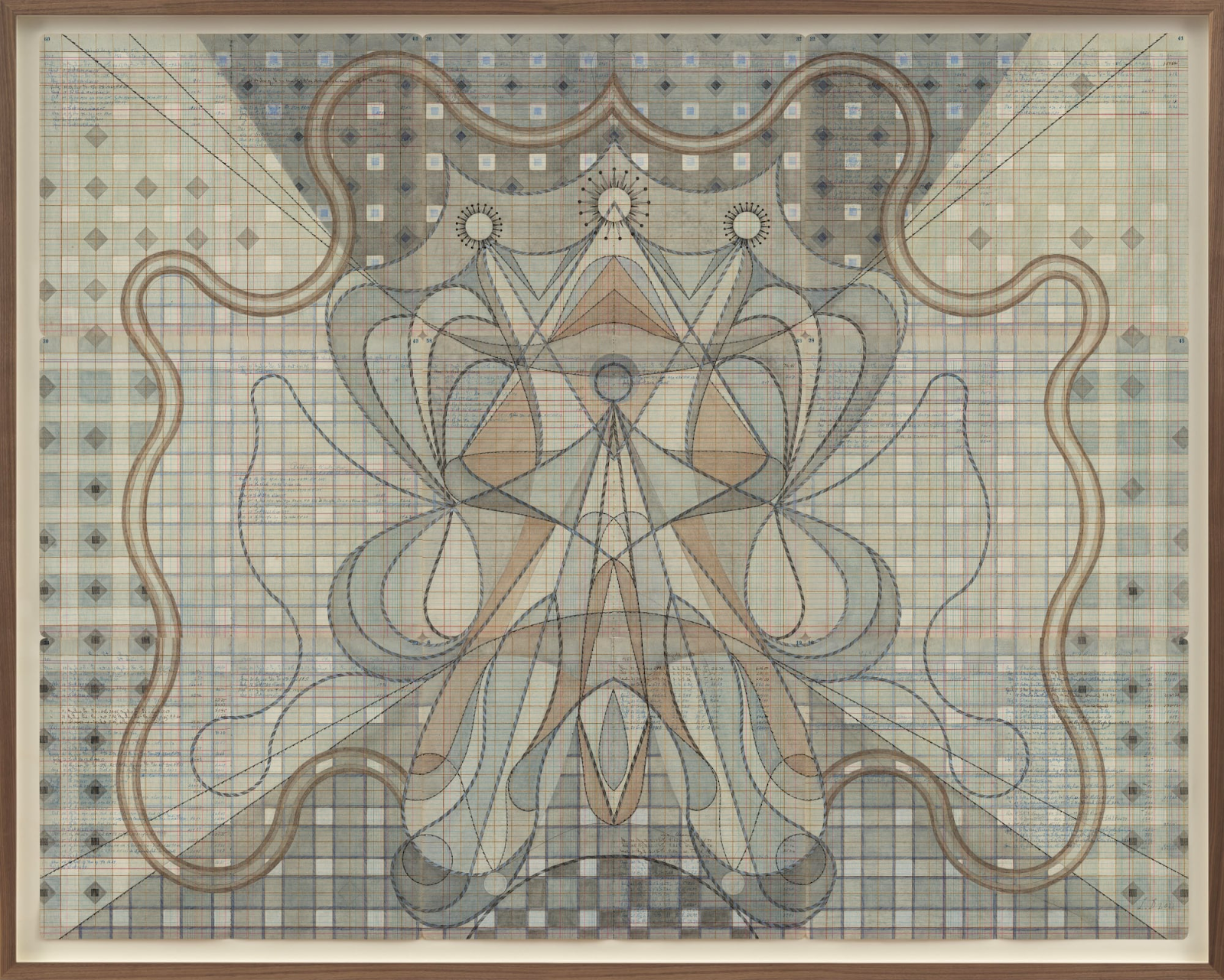
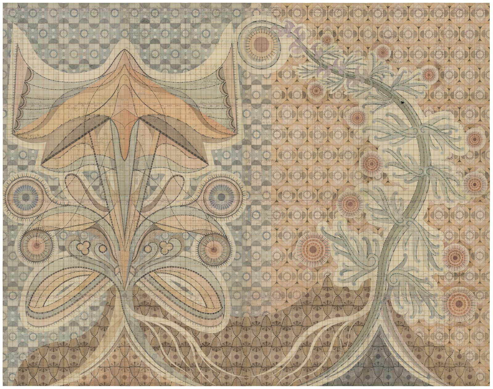
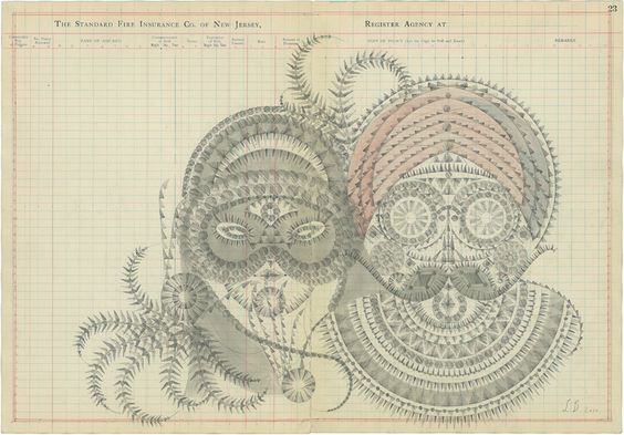
Despont works with coloured pencils and architectural stencils on paper. Her images work as huge diagrams that may refer us to Victorian geological maps or cross sections, or remind us of certain botanical illustrations. She reinforces these associations by drawing on old sheets of ledger paper, fragments of lines or text showing through her own self imposed geometry. The weaving together of old and new gives a certain authenticity to these images and their bilateral symmetry, makes them feel almost spiritual, as if they stem from a forgotten religious order, somehow familiar but strange.
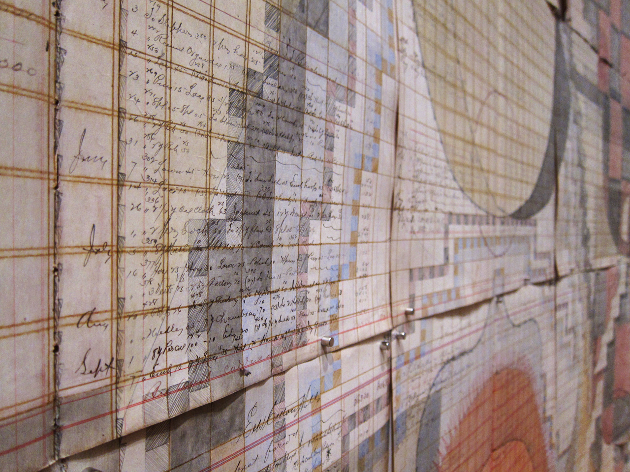
A close up view of her drawing's surface
As you can see from a close up, she pins sheets of old ledger paper together and then imposes her own geometric structures on top. She then draws with coloured pencils to achieve a very subtle colour effect. The white paper surrounding the thin lines of crayon drawings softens the colour, lowering its saturation, so you get this washed away look or perhaps more accurately a feeling that these drawings have faded due to their great age.
It is their scale that makes them so impressive. They reproduce well, these small images can be 'read' easily because of their structural clarity and her way of working by defining areas within the edges of geometrically outlined forms. This ability to be read at very different scales is vital during a time when the mobile phone is many people's first port of call when searching for any artist's work on line.
“Calc Fluor,” graphite and coloured pencil on antique ledger book pages, 53 x 67 1/4 in
Despont says this about her work, “I think my work has always attempted to bridge the worlds of plant wisdom and healing with a language of architecture, I’m interested in drawing the invisible, in attempting to represent the unseen but nonetheless powerful forces and systems that surround and inhabit us. I’m interested in art-making as a co-creative experience, a bit like gardening. I plant the seeds and tend to the work, but what grows comes from its own source.”
“Aconite,” graphite and coloured pencil on antique ledger book pages: 75 1/4 x 95 in
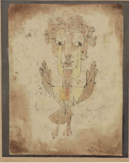
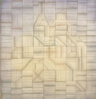
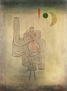
There is a certain lineage to these images. There are hints of Paul Klee, an artist that made images at the other end of the scale range, his best work often being no more than a few inches wide.
Paul Klee, The Angel of History
Paul Klee: Variations (Progressive Motif), 1927
Paul Klee: Departure of the Ghost 1931
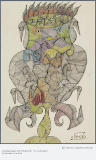
I also get a sense that the obsessive nature of Despont's images is rather similar to the work of Scottie Wilson.
Scottie Wilson's images seem to fit this context because of their tonality but also because of their totemic nature and their use of an almost bilateral symmetry.
Louise Despont
Despont's smaller drawings, can also fall into a quirky territory that is inhabited by those artists obsessed by details. The fact that these drawings can be approached in so many ways points to a body of work that has some clout and if you are interested in looking at her work in more detail make sure to visit her website; https://www.louisedespont.com/.
In the meantime you might want to consider the role of templates in visualising what is absent, rather than what is present and about how much templates rely on outline and edges to define what is there.
See also:




No comments:
Post a Comment