Sunday, 11 December 2022

Vanessa Baird

When I went down to London to see the William Kentridge exhibition at the Royal Academy I also managed to fit in a few other exhibitions including the OSL Contemporary Gallery at No. 9 Cork Street, that was hosting a FRIEZE exhibition of the work of Vanessa Baird. I introduced her work to readers of this blog last year as an artist who has directly confronted her difficult life as a source of imagery.  She is an artist that makes drawings of the chaos of existence, everything that happens to her being grist to a visionary mill. You really feel she has no inner censor and that what you see is the totality of what she experiences and feels about what is going on around her. If I wanted to illustrate the fact that drawing can be used to respond to the full spectrum of the human condition, there couldn't be a greater contrast between my last post on the work of William Anastasi and Baird's messy, colourful, psychologically intense images; images that seem to flow out of her life and that are exhibited in such a way that they totally fill any available space. 

Vanessa Baird: I Can Get Back Down to the End of the Town and Be Back in Time for Tea

The exhibition, 'I Can Get Back Down to the End of the Town and Be Back in Time for Tea', was quite an exhausting experience, Baird’s images made in pastel and watercolour on sheets of A1 paper, were presented three images high, edge to edge, wall papering the upstairs gallery space at OSL Contemporary, so that there was no space left for anything else.  
Her storytelling comes from a wide range of references, most from her own lived experiences, as well as some from Scandinavian folklore and literature. She is also regularly commenting on contemporary political and social affairs as well as making observations on personal domestic realities. 

Vanessa Baird

She is as happy to make an image of herself unexpectedly farting whilst cleaning up broken crockery, her severely distressed mother watching on, as she is to illustrate a creature from a Scandinavian folk tale. Because so many of her drawings include images of her very ill mother, her work reminds me of a time when I had to watch my own mother dying of cancer and of the images I made 40 years ago. They are images that when I see them now I still find uncomfortable and difficult to look at, but at the time they had to be made. I would travel down to Dudley on a Friday evening after work and travel back to Leeds on Sunday evenings. At the time I wasn't driving so I used the coach, filling small sketchbooks with scribbled drawings about what was happening and then making more worked up images during the week. I drew things she told me, stories of her life and images of her dying. The chair at the side of her bed had spirals of inlaid mother of pearl set into its arms, as the weeks wore on and it was clear she wasn't going to last long, those spirals become more and more significant. Life will at some point or other throw at you the full kitchen sink of emotional and intellectual conundrums and if art is what I think it is, it will be up to dealing with any and all of these experiences. 

Constance Thelma Barker 1985

Constance Thelma Barker 1985

Slipping away

Vanessa Baird's images are much more energetic and life affirming and I was very aware that her own experience differed considerably from mine. When I was making images of my mother's slow death I had young children of my own and responsibilities, all of which heightened a sense of being unable to really deal with the emotional issues that surrounded me at the time. Experiencing the death of another is also about the coming to terms with the death of oneself. I am now much older than my mother was when she died and feel as if I still have a lot of life's experiences to process as imagery. Baird's images are however far more immersive than mine, perhaps I have always maintained a certain distance from life in order to respond to it. Perhaps as Baird gets older she will become more detached, her present life whereby she spends most of her time caring for her ageing mother, is one many people might recognise, but few would have the energy left to also make so many images about the experience. Her life experience is I would have thought a hard one, but she also reminds us that we must never forget, in the middle of sorrow there is often comedy.


Earlier in the year I went to the Kawanabe Kyōsai exhibition at the Royal Academy, and Baird's imagery brought back memories of another artist that was happy to draw and make images of everything and anything he experienced. The fart as an image is ubiquitous, something I've seen in old German woodcuts and the drawings of Hokusai, as well as an activity celebrated by comics and comediennes from Mel Brooks to Miriam Margolyes. 

Kawanabe Kyōsai: A study of the effects of flatulence 

The fart joke is probably the oldest joke. Chaucer told a classic in The Summoner’s Tale. A manipulative friar seeks a donation from an old man, who angrily says he already donates enough to the church.  The friar then gives him a sermon about the dangers of anger, before asking him again for a donation. The old man replies that he can have a donation if he agrees to divide it equally amongst the other friars at the convent. The friar agrees and so the old man asks him to put his hands together as if he is about to receive some money. The old man then turns round and drops a tremendous fart into the friar’s cupped hands. The second half of the story is then concerned with how to divide a fart evenly and the tale's final image is of twelve friars arranged  around a wagon wheel, each at the end of one of its twelve spokes. Then, when a fart is released over the centre of the wheel, it will according to Chaucer, travel evenly along each spoke and therefore the nose of each friar will receive an equal portion of a carefully divided nasty whiff. 

A fart joke from an illuminated manuscript 1344

The images that we create as human beings can be sublime and can also be crude, who is to say which are the most important to us? 


Vanessa Baird's images are stacked edge to edge

Vanessa Baird

The fact that both William Anastasi and Vanessa Baird could at one time or another have been making images whereby I found parallels with my own approaches, points to the issue of life itself and how different concerns emerge. At one point in my life it was the philosophical conundrums of art practice that fascinated me, such as what lay behind representation and at another time I felt much more deeply engaged with the drama and complexity of everyday life and how I could use images to reflect on it. My recent work on interoception, consciousness and the way our nervous system is layered has made me much more thoughtful about how emotional feelings and intellectual engagement are intertwined and that the full spectrum of life; thinking and feeling can be all dealt with by a drawing practice that like a diary records and responds to life as it changes. As I get older I also get less and less worried about what my work is about and much more interested in what emerges as I make it. The journey of the work now made, perhaps reflects the complex journey of later life, of knowing a lot of stuff but being less and less able to do the things you used to do. The one thing that is still in common with the images I was making 60 years ago, being that I still just like making images and above all finding out what the next one will be like. 

See also:

Hybrid forms Reflections on the acceptance of difference and fluidity

Tuesday, 6 December 2022

William Anastasi and conceptual drawing

William Anastasi: Pocket Drawings

In 1969 William Anastasi folded a sheet of paper into eight rectangles, making them the same size as his back trouser pocket. As he walked, he held a tiny, soft pencil against the exposed paper inside the cramped space of his pocket; the resulting marks on the unfolded sheet of paper graphed the activity. When he decided a drawing on one section was finished, he refolded the sheet, creating a new blank surface, and the process began again until all eight rectangles had been used. 
He was the first artist I ever came across to suggest that walking was good for thinking, something I still believe is true. “I love walking,” he said, “I find that walking does something to my thinking, to my mental process, that is different from sitting or lying down.” 

When I was an art student in the late 60s and early 70s undertaking my DipAD, conceptual art was a very powerful shaper of possibilities and the musician John Cage and the artists associated with his practices were vital to the milieu that these ideas were emerging from. One of the artists central to these practices was William Anastasi and I thought it would be useful to remind both myself and those of you that read this blog, how influential at the time his work was. 

William Anastasi: Reading a Line on a wall: 1967

READING A LINE ON A WALL is one of those art pieces that seems almost about nothing and appears devoid of any content aside from the fact of its own legibility. However just like Joseph Kosuth's 'One and Three Chairs' of 1965, it opened up debate as to what was actually going on when we encountered an artwork. Kosuth like Anastasi belived that “art is making meaning,” and like the theorist Greenberg, he believed that most of the art of the Western canon was about artists trying to make responses to what it was to make art. For instance Gombrich's 'Art and Illusion' was a very important text at the time and it was centred on the history of the 
psychology of pictorial representation, suggesting that each new generation of artists was concerned to push the possibilities of visual representation, and that art history could be seen as an ever unfolding set of approaches to getting us to 'see'. 

Joseph Kosuth 'One and Three Chairs' 1965,

In Kosuth's case, by assembling three alternative representations of a wooden chair, he constructs a platform for exploring representational meaning or how we come to determine what things are; he asks the question, "What are the differences between a 'real' thing, its representation and its definition?" In Anastasi's case, the work's content is also about definitions, and it is also firmly in the present tense, as it refers directly to our reflective sense that during the moment when we read 'READING A LINE ON A WALL', we are reading and all distinctions between the content of the work and the activity of the beholder dissolve into a state of self-awareness, immediacy and a truth statement. It is what it is or a 'what you see is what you get' moment, a type of position that also reflects Frank Stella’s famous statement ‘What you see is what you see’, that became the mantra of Minimalism.

As a viewer you are 'asked' to reflect on the implications of reading the word 'reading', an activity fraught with intellectual pitfalls. It is easy to forget but this was a time of complex aesthetic yet conceptual but also semiotic and philosophical niceties, as unpicked very astutely by Tom Wolfe in his essay 'The painted Word'. As a student in the late 1960s I was quickly made aware of the need to 'read' a work of art as a text. Because of the still heavy influence of Clement Greenberg these 'texts' also had to be self referential, Greenberg's 'Towards a New Laocoon'* advocating a development of Lessing's position that different types of art could only carry certain types of content. For instance according to Greenberg painting could only carry messages about paint, surface and colour and that any additional 'narrative' was false and would be an additional interference. Therefore the most highly regarded paintings and sculptures of the day were those that most thoroughly manifested the essence of their own means of expression through various modes of self-referential production. These might be certain types of brushstrokes, or ways of dividing the canvas into areas of colour, or the artist leaving traces of painterly actions, (Abstract expressionism, the abstract sublime and minimalism were all movements influenced by these theories). Like many of the most conceptually rigorous works from the late 1960s, Anastasi’s drawing confronts the criteria of that narrow aesthetic paradigm in a way that is meant to demonstrate some of the flaws in the argument. For instance the sparse white wall in the drawing is an illusion of a white wall. Typical art galleries now hung art against large clean white walls, which was an idea that will soon be picked apart by Brian O'Doherty in his essay, 'Inside the White Cube, The Ideology of the Gallery Space'. What seems very non figurative is in fact a very highly figurative image, of a gallery wall, therefore a dreaded illusion. In fact it is a drawing of a particular gallery wall, the arrangement of air vents, electrical sockets and moulding corresponding precisely to one particular wall of the Virginia Dwan Gallery in New York. The physical flatness of the sheet of paper itself participates fully in the imitation of the wall that the drawing depicts, its size for size correspondence with the actual gallery wall, adding to the conundrum, especially when exhibited on an even larger gallery wall, such as those at MOMA.

But which line are we reading? The line that suggests moulding or the line of text? The drawn line or the written line? Both lines are central to their relevant disciplines. Lines are the bedrock of both drawing and writing. However the words 'READING A LINE ON A WALL' are in upper case blocked letter forms and as such they are solid forms rather than lines, which they could have been if Anastasi had used a lower case cursive text. Upper case or capital letters suggest something important, like the capital letters surrounding Roman civic buildings, they are authoritative. As you can see by now, 'READING A LINE ON A WALL' takes a fair bit of reading and for a young lad like myself this set of readings within readings was quite liberating and it opened a door to what is known as 'hermeneutics', the branch of knowledge that deals with interpretation, especially of the Bible, where various interpretations are often found surrounding earlier texts. Layers of meaning nested with layers of meanings. 

An annotated Bible 

You can find some old Bibles with already printed 
hermeneutic annotations and when these include the individual annotations made by the Bible's owner the reflective layers begin to get more and more fascinating as you begin to realise how as human beings we strive for the 'right' interpretation. However what we only ever arrive at are interpretations, never answers. This is perhaps the central meaning if there is one to Anastasi's 'Reading a Line on a wall'. No matter how carefully a text is read, even with expert guidance it will always remain unknowable. It is easy to forget the powerful role of critics at that time in determining what was good and bad art. In a post-modern world there are as many answers to what is good or bad as there are questions, but back in a time when people still went to Sunday school and were made to read and make sense of their Bible, it didn't seem so strange that someone in 'authority' might try to lay down a definitive interpretation of art. 

Garry Barker: Handmade Bottle Rack: 1972
This type of self referential art was very popular when I was a student and I was at the time sucked into the game, making several pieces of art that 'cleverly' commented (or so I thought at the time) on the activity of art making. I was bamboozled by theory and persuaded that all good and interesting art was always to some extent a reflection on the nature of art itself, by the staff that taught me at that time, Keith Arnatt in particular. It was not until I read Tom Wolfe's text 'The Painted Word' in 1975 that I was able to get past the what had become a block on my own ability to use art to reflect on the wider issues that I had begun to see as being much more worthy of taking up my time. Gradually I began to see that art's spectrum of human awareness included everything from philosophical debates as to how many angels could be found dancing on the head of a pin, to stories about leaving the washing up until tomorrow. In fact the older I got the more I began to realise that the best and most important stories weren't even told by humans, it was just that we like to hear the sound of our own voices. The 'Handmade Bottle Rack' was very much a response to my own history at the time. I had come to art college directly from working in a steel works and I decided to make Duchamp's readymade by hand. I was trying to make a comment about the way his intellectual achievement, had negated the achievement of the 'workers', those who laboured in factories to produce objects like the bottle-rack and who's labour was usually forgotten especially by the sort of people who would use a bottle-rack. (At that time wine drinking was seen as a very middle-class thing to do, working class people drank beer). I was also making a point about the artist's labour and that 'Judd's dictum', "That anything is art as long as somebody calls it art", was another middle class attempt to take away the meaning of labour, skill and craft from those who worked with their hands. Looking back on the work, perhaps its most important aspect was the fact that I made it in such a way that all the materials could be recycled. After exhibition and it being photographed, it was taken apart, and all the materials given back to the workshop where it was made, so that next year's students could use them. If the job of an artwork was to communicate an idea, then once done, like yesterday's newspaper, it was redundant, and the idea of keeping work for posterity was I argued, a middle class idea about the creation of an elite culture and a way of supporting an evil capitalist art world economy that relied on the monetisation of curated ideas. 

As a young man I was far more 'militant' in my thinking and found a harsh conflict between what I was being taught and how I felt as someone coming from a working class background. For instance my parents loved 'tranculments', (a Black Country word for ornaments) or as I had begun to think of them, small scale domestic sculptures. They carried ideas such as memories of places visited, (souvenir porcelain miniatures carrying names of seaside towns), reminders of old traditions, (horse brasses), a love of animals, (miniature ceramic dogs) and reminders of war (polished and engraved brass shell cases), but I was quickly educated to see these things as kitsch objects. They were I was told cheesy or tacky, this was apparently not art, these were objects that appealed to popular or uncultivated tastes because they were overly sentimental, and I was being taught to see these things as ugly, without style, false, or in poor taste. But in order to fight back I had to learn the language of middle class art and of course in doing so I received the approval of my tutors, who thought my work at that time was good. I had moved over to the other side and become middle class,  my 'educated' stance was understood by other middle class people as clever and the work I did was totally incomprehensible to the rest of my family who still collected souvenirs and polished the horse brasses on weekends. 

As contemporary students you may well have similar experiences. What I found as I got older was that all these things are simply aspects of a human condition that is a reflection of how we make sense of the world around us. The problem is that at certain times you will find gatekeepers to the profession that you want to enter. Whether this is your tutor, Clement Greenberg or your local arts council officer, people will have ideas about what art is and what it is for, and you will have to form your own beliefs and set of convictions if you are to practice art on your own terms. 

* 'Towards a Newer Laocoön' by Clement Greenberg, was a very influential critical text, the title refers both to Gotthold Lessing's Laocoön: An Essay upon the Limits of Poetry and Painting, of 1766, and to Irving Babbitt's The New Laokoön: An Essay on Confusion of the Arts, of 1910. Greenberg is interested in the existence of limits or boundaries that distinguished the differences between the various arts.  According to Greenberg's argument, it is a truth value characteristic of modern art that each type of art had to define itself in terms of the limitations of its 'proper' medium, or in other words to preserve a 'truth to the materials' involved in the practice of the various art forms. 

See also:

The Painted Word by Tom Wolfe

Who's afraid of Tom Wolfe: Judith Goldman's repost to the Painted Word

Walking and drawing More reflections on the influence of Keith Arnatt but also an introduction to the work of Stanley Brouwn another late 1960s conceptual artist who drew. 

Drawing and measurement Another Keith Arnatt reflection

Drawing and philosophy

Facing a blank sheet of paper One of my own attempts to make work that reflects on similar issues

The word 'art' and its history


Tuesday, 29 November 2022

The Embodied diagrams of Nicholas Gansterer

Nicholas Gansterer: Choreo-graphic embodied diagam

I'm always looking for artists that help me to validate my own practice, not so much trying to find artists that do work that looks like mine, but to find artists that think or operate in ways that confirm to me that the path I am on is worthwhile and also that the issues I'm trying to communicate are communicable. Nicholas Gansterer is one of those artists. I have pointed out his work before when looking at that space that drawing can occupy between art, geometry, emotion and science, but as I have for a while now been looking at ways to visualise interoceptual sensations and the awareness of somatic events, his work has seemed even more relevant to me recently.  


I have been fascinated by diagrams for many years and have put up several blog posts about how I think they can be considered as art practice. The examples above demonstrate how his thinking embraces both the annotated diagram and what I am beginning to think of as a type of image schema. 
Gansterer is also like myself very interested in how we record and document the perceived world around us and has made work both in relation to external perception and interoception. For instance he travels a lot by train and has attempted to draw the fragments of fleeting images that slip past as you gaze out of the train window. He has this to say about 'Training':

A series of drawings depicting "minutes of in-between-ness" – fleeting moments of fragmentary memory when travelling by train. The state of moving fast through the landscape triggers constantly the imagination. The continuous (and impossible) attempt to draw and get hold of some details of situations or objects flashing by – that which is seen but gone already.

The changing velocity and the permanent micro movements, the wiggle and waggle of the cars or almost falling asleep while drawing have an effect also on the scribbling and unfinished character of the drawings.


From 'Training'

You begin to realise that he doesn't waste time, even a train journey becomes an idea bank. He is constantly interrogating what it is to be in this world and to be perceiving it. As students you are always told keep a small sketchbook with you and be constantly recording scraps of information as you travel through the world but how many times does it remain in our pockets because we don't think there is anything worth drawing? The reality is that there is always something worth drawing, but it is our job as artists to pick out what that is. 

The most interesting aspect of Gansterer's work for myself was the 4 year research project he undertook Choreo-graphic Figures: Deviations from the Line*. In particular his drawings entitled, 'Choreo-graphic figures: Embodied diagrams' helped me to understand how my own collaborative work looking at interoception could be mapped out or understood in a more embodied format. His web-page that presents the work done points to 'shared figures of thought, speech, and movement'.


In his work drawing is conceived as a translational bodily process.  My understanding of this being that as an extension of the body, a pencil extends my fingers, instead of my fingers just being able to leave marks by scratching lines in the sand, a pencil or charcoal stick or any other drawing implement, allows me to leave a wider variety of traces of my body's movement, especially those movements controlled by my embodied thoughts.  He uses the term embodied diagrams to extend the notion of scoring, which I have interpreted as a sort of musical score, something that can be looked at by others and 'played' or followed as an idea or imaginative prompt.  The central issue is how to translate and visualise thought processes, both conscious and subconscious, Gansterer describing the resultant drawings as epistemic objects for the reader.


Gansterer has developed a cartography for the diagrammatic (re-)presentation of embodied knowledge(s) and in doing so he demonstrates how it is possible to visualise the interrelationship of ourselves and the world. In a similar way to myself he has tried to depict both interoceptive and perceptual experiences, but he has been much happier to annotate the resultant images, whilst I have always steered away from using words because I have always felt that they control the understanding in a way that removes a drawing's ability to be open to interpretation. 
Gansterer’s diagrams however are conceived in such a way that the annotations and the drawing are both part of the analysis of the situation, the one cannot exist without the other, and some recent drawings of my own have suggested to myself that perhaps I should not be so wary of words; after all I use them all the time to write this blog. 


Nicholas Gansterer: Choreo-graphic embodied diagams

My own recent images in comparison feel I think too 'arty' or too aware of fine art conventions, but as I'm so entangled into the process I shall have to ask some of my own collaborators whether or not this is the case. You can make decisions yourself, these are two drawings trying to communicate the interoceptual sensations of stomach pain and a breathing restriction. 

stomach pain

breathing restriction

Both the drawings above are images derived directly from my own personal experiences of inside the body happenings and they are attempts to visualise the feelings that I had at the time. These can be compared with the two drawings below of things seen, or perceptual experiences, one of a wheatfield  drawn during the summer when walking in West Wittering and the other drawn recently of some barriers that were erected to keep the public away from a building site that I often walk past on my way to work. 

Wheatfield West Wittering

Barriers on the edge of a building site

I have begun to understand 'feelings' as being central to the issue of how the body 'talks' to us, I have therefore begun to use emotive colour as an indicator of the feeling tone that I am trying to communicate. Because I am more and more aware of interconnecting 'fields' of action and the nature of vibration as an underlying force behind all things experienced, my perceptual drawings have become much more about rhythmic encounters than records of facts and my next series of images are going to be about how the two processes of internal and external awareness are brought together. In order to do that I'm carefully making my way through 'The Strange Order Of Things' by Antonio Damasio, a book that is helping me think about how image schema have evolved in different ways at different times and how the nervous system has evolved to cope with the body's evolutionary path. As I read I am beginning to see my interoceptual experiences as belonging to a much older evolutionary root and therefore being subject to being understood much more intuitively than perceptual experiences. 


*Choreo-graphic Figures: Deviations from the Line (2014-2018) was a collaborative artistic research project by artist Nikolaus Gansterer , writer Emma Cocker, dancer Mariella Greil and other guest collaborators.  

See also:

Drawing: Analogue and digital processes Why I use certain visualising processes 

Tuesday, 22 November 2022

Elizabeth Peyton and Watteau

Watteau: The pleasures of love

Elizabeth Peyton began like so many young girls by idolising certain pop stars, but instead of just putting posters up she made paintings of them. The 1980s upsurge in celebrity culture meant that the mainstream media was flooded by images of these new society doyennes, and Peyton was in the right place at the right time to be painting them. She modernised portraiture for the MTV generation, as a type of accessible documentation of fashionable celebrity lives. In a current time of selfies and celebrities engaging in and with nearly every aspect of the media this seems a bit simplistic but at the time she had clearly hit the 'what society wants from an artist' button. She very quickly therefore became a celebrity artist herself, and she was able to stylise and idealise her new and growing circle of friends, that also included newly glamorous artists, to which she would add more pop stars, trendy people from European monarchies and characters from literary fiction that seemed to somehow fit in, or who would have if they had been alive. Peyton's portraits and the lifestyles they depict, were an early forebear or warning of today's social media lifestyles where it begins to feel as if we are all worthy of celebrity status and if we don't have enough 'likes' we sulk.

Elizabeth Peyton

Elizabeth Peyton

Elizabeth Peyton

Elizabeth Peyton also makes intimate portraits of her friends, and these in her exhibitions hang alongside people that we associate with the shaping of contemporary culture, as well as historical personalities that still seem to have relevance to the cultural scene. Her drawings and paintings are distinguished by a certain fragility and transparency and especially by the melancholy mood of her chosen subjects and their body postures. There is also a similar melancholia in the work of the early 18th century French painter Watteau and the more I look at Peyton's work the more I am reminded of Watteau as a painter of transitional states; of people set into liminal spaces that evoke feelings of melancholy. He also managed to visualise a society's pent up eroticism, relations between people are suggested by small gestures and body postures that intimate something else is going on internally, that people's minds are suffused by a never ending series of unresolved actions and unfulfilled desires. You sense that the people in his paintings have lost direction, they drift through landscapes that surround them rather than these being spaces for action and direct physical relationships with others. 

Watteau

Watteau

Watteau

Peyton's subjects often stare blankly into space, or they inhabit the same space as other humans but make little attempt at making emotional contact. It is as if the air has been sucked out of their world. They are often 'unfinished' or at least incomplete. Peyton avoiding the work of completion, as if she has herself become like her sitters bored with the effort. Her portraits are of people existing, but not savouring their existence. Watteau's sitters are in a similar way trapped in a society of manners, destined to play out their days whilst time slips by and the real events that are shaping the world take place somewhere else. Just as many people in our current society would rather ignore the reality of wars and global warming, the people in Watteau's world also ignore the realities of the day. Whilst they engage in small talk and the refinement of gesture, the world around them has witnessed the War of Spanish Succession; France and Britain have exhausted themselves and their armies by fighting battles across vast stretches of mainland Europe; Philip V, has now been recognised as King of Spain, but Spain has itself during this time lost much of its empire. Spain and Britain have just signed a 30-year contract in which Britain is to have a monopoly in supplying Spain with slaves for the Americas. The Austrians who were alarmed by Ottoman expansion have declared war on Turkey and have defeated the Ottomans at the Battle of Peterwardein and Prussia is the new rising European power and begins to dominate the other German states. However for the people in Watteau's world, none of these issues seems to affect them. 

Watteau

Watteau's paintings of melancholic encounters, like Peyton's create a mood but do not employ narrative in the traditional sense. During Watteau’s lifetime, a new term, fête galante, was made up to describe them. Fête galante is a category of painting specially created by the French Academy in 1717 to describe his variations on the theme of the fête champêtre, which featured figures in ball dress or masquerade costumes disporting themselves wistfully in parkland settings, the simplicity of the event was however often contrived, as it was a very elegant form of entertainment, on occasions involving whole orchestras hidden in trees, with guests often wearing very expensive garments modelled on the dress codes of the rural working poor. It was an extreme form of decadence and a time when the rich had no actual interest in the lives of the poor, which were for them simply thought forms to be played with. 
It was a glamourised aristocratic form of entertainment, as in the case above, where rich patrons are looking at paintings in an art gallery that has strangely emerged from an ordinary street. Reality seem to float into art as exterior becomes interior or nature becomes transported into a romantic version of itself. 


Elizabeth Peyton: Keith Richards

Peyton's drawing of a young fashionable Keith Richards above could be compared with the drawing of a young man by Watteau below. 

Watteau

David

David, like so many of Peyton's male sitters has a 'far away' look about him, her watercolours and paintings in thin liquid oils sometimes break up these faces as a material metaphor for the fragile nature of her subjects' existences.  Some of David Hockney's early portraits have a similar feel to them, as he too was very aware of the short time left for the world of fashionable London that he then inhabited. 
Peyton often draws using oil paint, using a technique very close to watercolour in the thinness of the paint. Again it is in the 'unfinished' nature of the washed in surfaces that we see the almost ghosted nature of the subject. To be young and fashionable is such a fleeting thing, Peyton herself for a while once occupying a similar role within the art world. 
Watteau is a much more sensitive artist, he has a very high skill level that enables him to capture things that might be missed by a less accomplished draughtsman. Peyton works from photographs, so has the job of keeping the image alive or even giving it life, whilst Watteau has to capture everything he can as life passes in front of him. Both artists are concerned with capturing something about the fact that there are particular moments in life that linger in the mind like a sort of lassitude or uneasy awareness of the futility of it all. You might be famous or about to be, or you might be rich enough to not have to worry about where the next meal is coming from, but that doesn't inure you from that sense of melancholy, slight depression or feeling that life might not mean anything. Strangely, by making images of these feelings, the very feelings are dispersed. These feelings are worth preserving, they come across to us as being about a certain type of sensitivity, about a way of being in the world that relishes finesse and that appreciates melancholia as a feeling tone, a way of life that you can only aspire to if you are not having to live on the breadline or fight for every mouthful of food that you can get. Artists need to be alive to the full spectrum of human experiences and although this particular set of feeling tones are rarely seen as worth celebrating, they are central to our awareness of being in the world, and as such they are therefore important to record and in their recording, hopefully we can transcend and be alerted to do something about the situations that bring them into being. 

See also:

Tuesday, 15 November 2022

Drawing Grounds

I have posted several times on various drawing media and papers, but one area that is of vital importance to the final look and feel of a drawing is the ground preparation and this post is an attempt to begin to remedy this omission.

All painters are aware of the importance of their ground preparation and it is exactly the same for drawing. In fact many of the surface preparations are the same.

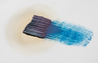
Oil based mark on unprimed paper

However before you begin priming any surface, you might want to consider whether or not the priming is going to support your idea. For instance in the image above you can see how on unprimed paper an oil based mark, such as from an oil stick or mark made with a brush using oil paint, will gradually separate itself out, the oil leaving the pigment as the paper absorbs the oil into itself. This capillary action is of course telling us about the nature of the paper and the nature of oils and pigments. The pigments are suspended in oil and the action of oil spreading out reveals this. It may be that this type of incident is vital to the material message that you want your work to communicate, and if so, you would be concentrating on the type of paper used and its ability to soak up oils, as well as of course on the makeup of the various oil based products that can be used for mark making. 
On the other hand you may want to investigate priming as a way to generate new ideas. By working across several different surfaces and grounds ideas sometimes emerge from the way the materials operate. But whether you have an idea of an effect you want to achieve, or whether you want to undertake a period of pure research and investigation of possibilities, you will need to use a surface of some sort and paper is for most drawers the one they begin with, so don't forget to check out previous posts on papers which can be accessed at the end of this post in the 'see also' section. 

Size

Sizing seals the support, which is why size is also called sealant. Basically size is a glue that seals the paper surface to reduce absorption. The surface sizing of watercolour paper helps watercolour sit on the surface rather than be absorbed into the fibres. This helps to preserve the luminosity of the pigments, whose reflective ability would be compromised by being partly absorbed into the mass of paper fibres.  

The same brush stroke on sized (left) and unsized (right) paper.

A size can be made from acrylic polymer, PVA, casein, (casein paints are ground in a solution of casein, which is a phosphoprotein of milk precipitated by heating with an acid or by lactic acid) or animal gelatine. The traditional size used by artists is rabbit skin glue, and it is the best if you are looking for a long lasting artefact, because it has a low acidic content. 

Primer

Before putting any paint on your surface you might want to use a primer. It is a glue that sticks well to your surface, better than your paint would. Then when your paint is applied, it sticks to the primer, so that it is well adhered, i.e. it isn't going to flake or crack off. Primers for acrylics are often called acrylic dispersion grounds and they are either acrylic gesso or acrylic primer and these new ones made by artist's suppliers such as Johnsons can fulfil the role of a size, primer and ground all in one. 

Gesso

Genuine Gesso is made of warmed animal glue and whiting. Gesso is a common preparation for a paper drawing base and has a range of qualities that make it very useful for surface control. You can sand back down into it and in doing so remove areas of drawing in a very subtle way, so that the drawing appears to emerge from the ground, or look as if it is sinking down into it. Genuine gesso is a hard, chalky surface built up by several thin layers. It is sensitive to water and will crack if used on a flexible surface, so to prevent cracking it must only be used on rigid substrates. Genuine gesso is extra-absorbent so it’s the best choice for painting in egg tempera or encaustic. Unless it states that it is traditional gesso, most things labelled gesso, are made with acrylic ground and are not as absorbent as true gesso, so if you can, test out both before making a decision as to which one is right for your particular approach. In drawings mixed with watercolour or dilute inks, the ability of gesso to absorb liquids again comes into its own and there is a deep, saturated look to liquids applied to true gesso surfaces that you cannot get on unprepared paper surfaces.  


Marks made on gessoed watercolour paper

The paper above was painted using a large brush that left brush strokes using an acrylic gesso. It was when dry lightly sanded to give it a grain and it was then drawn into with a sharp metal point, in order to scratch deep into the gessoed paper. A dilute black ink wash was then applied over the scratch marks and then a clean damp cloth was used to remove the ink from the surface so that it was left concentrated in the scratches. The wiping also enabled the surface to be 'softened' and a further layer of coloured watercolour was then applied and also wiped off. 

Watercolour over acrylic ground gesso.

In the image above you can see that the gesso was applied with a big brush in a straight downwards stroke and then put on slightly thicker using a palette knife using horizontal strokes. Watercolour was then applied with a large soft brush and partly removed using a dry cloth. 
 
Many acrylic primers were created to be similar to traditional gesso. You will therefore find various terms such as ‘true gesso’, ‘genuine gesso’ or ‘traditional gesso’, but to begin with just try them out and see what affects they help you achieve. All of them can be painted onto paper, and all of them can then be sanded, scratched into and variously distressed in order to give you textural control over a drawing's surface. 

If your surface needs to flex, Sinopia Casein Gesso can be used. It is very absorbent and is the next best thing to genuine gesso. You use it straight from the jar at room temperature. It is made with milk protein (casein) which is a binder in casein paints. It contains a small amount of linseed oil that has been emulsified so it can be thinned and cleaned up with water. But the oil content is actually quite minimal, just enough to make the gesso flexible and water insoluble after it has dried and cured – because it is minimal they say that the surface doesn’t need to be sized first to protect it from the oil. This also means it is not very absorbent, so intense watercolour or ink colours are harder to achieve. 

Once the gesso is applied it dries to the touch in a short amount of time so you can apply the second coat the same day when the first is touch dry, but no more than two coats a day. While the surface is stable enough for one additional layer, the oil content has to cure enough for subsequent layers to be applied. Because the recipe includes a linseed oil emulsion it will take four or five days for the surface to cure and become water insoluble. If you are working with aqueous wash techniques, which soak the surface with water, then you should wait for a complete cure. With less water or with oil techniques, the surface can be painted on after a few days.


A ground is the textured surface that all of your various drawing media have to respond to, whether these media are wet or dry. It’s the thing that you experience as 'touch'. Whether it is hard or soft, smooth or textured, absorbent or non-absorbent, coloured or white, it will directly effect the way that a mark sits on a surface.  Of course for a painter grounds are also vital, but sometimes the drawer can forget that the paper surface holds 50% of a drawing's textural potential. 

Some drawing media have grounds specially made for them, such as pastel and silverpoint. Transparent acrylic pastel primer is a ground that makes it possible to work in soft pastel on a wide variety of substrates: canvas, card, plastic, glass, paper, wood, ceramic or metal. It has a slightly gritty or toothy texture which will hold soft pastel grains. (You also have to think about fixative technology with pastel, so do follow the links at the end of the post for more thoughts on this). 

I have posted on silverpoint in the past and in order to get the metal to rub off on paper you need to apply a ground. My first use of a primer to do this was of ground-up cuttlefish mixed into gouache paint. But you can draw with a variety of metals as long as you consider the paper's surface preparation. Metalpoint drawings are made by dragging sharpened wires of soft metal (usually silver or lead, but sometimes gold) over a slightly toothy, textured surface. Particles of the metal wire are deposited on the surface, leaving ghostly grey lines which will tarnish over time to a warm brown tone. There is now a specially prepared commercial ground available, called 'Golden Silverpoint Ground' a milky acrylic ground that is designed for use on porous and flexible substrates. 

Detail from Lauren Amalia Redding, ‘De Donde Crece La Palma’ Silverpoint on panel

A good traditional ground is made from rabbit skin glue, bone ash, and pigment, but the rabbit skin glue must be kept at a constant temperature and several coats are required, this is why I used the gouache method. If you want to look at an artist that uses silverpoint grounds really well try Roy Eastland. He combines drawing on gesso grounds with scratching and sandpapering his images away, so that he gains full control of surface possibility. 

Roy Eastland

Roy Eastland

I particularly like Eastland's drawings of old toys such as the one above, the sanding back of the gesso allowing the images to ghost out of the ground, suggesting that they are emerging out of history. 

This post is simply an introduction to grounds and was prompted by the fact that several first year students are beginning to take more care over stretching papers and thinking about how they might use wooden frames to support taut drum like surfaces to draw on, but very few are exploring paper grounds and how they also affect mark making possibilities. 

See also:

Charcoal Includes a section on fixative and how to use it 
Sumi papers A reminder to explore what is out there in relation to possible surfaces to use