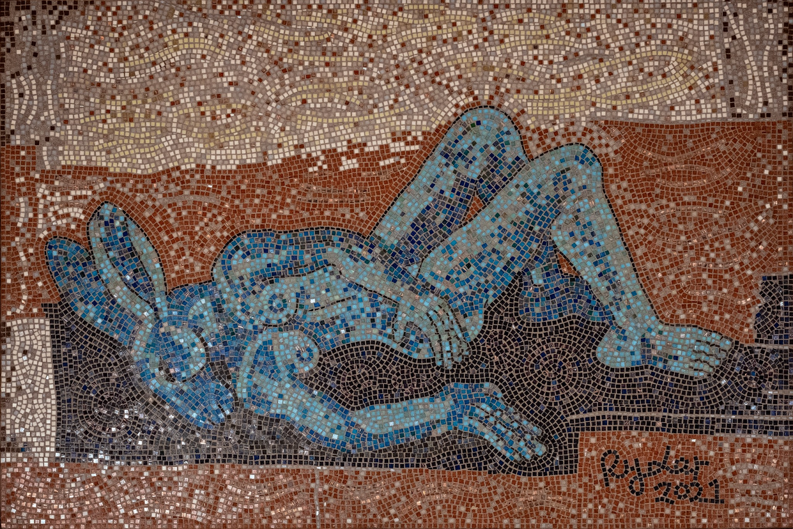
Sophie Ryder ‘Blue Lady’
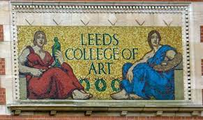
I see that Sophie Ryder has been making mosaics, her recent exhibition in Halifax included the mosaic ‘Blue Lady’ which was on display at Dean Clough Mills. Her images reminded me of when I was in Greece and looking at the mosaics set into the floor of a very ancient villa. Ryder has had to use the mosaic way of simplifying form and in doing so she gives her images a timeless or perhaps 'set into time' quality. I have worked at what was Leeds College of Art for well over 40 years and over the doorway to the Vernon Street entrance the old mosaic mural still welcomes new students into the profession.
The mosaic mural above the Vernon Street entrance to Leeds Arts University
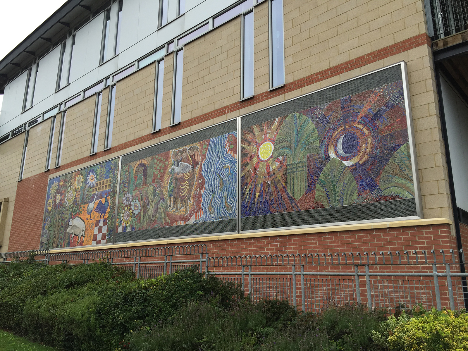
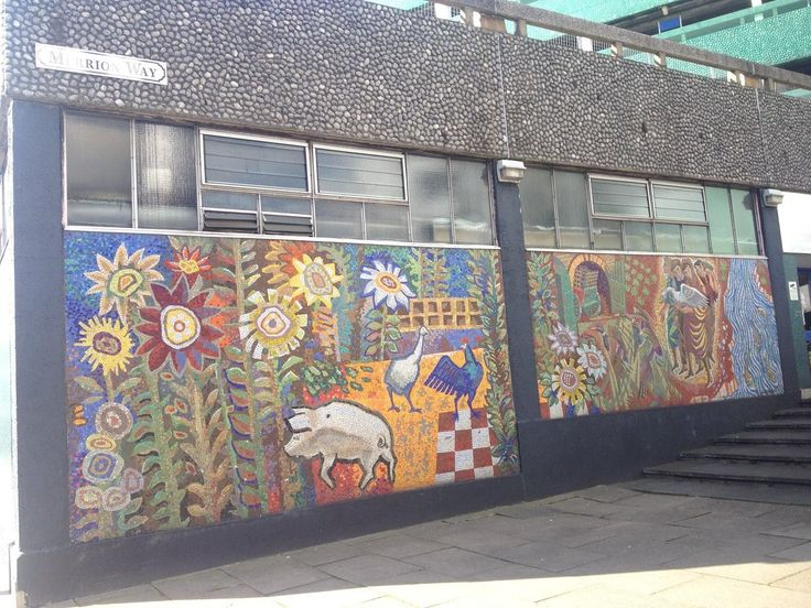
Eric Taylor who used to be a principal of the college was also an accomplished mural designer and his mural for the Merrion Centre was relocated to the walls of the college's new Blenheim Walk building, when the walls hosting it were knocked down as part of a refurbishment scheme.
Eric Taylor mosaic murals
Eric Taylor mosaic murals in their previous location
I have always loved Eric's murals, the juxtaposition of a rural scene set into the walls of a what was a then new shopping arcade, with the centre's raw brutalist carpark design, used to be like flowers growing through the cracks of a concrete pavement. But mosaic traditions also include the early Christian Church and in Greece the mosaic tradition carried on and the tradition of Greek orthodox icons ensured that a powerful simplicity of form was maintained. It is for myself fascinating that the term mosaic is likely derived from the Greek word “mousa,” meaning “work of the muses.”
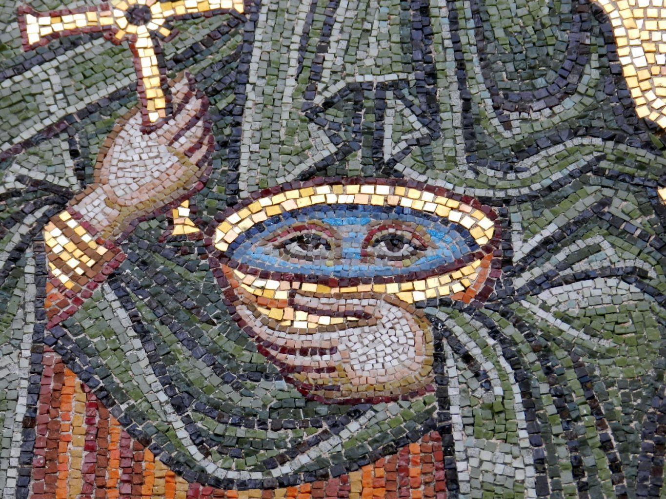
Greek orthodox mosaic
A detail of eyes changes our relationship with a bowl carried by I presume by St Lucy. Suddenly the bowl is animate, it has as they say agency and it stares at us with mystic eyes perhaps coming from older more magical traditions.
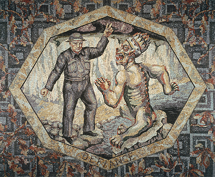
I find a mosaic surface mesmerising and visually hypnotic, therefore prefect for an image depicting magical ideas, or other worldly issues. Mosaic is usually associated with public spaces, and it often graces the entrances of large public buildings. I have for some time now had an interest in the mosaics that you pass when entering the National Gallery.
Winston Churchill as 'Defiance'
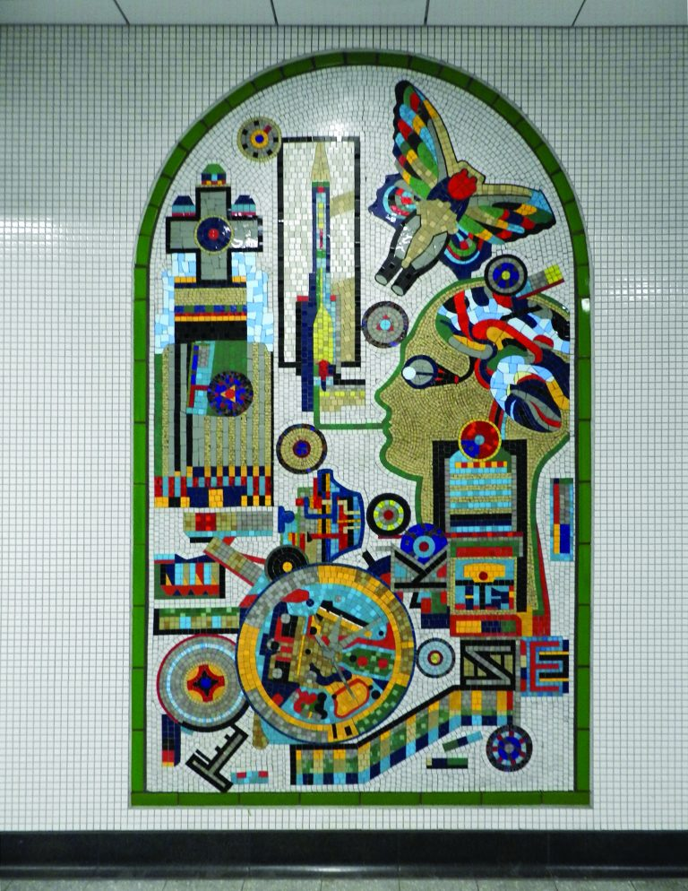
The London School of Mosaic still operates courses up to degree level for anyone wanting to study this old craft and you can find several contemporary examples on the walls of the underground, such as the one by Eduardo Paolozzi below.
Eduardo Paolozzi, Tottenham Court Tube station
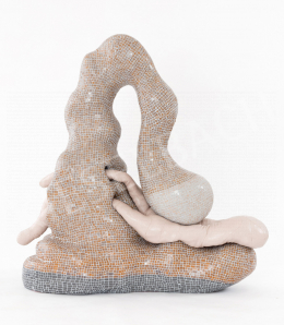
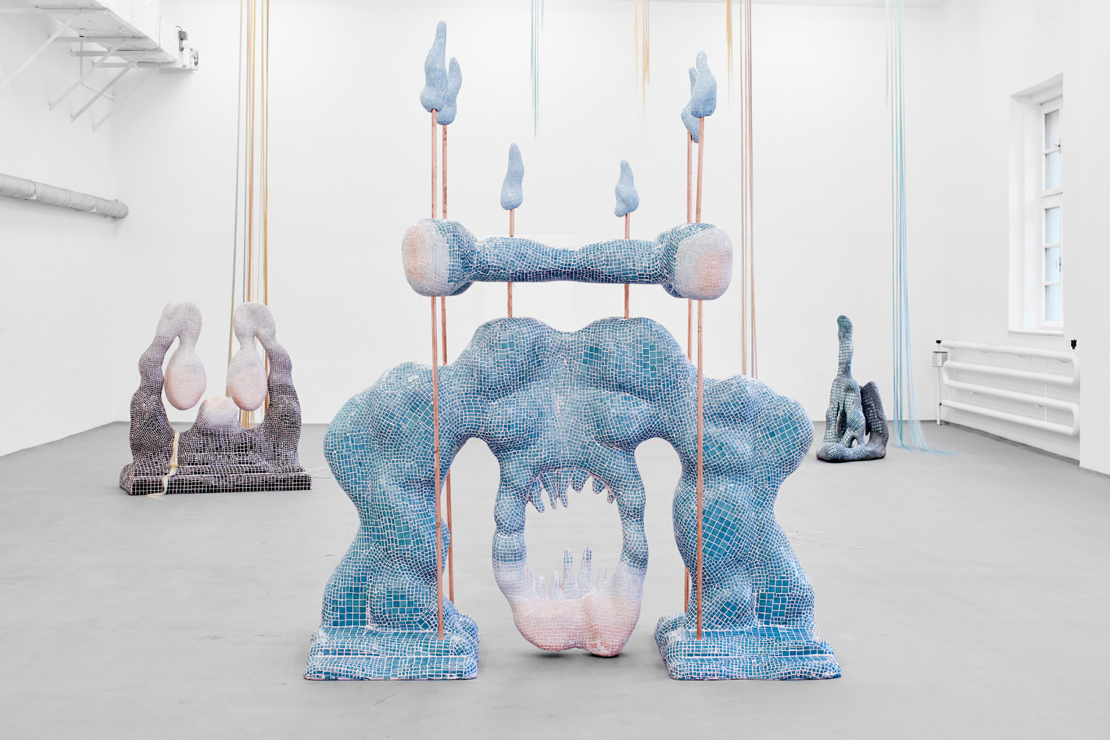
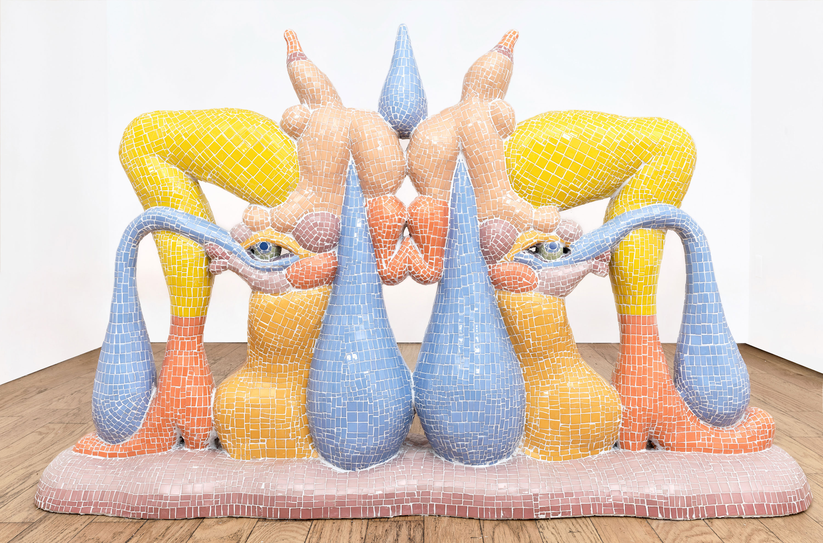
I was over at the Venice Biennale last week and encountered mosaic again, Zsófia Keresztes' mosaic covered sculptures that filled the Hungarian pavilion being hard to miss.
Zsófia Keresztes: Wilting Sympathy
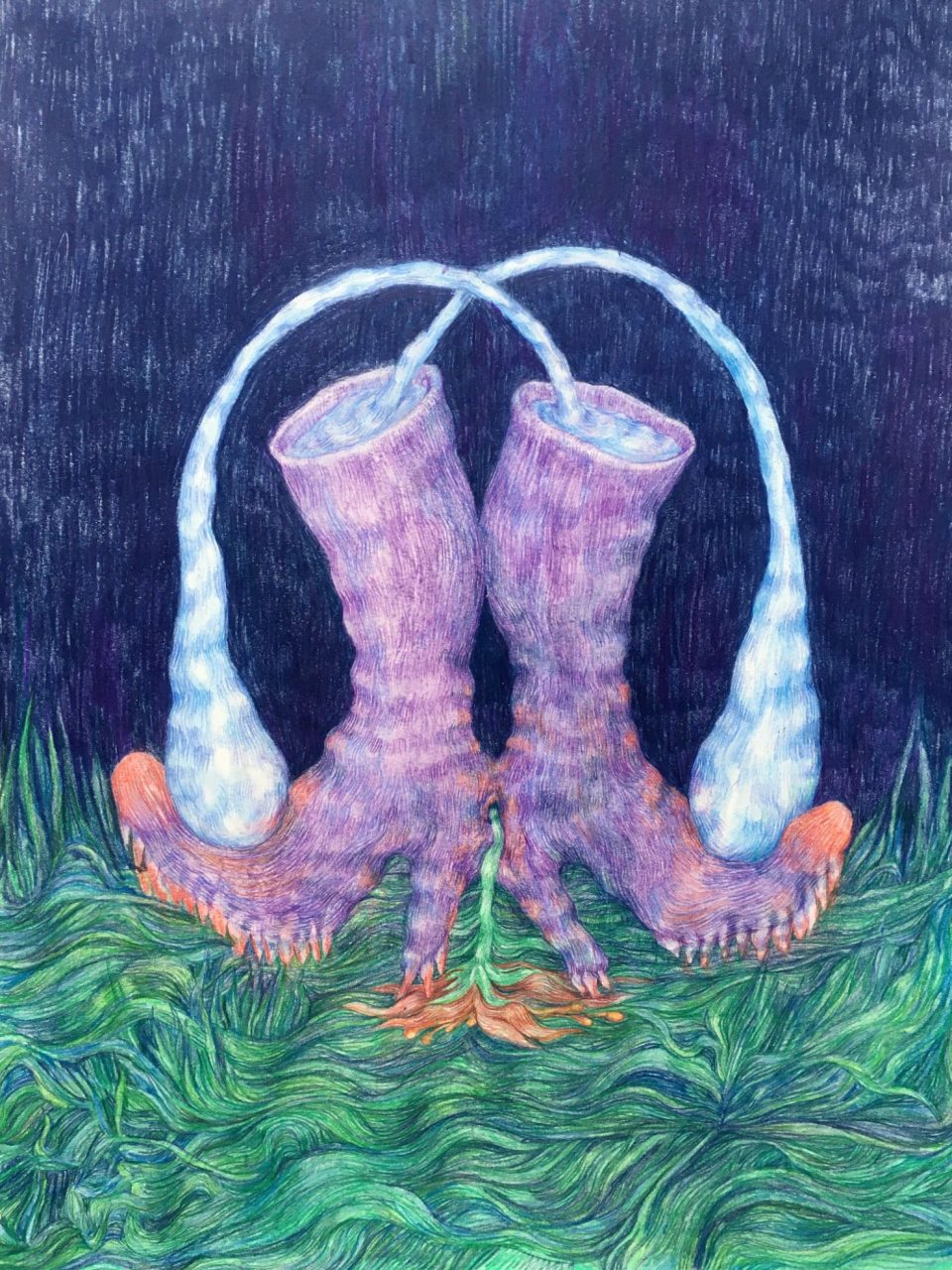
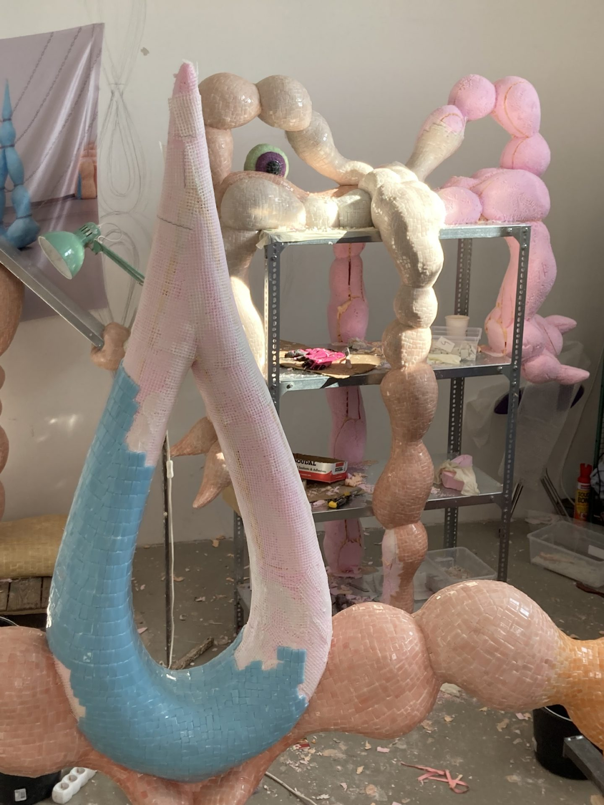
Keresztes is an artist that draws in order to find her imagery. You can see her mind working when you look at her drawings perhaps easier than when you see her final sculptures. She had this to say about her drawing above, “The twin boots feed off each other’s sadness. Under the pressure of their crushing teardrops, a single flower blooms out of the split of their conjoined body. The crop of their blooming empathy perishes under the teeth of their solid ground-searching heels.” Her imagery comes from a deeply personal but poetic sensibility and like several artists at the moment she has a sensibility that recognises the non binary nature of aesthetics, embracing fluidity and hybridity. The use of mosaic helps her to harmonise all the disparate elements that emerge in her ideas.
Zsófia Keresztes
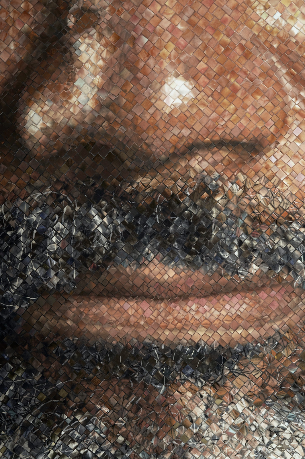
Another artist that was interested in how digital images need to break surfaces down into tiny areas in order to achieve optical blends was Chuck Close and he was at one time producing (or having produced) very large mosaic portraits made from photographs.
Chuck Close: detail
I can see what Close is getting at as he spent years copying photographs by gridding them up and carefully working small square by small square to reproduce them. The grid then became a space to play within and he started to loosen up his paint technique whilst still being able to use the grid's control over the final reading of the image. Even so it seemed to be that this was a heck of a lot of work to make what is at the end of the day a point about reproduction and how the eyes work to form holistic images from lots of bits of information.
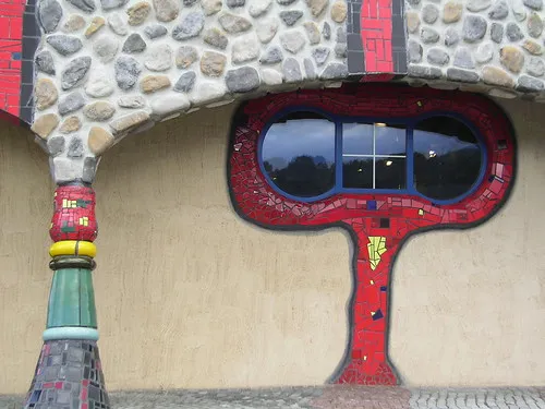
Hundertwasser
Gaudí
Hundertwasser is following in the footsteps of Gaudí and if you want to really appreciate the possibilities of mosaic at scale you ought to go to Barcelona and visit his work in situ.
Mosaic is one of those techniques that sits on the fence between drawing and painting. On the one hand it can be very linear, as you layout the tiles you can design using edges and see your image development as one coming from a drawing based tradition. On the other hand it can be seen as very painterly, colour being applied in small patches very like brushstrokes.
Remember that old technologies can always be re-invented, and that mosaic in particular has a lot of potential, especially if you want to work in public spaces, as it is very robust and hard to damage. Sometimes you just need to see what happens to existing imagery when it has to go through a process of severe simplification. It helps with an understanding of an image's readability and its ability to withstand severe distortion and still be effective. See also:
How to pay attention: More on Chuck Close
Visualising the invisible More on Hundertwasser







No comments:
Post a Comment