Showing posts with label drawing and touch. Show all posts

Monday, 25 June 2018

Where stains and traces meet: To touch is to believe

The way that stains are made changes the way we think about them. For instance if you have a wound and wrap it in a bandage, the blood that seeps into the bandage becomes a record of your ordeal. Alberto Burri was before he became an artist an army doctor and his images consisting of paint soaked rags were made to simulate the blood-soaked bandages of wounded Italian soldiers. The critic Milton Gendel in describing Burri's work stated: “The studio is thick-walled, whitewashed, neat and ascetic; his work is ‘blood and flesh,’ reddened torn fabric that seems to parallel the staunching of wounds that Burri experienced in wartime.” Burri's distressed surfaces were made by ripping, cutting and staining and often included blowtorched burnt surfaces. His work relies on certain conventions of mimesis and his creation of metaphors for the wounded humans he had treated as an army medic was essential to his ability to cathartically engage with the interface between art and life.

Alberto Burri

This approach is similar to but not the same as using real blood to create images. Burri is in effect still maintaining a certain distance from the subject. He does not use rags soaked in blood, but uses paint and a surface treatment such as cutting or slicing to evoke wounds. He wants his audience to think about things and is trying to use the drama of material association to frame the idea. Artists such as Hermann Nitsch and Portia Munson (see previous post) want their audience to make a direct visceral connection with the actuality of blood. How artists break through the distancing that visual metaphor creates is an old problem and it is often associated with the difference between looking and touching.


If we go back to the 16th century and look at Caravaggio’s 'Incredulity of St Thomas' I think we can see the root of the problem. Thomas can't believe that this figure he sees before him is Christ, he believed that Christ had been nailed to a cross and was speared; therefore he should be dead. But touch is a more powerful indication of the reality of things than sight, so Christ allows Thomas to put a finger into the wound in Christ's side. Sight is now confirmed by touch and Thomas is finally convinced of the risen Christ's new spiritual reality.


Caravaggio 'The Incredulity of St Thomas'


Margaret Atwood wrote: “Touch comes before sight, before speech. It is the first language and the last, and it always tells the truth.” Atwood points to the fact that authenticity is vital to the conviction of our beliefs and 'things' have a substantial weighty 'reality' that words and images lack and therefore give authenticity.

The linking of looking and touching is an essential element in the moving of an idea like the stain from an intellectual understanding, to a much more visceral 'knowing'.

Traces of reality are left when one thing bumps into another. However traces are incomplete records of events, so they are often ambiguous, but even so we often read traces as signs. A brown stain can be a sign of a recently spilled cup of tea or of the passing of a wounded man. The physical reality of a stain highlights the idea that a drawing can be an object, a thing in the world that acts upon the world and can be acted upon, rather than being an illusion or window onto the world. In this way a stain can be seen as a record of facts after the event. A window onto the world also denotes a certain distancing, and the stain as a factual record again suggests that this is something we can touch as well as see, the 'fact' of life being more important than a reflection on it.

The Turin Shroud is an object / drawing that sits right in the middle of these issues.

The Turin Shroud

The Turin Shroud is one piece of cloth that was at some point folded in half and was used to wrap up a body. However the body's traces were somehow embedded into the cloth. You can just about see the face near the centre fold and once you can see that the rest of the body comes into focus, the top half of the image above carries a back impression of the figure and the bottom half the front. It is easier to see in negative (below).


The reddish-brown stains that are found on the cloth it is argued correlate with the Biblical description of the death of Jesus. The triangular shaped inserts are patches that were sewn into the cloth by Poor Clare nuns in order to repair damage caused when molten silver from an incinerated chalice came into contact with the folded up shroud during a fire in 1532. How old it is uncertain and how authentic it is also questionable, as long ago as1390 Bishop Pierre d'Arcis wrote a memorandum to antipope Clement VII stating that the shroud was a forgery and that an artist had confessed to its making.
The authenticity of the shroud has been at the centre of several forensic investigations, some concentrating on the materials used to make the image and others on the weave and consistency of the linen itself. The fact that the image of a man is of both the back and front has suggested to many people that the image it an actual print taken directly from a person and that this person may have had a fever that caused them to sweat extensively and thus stain the shroud in their image. Others have argued that the image is too like how someone would be seen rather than an imprint of the linen touching someone. Therefore it is argued the image is in some way 'painted' or impressed into the linen by an artist. What is interesting to me is that the more the image is seen to be the result of touch or direct contact it is authentic and the more it is seen to be the result of an artist making an image it is seen as a 'fake'. The stains in this case hovering between being symbols of Christian veneration and human artifice. Are these brown stains the blood of Christ (haemoglobin) or simply the result of iron oxide based pigments?


Iron oxide is of course also known as rust and if you leave a rusty object on damp paper or wrap it in cloth you will be able to make an impression. Rust stains are a common problem when clothes are left out to dry and inadvertently find themselves in contact with some old rusting iron. Some rusted objects are more associative than others. In certain situations scissors can be weapons. Superficially rust stains can look like scorching, both are usually brown but they have very different associations.

A scorch mark left by a hot iron

In this case we have something that can look like a stain but isn't and as we explore the difference we begin to see how a different set of meanings opens up. A scorch mark is much more a result of violent action. (Think of the holes in the Turin Shroud that required patching or repairing). We brand animals by scorching them and indeed we use hot irons to torture each other.
A tortured victim's iron burn


We seem to have come a long way from Burri's attempt to use red paint and distressed textile surfaces to signify his experiences of bandaging soldiers during war. The last thing I am suggesting is that as artists you need to be more directly engaged with violence in order to depict it. What I am trying to suggest is that the relationship between touch and sight is an important one when it comes to certain types of mark making. Staining in particular has a series of associations that begin to open out if we look at some synonyms.
To stain: to blemish, to soil, to sully, to spoil, to defile, to taint, to besmirch, to discredit.
Whereas the physical traces of something can mean: to hint, to indicate, to point to, to tell, to warn, to leave evidence or to notify. All of these inferences suggesting that a trace is only a partial indication of something, an incomplete account, which leads to a certain ambiguity. There is no ambiguity in the torture victim's iron burn, we are clear as to the intention of the perpetrators. The fact that whoever did this is not thankfully an artist is important. We might worry about the fact that our ideas are not clear enough or not 'getting through' to our audience. But part of the wonder of communication is that it can be very subtle and still work. You just have to be attentive.
Consider the tale of 'Clever Hans'.

Clever Hans

The horse Clever Hans was a mathematical sensation and he hit headlines during the first decade of the 20th century. If you gave Hans a basic addition or subtraction problem he would nearly always get the answer right by tapping out the answer with his hoof. No one could work out how Hans did it, because when his owner died the horse was still able to perform these feats of counting. Eventually someone solved the problem, Hans was clever but not as a mathematician, but as a reader of human emotions. Hans could sense the growing tension of people around him when he 'counted'.  As he neared the right number, Hans would gradually slow down his hoof beats, tension mounted in his audience and this would enable him to respond to the release of emotion as he reached the right answer. Hans was using a high level of emotional intelligence and keen observational skills to communicate with his not quite as sharp human friends.
Sometimes though we need some other information, because traces are as we have seen incomplete evidence. So consider these coffee cup stains below.


These stains were left over from a meeting between a group of people that were having to make a very important decision. The meeting as we can see went on for some time and several cups of coffee were drunk, someone in particular had slopped their coffee into a saucer, probably due to their agitation in relation to the meeting's agenda and as they put their cup down several times, they were inadvertently beginning to create the beginnings of a pattern. How does this 'drawing' communicate? Can we like Sherlock Holmes decipher this image by using inductive reasoning? Do we intuitively read the image as a sign for both a meeting and a long mulling over of an idea? Context and story line are both important here and it is hard to avoid certain narratives even when they are the wrong ones. Everybody thought that Clever Hans was doing what he did as part of some elaborate con trick, therefore the narrative of trying to reveal the trick became so dominant that everyone missed the reality of what Hans was doing. In this case if I told you that this image of coffee cup stains was a detail from a much larger photograph taken in 1942 at the Los Alamos National Laboratory immediately after a meeting between General Lesley Groves, Major John Dudley and J. Robert Oppenheimer, would it change the way you were thinking about the image?

See also:


Monday, 11 July 2016

Iterative Drawing

Anthony Gormley

We are always advising you to draw more. But why? There is an aspect of drawing called 'iterative' which means that drawing is centred around trailing and testing and making variations. This allows you to discover what works and is at the core of what you need to do in order to find new imagery. It also gives essential time to the development of skills. In essence hours spent doing things leads eventually to a command of your language. John Cage wrote 10 rules for students and teachers and at their core are 'There is only make' and 'The only rule is work'.


Another key rule from the list above is 'Do not try to create and analyse at the same time'.
However trailing and testing and making variations is not just a process of unthinking making. Every now and again you need to look at what you have done and make decisions about it. Joseph DeFazio in 'Designing with precedent: A cross -disciplinary inquiry into the design process' (2008) refers to Goldschmidt's distinction between drawing as 'seeing that' and as 'seeing as'. 'Seeing that' incorporates the process of reflective criticism and 'seeing as' represents the process of making referential analogies and interpretations. He sees this as a type of conversation and negotiation. Goldschmidt (1991) intimates that drawing is an iterative process that materialises towards a final product and can include intuitive inductive loops that cross cut through any existing body of information. He has another mantra; 'Draw, re-draw: test, re-test'.
However it's not all about new information. Schon and Wiggins (1992) have a theory of the displacement of concepts, in which you use old existing information in the creation of the new. Old concepts and working practices are restructured in relation to new situations. I.e. the more you have done in the past, the more you can draw upon these experiences to construct new ideas in response to change.
These ideas about visual thinking come from research into designers drawing, mainly because designers are thought of as people with visual problems to solve. Artists also have problems to solve, but perhaps without the pressure of an outside client. I say 'perhaps', because in reality artists have just as many outside pressures to resolve what they are doing as designers. For instance I have just been given a commission to install a site specific work in the grounds surrounding York City Art Gallery, this involves various types of drawing, both imaginative and practical, as well as lots of site testing to make sure what I make will work when placed in situ.


Two of my working drawings for York City Art Gallery project

In Richard Sennett's 'The Craftsman' he points to the fact that making exemplifies the special human condition of being engaged. He goes on to state that skilled craftsmanship needs about 10,000 hours of experience to enable the maker/drawer etc. to reach a level of competence whereby they can become much more problem-attuned, whereas people with lower levels of skill struggle just to get things to work. When a skill is fully developed its technique is no longer just a mechanical activity; the maker can feel different levels of expression and think much more deeply about what they are doing. They in effect become tuned into the materials they are working with. They don't separate themselves from what they are doing, they are in effect part of the process. A good craftsperson knows their own body and how it operates and senses how it can enable the materials used to flow into forms that 'arrive' through the process of making.
Juhani Pallasmaa looks at how touch gesture, habit and intuition are essential to our understanding of space and materials, he explores how the hand operates in partnership with the eye and the brain.
I pointed out in an earlier post that material thinking is now becoming more and more important. This is because there is a reaction against what was called 'the linguistic turn' and then a further reaction against something called 'the cultural turn'. The basic argument is this. Although it was useful for us to think about the world in relation to our codes of communication (seeing everything as language and therefore analysing it in terms of semiotics) or in terms of cultural production, what we were in effect doing was
ascribing human centred thinking to everything else; animals, plants, materials, objects, etc. We had developed a view of the world whereby the conceptual frameworks we were working with put ourselves at the centre of operations as if we were the most important things in the world and usually our concepts didn't just place us at the centre but also at the top of the pile. We elevated our own concerns, our own timescales, our own ways of being as in someway being of much more importance than anything else. We have of course recently had to rethink this. The world itself is fighting back, we begin to realise that we should have been working sympathetically with the world and not mining it for its resources and polluting it with our waste. We have slowly begun to realise that if we don't change our viewpoint the world will work to erase us. Only by being in harmony with the plants, animals and materials that we co-inhabit with on this planet will we survive, and if we are to do this we need to change our conceptual frameworks in order to become inclusive of not just others like ourselves but minerals, energy flows, organic and inorganic forms.

Artists have a responsibility to think about these things as well as politicians. But small changes begin at a local level, and a first step might be a reflection on what it is to make anything. By asking a basic question such as 'how can we be sympathetic to a material?' we open the door to a series of rooms that have perhaps not yet been explored. This basic question may lead you to ask others, such as 'how does an awareness of the wider ecological or environmental issues affect your choices of action?' or 'how many recent political decisions are actually the result of climate change?' Do we anthropomorphise our concepts or not? Perhaps by doing so we place feelings in and with things other than ourselves and thus have a better link with them. A child may play with toy animals and grow up to love real animals.
Immanuel Kant said that "the hand is the window into the mind," but the nature of materials allow the hand to be what it is. Oxygen, carbon, hydrogen, and nitrogen make up 96% of your body mass. The other 4% of body weight is composed almost entirely of sodium, potassium, magnesium, calcium, iron, phosphorus, sulphur, chlorine, iodine and silicon. Oxygen and hydrogen are fused together in the form of water, which itself allows for the dissolving of other elements into it, in effect recreating an ancient sea inside a walking container. Early single celled organisms extracted calcium carbonate from those seas to create shells and now similar processes create bone. You are a product of material flow, the material flow is not a result of human decision making but humans can make a decision whether or not to 'go with the flow' or to interrupt it.
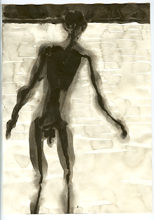
Therefore we both need to choose a suitable material and become tuned into the chosen material we are working with. You cant really separate these things out, they are in effect part of the process. In Gormley's case, these drawings a made with dissolved pigments in water, which means that we could read them as being metaphorically connected to the idea of the body as an ancient sea inside a walking container. The more drawings he makes, the more variations on this theme revel themselves, the body dips into and out of the pools of pigmented liquid, sometimes its edges are sharp and clear and at other times they begin to dissolve back into the paper surface. Personally I think these images could be taken much further, but of course I'm sure he has at some point, because he normally makes lots of variations, most of which we wont see.

Anthony Gormley

Anthony Gormley has commented on these issues both as an iterative drawer and maker and as someone worried about our responsibilities in the face of climate change.
'Hopefully it gives you an opportunity to put yourself in the place offered by this silhouette and to think about your connection to and dependence on the context in which we find ourselves... the most important being the elemental world that we have managed for the first time ever, for any species, to have destabilised.'
“Short termism is the way capitalism works and the way politicians work and capitalism is not going to solve this. We have to find another form of defining value that is not market value.
“Nobody wants to face the truth that actually air, water, sunlight are resources that are certainly not free.” From: The Guardian.

In Gormley's notebook pages below again we see him exploring variations, but this time of human figures made up of lots of small units. The metaphors are now very different to the dissolved pigments in liquid. These figures seem to belong to the built environment rather than being things that have evolved out of primeval seas. The individual drawn marks carrying the metaphorical weight of these images.


Gormley: Notebook pages

Coda:

A very clear example of iterative drawing can be found on Jen Roper's website. She is an ex-student of the Leeds Fine Art Degree Course and has recently been selected for the Contemporary British Painting Prize. 

Jen Roper: Drawings Jason's Coat

References

Ingold, Tim. The Textility of Making:  Cambridge Journal of Economics. 34. 1 (2010): 91 -

102. Web. 1 January 2014.

Ingold, Tim. Toward an Ecology of Materials: Annual Review of Anthropology. 41 (2012): 427 - 42.

This podcast is a very good introduction to what has been called 'the material turn.

Rebecca Jane Bennett’s book Vibrant Matter is an excellent introduction to the issues surrounding the material turn, as well as Karen Barad’s (2001), "Re(con)figuring space, time, and matter", which has a more feminist perspective.

Goldschmidt, G., 1994. On visual design thinking: the vis kids of architecture. Design studies, 15(2), pp.158-174.

Schon, D.A. and Wiggins, G., 1992. Kinds of seeing and their functions in designing. Design studies, 13(2), pp.135-156.

The Craftsman by Richard Sennett is available as a pdf here

The Thinking Hand by Juhani Pallasmaa is available as a pdf here

An article on Anthony Gormley's drawings

See also: 

material thinking
On not knowing and paying attention a talk by Tim Ingold
Letting things happen Heidegger and concept of ‘at hand’
Drawing and philosophy (More on Heidegger)
Drawing and Heidegger
John Dewey Experience and making art


Tuesday, 17 February 2015

Swell Paper

We have been looking at the relationship between touch and sight in some of the level 4 sessions. I was doing some research into how people with sight impairment could read diagrams and discovered that there is such a thing as ‘swell paper’. Swell paper offers an interesting solution to the problem of making drawings in shallow relief so I thought it worth a post. 


Look carefully and you can see how the surface is raised underneath the black areas.

This technique was designed for drawing raised diagrams and probably works at its best when using clean sharp images and thick lines.
There are several different makes of swell-paper, sometimes called capsule paper, puff paper or fuser paper, available, the trade names include Tangible Magic Paper, Matsumoto, ZyTex and Flexi-Paper. Some need more heat than others to raise lines and like any other material you need to work with it to find out its full potential. Ask for free samples of paper from suppliers, and of course test, test, test. 

For papers that will work on a photocopier I have seen good recommendations for Tangible Magic Paper.

Because black photocopier and laser printer toner is carbon, these two devices can produce wonderful images for tactile graphics. However, they both have very hot internal parts, and it can cause a very bad paper jam if you attempt to print or copy onto swell paper without taking a few precautions first:

1: Always pass your swell-paper through the manual feed of the unit, one sheet at a time;

2: Try to use the copier or printer just after it has been switched on from cold, or after it has been idle for long enough to cool down. Never use it immediately after a large print or copy run, because the swell-paper can swell in the high-temperature environment inside the unit, and cause a very serious paper jam. I.e. keep it cool and don’t try and put several sheets through one after the other, because the machine will get too hot.
Zychem Ltd. supply specialist heaters for work with their swell paper, but you can also e mail files to them for printing on non standard sizes. From what I have seen the images made from their dedicated machines are very good. 

Web links

For Zytex swell paper and specialist heating machines from Zychem click here

A useful video here can help you to think about how an image should be simplified before being translated into a black and white line diagram.

www.tactilegraphics.org- a collection of resources for people doing tactile graphics. There is an excellent Decision Tree linked from the front page. This might be for graphic designers, but it is also a useful guide for when thinking about whether or not a drawing would work as a shallow relief.
Lech Kolasiński has made five adaptations of paintings by Jacek Malczewski. The image below, ‘Tickled to Death’ is divided into two longitudinal halves, each of the re-interpretations is a reconstruction of the original, in the upper section we have a simplification of the composition, while in the lower part an interpretation of the meaning of the image, which is simplified and so clearer to the blind. Both images are raised using swell paper to provide a heightened tactile experience.