Monday, 22 November 2021

The smiley face

It is now over 50 years since the smiley face image was introduced into our culture. There are two aspects to it that really fascinate me, one is how we use the same image over and over again but in different ways according to our needs and the other is how as a society we have set up legal structures surrounding ownership that are strange and bizarre, (well they are if you are someone who dislikes the capitalist system) and yet as artists you have to be aware of legal precedent in copyright law and its use if you are to safeguard your intellectual property rights. (My personal belief is that I find the phrase 'Intellectual Property Rights' quite difficult, and the transfer of the right to own property to ideas, as something that goes totally against my vision of society as a cooperative effort.) This is however another post that is designed to raise awareness of legal issues, something which is a mandatory requirement of the course here at LAU, so whether I support the copyright law system or not, I do have to acknowledge its existence and communicate something of its implications to those of you that may need to use copyright law at some point in your careers.  

In 1963 the graphic artist and ad man Harvey Ross Ball was commissioned to create a graphic image to raise the spirits of the workers of the State Mutual Life Assurance Company. He was paid $45. 

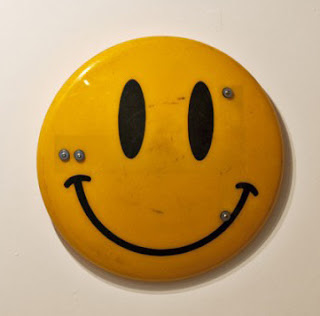
Harvey Ross Ball's original smiley badge. 

When you look at the image there are certain distinguishing features, the eyes are not perfect circles, one is an oval and the other more like a short dash. The mouth is off centre and slightly thicker on one side, the image basically says it was drawn using tools that reflected the hand made nature of their application. The original smily face still carried within it the traces of the maker, the hand skills of Harvey Ross Ball. You can still 'see' him drawing that smile, the slight wavering of his hand as he used a pen and black ink to thicken it, until the smile had enough visual weight to work within a circle of that size and colour. A simple drawing, but one that reflects the fact that Harvey Ross Ball was a professional graphic artist, who used the tools of a trade that in 1963 had yet to encounter a computer. 
The image was very successful and the company used it extensively, but never thought to copyright it. 
In the early 1970s, brothers Bernard and Murray Spain, from Philadelphia came across the image, saw it was popular and after adding a slogan “Have a Happy Day”, in 1971 copyrighted the revised design. In my earlier post on copyright law I cited the fact that in the logic of “transformation” any creation of a derivative work which under the law should require a license, needs to prove a “transformative use” and if so, this can be seen as “fair use.” In transformative use, alterations must result in an aesthetic and character different from the original; therefore if applied, in this case the Spain brothers could have argued that adding the slogan was transformative and therefore a 'fair' use of the idea. However because neither Harvey Ross Ball or the State Mutual Life Assurance Company copyrighted the idea there were no impediments to the Spain brothers' application. The fact that courts are more likely to consider artwork commercial if it is sold as decoration or merchandise, such as mugs or t-shirts and that people are using the artwork to sell consumer merchandise, rather than selling the artwork itself, didn't really come into the situation, but it would have been interesting to see how the courts would have dealt with a counterclaim for copyright by Harvey Ross Ball, if he had been aware of what was happening at the time, as the smiley face was clearly being sold as merchandise. 

The Spain Brothers 'Have a Happy Day!' smiley face 

The Spain brothers' smiley face is a more centralised image, the two eyes are the same, both elongated ovoids, a black circle of a particular weight now contains the face and the mouth has a much smoother curve, suggestive of drawing implements being used to sharpen the design. Soon after their copyrighting of the image they were asked to go on the TV program 'What's my line?' and they were introduced as the people who had invented the smiley face, an image that was now selling huge amounts of associated merchandise and making a very handsome profit. 

However over in Europe in 1972 Franklin Loufrani registered the smiley face for commercial use, using it to highlight the rare instances of good news in the newspaper France Soir

The contemporary smiley

He trademarked the “Smiley,” as he called it in over 100 countries and launched the Smiley Company by selling T-shirt transfers. By 1996 the Smiley Company had developed a formalized style guide, had set up international licensing agreements and had started to develop the first graphic emoticons for computer use in association with word processing software. 

Emoticons

The Smiley Company states, 'an emoticon is a typographic display of a facial expression, used to convey emotion in a text-only medium'. The present owner of the company argues that the design of the smiley is so basic it can’t be credited to anyone. It is so well known that it is appropriated by people all over the world and law suits are constantly being taken out to try and quash the various appropriations that are constantly emerging. It's current manifestation is slightly different again, two oval eyes, often now moved as part of a change of expression and a mouth that has a clearly vector graphic supported curve. Harvey Ross Ball's hand drawn version now long gone, the contemporary smiley's oval eyes surely the product of a vectored graphic package. 'Have a happy day!', eventually morphed into 'Have a nice day' and more and more creative uses of the smiley face were seen out there in the image-sphere, from Kurt Cobain's anti smiley to Jimmy Cauty's Riot Shields. 

The Nirvana smiley

Jimmy Cauty: Riot Shield

Over the years meaning and use has changed alongside social and cultural values; the optimistic message of a 1960s insurance company became a commercialized logo, in 1970s Vietnam, for American soldiers it became an ironic fashion statement, in the 1980s a symbol of rave culture imprinted on ecstasy pills, and now it is central to our wordless expression of emotions in text messages.

A collection of sew on badges from a Vietnam veteran's collection

Ecstasy pill

An emoticon

Dave Gibbons used the smiley face with a trickle of blood running down it as a symbol for the deceit and lies of a dystopian world of depressed and traumatized superheroes in the classic graphic novel he created with Alan Moore, 'Watchman', Gibbons stated “It’s just a yellow field with three marks on it. It couldn’t be more simple. And so to that degree, it’s empty. It’s ready for meaning. If you put it in a nursery setting…It fits in well. If you take it and put it on a riot policeman’s gas mask, then it becomes something completely different.” 


The smiley face is now an icon of contemporary visual culture, and as such it becomes subject to fine art's attention. Antonio Brasko an Iranian/American artist has developed a practice that fuses together graffiti, pop culture, various fine art tropes and fashion, his version of the smiley perhaps breaking the mould by now placing it in a rectangle; the rectangle of the fine art canvas meeting the spray language of the streets. 

Antonio Brasko

Tala Madani 

Tala Madani has highjacked the smiley face, giving it a personality that envies real faces with noses and thus the anonymous icon begins to slowly merge back into the emotional faces from which it emerged, it's smile now being one of happy vengeance, of the smiling retribution of the noseless smiley, as it scissors away the noses of its distant relatives.

See also:

Another post on copyright law

More information on Jimmy Cauty's riot shields

Abstraction and meaning

Drawing can be funny

Dots and spots

Authenticity and Blockchain

The circle

Tuesday, 16 November 2021

Pushing paper: contemporary drawing from 1970 to now

I have just been to see the exhibition 'Pushing paper: contemporary drawing from 1970 to now', which is on at the Cooper Art Gallery in Barnsley. We rarely get to see drawing exhibitions of this quality in Yorkshire, so I would advise anyone living locally to go and see this carefully curated show. 

There are so many interesting drawings that it's hard to know where to begin, but perhaps simply because I know that every year Fine Art students at the LAU are given the opportunity to take part in the British Art Medal society's design a medal competition, I'll begin with Ellen Gallagher's 'An experiment of unusual opportunity', a drawing done as a design for a medal to raise the profile of the difficult to face life and work of Eunice Rivers. This small pencil drawing fascinated me because it was dealing with similar interests to my own, how do you communicate ideas through depictions the human body? In this case the carefully knotted hair of Rivers, is pushed right up against the ear and greatly enlarged eye, which replaces the rest of the face. In fact the eye punches the face away, its pupil a conker shaped stone at its centre, all of which works against the delicate tracing of light pencil lines that make up the hair and eyelashes. It was perhaps this conjunction that drew me in. The pencil drawing was light and airy, almost etherial, but the visual logic was of a clunky juxtaposition, a drastic short cut to bring the viewer up short. 

Ellen Gallagher: An experiment of unusual opportunity

This small drawing set the tone of the exhibition for me and I began looking for embodied moments in drawings, searching for visual ideas that I could take back into the studio where I'm working on a range of drawings that attempt to communicate various concepts about my own and others bodies. 

Hanging high on an adjacent wall to Gallagher's small image was Glenn Brown's 'Children of the Revolution' (after Rembrandt). This large image is a type of Brown drawing I had seen before in the British Museum and had remarked on in an earlier blog post, but this time I was interested in another aspect of how the body could communicate an idea. The subject is Rembrandt's etching of the goddess Diana, but Brown has left the head off. As in Gallagher's drawing, a process of removal focusses attention on the rest of the body, that has itself been elongated, Diana's solidity and human weight as given to us by Rembrandt, is now made more El Greco like, her body flickering upwards in white ink pen lines, made all the more sharp by the drawing being done on transparent polyester film and mounted on brown cardboard. Some tonal effects are introduced by playing off the white lines with black ones, and the body is being given form more by white lines acting as cross contour definers, than by tonal massing. The curve of the inner frame in effect replaces Diana's head and the sinuous lines demarcating the body, dissolve back into background supporting lines, almost as if they are drawing a rock being pulled out of flowing water. The headless figure has its arms cradled around what is in the Rembrandt etching almost a void, and which in Brown's image becomes a trapped swirl of black curled marks, as if the figure was attempting to cradle or hold on to the top of its recently lost head. Brown's reflection on an old master image intrigued me, perhaps above all because I had always loved the original's ability to bring the gods down to earth. 

Rembrandt: Diana at her bath: Etching 7 x 6 in

Glenn Brown 'Children of the Revolution'

By taking Diana's all too human head away, Brown had somehow released the idea back into a more spiritual understanding; Brown's flame flicker of body energy, releasing the image to burn itself out in an intellectual frame, whilst Rembrandt's original was still reminding me of the inescapable weight of the body as it ages, and that if the gods made humans in their image, they must themselves therefore be subject to the same ageing process that we mortals have to inhabit.

One of Claude Heath's head drawings done by touch whilst blindfolded was exhibited not too far away from Brown's. This was another meditation of what was missing, this time sight itself was taken away, and the way touch can be used to gradually inform us of what is there was indicated by changing colour each time a new inquiry took place. The artist used a cast plaster model of his brother's head to work from. Another absence; in this case the solid, intractable cold plaster cast, replacing the warm hard/soft surfaces of a real head, resulting perhaps in the more 'measured' ball point pen tracing of lines that recorded touch. I could still see the 'looking' behind the 'touching', the empty space of the drawing suggesting a 'visual knowing', so inbuilt into our awareness of what a head is, that even when blindfolded we seem to almost instinctively know what a face is. Would the drawing have been so much more 'emotional' if Heath had had to feel his brother's actual head? Would he have had to invent a much wider range of marks to cope with touching real hair, or skin or the gristle of nose cartilage or the dampness of eye corners? Even so the pouring of the drawing's lines from a single fixed point, seems to echo the movement of a waterfall as it drops from height onto rocks. Reminding me of the flowing lines surrounding Brown's drawing and my own long preoccupation with how to draw water. Water being a fluid, a fluid like the air we breathe, something that can invisibly surround us, and which when drawing we often forget to include. 

Bad photograph of Claude Heath's Drawing Head 100

Could Heath's drawing also operate as a metaphor for those intakes of breath we all need to take when rethinking. The air pouring down the throat and out into the lungs, which in turn shape the air into an invisible cast of our insides, before we push it back out again. As I think this, I am mentally drawing it, trying to nail down an image that I'm still searching for in my own drawing. I'm looking for an entry point like the mouth that takes you down into the body, a topological journey that begins on the skin's outer surface, and then continues over the mouth's lip and into the body's interior. 

Hew Lock's 'Sovereign 3' an image of the queen made from green and red eyes bunched together and fighting for space, surrounded by grinning skulls, was a timely reminder that any image, even one as familiar as the queen on my banknote can be reclaimed and reused if you have a strong enough visual language. In Lock's case, this was I felt a sort of reverse colonisation, the queen now constructed from a language 'spoken' by one of her colonial subjects, rather than the queen's English being the exported language of the coloniser. 

Hew Lock 'Sovereign 3'

Lock's colour drawing gave me an insight into the potential of the body to contain complex forces, Walt Whitman, in his 'Song of Myself' gave us the image, 'I contain multitudes', an image returned to us again much more recently in the album 'Rough and Rowdy Ways' by Bob Dylan. The refrain, "I fuss with my hair, and I fight blood feuds, I contain multitudes" reminding us that both the inconsequential and the mythic are at the end of the day, both interwoven into the cloth that makes up the fabric of our lives and that we are the consequence of all the people who have made an impact on our lives and that they continue to live within us. 

Gwen Hardie's 'untitled' charcoal drawing of a female figure was another image that drew me in; I was interested in her drawing as an example of how to conjoin interiority with exteriority. Her nailed or pinned exterior linear surface line surrounding what could be read as a vaginal/fallopian tube/breast/lung synthesis, or 'waterworks' as my mother would say, when talking about anything related to a woman's interior parts. 

Gwen Hardie 'Untitled' 

The head is in this case there, but its surface features are totally eradicated, the simplification of the body being almost pre-historic in its direct, map like deportment. 

As you can see, my initial entry into this exhibition was directed by my particular interests in making drawings about the body. This is I would argue quite normal and most artists I know would do the same and I would expect you as students to begin looking around an exhibition of this sort in a similar way. But once the initial excitement of looking at new images is over, then a secondary set of reflections begin to come through and their effect is perhaps more subtle. 

Jan Vanriet: 'Ruchia

I became interested in Jan Vanriet's 'Ruchia' after initially just giving it a cursory glance. I think I had subconsciously dismissed it as yet another portrait made from a photograph; but on re-looking found that this drawing could help me think about how you could work from a photograph and still engage with an emotional intensity worthy of the subject. Again this is something I've tried to look at before and in my review of Adam Stone's work I tried to use Lorca's term 'duende' as a way of thinking about how additionality could be added to a photographic image by working from it. In this case Jan Vanriet's images are an attempt to give back life to the victims of the Holocaust. Old black and white photographs are the source material for watercolour portraits. Jan Vanriet's portraits using watercolour's propensity for staining and bleeding past edges to suggest an alternate life. The material language of watercolour on paper speaking out in an alternative voice to that of the faded photographs that Jan Vanriet works from. I am fascinated by the idea of the stain, and how we use written or verbal language to inflect meaning on something that could be simply a darkening or colouration by one thing impinging its material presence on another by means of a liquid transfer. But we are creatures of the external body, we are animals that worry about our insides and their watery, squidgy nature and whenever we see stains we are reminded of those bed stains of vomit or blood, of those times of first menstruation, wet beds, illness or death, when we don't know what is happening and feel besieged by unknown forces from inside us. This is the flip-side of those lovely watercolour landscapes of the Yorkshire Dales, this is the stained presence of bodies, the Turin Shroud of the bodyscape and the bits we don't really want to talk about. So once again I return to the body and its possibilities as stimuli for representation. 

Finally, even though I could go on to talk about several more drawings, I ought to mention Andrzej Jackowski's watercolour, charcoal, graphite and gouache drawing on buff textured Indian paper; 'Voyage 5'. I have had along time respect for Jackowski's work, first seeing his painting 'The Beekeeper's Son' in the Walker Art Gallery in Liverpool back in the early 1990s. 

Andrzej Jackowski: The Beekeeper's Son

Andrzej Jackowski: Voyage 5

Jackowski paints how i would like to be able to draw, his images appearing to emerge out of the picture plane as if from a dream and not just any dream, an archetypal one that as Jung pointed out we all need to belong to. The drawing in this exhibition feels much more about the way everyday moments drift into mythic ones. The father perhaps comforting the child because they have had to pack away Christmas, the empty box on the side a reminder that all the presents were opened and there will be no more until next year. The boy is an echo of the father, both established by a single line that divides them in half, a line that also helps form what might be the father's long coat and the boy's shorter one. But that Christmas tree is also something else, it is one of those images that slip between things, at one moment a burning tree and at another a stylised vulva, perhaps evoking the ancient belief that exposing one’s vulva could ward off evil and defeat the devil. Are we looking at a moment in a boy's passage towards maturity where the father inducts him into some sort of ritualised maleness? Is this an image of some sort of cultural shaping of gender? By being so simply drawn the man is reduced to an upright member, but is that an escape ladder behind the two figures, and if so what are they supposed to escape from? Jackowski titles his image 'Voyage 5', is this the voyage of life? Are these two setting out on a journey into manhood? The drawing allows us to develop a variety of suggested narratives, it triggers our innate ability to discover stories in ourselves and that is something I have always valued in Jackowski's images. 

If you go to the exhibition you will find the drawings broken down into several categories, 'Systems and Process', 'Identity', 'Place and Space', 'Time and Memory' as well as 'Power and Protest', enough categories to be of interest to most people. Barnsley is easy to get to by train from Leeds and the Cooper Art Gallery is only 5 minutes away from the station, it also has a good cafe and room enough to show a variety of other art work as well as a contemporary gallery space for exhibitions upstairs. 

See also: 
Drawing from old masters for further reflections on Glenn Brown's work
Cross contour drawing
Drawing water

Drawing and photography
The Cooper Gallery for details as to opening times etc. 
More on Hew Lock

Tuesday, 9 November 2021

I swear I saw this

'I swear I saw this' is the title of Michael Taussig's book of reflections on the use of fieldwork notebooks. Taussig is an anthropologist and like Tim Ingold, he has much to say about the role of drawing that is just as applicable to an artist, as to an anthropologist. In particular he unpicks that mix of observation and reflection that fills many people's drawing notebooks and gradually as he does so, he dives deeper and deeper into the process of thinking about thinking that many creative people do as they reflect back on experiences and how they effect them. 

A page spread from chapter 1

Chapter one begins with a description of an event that deeply effected Taussig, so much so that the entire book is shaped and driven by his trying to come to terms with this event. This is what he writes about the drawing set into the page spread above:

This is a drawing in my notebook of some people I saw lying down at the entrance to a freeway tunnel in Medellin in July 2006. There were even people lying in the pitch-black tunnel. It was 1.30 in the afternoon.
The sides of the freeway before you enter the tunnel are high there, like a canyon, and there is not much room between the cars and the clifflike walls. "Why do they choose this place?" I asked the driver. "Because it's warm in the tunnel," he replied. Medellin is the city of eternal spring, famous for its annual flower festival and entrepreneurial energy.
I saw a man and a woman. At least I think she was a woman and he was a man. And she was sewing the man into a white nylon bag, the sort of bag peasants use to hold potatoes or corn, tied over the back of a burro making its way doggedly to market. Craning my neck, I saw all this in the three seconds or less it took my taxi to speed past. I made a note in my notebook. Underneath in red pencil I later wrote:
I SWEAR I SAW THIS

Taussig then asks himself a question, 'What is the difference between seeing and believing?'

As he begins to write about the experience he opens out several issues about drawing and perception that intrigued me, in particular he begins to see a notebook as a sort of external mind, something that gives a physical shape to perception and its imaginative unfolding. At times he believes the notebook is like a magic fetish, something that has so much of him invested in it, that he has to be careful that it is not used against him. He sees the potential of the physical embodiment of his mind to be effected by means of shamanistic magic, in a similar way that voodoo magic works by affecting the mind of an individual through items that have been closely associated with them, such as a piece of old clothing or snips of hair or finger nails. 

Of course as I began reading his book, I began to see parallels between the way he thought about his anthropologist's notebooks and my own sketchbooks, things that I would also argue carry within them an externalised mind, or perhaps 'are' externalised physical minds. You could think of a notebook therefore as a type of crystallised or fossilised brain; each image or note within it a frozen memory of a thought. 

Taussig's issue though is how to unpick a moment of experience and how especially experiences that are highly emotionally charged, can be recorded. I think I know what he's getting at, but will have to explain the issues using a drawing of my own. 

Drawing made immediately after seeing an incident on a tube escalator in London

I was rushing to catch a train at Kings Cross and as I was going up one escalator on another one to my right there was an incident. A man began to topple backwards and someone behind him tried to hold him up. However he was too heavy and the person behind was also being pushed over backwards, this was leading to a calamity, as those behind were also now being knocked backwards by the weight of falling bodies. Then just as the whole thing seemed to be about to become a disaster, someone, it might have been my wife, was able to reach an emergency stop button and the escalator stopped and everyone was able to right themselves. In fact the first one up and marching straight on and out towards the station was the older man who had initially toppled backwards. Just as with Taussig, the incident took no more than a few seconds, but time seemed to freeze in the visual mind. There was something about the interrelationship between the man and the people that had tried to save him. Were they his relatives? He never thanked any one when he got to his feet and marched on, not even looking round, it seemed as if he was embarrassed. A suit wearer, he looked as if he was normally in control, but this incident had really fazed him. However I'm sure I heard someone call out 'dad' as he was falling. My mind hearing perhaps a sound I was tuned to hear as opposed to what had actually been shouted. There were three escalators, two side by side going up, which I supposed made sense as people find it hard to carry heavy bags up steps and one going down. That meant that in that brief moment there was a visual confusion, generated as a result of two sets of people going down, one due to the actual downwards momentum of people on the far right escalator and the other people on the central escalator, falling backwards, but at the same time being moved forwards. People on the down escalator were of course concerned with what was happening, but they were unable to do anything, except of course hit the emergency stop. The interaction of the people on my escalator, mirrored the one on the down escalator, we were all cast as spectators, and then all of us were thrown into unsteadiness as all the escalators suddenly stopped and we scrambled on our ways, looking backwards, as the people on the middle escalator also rushed to get back on track and the emergency services began to turn up. No one was I think badly hurt, some must have been bruised but that was not really the point. Taussig asked the question, 'What is the difference between seeing and believing?' The event I have just detailed was one I'm not actually sure I 'saw' as such. It was an event, an event that interlaced with other events, such as my journey to the station, and it sort of had a beginning and an end to it. But what did I see? The event began as I was not far from the bottom of the escalator, I believe I saw something that caught my eye as being an unusual movement ahead of me and to my right. I was of course always moving upwards, as my body was borne along by a rising escalator. But so was the escalator next to mine, so the event would have always been at the same distance from myself. However in my mind I see it getting ever closer, probably because as I 'understood' what was beginning to happen, I was anticipating lots of future events. As my mind ran through probabilities, most of which were centred on, will this effect me, it was also building up ideas of what was happening. Only gradually (and we are thinking seconds here) did my thoughts turn to how can I help? What action can I take? Then of course I, like I think a lot of other people, became aware that the emergency button needed pressing. But not until a few moments had passed, moments that seemed to go past very slowly. It was in that brief time that I decided that what had happened was that the older man, the father I had decided, was leading his family somewhere, somewhere that he was familiar with, and that he had lost concentration and footing as he had turned to his family to point something out. This being why the people behind him were so quickly trying to support him. However they were not used to handing a heavy body like his and were also agitated because they were aware of his fragile condition. (Another conjecture, but one that I'm sure I had at the time, belief being far more powerful in this situation than knowledge). All of this because I thought I heard the word 'dad'. 

However as the man unfurled himself, he acknowledged no one, not even those who had tried to help him, and he strode off, looking red faced and slightly distressed, but with no regard for anyone else. So what had I seen? 

Taussig's point is that even trained observers like him, are always having to contend with beliefs and it is beliefs that the mind uses as triggers for action, especially in relation to events that are fraction of a second encounters. 

His second point is that these beliefs, such as the one he was building up in response to seeing people in such a deeply affecting situation, are much more powerful than we tend to think. In his case the experience was shaping a book full of reflections on the implications. In my own case, I did begin to wonder if something very peculiar had been going on between the older man and those immediately behind him. Why wouldn't he thank them for trying to help him, what was he doing that demanded such as forceful march away from the incident, was his bearing that of a military man and did that have any significance? The mind is always looking for stories, for patterns that make sense of behaviour. 

I am supposed to be getting on with a series of drawings that explore interroception and a somatic understanding of our bodies, but like the perception of outside the body events, stories keep injecting themselves into the situation and I cant seem to avoid them. Perhaps the fact is that without stories my mind cant make sense of things and that everything I encounter can only be processed by my mind as a story of one sort or another. 

I first came across Michael Taussig when I read his 'Mimesis and Alterity', a book that made me for the first time become aware of how strange my own life was. It is only when you see your life reflected in the views of others that you can really understand how peculiar all the things you take for normal really are. This was not the main point of Taussig's text, which was centred on a meditation on mimesis but a feeling of alienation in relation to my own world gradually came over me as I looked through some of the images in the book. In the image below for instance, the tie drawn down the front of the man in the pith helmet, reminded me of my own life and the strange roles ties had played in that life at various times.

Mbari figures 

The Mbari figures above are not from Taussig's book, but as they are very similar, I have used them to illustrate the feeling of alienation I had that emerged from its reading. Our look, our actions and our environments must seem very strange to anyone from a different society; but within our own culture these are our norms and perhaps one of the roles that artists need to take is to be an alien, someone with insect eyes, three noses and five ears, as well as other organs of perception that operate outside 'normal' human sensibilities. Perhaps artists need to develop a way of thinking that reminds us that our everyday is for others a dangerous journey; that our reality is for some people a fantasy world, where things happen as if by magic and what we see as logical behaviour is regarded by others as insanity. 

See also:

Sketchbooks

Tim Ingold

Drawing it all together


Wednesday, 3 November 2021

How to pay attention

Chuck Close

Chuck Close

If anyone knew how to maintain his attention span it was Chuck Close, who has just packed up his studio forever. 

Chuck Close said, “Inspiration is for amateurs – the rest of us just show up and get to work.” He was right and perhaps one of the most important issues is that the more time invested in working, the more time is invested in keeping your attention focused. Like anything else you build up your muscles by using them, so the more time spent working and trying to pay attention to what you are doing, the more practiced you will become at spotting what works and what doesn't. 

One of the hardest things to do as an artist is to pay attention to what you are doing. Too often you think you are doing one thing and in reality you are doing something different. You need to be very aware of what's happening as it happens, be this as a drawing emerges from the surface of a sheet of paper, as the forms unfold from the sculptural work you are doing or how sequences restructure themselves during the editing of a piece of film. 

It is about watching for what is becoming important and not about always keeping an eye on the constant control needed to ensure the work is done. However, yes, you do need to keep an eye on that control, or the work will never get done but the important moments that emerge as the work evolves, are those that will give it 'duende', that heightened state of expression or authenticity, those moments that if you do not follow them as they emerge, will be lost in the 'finishing' of the work. 

However you cant keep a heightened state of attention going for more than a few moments at a time, so certain devices can be used to enable you to 're-look at' or 're-see' what you have been doing. 

One of the oldest is to have a large mirror in the studio. Simply by looking at your work in reverse you get to see it again. What was familiar can now become strange, your work's dopplegänger, and in that otherness you can often find alternative meanings or opportunities that you had not thought of before.

Squinting your eyes up, so that the work goes in and out of focus, is a useful exercise as it can allow you to assess which elements are becoming more or less dominant, it also allows you to assess overall impact and pulls you away from obsessing about details. This is usually coupled with walking backwards and forwards and getting to see the work up close and far away, which will allow you to also think about how the work will be encountered by an audience.

Adjusting the light in the room or taking the work outside can get you to rethink colour values and to think more about tonal range. 

A lot of artists will turn work to the wall or simply not look at something for a while, so that when they do eventually get back to it, they return with fresh eyes. Even a short break, a walk outside or undertaking a totally different activity, can be beneficial.  

The studio critique is of course the traditional art school way of getting a chance to re-see a piece of work and it is a real learning curve to see how others spot something in what you are doing that was previously invisible. Another method related to this, is to see if you can approach your work as if you are standing in someone else's shoes. 

Having the sort of attention that can spot what is becoming important is perhaps what singles out the significant artist from the everyday artist. It is that capacity to constantly surprise yourself that you need to cultivate, but that also means letting go of ideas like trying to find a personal style or way of working, because a personal style can simply mean that you are no longer searching, but believe you have found what you were looking for. The more you are lost in the finding of the work, the more it will have an authenticity and in that you will find true 'style'. 

Think of the early hunters stalking prey. They would have to be fully attentive to every sense if they were going to be successful and success or failure was of course a matter of life or death. 

Try to engage with mindfulness, which is simply about focusing completely on what you’re doing; as well as slowing down, and observing all of the physical and emotional sensations you are experiencing in that moment. Being open and allowing sensations to arise rather than needing to be in control all the time is an important aspect of mindfulness, and paradoxically as you let go of control, somehow you find yourself being far more aware of what is going on and therefore more in control.

This type of advice isn't new, this extract from a 1928 letter to Jackson Pollock from his father gives similar counsel:

'Well Jack I was glad to learn how you felt about your summer’s work & your coming school year. The secret of success is concentrating interest in life, interest in sports and good times, interest in your studies, interest in your fellow students, interest in the small things of nature, insects, birds, flowers, leaves, etc. In other words to be fully awake to everything about you & the more you learn the more you can appreciate & get a full measure of joy & happiness out of life.'

In 'Some Rules for Students and Teachers' first of all set out by Sister Corita Kent and then adopted by John Cage, there are are some other important messages for both staff and students of art, again one of the most important is the advice to keep working. The more you work, the more you will learn to see.


However it's not all about work. Sometimes we need to redirect our attention in order to notice interesting things, especially those that we weren't even looking for. For instance if you pick a colour, lets say red and begin by looking for the range or variety of reds encountered you will eventually begin to spot peculiar relationships, strange colour combinations or things that are red that shouldn't be. By looking for the same thing, you begin to spot differences. Another way of approaching this is to “see something new” every day in something that is so familiar that you don't look at it any more. For example a stretch of the street walked every day, that corner shop you visit constantly, a draw in the kitchen you take things from at every mealtime, the pair of shoes you have been wearing everyday this last three months. Examine whatever it is forensically, begin in one corner and move along carefully until you find something you hadn't noticed before. Then record what you have found, (draw it, model it, write about it or photograph it) and once you have recorded something, get on with something else, but don't forget to set yourself the same exercise the next day. Gradually you will begin to discover a new universe. One tip I will give you is to keep changing the direction of your gaze, look up or look down and stop glancing, become systematically directional. As you begin to collect things noticed, begin to think about the connections between them, why have all of these things been found in the same place? What story are you unearthing, how does it begin and where might it be going? 

Finally, don't forget that it is in noticing what everyone else has missed and you highlighting it through your work, that will make people sit up and take notice of you. 

Coda

Since writing this post I have looked at a few Chuck Close obituaries (see) and found out that in later life he was accused of misogynistic behaviour. He was also I understand suffering from dementia and of course he spent most of the latter part of his life in a wheelchair. I think it is important to not hide these things, especially in the case of his misogyny as it helps reveal the extent of problems with sexual harassment and assault on women by showing how many people have experienced these events, how many unexpected perpetrators there are and in how many often unexpected situations. On the other hand I have decided to still show his work and comment on his methods of art making, as he took an approach that was influential to many and which asked questions about our relationship with photographs, which still remain valid. 

See also:


Wednesday, 27 October 2021

Fine art?

The English Royal Academy: Thomas Houseago courtyard exhibition

Those of you who are regular readers of these posts will have gathered by now that I find words suspicious and that they need to be treated with a certain caution. I was asked recently why the course I teach on is called a 'Fine Art' course and I didn't really answer the question very well, mumbling something about my unease about distinctions between fine art and craft and whether or not some of the problem solving skills used by illustrators were not just the same as the ones used by painters.

However, I shall now try and give a much more detailed answer and see if I can unpick a few issues that begin to raise their heads as I do so.

A while ago I put up a post on the etymological root of the word 'art'. I didn't go into detail, but suffice it to say that I was concerned to look back and see if a much earlier definition could be something artists could return to. At the core of my concern is the fact that I worry about whether or not the discipline I'm supposed to work within fulfils a useful function anymore, especially as its definition is as far as I can tell, quite suspect. Students I work with have an expectation that the discipline is going to help them be able to articulate things about their relationship with the world that cannot be expressed in words alone. They want to be able to understand how art can communicate their thoughts and experiences to other people and that means that in some ways the discipline has to be unpacked and has to be probed in relation to its many complex conundrums and most of all there is a need to reveal how in many ways, it has become compromised by being given a certain status within European dominated discourses about culture.

A common definition of fine art is, 'a visual art considered to have been created primarily for aesthetic and intellectual purposes and judged for its beauty and meaningfulness'. An interesting definition that I well remember having a long argument about with my school art teacher. I had just read Ernst Fischer's 'The Necessity of Art' which was written from a Marxist point of view, and in Fischer's view art could be used as a lever to help change society for the good. That's what I wanted my art to be able to do, but my teacher argued back, he said that didactic art was always by definition poor art and that only in disinterested contemplation could art be properly appreciated. I think though that he was doing what a good teacher should and by testing my understanding of Fischer's viewpoint, he was helping me frame up my own ideas.

Larry Shiner in his book The Invention of Art: A Cultural History (2003) locates the invention of fine art in the 18th century: He states; “The modern system of art is not an essence or a fate but something we have made. Art as we have generally understood it is a European invention barely two hundred years old.” (Shiner 2003, p. 3) Shiner argues that the term fine art appeared for the first time in the 18th century when the French philosopher Charles Batteux began to use the term 'fine artwork' in his book 'Les Beaux-Arts réduits à un même Principe' ("The Fine Arts Reduced to a Single Principle") written in 1746. In this text, he uses the term 'Beaux Arts' which at the time meant meant delicate, excellent, and finely made, and you would expect it to be translated as 'beautiful', but 'Beaux' was translated into English as 'fine', which has a very different meaning. "Fine" (adj.) is a word that comes into use during the mid-13th century and was used to refer to things that were; "unblemished, refined, pure, free of impurities," also "of high quality, of choice." This derived from the Old French 'fin' meaning, "perfected, of highest quality" a term that is suggestive of boundaries between things, a way of separating out what is good, better and best, a word evolved from the Latin 'finis' "that which divides, a boundary, limit, border, end" a word we are used to seeing at the end of any French film: FIN.


The word "fine" in its current use does not so much denote the quality of the artwork, but the purity of the discipline. Hence in maths we have 'pure' maths. The decorative or applied arts, being seen in a similar way to how 'applied maths' is seen in relation to 'pure' maths. This conceptual separation is something we sometimes forget is cultural, and we need reminding that other cultures have very different ideas about this. For instance in the world of Islam, calligraphy is given the highest status within visual art disciplines. What in the West might be considered 'craft', is in many non European cultures seen as art. The notion of purity also has racial connotations, that in a post-colonial time also need to be confronted. We need to examine what is meant by this purity of 'fine' art; is it freedom from anything that debases, contaminates, or pollutes it? Is this purity some sort of ceremonial or ritual cleanliness? Is participation in the 'fine arts' a type of rite of passage? Purity can also be seen as some sort of innocence, so are we talking here of art practice being some sort of return to the Garden of Eden? What I wonder is bad about the word 'applied'?

Before the idea of a separation between high and low art, in medieval Europe an artist or artisan was a skilled maker and a work of art was the useful product of skilled work and the appreciation of the arts was integrally connected with the use value of visual thinking and imagery in relation to how the work was useful within the context for which it was made. In many ways you could argue that this is the role design and illustration take in our present society. The idea of fine art being an 18th century invention is however debatable and another argument is that the term arti di disegno, which emerged in Italy in the mid-16th century, is when the idea of art as we know it emerged. The cult of the individual artistic genius, which was an important part of the Renaissance theoretical basis for the distinction between "art" and 'craftsmanship', did though draw on classical precedents, and the names Zeuxis, Apelles, and Parrhasius have come down to us from classical Greek times as examples of artists as special people with skills that go beyond craft, so it would seem that this narrative re-emerges when a society needs it.

It is interesting to see that the term "fine art" was seen as problematic as early as the 1920s, especially by exponents of industrial design, who opposed a double standard of judgment for works of art and for useful objects. Read: Kubler, G (1962) The Shape of Time: Remarks on the History of things New York: Yale Page 14.

The term 'fine art' remains in use in higher education especially in the names of colleges, faculties, and courses, such as the one I teach on. Equivalent French institutions use the term beaux-arts and the Spanish bellas artes. This reflects a particular history that sits behind European traditions in art teaching. The art academies were set up initially in Italy, and in England the Royal Academy (which of course still exists) was both the centre for teaching skills and the place whereby standards were maintained. It could be argued that one of the roles of the academies was to ensure that the social and professional standing of artists was protected. So is this why the term 'fine art' is still used? It is perhaps a last gasp form of protection for a type of activity that has often been questioned as to its status and that has a long history of seeking to elevate its status above that of a purely skill or craft based activity. If so, the Thomas Houseago exhibition held in the courtyard of the Royal Academy the other year, could therefore be read as a way of putting the Royal Academy stamp of approval on a body of work that is clearly to be now read as a continuation of the classical tradition. His work can also be read as an attempt to subvert or rethink approaches to monumental figuration, a reading that now places his sculpture within the tradition of the avant-guarde, a paradoxical tradition, as it is a tradition of the always 'new' but more importantly a tradition that only belongs to a sub-group preoccupation within a particular history of northern European art. You don't get an idea of inbuilt obsolescence for instance in cultures that were not part of the original capitalist enterprise.

There is love in making. As a human being becomes more and more familiar with a material, gradually it feels as if like the policeman in Flann O'Brien's 'The Third Policeman', the maker and the material exchange atoms. This happens whether you are an artist or a craftsperson and is probably far more deeply significant than the use value of the two words 'fine' and 'art'. The slur on craft as not being as important as art is a poor reflection on theory and theoreticians and I suspect this attitude comes back to class distinctions and that people who work with their hands are never really understood by people that don't.

I would like to think that the course I work on begins with an understanding of the importance of the hands, touch and thinking through materials, but again words come to argue with me. What I know with my hands, what if feel through my physical body, can be very different to what I know or understand intellectually or is defined by words. Fine art? Hmmm, I'm not sure, lets go back and remind ourselves of an earlier idea.

In my earlier post on the etymological root of the word 'art' I tried to explore it's Proto-Indo-European root. The word/sound 'rt' in that language was associated with a dynamic process of universal creation. From ‘rt’ would eventually evolve English words such as right, rhetoric, worth, rite and ritual. 'Rt' was also associated with concepts of ‘creation’ and ‘of beauty’ but also moral and aesthetic correctness. 'Rt' was concerned with what was 'right'. It also referred to first or original things, so therefore it was associated with creation and what was created. What was beautiful was linked with order and ideas of moral and aesthetic correctness. Notice how all these meanings float around each other, our need for a precise definition has no traction here, because this is not a world of binary opposites or defined differences, but a world of constant emergence. It was also a world where words were still sounds, 'rt' a sound slipping between the whistle of wind in the trees, frogs croaking and water babbling in a stream at your feet.

The admonition to seek what is right and at the same time to develop structures that in themselves express some sort of 'rightness' would seem to be a good thing to respond to. However for each generation what is right is something that needs to be decided upon. At one time it seemed right that man should have dominion over everything.

'And God said, Let us make man in our image, after our likeness: and let them have dominion over the fish of the sea, and over the fowl of the air, and over the cattle, and over all the earth, and over every creeping thing that creepeth upon the earth'. Genesis 1:26

We now see that this was not a good idea and realise that we should be working in harmony with the Earth, and that thinking we had dominion over it has led to our pollution of the very atmosphere that we rely on to breathe.

So "fine art' is perhaps not so fine and 'art' not so simply defined. But as we move beyond definitions perhaps we can become released from them, and this allows us to make of these things, like life itself, whatever we need to make of them. Not long ago if a baby was born and its genitalia failed to be clearly masculine or feminine, it would be taken away and operated upon to ensure that it was either one or the other. That sort of binary distinction was and still is the product of a society that has rigid boundaries around itself and its various views of what is right and wrong. The same society that has attempted to define art perhaps forgets the concept's roots in 'rt' a tiny word that is big enough to carry a much grander and wonderful set of meanings on its very broad shoulders. As I pointed out at the end of my post on the word 'art' and its etymological roots, we need to perhaps think of art practice as a way to reveal the dynamic processes that lie behind how things fit together. It may also be possible to rethink the use of art as part of a ritual designed to re-attune ourselves to an ever unfolding act of creation and in doing so, allow us to embrace our embeddedness into nature.

Reference
Shiner, L. (2003) The Invention of Art: A Cultural History Chicago: University of Chicago Press

See also:

Indian aesthetics
Japanese aesthetics
What use is art?
Ben Shahn: Commercial v fine art
Pouring water More observations on the Third Policeman and art theory

Friday, 22 October 2021

Drawing in Neon


Willem Volkersz: Home on the range

A while ago I was asked to contribute to a BBC Radio 4 broadcast on the history of painting by numbers. During the making of the program I made contact with a former lecturer at Leeds College of Art or the Jacob Kramer College as it was then, Willem Volkersz. Willem had been working with painting by numbers concepts for a long time and was very interested in how 'low art' and 'high art' concepts could feed off each other. The painting by numbers concept had an inbuilt structural necessity, which meant that he had to keep his imagery very clear, so that every area of colour could have a defined space within which to exist, and therefore further colour mixing once the paint was applied had to be done optically. His interest in colour and culture, had then naturally moved on to include neon lights another 'low art' craft and so he began to integrate neon into his work. 

Looking at Willem's images reminded me of how much working in neon tubing highlights drawing's ability to summarise a form or object. The extreme limitations imposed on the use of pure line by the glass tube technology is also a space where two aesthetics collide and collude, material specificity and form follows function. A neon tube can only be shaped in certain ways, therefore curves and lines have to follow certain very tight rules. The function of neon lighting arose out of the need for night time illumination, that also doubled up as a clear sign or advertisement for businesses that traded into the night. The necessary simple clarity of the signs led almost inevitably into the development of the 'logo' or visual summation of what a business or trade stood for. Neon also seemed to bring drawing and writing back together into the same visual world. 

Neon street signs at night

A neon in the daylight

Neon signs are also interesting objects when they are turned off. Their formal clarity ensures that they are still readable, but this time with the visual accompaniment of wires and connectors, thus making them more sculpturally weighty, as they are now tied back down into the reality of their materials, and not operating as floating images in the night sky. 

How to... videos

As a drawing medium it carries with it perhaps more cultural baggage than most, but this is its USP and artists that work with it, like Willem Volkersz, work with an understanding that they are appropriating the medium's history, alongside its extreme aesthetic. 

The latest technology that is used for the production of neon light tubes uses PVC or Silicone and because of that they are less expensive and safer than traditional glass tubes. However this also changes the working constraints, and these newer forms can be bent in different ways and tend to encourage longer stretches of tubing. This shift in technology also begins to change the aesthetic potential of the medium. 

Another interesting thing about neon is that it can be turned on and off. 

Bruce Nauman – Double Poke in the Eye II, 1985

Bruce Nauman often uses the fact that elements of a neon can be individually turned on and off. In the case above each figure can both poke and be poked in the eye. This is very physical in its effect and you sort of have to glance away as that aggressive 'poke' begins to work on your own protective/aggressive sensibilities. 

Glen Ligon: Give us a Poem (Palindrome #2) 2007

In 1975, when Muhammad Ali had just finished a speech at Harvard University, a student in the audience asked him to improvise a poem: “Me/We” was the sharp response Ali came up with. Was it a gesture of solidarity between Ali and his white audience, or was it an underlining of their differences? Ligon turns the two word poem into a visual palindrome, the ability of neon to be turned on and off means that the words alternate. Each word is being lit (white) and unlit (black), but never both lit at the same time. Of course most political situations are deeply complex and there are rarely black or white answers, but Ligon's palindrome helps us see the ambiguity of points of view, in this case even standing on our heads we are faced with the same conundrum.

Light is a powerful medium and because of new technological advances in LED technology neon like tube drawing is becoming cheaper and more available to artists as a way of carrying ideas.

Tracy Emin

I'm not always convinced by its use, Tracy Emin's conversion of her own handwriting into neon is arguably taking the medium into a direction that is too personal; there being a conflict between the public demands of street imagery and the need for private emotional release. However in a time of selfies and the marketisation of private lives, perhaps Emin has made the right choice. Emin's neons are very popular and in the case above even installed in Number 10 Downing Street by the then prime minister David Cameron. Emin's signs reach a wide audience, and perhaps reflect society's need to be more open with emotions, things that a boy brought up during the 1950s was taught to hide and never admit to. 

West Yorkshire has a very good local neon workshop, https://www.neonworkshops.com/ and they offer courses including basic introductions to the technology. At the moment they are co-hosting with the ArtHouse Wakefield a Fred Tschida exhibition, 'CIRCLESPHERE', so if you are interested in neon, there is a chance to see a world renowned neon artist's work locally.

Fred Tschida exhibition: the Art House, Wakefield

See also:

Painting by numbers 

Drawing with light

Artificial light

Drawing with fireworks

https://the-arthouse.org.uk/ for details of what's on at the ArtHouse