Wednesday, 6 September 2017

Paper: Folding and the songs of trees

Papermaking in Echizen

David Haskell in his wonderful book ‘The Songs of Trees’ has a chapter on Japanese paper making in Echizen. He points out that in Japanese the word for deity ‘kami’ 神 is the same sound as the word for paper ‘kami’ 紙, of course the Japanese character for each is different. When Haskell arrived in Echizen, because of the similarity his taxi driver wasn’t sure whether he wanted to be dropped off at a shrine or a papermaking facility. This caused Haskell to reflect that both shrines and papermaking are centred around water and the fact that a spiritual understanding of both paper and its manufacture was essential to the continuation of papermaking as a craft.

Echizen paper's stamp of authenticity, the goddess Kawakami Gozen

The Okamoto Otaki Shrine in Echizen is home to the goddess of paper, Kawakami Gozen, which translates as “The Goddess who lives above the stream”. The village of Echizen has around 40 studios that make Washi or Japanese handmade paper. The manufacturing process is a long and intricate one that is undertaken in the cold weather of winter in order to ensure that the pure, cold running water can inhibit the production of bacteria and prevent the decomposition of fibres.  The cold also makes the fibres contract, producing a much crisper feel to the paper.
Haskell writes beautifully about his experience and rather than try and paraphrase his writing I will quote one section in full;
“In a bath of mashed inner bark of kozo or mitsumata trees, water floats the plant cells’ dissociated strands, buoying them as they drift. Each molecule of cellulose is a strand of sugars, up to fifteen thousand links in the chain. Suspended in a haze of water and hibiscus mucilage, they crosshatch and weave. Coldwater forestalls fermentation and makes a viscous suspension, yielding the finest papers. The foothills of Echizen might not be able to grow much food, but Kawakami Gozen brought a craft suited to the mountains. Even the trees here grow longer fibres than those of the warmer valleys, giving paper strength and luster. Echizen became the hub of papermaking in Japan. The town was the exclusive supplier for aristocrats, shogunates, and governments. From these vats of water and fibre, Japan crafted its written culture. Later as trade with the west commenced, the paper travelled to Europe, where papermaking methods were one thousand years behind those from Asia. Rembrandt preferred Japanese paper, likely from Echizen for his etchings.
A scoop into the bath with a fine screen captures the maze of cellulose, locking the tangle as the sheet flattens. Repeated dips laminate the paper’s surface. Water’s capillary bonds, the same bonds that hold water within living plant cells, suck and mat the plant strands. Crushed by a press, water seeps out of the paper. The sodden sheet tightens as it oozes and drips. Finally the departing water draws the cellulose close enough that plant atoms find one another and bind, atom to atom.”
Near the end of Haskell’s article he begins to remark on the importance of sound as an indicator of a paper’s quality. Again I quote from him;
“Forged banknotes have a different timbre from real money. Criminals seldom find the right mix of plant species and water. The banker and printer hear the age and provenance of money in crack or slur, their fingers massaging sound from paper. A connoisseur of cash hears paper’s origin.” (Haskell, 2017, p. 102)
Japanese paper money is printed on a paper made from pulped mitsumata bark and abaca leaf fibre, American dollars are printed on paper made from rough cotton and linen rags; the new British paper money is printed on synthetic polymer instead of paper. When you fold money and put it in your pocket you will feel it and hear it, technological change and cultural association coming together in a moment of audio and tactile meaning. This could be one of those starting points from which a body of work could grow.
Why not spend a day listening to your finger tracing its way over different papers? If you have access to a contact microphone why not record the sounds different papers make when you draw on them, or when you fold them? How would you compose these sound stories? Has anyone written the tragic opera of the folded banknote?
As with all my posts on materials, what is important is that by focusing for a while on anything, by stopping to research what lies beneath appearances, new avenues for practice should become apparent. Paper's story is biological, chemical, socio-cultural, phenomenological, historical, geographical, technological and personal. Usually thought of as a support for drawing, paper is much more than that, it has wonderful physical and metaphorical possibilities and a rich set of associated stories that cross many cultures. For instance the Glasgow based artist Karla Black uses a very particular sub-set of papers, cellophanes and tissues, touching upon a certain series of associations we have with bathroom textures, scents and colours; by owning this particular 'territory' she is able to construct a distinct body of work, this year showing in the Venice Biennale as Scotland's representative. 

Karla Black

Sipho Mabona works using origami techniques, techniques that begin to become interesting when you push them to an extreme. The fold is an important aspect of paper, you could argue that folding is in effect paper's own internal drawing method, folding reveals a paper's geometry, the lines of folds made reveal the internal dynamics of possibilities. We fold a banknote as we put it into our pocket, or carefully fold that note on a slip of paper given to us by a secret friend and slip it into a wallet, both activities of the everyday. As artists we can look at those things we do everyday and in them find the wonder and magic of life. 

Sipho Mabona at work

T. Sundara Row's Geometric exercises in paper folding is the classic text on paper folding and is itself a wonderful example of how by focusing on one idea a whole field of possibilities open out. In this case the relationship between folding and photographic documentation is also really interesting*. 


T. Sundara Row exploring the equilateral triangle 

*The issue of how documentation can shape drawing practices is going to be something that I will be looking at in much more detail in a future post. 


Sunday, 3 September 2017

Anthony Earnshaw

Anthony Earnshaw: Wokker

Before it closes do go a see the Anthony Earnshow exhibition in the college's Vernon Street Gallery. Earnshaw was a student of the college back in the day and a member of staff on the Fine Art department when that moved into the then Polytechnic. Earnshaw was that rare beast, an English Surrealist. Not just English, but a Yorkshire Surrealist, an even rarer beast but one well worth investigating. There is a peculiar strain of drawing that has perhaps something to do with the Leeds water. I did hear rumours that certain hallucinogenic substances used to naturally occur when the rocks underneath the River Aire were exposed to acid rain and long before Millennium Square was developed the slipper baths that stood directly opposite the old Art College building housed a drinking fountain that tapped directly into an underground tributary of the Aire.


It is also rumoured that Glen Baxter, another ex student of the college was known to also drink from the same fountain. When I first arrived at the college there was still an extensive network of old lead pipes that orchestrated a complexity of water outlets throughout both the art college and adjacent buildings, this network was the last surviving vestige of the ancient hallucenogenic wells of Leeds. 


Glen Baxter 

See also:


Saturday, 2 September 2017

Drawing into installation

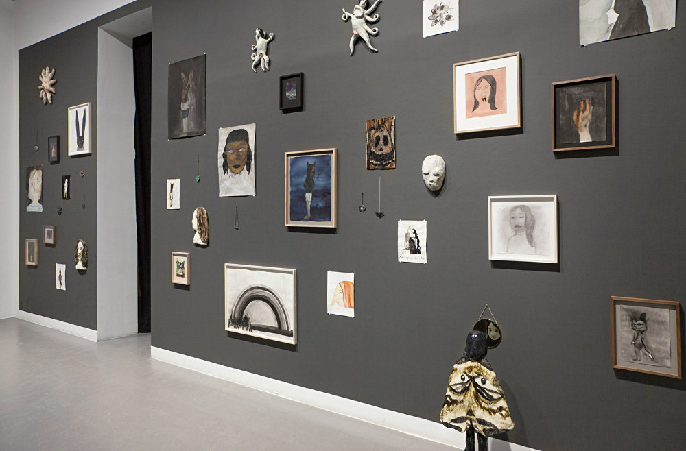
There is a move towards a scattering of work across walls and using both high and low hanging and I think it's because artists are wanting to make their exhibition presentations more physical. Using a dispersed arrangement of smaller works of different sizes and at different heights, you can get your audience to read your images as an integral part of an activated environment. Flat images begin to work more as dispersed low relief objects; if framed these are usually a mixture of frame styles, and if unframed drawings are often pinned directly to the wall with no attempt to hide the fixings, thus ensuring that the objectness of the individual elements is heightened. All these things emphasise the physicality of the situation and take you away from the idea of drawing being a window on the world or a space for meditation. 
If you look at the presentation of drawings by the ceramic artist Klara Kristalova below you can see what I mean. She also attaches some of her flatter ceramics to the wall, which further reinforces the idea. She pins some drawings, others are framed in what look like junk shop frames and a few items of jewellery are attached beneath a couple of images.


Klara Kristalova

The colour of the wall will also make a difference, notice how the dark grey wall lends an additional presence to the work. This dispersed way of presenting work also allows other objects to be integrated into the presentation. In Kristalova's case a ceramic moth figure stands facing the wall looking into a mirror, in a space between drawings. The mirror acts as an object that links the ceramic figure with the wall and in doing this engages all the other things hung on the same wall into the dialogue. As you stand looking at the images, you extend the idea, each observer, mirroring the action of the ceramic figure. As the work's audience arrives the presentation becomes an installation. 


Klara Kristalova

Ida Applebroog has taken this idea on a step further, she arranges and stacks her images in gallery spaces. It feels as if she is much more interested in how comic book pages work, images are cut and stacked one on top of each other, but in this case literally stacked, because her images are constructed on the sides of shallow box type frames. 


Ida Applebroog

Sometimes the work is held up by a supporting bar such as in the image on the right below, again this reinforces the idea of the image as object. 


In the exhibition view below you can see that very few of Applebroog's images are wall mounted, some are simply leant against the walls and one is laid flat on the floor. 


Applebroog has also used large open frames to make supports for her drawings. Sometimes she puts a light source inside, once again this adds to the objectness of the situation. These frames are often added to by drawings attached to ladder type supports, or stand alone single frames, the work becoming more sculptural as each additional element is added. 


This sculptural approach has been used by Applebroog to build a house of drawings, the images now becoming part of the texture of the building's surface.  


Ida Applebroog

Applebroog is an artist well worth investigating as an image maker, and not just because of her presentation skills. She uses composition in a very physical way. As you can see in the drawing of the boy with the Pinocchio nose below, when wanting to extend the image she very straightforwardly simply adds an area on. 


Ida Applebroog

Applebroog uses a range of styles but always seeks to capture the dramatic potential of the image. The yellow childlike figure with the sophisticated shoes is a good example of her use of separate sheets of paper to develop the image, two sheets make the simple split between child and adult and the third reinforces the idea by allowing her to establish the woman's shoe. As an exercise in composition, look at the difference between the two images of the couple kissing. The landscape format allows them to be about to gently kiss, the portrait format squeezes them together much more urgently, but both images rely on the noses as their 'punctum'. As the noses touch they also make you much more aware of the space between the two heads, the noses effectively separating the faces in such a way that they will never be able to touch lips. A moment of tenderness, stopped by the awkward interjection of noses. (In the work of the philosopher Roland Barthes the 'punctum' is a touching detail or a small aspect of an image that allows the reader to understand the whole image in a particular way).

I think the first time I saw a show hung with images splattered across the walls was a Raymond Pettibon exhibition in Berlin, his images were both drawn directly on the walls and attached to them within frames. Pettibon also added text into the mix which in effect turned the walls of the gallery into giant comic book pages. 


Raymond Pettibon

Pettibon has also exhibited work done in co-oporation with other artists, and this informal way of presenting work works well, as it physically mixes up their styles, the presentation echoing the concept. 

Marcel Dzama and Raymond Pettibon

This desire to get away from the nicely framed image and escape the formal need for a regulation height for framed work* is perhaps a response to Sol Lewitt's work. Lewitt by working directly on the wall, in effect took us back to drawing's earliest manifestation on the wall of a cave. 

Constructing a Sol Lewitt wall drawing

Cave painting from Kimberley Australia thought to be even older than Lascaux. 

By integrating images into the fabric of a structure, whether this is a cave or a room, artists effectively embed their ideas into the very foundations of the environment.  The wall can be thought of as a sensitive membrane, and when it is drawn on it is as if it has been tattooed. Think of the difference between having a body tattoo and wearing an image on a 'T' shirt, the tattoo is just so much more authentic. 

'Tribal' 'T' Shirt

'Tribal' Tattoo

*The regulation height for framed work is often set at 57 inches. This distance is measured from the middle of the image, so that all the images in an exhibition share a midline. Some galleries state a 60 inch midline and the highest I have seen is a 62 inch midline. What they all have in common is the idea of a midline. However I have always thought that sticking to an average means that no one is then at the right height, people are either too tall or too short, so having a variety of heights means that at least some work will be for some people hung at the right height. Most gallery directors would argue that the one thing about a consistent height is that it gives coherence to their exhibitions, so if you do want to approach hanging your work in a much more informal way, make sure you have a good argument for it. 


Tuesday, 29 August 2017

Venice Biennale part 4 Continuing traditions

Although I'm reviewing the 2017 Venice biennale, the themes and technologies I'm looking at often reach far back into history. For instance abstraction has a long history, Tantric art in particular having an ancient abstract lineage and research into abstract entoptic forms can take us all the way back to pre-history.
Abstraction in this year's biennale was represented by several artists, it obviously still has an important place within contemporary fine art practice. The two artists I have chosen to represent abstract practices however come from opposite ends of the aesthetic spectrum. Dan Miller is autistic and drawing is his main means of communication. He draws words and images over and over again. Each drawing is gradually lost under a surface of marks as new drawings replace it. Superficially these drawings look like Abstract Expressionist works, but they are not, they are records of someone's life, a life that is perhaps hard for us to understand, but by the sheer perseverance of Miller trying to communicate, we are presented with powerful images that seem to have been 'abstracted' out of his various attempts to communicate, each surface becoming a palimpsest of seismic energy, which itself is more powerful than words. 

Dan Miller: detail


Close-up of the framing of one of Dan Miller's drawings

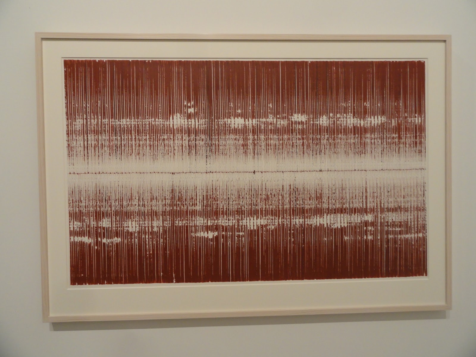
Sopheap Pich sits at the other end of the abstraction spectrum. His drawings are meditative responses to particular processes that he has set up. The drawings on exhibition were made by systematically pressing a stick of pigmented bamboo onto a sheet of watercolour paper. As each print is made more or less pigment is deposited, the process always being done to ensure a bi-lateral symmetry is maintained, carefully and systematically working a way out from the centre to the edges. 

Sopheap Pich

Sopheap Pich: Window mounted drawing 

It is interesting to compare how Miller's work is framed to Pich's. Miller's drawings float off their backing board behind a shallow box frame. The edges of the paper can be clearly seen and you get a sense that Miller works around his paper in such as way that the edge is very important. The paper in this case is presented as a physical object. In contrast Pich's work is window mounted, this heightens a sense of separation from the world, we are given a space within which to meditate on the process. 

Several artists were using textile materials and I have posted before on the stitched line and the relationship between drawing, grids and weaving. Of the artists using textiles I was particularly drawn to Maria Lai's work. 

Maria Lai


Maria Lai: detail of stitched writing


Maria Lai 

Maria Lai was given a posthumous retrospective, her stitched maps and books coming across as still being relevant and aesthetically potent when viewed at a time of international disruption, when there is a great need for empathy, but little coming from our world leaders. Sewing gathers threads together and her books which at first sight appear readable, dissolve back into a language of fits and starts, black blobs of caught cotton, standing for the words on a page, becoming the texts of forgotten languages of appeasement; as people babble and misinterpret each other’s languages as possible threats or aggressive sounds. Her books are soft; their unspoken words soft whispers for weary minds worried about world events, and a welcome distraction from the newspapers. 

Compared to Lai's work I found Achraf Touloub's textile hangings overly mannered and portentous, and although I could get the chain references, I wasn't really convinced. However as a way of furthering ideas in relation to the stitched line the work occupies that territory between 2D and 3D, the stitched lines incised into the surrounding padding, making these pieces into relief sculptures. 


Achraf Touloub

His small drawings, that were sort of Futurist in feel, were much more convincing and when I  looked at some of his other earlier work, decided that his drawings were nearly always more sensitive and concise. 


Achraf Touloub


Sparse and sensuous drawings by Huguette Caland were presented alongside three costume and mannequin works the artist made during the 1970s and 80s. The drawings were of particular interest as they demonstrated how minimal you can be and yet still be very sensual. 


Huguette Caland
Huguette Caland: Mannequin

I spent quite a long time in the Chinese pavilion, one of the reasons being the juxtaposition between old and new technologies. 


Wang Tianwen, Wu Jian’an and  Tang Nanan, Continuum – Removing the Mountains and Filling the Sea, shadow theatre performance, front and back views


Wang Tianwen, Wu Jian’an and Tang Nanan's 'Continuum' was a fascinating mix of technologies, using old shadow play techniques with contemporary animatronics. You could watch both sides of the installation with equal interest, the animatronics were easy to see and all the workings were 'open', so that as the bird flew across the sky, you could watch the mechanical arm and joints moving in order to activate the bird. You were of course reminded of how sophisticated we are as humans, and how hard it is to duplicate our actions with robots. By mixing the telling of an old story and an old shadow technology with contemporary robotics, 'Continuum' asked questions about the nature of our future relationship with technologies. 

A collaborative work had been developed by Tang Nannan, ‘what’s the sea’ with school children. This began with stories about the sea and workshops whereby the artist supported the children in making images about the sea. These images were then collected together and storyboarded so than an animation could be made, children sometimes then asked to return to their images so that they could draw the in-between frames. I should perhaps have put this post in with the one about relational practices, but because of the nature of the Chinese pavilion, this felt more about passing on a continuing cultural tradition than an artist acting as a catalyst for the development of a relational practice.


Tang Nannan, ‘what’s the sea’ workshop


The whole point of the Chinese pavilion was the interconnection between the past and the present. Old craft techniques and ancient stories, combining with new technologies and people both from inside and outside what could be called the 'fine art' bubble. Crafts people were working using traditional materials alongside fine artists, both equally valued. This attempt to demonstrate a continuing aesthetic tradition was I presume also a political statement about the coherence of Chinese culture, even so I thought it a powerful statement and one that had a lot of resonance for myself. I have often thought that if my own work is to have any traction, I need to make sure it sits within a tradition that makes it accessible and understandable to a wider public than the 'art cognoscente'. But what that is, is difficult to define. Because I'm interested in narrative, I tend to look at a tradition that goes via William Blake and Hogarth, via Rowlandson, 'folk' prints, comic book art and Steve Bell, and has its roots in Pieter Bruegel.  


Qiu Zhijie, The Map of Continuum.


I'm always drawn to maps as images and Qiu Zhijie's map of “Mountain/Sea” and “Ancient/New” representing “Yin/Yang” was presented as the framework around which the exhibition was built. Two well-known Chinese fables, The Foolish Old Man Removes the Mountains and Jingwei Filling the Sea, provide the imagery for the exhibition and the concept of “Bu Xi” (continuing tradition) is used to give coherence to the idea of bringing together two folk artists and two contemporary artists to convey the meaning of the narrative. 
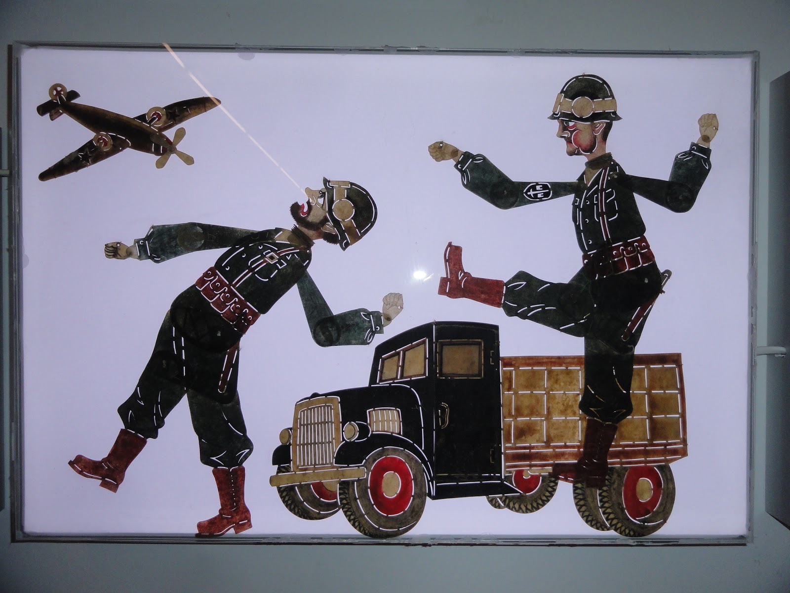
I really enjoyed the presentation of traditional 'light box' images, these worked in a very similar way to stained glass and relied on the simplification of images and their articulation in a similar way to shadow puppetry. You could make very similar figures out of stained acrylic sheet.


A traditional animated story, presented as a video with English text overlaid


This complex cutout was used in exactly the same way as a stained glass window


Detail from the window above


Another detail from the window above


The point I am trying to get across is that as an artist you can use both old and new technologies, the one will often refresh the other and in their juxtaposition or combination you can often find a new way of pushing forward those perennial ideas that will always surface, ideas that each generation of artists will have to redefine in their own terms, but will be about life and how it is experienced. 


Nevin Aladağ: Traces


Finally I would like to recommend Nevin Aladağ's playful sound video, 'Traces'. She had edited together a series of short takes of various ways of getting things to play their own sounds. See this a how it was made documentary.  You might wonder what this has to do with drawing, but I would argue that the editing process is itself a type of drawing. Aladağ would have had to storyboard the idea and organise each shoot so that eventually all would fit together and in doing this I believe she would have had some sort of overall plan or map to work to.  You can see how Traces worked as a three screen installation here. 


Nevin Aladağ: Traces


In 'Traces' the city of Stuttgart plays itself. This review of Aladağ's work by Andreas Schlaegel in Frieze explains the work much better than I could.
"The action unfolds in public playgrounds and urban pedestrian areas: in one sequence, a cello rotates on a toy carousel; with each turn, it hits a stationary bow fixed to the ground, producing a note that elongates as the carousel slows. Aladağ has skilfully edited the scenes to create an ambitious musical and visual composition, at turns operatic and slapstick. As soon as a musical thread establishes itself, however, it is quickly interrupted or concluded, as when an accordion hanging from a lamppost slowly submits to gravity, emitting a final, fading moan. Traces, ultimately, is a composition of continuities and ruptures that resists readily identifiable melodies and harmonies, as well as all-too-easy politically correct readings. Aladağ’s ambivalence toward a finite meaning is tangible in the deceptively simple musical devices she creates. Traces is not only a theatre of animated matter, but of cultural references in motion – dynamic and quirky, but more often idling, aimless and melancholic. If the town plays itself, it is moody".
Andreas Schlaegel 

Nevin Aladağ talks about her work, she talks about one aspect being 'a drawing of the sounds'. 
See also: