Do Ho Suh was exhibiting at the Henry Moore Centre in Leeds not that long ago. I have looked at his work before as a cross between drawing and sculpture, his material meshes working as if they were assembled from full scale technical drawings of architectural environments. However you could also think of his work as a very portable way of carrying information around, and as such to begin thinking about certain sorts of drawing as portable sculpture.
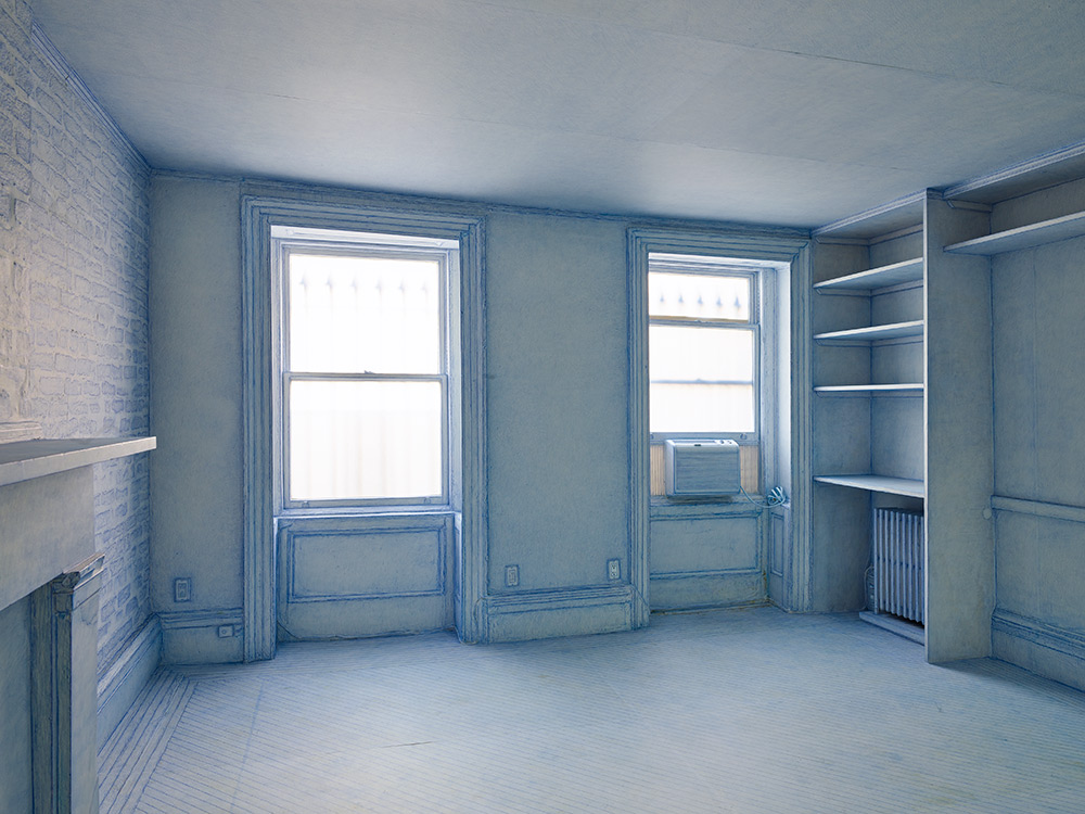
A few years ago Do Ho Suh papered over much of the interior of a four-storey New York townhouse. He used thin paper, stuck down with a soft glue, and delicately worked the paper over fixtures such as radiators or pipes. He was sort of caressing the surface, treating it as a kind of second skin. Finally he coated his fingers in blue pastel and rubbed himself into the walls, and floor and fireplace and shelving, ‘caressing them’ as he put it. He went on to rub different colours into the surfaces of the other rooms. The rubbing got less intense the higher up the house he got and the rooms less familiar. Suh remarked on observing he rubbed away his fingerprints; ‘I gave part of my body’
Do Ho Suh: Papered and pastel coated room
I was in particular fascinated by photographs of Do Ho Suh's rubbings of fixtures and fittings, such as the one below. It operates in a very strange space that sits between photography, drawing and sculpture.
Do Ho Suh: Photograph of a paper covered sink that has been rubbed with a blue pencil crayon
Photograph of a paper covered radiator
The paper covered radiator is more sculptural and if the paper surface was carefully removed from its metal underpinning, it could become a free standing sculpture. Because the sink photograph has no visual edges to it, we become more aware of the direction of marks taken by the rubbing process, and this makes it more like a drawing. In either case the idea of drawing as portable sculpture still seems viable, so perhaps its worth opening the idea out a little further.
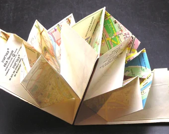
Frances Richardson remarked that she thought of some of her drawings as thin sculpture. Blueprints can be thought of as thin plans for sculpture. When we make a map we think of it as a flat drawing. However when you buy an ordnance survey map it comes as a folded object.
Opening out a folded map
The folded paper is very sculptural and of course the art of folding flat paper into complex three dimensional forms can reach extremely high levels of complexity. Arisawa Yuga's design for an origami dragon being typical of the thinking processes that allow us to think about the relationship between a flat drawing and a sculptural form.
Arisawa Yuga: Dragon
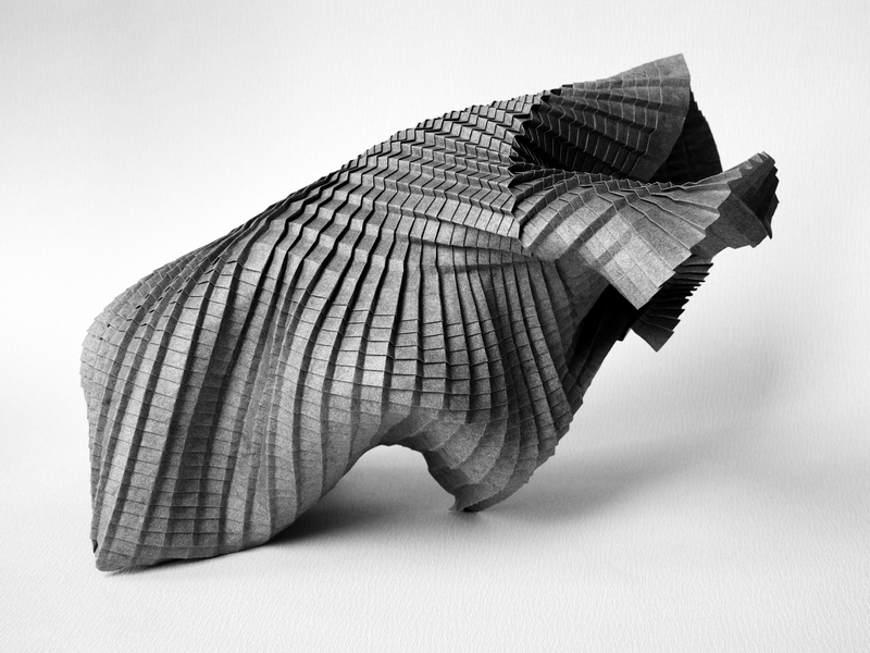
So could we think about Arisawa Yuga's design for an origami dragon as another form of portable sculpture? If we look at a very formal set of folds by Paul Jackson, such as the parallel, but unequal v-pleats below, we see a more engineering than sculptural set of concepts in action. In fact the conceptual thinking around paper folding is even more interesting than simply thinking of how two dimensions can become three. A 'No' crease is a one-dimensional point which creates a dent in the paper called a 'Break'. This generates complex curves in the paper, which can change from convex to concave and back again. So we have a one dimensional point, leading to a fold in a two dimensional surface that allows the maker to create an object with three dimensions. In this case engineering becomes art.
Paul Jackson: Parallel, but unequal v-pleats
The current more sculptural understanding of origami stems directly from Akira Yoshizawa's work. He pioneered many different origami techniques, including most importantly wet-folding which involves slightly dampening the paper before making a fold, which allows the paper to be manipulated more easily, resulting in finished origami models that have a rounder and more sculpted look.
Akira Yoshizawa: origami self portrait
Goran Konjevod: origami
Yoshizawa's work paved the way for artists such as Goran Konjevod, who explores paper folding as a pure sculptural device, the potentiality of a flat sheet of paper being what this type of portable sculpture is all about.
Perhaps we could think of architects' drawings as another form of portable sculpture. The drawing of an idea of a building is something that gradually coalesces and accumulates around itself plans and elevations, physical materials and associated actions that eventually make the concept become solid. I'm reminded of a north American Indian description of thinking as crystallised air.
Frank Gehry: Drawings and final resolution of Guggenheim in Bilbao
The bringing back inside one building the elements of another building, suggests something akin to a 1 to 1 scale map. Michael Rakowitz's rubbings of architectural details as in his exhibition 'The Flesh Is Yours, The Bones Are Ours', highlighted the traces left in Istanbul of the Armenian craftsmen who shaped Istanbul’s ornamented facades, until they were massacred with the rest of Turkey’s Armenian population. The buildings in Istanbul keeping memories alive, when written historical documents don't.
Michael Rakowitz: 'The Flesh Is Yours, The Bones Are Ours'
In the very short story 'On Exactitude in Science', Jorge Luis Borges writes; …'In that empire, the art of cartography attained such perfection that the map of a
single province occupied the entirety of a city, and the map of the empire, the entirety
of a province. In time, those unconscionable maps no longer satisfied, and the cartographers' guilds struck a map of the empire whose size was that of the empire, and
which coincided point for point with it. The following generations, who were not so
fond of the study of cartography as their forebears had been, saw that that vast map
was useless, and not without some pitilessness was it, that they delivered it up to the inclemencies of sun and winters. In the deserts of the west, still today, there are tattered ruins of that map, inhabited by animals and beggars; in all the land there is
no other relic of the disciplines of geography'.
Borges' short story is a sort of inverted idea of a map, which is usually meant to operate as a portable landscape, something that allows us to conceptualise our position in the world and therefore be able to navigate it. However the most exact scale map is 1 to 1 and this is reality itself, which as Borges intimates, can suffocate us with its weight and enormity.
We are left with ideas as portable objects. During the early Renaissance, Filippo Brunelleschi came up with a way of making images that enabled architects like himself to make flat copies of buildings built.
Brunelleschi (1377-1446) painted two panels in the course of an experiment that marked an event which was to change the way we would all begin to look at the world. These two panels are probably the first pictures to correctly embody linear perspective. This is how Antonio di Tuccio Manetti, a man who was there, explained how the images made by Brunelleschi were made to come alive: "In order to constrain the viewer to place his eye at the centre of projection, Brunelleschi had made a hole in the panel on which there was this painting; ... which hole was as small as a lentil on the painting side of the panel, and on the back it opened pyramidally, like a woman's straw hat, to the size of a ducat or a little more. And he wished the eye to be placed at the back, where it was large, by whoever had it to see, with the one hand bringing it close to the eye, and with the other holding a mirror opposite, so that there the painting came to be reflected back; ... which on being seen, ... it seemed as if the real thing was seen: I have had the painting in my hand and have seen it many times in these days, so I can give testimony."
In effect an image could now be made of something, which acted as an exact copy. This meant someone like Brunelleschi could take an image of a building he had designed and had built to another city and use it to explain what he could build for that other city. A sort of portable architecture. The great grandchild of this event was of course photography, the implication of my question finally being to ask whether or not a photograph could be considered some form of portable sculpture.
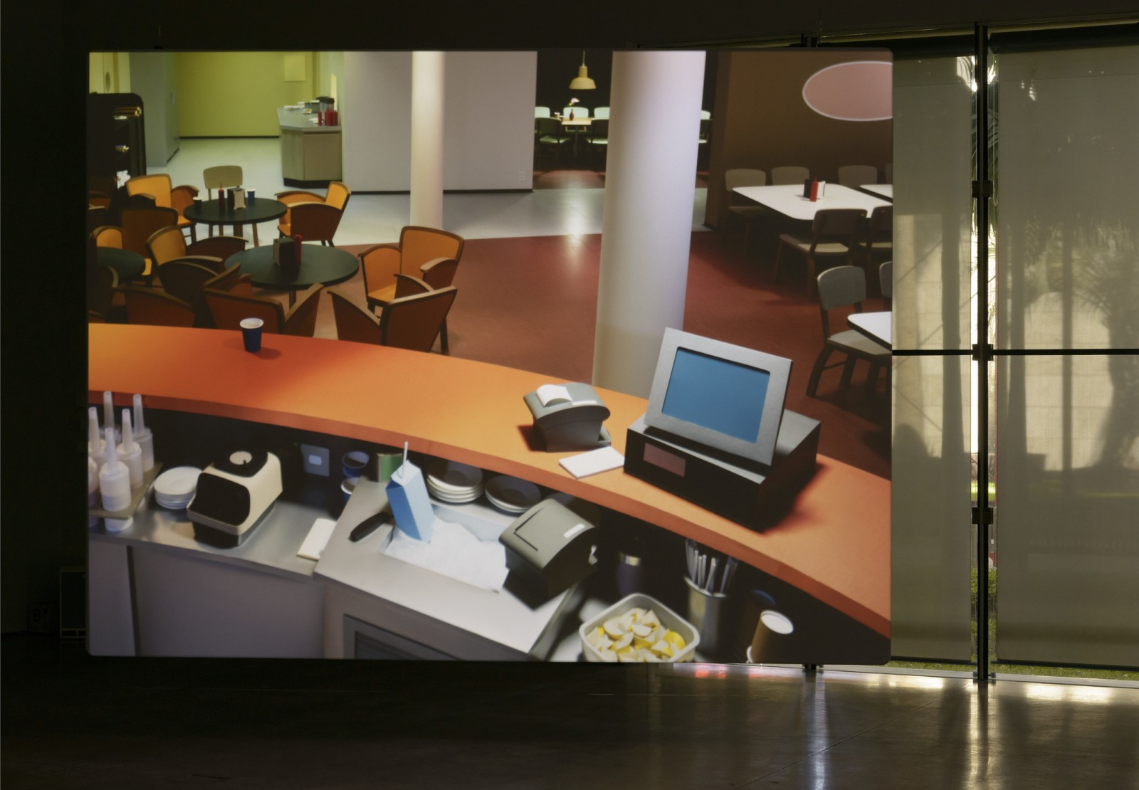
Thomas Demand uses paper to make fragile models of familiar objects that he turns into photographs. The photographs complete the work, the paper objects being thrown away once the photograph is printed.
Thomas Demand
In the case of Thomas Demand the photograph carries all the information needed to understand the sculpture, in fact it is the only information available, the three dimensional reality of the paper environment compressed into the photographic surface. Is this then the ultimate in paper based portable sculpture?
Some of the papers we use in everyday life are decorated as they are made, their surfaces embossed as part of the moulding process and others are embossed after they are made by having shapes pressed into their surfaces. What is interesting about these ways of marking paper is that because of surface indentations we become more aware of the importance of the angle of direction of light sources. A light falling directly in front of the image may not reveal anything, but a light source from an acute angle can reveal every textural difference. Therefore this type of drawing makes you much more aware of the complex interrelationship between light source, drawing and observer. Just to take the photograph of the humble toilet roll above, I had to move the object around and try several locations, as well as shift my own viewpoint a few times before deciding on an angle that I thought demonstrated my point well enough.
If you make your own paper you will have I'm sure realised the potential to weave wire into your mesh, so that a 'watermark' can be made. This simply thins the paper that sits over the wire when it is as a thin pulp collected over the mesh and is often seen at its best when you hold the paper up to the light. Folding or scoring paper will give you a wide range of marks depending on how you make the fold, for instance you can make a former by taping down two sheets of card with a narrow gap between them and scoring a line along this gap with a traditional bookbinder's bone folder. This gives you a line that on one side of the paper rises up like a small wall and on the other side opens out like a tiny empty canal. Every implement used to score paper will create a different mark, and the different ways that a fold can be worked on, such as by applying different amounts of pressure or working on the back of the paper with smoothing implements, again create different line types.
Paper scoring tools
You can also sand your paper down, each movement of a sheet of sandpaper creating thousands of tiny marks, all of which can be seen if you get the light hitting the paper at the right angle or beat your paper with a hammer or other heavy tool, such as those hammers used in the silver manufacturing industry, that are used to build up beautiful textures as a silver sheet is formed. They can do the same job on thick watercolour paper, crushing the surface as it is hit, whilst at the same time building a repetitive textured surface as you overlap your hammering marks.
Silver hammers normally used for giving textures to hammered sheets of silver
However in the printing industry the most common way of creating surface difference by using the properties of shadow is to emboss paper. This at its most basic means applying a cut out shape to the paper under great pressure. The surface of the paper is in effect crushed by the weight applied.
The video above is interesting because it shows how someone can use a combination of new and old technology to create what they want. The tools made by the artist in this case are quite specialised and if you do want to create work in this area sometimes you do have to refine your working methods in order to get the best out of the process.
You can also draw with specialist tools made for other purposes such as using pricking wheels made for sewing through leather, such as the one above. But the most common way of making surface textures of this sort is by using an ordinary needle. This technique can be used to create basic lines and simple drawings or the most complex images, it just depends on the amount of time you want to spend and the invention that you can put to the process.
The artist Fu Xiaotong uses pins to create her massive drawings on handmade paper.
Fu Xiaotong at work
In an earlier post I looked at the drawings of Frances Richardson and she has at times commented about the relationship between drawing and sculpture and in this case I believe the relationship is very close.
So why use these techniques? There are several issues that fine art students could consider here. The first one is the 'objectness' of the papers that you use. By making the image an integral part of the paper, you can begin to separate the idea of the image, from the idea of the object. No longer do you have an idea/image/design placed on top of the paper, the paper traditionally operating as a background or support. In this case, because the image is embedded within the field of its making, it is itself now part of the object. This was part of the point Frances Richardson was making when she referred to her drawings as 'thin sculpture'. If we go back to some of the issues raised when we were looking at framing drawings, we had to explore the differences in presentation between drawings that were 'illusions' of things and drawings that were exploring the 'objectness' of flat things made of paper. Working in this way can open the debate out further. For instance compare paper folding with making embossed paper illusions such as this one below.
Embossed paper used as shallow relief
Another theoretical area that can be explored using these ideas is that of Greenberg's media specificity. If you follow the implications of his writings, paper is itself a medium and therefore its specificity is to do with what it is capable of as a medium. So instead of looking at how it can be used to carry representations of other things, such as the image above, it should be treated as something that has its own possibilities, therefore as an artist you should engage with this process of revealing possibility and in doing so you will also discover your own language.
I am personally very interested in the relationship this type of work has with revealing light as the most important factor in seeing anything. You can make your audience much more active as they have to move around to see this type of work to its best effect and more importantly you can get your audience to focus on how a light source is effecting perception.
There is a 'stripped down' feel to the aesthetics involved in this type of work. As colour is eliminated and all additional materials such as drawing or painterly substances are also eliminated, you can also touch upon notions of purity and truth to materials.
Miso: New York Moon
The artist Miso in her work 'New York Moon', took maps of the New York city grid and laid them over images of the valleys and craters of the moon and then combined the images by pin pricking through both into a sheet of paper below. In this instance she is finding a new use for a very old technique of transferring drawings using pricked papers.
An old print that has been pricked in order to transfer the image
This technique goes back to the Renaissance, when painters would use holes pricked in large 'cartoon' drawings to transfer their images onto wet plaster ready for fresco painting. They used to pounce these cartoons with crushed powder or charcoal, thus leaving faint dotted lines on the wet plaster as guides within which they would paint.
All of these techniques depend of course on the types of paper you are using.
My last post about paper reminded me of how important process and its
documentation are as ways of developing practice.
When writing the
previous post about Sipho Mabona's origami folding, I was reminded of Dóra
Maurer's 'Seven Foldings', a print that became, as she stated, "the object
of actions in continuous change".
Maurer began this series
of works by dropping acid onto an etching plate and documenting the process
with a series of photographs. She called these performances ‘vehement actions'
and began to use systematic photographic documentation of what happened. 'Seven
foldings' was an attempt to record the process of change that a plate could go
through in a more ‘geometric way'. She cut into the plate, folded it and took
‘phase-prints' of each of the stages. The work becomes a record or
documentation of the process and as such its meaning becomes less about issues
such as composition or media specificity and more about how as a document it
can reveal the processes that lay behind its making.
Maurer then began to
use 16mm film to document her work, for instance the film‘Timing',
shows a canvas being folded.
Folding was something
that fascinated several artists during the late 60s and early 70s, because it
was an activity that both revealed the physical structure of what was being
folded, and was an activity that could be easily recorded and presented.For
instance in relation to her project, 'Drawing
Which Makes Itself', Dorothea Rockburne stated, “I came to realise that a
piece of paper is a metaphysical object. You write on it, you draw on it, you
fold it.” She was interested in paper not just as the ground for a drawing but
as an active material, its inherent qualities determining the form of the
artwork. The folds when exhibited in series reveal the process of
exploration, this type of presentation being very important when process
becomes dominant. Work that presents process as an essential aspect of its
reason d'etre, has to often be presented very systematically, so that an
audience can follow the moves that were made.
Dorothea Rockburne,
Untitled from Locus, 1972
Without the example of
artists such as Maurer and Rockburne, Sipho Mabona's practice, (see last post)
that relies heavily on its documentation, would not have been possible.
However, I suspect this
older generation of artists associated with process would have criticised
Mabona's practice as being not rigorous enough. The fact that he decided to
make an elephant, they would have argued, took the audience's attention away
from the process of folding itself.
I think this debate is
important because it highlights the post-modern divide. Modernism tended to
valorise media specificity and abstraction was a way of getting audiences to
focus on the process of making art, such as the quality of the paint marks or
surface. The introduction of imagery was often thought of as bringing in a
narrative that came from outside art. Artist were advised to stay away from
illustrating stories. But theories have moved on and in a post-post-modern world
of practice, we are now in a situation where all earlier approaches to and
theories about art making are available as on-line resources. However with so
much choice, it becomes much harder to make decisions, my advice is therefore
to focus on researching whatever it is that is interesting to you and as the
research develops hopefully it will reveal an approach and imagery that is
unique to your personal vision; not by you trying to make work that is
'different or stylish' but by the force of the inner logic of your process, by
the depth of your research and the sharpness of your perception. Whatever
you do, you will eventually have to present it to an audience.
Presentation is very
important when systematic processes becomes dominant. Work that presents a
timed process has to be presented very systematically, so that an audience
can follow the moves that were made.
Eleanor
Antin, 'CARVING: A Traditional Sculpture' 1972
A typical example is Eleanor Antin's 'Carving', every day
she reduced her food intake and then each morning, she was photographed naked
in the same four stances. She was effectively 'carving' her own body into
shape.
The grid of looking,
which historically is located within the domain of drawing or geometry can
also work as a grid of classification, its structure allowing the observer
to clearly examine visual difference. This is a structure borrowed from
science; for instance the image below allows various gradients to be compared.
Slopegraphs for comparing gradients
Eadweard Muybridge
The gridded systematic
approach used by scientists and analytic researchers such as Muybridge allows us to easily see the results of an
investigation and this was to have a powerful influence on art. It is of course
important to remind ourselves that drawing as a means to explain things is
an essential tool for all disciplines. During the Renaissance when the
disciplines of art and science were not so rigidly separated it was easier to
see the grid as part of the process of looking and systematically checking
relationships.
Durer: gridded perspective device
As a tool for measurement
a grid could be both laid over a plot of land or established as a screen
through which to look at the world.
In the late twentieth
century Rosalind Krauss wrote an important theoretical text on the relationship
between the grid and modern art. The grid as a formal device to use
when stabilising visual relationships was during the last
century embedded as a central component of design thinking. In the last
fifty years, any artist with even a small amount of training in graphics or
visual design would therefore have been introduced to the importance of the
modular grid as an organising structure.
In the 13th century, the
architect Villard de Honnecourt produced a diagram used for producing page
layouts with margins of fixed ratios.
Use of fixed ratios to stabilise layout in design
Although gridded
page layout had been used since the invention of printing, the profession of
graphic designer did not get established until the early 20th century, but with
the rise of industrialisation, print in particular became vital to the
dissemination of information and although fixed ratios were still useful,
geometry and in particular the grid, were organising
systems that could be used much more flexibly. There was a move away
from centered text to “asymmetric” design as in a newspaper page, and designers
began to use a Modular grid, whichwas an especially
flexible model for text and image arrangement.
Compare the modular grid
above with typical gridded modular presentations used by artists who use
systematic processes.
Bernd & Hilla Becher
Andy Warhol
herman de vries
Sol Lewitt
The compositional logic of
the grid as a template for aesthetic investigation was central to the
development of the work of several artists interested in process. The
serialised exploration of formal variation, was guided and limited by the
geometric configuration of the grid and was an aspect of fine art I clearly
remember being promoted from my time at college in the late 60s and early 70s.
Perhaps the most sensitive of the artists working in this way was Agnus Martin.
She often held a delicate balance between following the logic of the grid and
allowing her own aesthetic sensibility to determine the final result.
Agnus
Martin
In the mid twentieth
century the design grid was incorporated into the grid of the computer screen
and early users of the computer to create art relied on this to generate their
work. Frederick Hammersley was one of the first artists to use computer coding
to generate imagery and the way numbers are used to identify the points on a
screen relies on Cartesian coordinates which are themselves essential to the
development of analytic geometry.
Frederick
Hammersley
Looking at the grid in
relation to 'documentation', it also becomes clear how what was initially
used as a device to stabilise design, is now becoming a format to emphasise
rigor and authenticity. Tehching Hsieh's 'Doing Time' which was the Taiwan
pavilion's presentation at this year's Venice Biennale,
relied heavily on systematic documentation.
Tehching
Hsieh's 'Doing Time'
The geometric grid that was used for the serialised exploration of formal variation is in
this case being used to establish the authenticity of the action. Once more I'm
reminded of how important 'disegno' is as a principle and or method that
underlies fine art practice. Disegno constitutes the intellectual
component of the visual arts, which in the Renaissance justified their
elevation from craft to fine art. The use of a grid in this case is not simply
about the clear visualisation of the process, it also asks questions about the
human capacity to systematically organise the world. From the way we are
clocked in, given a number and registered from the moment we are born, to the
way that the collection of statistics becomes the driving force behind
government decision making. Disegno, 'drawing' in this case being the way
that an underlying concept shapes the final presentation.
Geometry itself began as a way of
developing a particular understanding of the world, when it was first used
there would have been no separation between what we now call art and
science, it was simply a useful way of drawing. Documentation has long been
an essential tool for the understanding of scientific investigation and
has now become central to contemporary art practice. Perhaps we are at last
beginning to respond to C. P. Snow's problem of two cultures. He argued
that "the intellectual life of the whole of western society" was
split into two cultures; the sciences and the humanities, and that
this was a major hindrance to solving the world's problems.
Social media relies on documented imagery to function,
many artists have extended their practices into filmmaking via the process of
documenting their actions and processes. Technological advances now
mean that we all have a mobile device in our pockets that we can use to make
films that are of better quality than those made with movie cameras used to
be. I began this post reflecting on the film that was done to document Sipho Mabona's origami folding. Why not consider making a series of short videos about your own practice? Which aspects would you focus on? Would these videos focus on the sound of your drawing's making? On the way marks change a surface? or on the more performative aspects of your work? Perhaps a video could be made of the processes 'off camera'. Is there a filmic story in the history of the elements that you are working with? I have posted several times about the stories that come with various papers or substances such as charcoal or graphite, is there a way of making these histories into videos?
See also some other related posts on the grid
and disegno: