Showing posts with label stitched lines. Show all posts

Sunday, 1 November 2020

Maryam Ashkanian: The stitched line

Maryam Ashkanian

Iranian artist Maryam Ashkanian's hand-sewn ‘Sleep Series’ consists of embroidered drawings of sleeping people and their dream states. Ashkanian uses the concept of the dream as a way of getting audiences to enter a very different relationship with her portraiture. She states, “Pillows are a metonymy of a dream,” and “Every person has a close relationship with his or her pillow."


Because the pillows are stuffed, the sewn on portraits are subject to puckering which alters the play of light across the surface of the pillows. As part of their process of metamorphosis they begin to resemble clouds, forms that we often use to help trigger a dream like state of imaginative play.


The Sleep Series was inspired by the notion that we become who we really are when we’re asleep. Working from photographs, Ashkanian creates line drawings of sleeping people which she then embroiders onto her handmade pillows.


Maryam Ashkanian

Presentation is as always important and Ashkanian floats her pillows in box frames behind glass, slightly distancing them and taking away their tactile 'reality' so that you are forced to imagine their texture rather than touch it. Touch is one of our key tests when it comes to reality, putting things behind glass therefore heightens a sense of something being 'untouchable' or 'unreal'. 

See also:

The work of Maria Lai in a post on the Venice Biennale 

Stitched, dotted and dashed lines

Patterns, knots and entanglements

Knots

Clouds

More on touch


Tuesday, 29 August 2017

Venice Biennale part 4 Continuing traditions

Although I'm reviewing the 2017 Venice biennale, the themes and technologies I'm looking at often reach far back into history. For instance abstraction has a long history, Tantric art in particular having an ancient abstract lineage and research into abstract entoptic forms can take us all the way back to pre-history.
Abstraction in this year's biennale was represented by several artists, it obviously still has an important place within contemporary fine art practice. The two artists I have chosen to represent abstract practices however come from opposite ends of the aesthetic spectrum. Dan Miller is autistic and drawing is his main means of communication. He draws words and images over and over again. Each drawing is gradually lost under a surface of marks as new drawings replace it. Superficially these drawings look like Abstract Expressionist works, but they are not, they are records of someone's life, a life that is perhaps hard for us to understand, but by the sheer perseverance of Miller trying to communicate, we are presented with powerful images that seem to have been 'abstracted' out of his various attempts to communicate, each surface becoming a palimpsest of seismic energy, which itself is more powerful than words. 

Dan Miller: detail


Close-up of the framing of one of Dan Miller's drawings

Sopheap Pich sits at the other end of the abstraction spectrum. His drawings are meditative responses to particular processes that he has set up. The drawings on exhibition were made by systematically pressing a stick of pigmented bamboo onto a sheet of watercolour paper. As each print is made more or less pigment is deposited, the process always being done to ensure a bi-lateral symmetry is maintained, carefully and systematically working a way out from the centre to the edges. 

Sopheap Pich

Sopheap Pich: Window mounted drawing 

It is interesting to compare how Miller's work is framed to Pich's. Miller's drawings float off their backing board behind a shallow box frame. The edges of the paper can be clearly seen and you get a sense that Miller works around his paper in such as way that the edge is very important. The paper in this case is presented as a physical object. In contrast Pich's work is window mounted, this heightens a sense of separation from the world, we are given a space within which to meditate on the process. 

Several artists were using textile materials and I have posted before on the stitched line and the relationship between drawing, grids and weaving. Of the artists using textiles I was particularly drawn to Maria Lai's work. 

Maria Lai


Maria Lai: detail of stitched writing


Maria Lai 

Maria Lai was given a posthumous retrospective, her stitched maps and books coming across as still being relevant and aesthetically potent when viewed at a time of international disruption, when there is a great need for empathy, but little coming from our world leaders. Sewing gathers threads together and her books which at first sight appear readable, dissolve back into a language of fits and starts, black blobs of caught cotton, standing for the words on a page, becoming the texts of forgotten languages of appeasement; as people babble and misinterpret each other’s languages as possible threats or aggressive sounds. Her books are soft; their unspoken words soft whispers for weary minds worried about world events, and a welcome distraction from the newspapers. 

Compared to Lai's work I found Achraf Touloub's textile hangings overly mannered and portentous, and although I could get the chain references, I wasn't really convinced. However as a way of furthering ideas in relation to the stitched line the work occupies that territory between 2D and 3D, the stitched lines incised into the surrounding padding, making these pieces into relief sculptures. 


Achraf Touloub

His small drawings, that were sort of Futurist in feel, were much more convincing and when I  looked at some of his other earlier work, decided that his drawings were nearly always more sensitive and concise. 


Achraf Touloub


Sparse and sensuous drawings by Huguette Caland were presented alongside three costume and mannequin works the artist made during the 1970s and 80s. The drawings were of particular interest as they demonstrated how minimal you can be and yet still be very sensual. 


Huguette Caland
Huguette Caland: Mannequin

I spent quite a long time in the Chinese pavilion, one of the reasons being the juxtaposition between old and new technologies. 


Wang Tianwen, Wu Jian’an and  Tang Nanan, Continuum – Removing the Mountains and Filling the Sea, shadow theatre performance, front and back views


Wang Tianwen, Wu Jian’an and Tang Nanan's 'Continuum' was a fascinating mix of technologies, using old shadow play techniques with contemporary animatronics. You could watch both sides of the installation with equal interest, the animatronics were easy to see and all the workings were 'open', so that as the bird flew across the sky, you could watch the mechanical arm and joints moving in order to activate the bird. You were of course reminded of how sophisticated we are as humans, and how hard it is to duplicate our actions with robots. By mixing the telling of an old story and an old shadow technology with contemporary robotics, 'Continuum' asked questions about the nature of our future relationship with technologies. 

A collaborative work had been developed by Tang Nannan, ‘what’s the sea’ with school children. This began with stories about the sea and workshops whereby the artist supported the children in making images about the sea. These images were then collected together and storyboarded so than an animation could be made, children sometimes then asked to return to their images so that they could draw the in-between frames. I should perhaps have put this post in with the one about relational practices, but because of the nature of the Chinese pavilion, this felt more about passing on a continuing cultural tradition than an artist acting as a catalyst for the development of a relational practice.


Tang Nannan, ‘what’s the sea’ workshop


The whole point of the Chinese pavilion was the interconnection between the past and the present. Old craft techniques and ancient stories, combining with new technologies and people both from inside and outside what could be called the 'fine art' bubble. Crafts people were working using traditional materials alongside fine artists, both equally valued. This attempt to demonstrate a continuing aesthetic tradition was I presume also a political statement about the coherence of Chinese culture, even so I thought it a powerful statement and one that had a lot of resonance for myself. I have often thought that if my own work is to have any traction, I need to make sure it sits within a tradition that makes it accessible and understandable to a wider public than the 'art cognoscente'. But what that is, is difficult to define. Because I'm interested in narrative, I tend to look at a tradition that goes via William Blake and Hogarth, via Rowlandson, 'folk' prints, comic book art and Steve Bell, and has its roots in Pieter Bruegel.  


Qiu Zhijie, The Map of Continuum.


I'm always drawn to maps as images and Qiu Zhijie's map of “Mountain/Sea” and “Ancient/New” representing “Yin/Yang” was presented as the framework around which the exhibition was built. Two well-known Chinese fables, The Foolish Old Man Removes the Mountains and Jingwei Filling the Sea, provide the imagery for the exhibition and the concept of “Bu Xi” (continuing tradition) is used to give coherence to the idea of bringing together two folk artists and two contemporary artists to convey the meaning of the narrative. 
I really enjoyed the presentation of traditional 'light box' images, these worked in a very similar way to stained glass and relied on the simplification of images and their articulation in a similar way to shadow puppetry. You could make very similar figures out of stained acrylic sheet.


A traditional animated story, presented as a video with English text overlaid


This complex cutout was used in exactly the same way as a stained glass window


Detail from the window above


Another detail from the window above


The point I am trying to get across is that as an artist you can use both old and new technologies, the one will often refresh the other and in their juxtaposition or combination you can often find a new way of pushing forward those perennial ideas that will always surface, ideas that each generation of artists will have to redefine in their own terms, but will be about life and how it is experienced. 


Nevin Aladağ: Traces


Finally I would like to recommend Nevin Aladağ's playful sound video, 'Traces'. She had edited together a series of short takes of various ways of getting things to play their own sounds. See this a how it was made documentary.  You might wonder what this has to do with drawing, but I would argue that the editing process is itself a type of drawing. Aladağ would have had to storyboard the idea and organise each shoot so that eventually all would fit together and in doing this I believe she would have had some sort of overall plan or map to work to.  You can see how Traces worked as a three screen installation here


Nevin Aladağ: Traces


In 'Traces' the city of Stuttgart plays itself. This review of Aladağ's work by Andreas Schlaegel in Frieze explains the work much better than I could.
"The action unfolds in public playgrounds and urban pedestrian areas: in one sequence, a cello rotates on a toy carousel; with each turn, it hits a stationary bow fixed to the ground, producing a note that elongates as the carousel slows. Aladağ has skilfully edited the scenes to create an ambitious musical and visual composition, at turns operatic and slapstick. As soon as a musical thread establishes itself, however, it is quickly interrupted or concluded, as when an accordion hanging from a lamppost slowly submits to gravity, emitting a final, fading moan. Traces, ultimately, is a composition of continuities and ruptures that resists readily identifiable melodies and harmonies, as well as all-too-easy politically correct readings. Aladağ’s ambivalence toward a finite meaning is tangible in the deceptively simple musical devices she creates. Traces is not only a theatre of animated matter, but of cultural references in motion – dynamic and quirky, but more often idling, aimless and melancholic. If the town plays itself, it is moody".
Andreas Schlaegel 

Nevin Aladağ talks about her work, she talks about one aspect being 'a drawing of the sounds'. 
See also:

Tuesday, 5 January 2016

Stitched, dashed or dotted lines.

A Running Stitch

When stitching the line of thread comes into vision for a brief moment and then disappears as it digs down into the fabric it is being used with. In and out of vision, the visual line moves along in memory of the hand work involved in pushing and pulling the thread in and out of a soft ground. This particular line is both metaphorically rich and as a type of broken line has been developed as a graphic form in its own right. It is therefore worth investigating both as a material process and as a visual metaphor.

The stitched line both represents a particular craft and the associations we have with that craft. Therefore in some instances it has been appropriated by Feminist theorists, as in 'The Subversive Stitch'. A potentially fascinating area to explore in relation to this is the connection between textile metaphors and the web. Patchwork Girl by Shelley Jackson is a hypertext fiction, but the images used often denote connections between elements using dashed lines. The 'stitching together' of Frankenstein's monster, is echoed by the way 'Patchwork Girl' a feminine on-line version, is constructed. See also post on the grid and Sadie Plant, "The Future Looms: Weaving Women and Cybernetics"


Patchwork Girl

The idea of a stitched together being has more recently moved on from something belonging to Mary Shelly's Frankenstein's monster and has entered the world of tattoo design, whereby if you want to, you too can make yourself appear to be the result of a crude scientific stitch up. In this case a fear of our own inherent abjection, the anxiety of always being too close to death is faced up to almost too directly. 


A stitched on shoulder

Getting ready for plastic surgery


Surgeons draw on the body before they embark on their surgery. In the case above we have an indication of where plastic surgery might be done. The dashed line in this case indicating future possibility, something even clearer in the image below.


A set of dashed lines indicating a desire for a slimmer body

Jonathon Yeo

In Yeo's painting above we see two different types of preparatory drawing taking centre stage. The surgeon's dashed line indicates where incisions will need to be made and the artist's broken lines indicate where the body is. A further set of gridded lines indicates that this image was probably copied from a gridded up photograph. This image also reminds us of the dotted line of a cartoon drawing, through which charcoal dust would be pushed through, so that a fresco painter had a clear indication of where to paint while the plaster was wet.

A pricked cartoon drawing

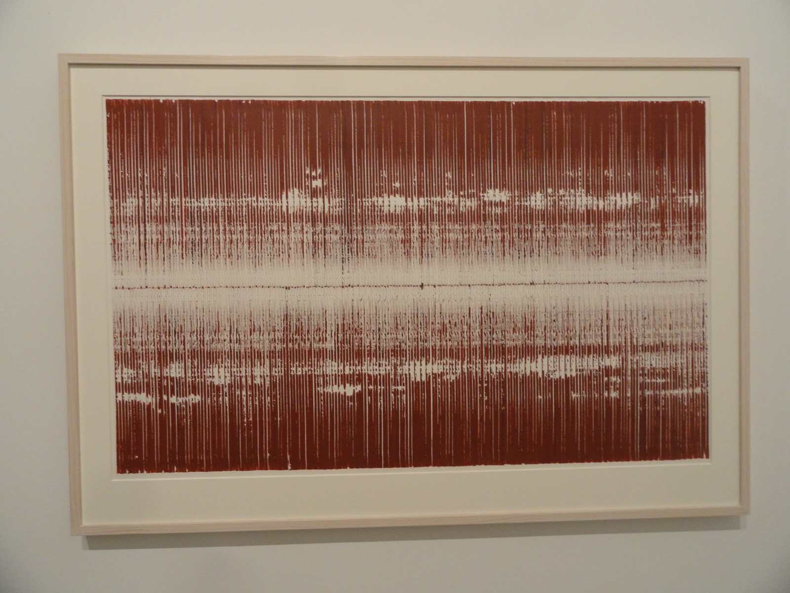
Artists have used stitched lines in a variety of ways, but almost always with an awareness of their wider metaphorical associations. Jen Southern and Jen Hamilton's Running Stitch from 2006 saw the production of what they called "a tapestry map”. Walks were represented by lines of stitches on a canvas. The use of threads to record where someone has been echoing the myth of Theseus and Ariadne, who gave him a thread and told him to unravel it as he penetrated deeper and deeper into the Labyrinth, so that he could find his way back out by following it.


Jen Southern and Jen Hamilton's Running Stitch


A stitched line that picks out a route taken on a map


Debbie Smith's embroidered drawings often directly link two stereotypical Female associations together, in this case the shopping trolly and stitch. However in doing so the resultant image is spiky and agressive, thus undermining the stereotype.


In the world of painting, Michael Raedecker was known for using the stitched line to add both texture and contextual nuance into his carefully controlled surfaces.


Michael Raedecker

Raedecker reminds us that canvas is a woven textile, and his thread work brings that awareness into the foreground, as if it is part of the ghost life of a painting. 


A stitch like all other types of marks can be easily varied in the way it is made. A language can be built by changing expectations, such as rhythmic conformity or implied direction. Gaps can be used to create moments of either awkwardness or silence. 


Stitched lines can also be graphically represented to illustrate how they are made. In the examples below entry and exit points are colour coded.

The illustrations above also demonstrate how the actual stitched line is easily related to a drawn one, at some point the physically stitched material line becomes the dashed or dotted graphic line: -----------…………..

Gestalt psychologists would argue that we see a series of dashes or dots as a continuous line because of the close proximity of each element, the consistency of repetition and similarity of the forms. It is also argued by gestalt psychologists that we have an innate tendency to perceive a line as continuing in its established direction and that this happens prior to our conscious awareness at a time in early vision known as preattentive processing.
When compared to a continuous line these lines are read as less forceful, less sure of themselves, and this is their unique quality. This is related to another aspect of visual psychology, how we perceive boundary lines around things. According to (Hoffman & Singh, 1997), the clarity and weight of a boundary line around an object helps to determine its importance within the visual field. A dashed or dotted line reduces the clarity and strength of a boundary, therefore we interpret it as “lesser” than a solid line.
In the case of these two speech bubbles above the dashed line example could be read as a format to hold a whisper, or in the case of Nancy below, it shows her speaking softly. 


In visual language, the dashed line allows us to express ideas that are not solid, or questionable. For instance Jack Kirby when trying to visualise someone becoming invisible used the dashed line to show Susan Storm of the Fantastic 4 transforming into invisible girl.
Dotted or dashed lines therefore have an association with the temporary, the invisible, the hidden, the not finished or not solid.
In the image above a dotted line is used to represent what is hidden beneath the body.

However the dashed or dotted line can also be used to represent movement.


These speedlines suggest falling or rising, depending on context, they splay out, perhaps suggestive of water emerging from a sprinkler. They need something at one end or the other to give a sense of direction, such as the scissors below.


The dashed line that represents 'cut here' is implying an action as well as a boundary. The dashed line of direction can be used to both trace a route taken as here...

or can be the result of direct visual documentation of movement as here...

Maray

In the case of the time lapse photograph, Maray's initial drawing on the body appears to fuse drawing and photography into a new medium. 
However dashed lines can also be used to represent movement in time in a slightly different way. Something can be in one place then another. The dashed line's ability to indicate something that is not firmly fixed in place being used both spatially and temporally.


Or a broken line can be used to predict the future, because it is unsure.

Dashed line as forecast
These observations could be extended easily into other areas, for instance the use of dashed and dotted lines in diagrams, how to use them to create illusionary movement in cartoon images or as road markings.


On the road they are not just suggestions they are instructions. The Highway Code tells us how to read various dashed line symbols.


Dotted or dashed lines are also about the various strengths of relationships. In mathematics, direct relationships among univariate probability distributions are illustrated with connected lines, whilst dashed lines mean an approximation relationship.

Relationships among univariate probability distributions

In Photoshop or other image editing software, a selection tool will enable you to establish a boundary between different areas of your image, it uses a dashed line to highlight what is now an active area, an area you can now fill with a different colour or make more transparent. It establishes a boundary within which to change things. 


Dotted or dashed lines are also used by map makers to identify temporary boundaries. In the case of the map below the red dashes indicate Chinese claims of territory and the blue dashed lines indicate nautical exclusion economic zones that it is argued belong to other countries. These lines overlap and it is easy to see that they could be used in a similar way to the selection tool above. One side or the other could use a 'fill' option and make what is at the moment a proposed boundary a factual one.   


These red and blue dashed lines on a map could one day become a war zone. What at one time is a conjecture at another becomes a certainty. The move from dashed whisper to a shouted certainty is as easy as the move from a hand to a fist. This is perhaps the hidden power of the dotted line, it suggests that what is initially just a vague idea, might eventually be a new truth. 

The stitched, dashed or dotted line is a subject worthy of study in its own right, hopefully by highlighting some of the issues associated with its use, the next time you come to use one, you do so with a much clearer sense of purpose. 

See also: 
The straight line
this post on spots, dots and points
Drawing maps
The work of Tiffany Chung which is partly a response to these issues. 
Lines
Scientific references

Hoffman, Donald D. & Singh, Manish. (1997). Salience of visual parts. Cognition, 63, 29-78.
Nahum Kiryati et. al., On The Perception of Dotted Lines. Image Science Laboratory, Institute for Communication Technology Swiss Federal institute of Technology, Zuirch, Switzerland.
Singh, Manish and Donald D. Hoffman. Part-based Representations of Visual Shape and Implications for Visual Cognition. From Fragments to Objects: Segmentation and Grouping in Vision.
Smits, J. T. S., Vos, P. G., & van Oeffelen, M. P. (1985). The perception of a dotted line in noise: a model of good continuation and some experimental results. Spatial Vision, 1, 163–177.
Srimant P. Tripathy et. al. Detecting collinear dots in noise. Vision Research 39 (1999) 4161–4171.