Birgit Jürgenssen's drawings bring things together as hybrids that tap into our unconscious minds. She was a politically engaged Austrian feminist who was able to harness a psychosexual energy in order to create work that asked questions about the nature of gender roles. This was at a time when what were then very macho Austrian art practices, such as the blood soaked performances of Hermann Nitsch, were what the art world was focused on. In her drawings Freudian psychoanalysis is joined with political opportunism as she stated, “between ‘waking and dreaming’ we can learn ‘seeing,’ and recognise ‘a tomorrow’ in the future.”
Birgit Jürgenssen, Untitled, 1980, pencil, coloured pencil, and oil crayon on paper
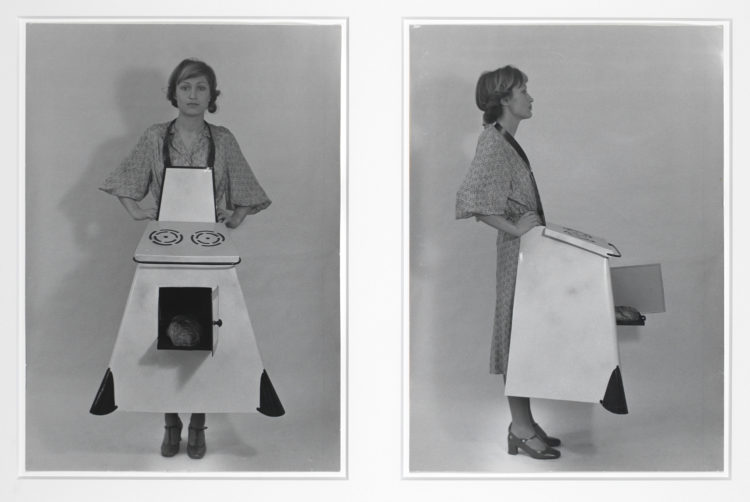
Housewives’ Kitchen Apron
Jürgenssen was also a performance artist and she used her interest in creating hybrid images to make often humorous statements about the roles that women were forced to play.
Scrubbing the floor
Ironing 1975
Untitled (Improvisation), 1976
In 'Untitled (Improvisation)' Jürgenssen draws with a photograph. By slipping her arm into a leg of her stocking and then inserting the high heel from her shoe, she creates a hybrid image of flexed muscle, (male) associated power, balanced on the heel tip (woman's acceptance of the beauty myth, (see Naomi Wolf), the sexual associations of stocking and high heels, reprogrammed as a powerful image of a woman taking control. I think she is a fascinating artist often missed out when lists of artists are made that celebrate those who were in the vanguard of contemporary practice. She brought the tropes of Surrealism into feminism, and in doing so was able to re-vitalise what was by then, (the 1970s) a very tired set of ideas based on the chance meeting between a sewing machine and an umbrella on a dissecting table.
Reference:
Wolf, N. (1991) The Beauty Myth: How Images of Beauty are Used Against Women London: Vintage
If as artists we are to embrace sustainability we will have to re-examine the practices that we call art. This isn't something new and I have looked in the past at how the word 'art' has changed its meaning over time. The stem 'rt' from the old Indo-European language root meant, 'the dynamic process by which the whole cosmos is being created.' A powerful idea that suggests 'rt' and its successor 'art' are much more to do with being involved with unfolding events than making objects, a concept that celebrates the interconnectedness of everything, rather than something just about painting and drawing. Perhaps our society needs to think again about the way art is used or perhaps we need to revisit a much older tradition. Art under capitalism has become about the exchange value of objects, unfortunately the news media now concentrates on the amount of money that an art work achieves at auction and rarely on how art might be used to add value to society. In 2017 the Wall Street Journal reported that the painting 'Salvator Mundi' by De Vinci had been bought for $450 million by Saudi Culture Minister Prince Badr bin Abdullah. A figure so huge that it is almost impossible to begin thinking about what this means. In a time of war, migration of displaced peoples, global warming and planetary wide instability, somehow the putting of so much money into an art investment seems not just futile but criminal, a sign that something has gone wrong with our idea of value.
So it is perhaps time to look at alternatives, of ways of approaching art in such a way that its relevance to our collective understanding or feeling about the world goes beyond whether or not a drawing or painting is suitable to be shown on a gallery wall.
In connection with my earlier posts on sustainability and the linking in of artists associated with eco-awareness, I'd therefore like to add another strand of practice, and in doing so perhaps open out alternative models that some of you might find useful or at least thought provoking.
The term ARTocracy, a sort of 'how to do it' brand name, was first used by Nuno Sacramento and Claudia Zeiske in their 2010 book of the same title. The book systematically shows how creativity could be applied through a sensitive interconnecting of people, context, processes and outputs, all of which it is argued will need to work together if we are to develop more sustainable communities.
The book is about the organisation of collaborative projects and it is designed to raise awareness as to how projects get off the ground. It provides practical guidance about funding, communication strategies, education and the making of art in community contexts, and in particular it looks at the balance between artistic quality and social consequence. I thought this was interesting because these issues go deep. For instance I remember being told very early on in my career that I was to avoid being didactic. I.e. that I should not intend to teach or give moral instruction through my artwork, if I did my art teacher told me, it would not just be detrimental to its aesthetic value, it could actually stop it being considered as art. Years later I was to meet Joseph Beuys and the first thing he said to me was that he was a teacher and that his artwork was designed to educate and provide a moral framework for others. Beuys used the term 'Social Sculpture' for his work, a term he used to describe an expanded concept of art, in particular to advocate art's potential to transform society. The fact that Beuys was co-founder of the German Green Party, illustrates how deeply he wanted to integrate politics and social awareness into his practice. In 1982, which was the year he was in Leeds; for documenta 7 he proposed to plant 7000 oaks, each one paired with a basalt stone. The 7000 stones were piled up on the lawn in front of the Museum Fridericianum in Kassel with the idea that the pile would shrink every time a tree was planted. The project, seen locally as a gesture towards green urban renewal, took five years to complete and it eventually spread to other cities around the world. If you stand outside the Henry Moore Centre in Leeds and look slightly to your left for an oak tree, you will see one of those Beuys oaks still standing next to its basalt stone.
I thought it useful to begin with ARTocracy simply because it is subtitled; 'Art, Informal Space and Social consequence: A Handbook for socially engaged practice', and we all need to start somewhere and this is a handbook. The first premise it establishes is that the town is the venue. I.e. the place you live is going to be where you develop an audience, find participants, seek content and be a place to both make and present or exhibit work. Your art practice is in effect embedded into the society and particular locality in which you find yourself. This is a very different approach to the idea of the artist as outsider, or cool observer of reality. It also questions the role of the artist as individualist or 'genius', looking at the artist's role as cultural activist, rather than artistic producer, exploring how an artist can energise people and local communities, rather than provide images for contemplation. Art processes it is suggested can be employed to untangle and overcome real-life challenges, defuse conflict, solve problems and open up new possibilities. Sometimes though its good enough just to help people see what's there.
Socially engaged art practice is collaborative and participatory and how you involve people in the work is central to the process. You can involve people and communities in debate, collective action and social interaction. The term 'new genre public art' is another way of thinking about it, a description that was coined by Suzanne Lacy, who wanted to find a way of making public sculpture that wasn't putting up statues of high achievers onto pedestals, as she wanted to show how 'ordinary people' could participate in collective decision making.
City conversations: Suzanne Lacy
What Kind of City? is the title of many of Suzanne Lacy's conversations, she has visited Leeds in the past, and this question was the title of her presentation at the art gallery. Lacy has also engaged directly with drawing in her work. She undertook a collaborative project with the artist Andrea Bowers called appropriately enough; 'Drawing Lessons'. This was a nine-day installation at The Drawing Centre, New York, during which artist Andrea Bowers attempted to teach Lacy to draw. Each day for nine days, Bowers offered Lacy lessons, which were also open to the public. Working together under the scrutiny of the audience, Bowers and Lacy explored the questions, in work and conversation, that they engage with in their individual practices. This really interested me, because I am convinced of the power of conversations as being central to social integration and sensitive action. The project served as a platform for extended conversations with curators, union organisers, people who attended from the area and other artists who draw or do performances. The conversations reflected on feminism, performance art, drawing, and socio-political issues of concern to the artists. For example: what are the roles and problems of representation in public art practice? How do artists reconcile activist and field-based practices with the necessities of production for the gallery and museum? What is the relationship between first and second generation Feminism? What is the role of venue, object, and style in the identification and evaluation of art?
Suzanne Lacy and Andrea Bowers 'Drawing Lessons'
The pulling down of the Colston Statue in Bristol last year, raised many issues about the role of both artists and public statues. If the making of statues is problematic, then what can artists do when they work in public? One project I remember in particular that helped me to think about the possibilities for making art-work in this area was, 'Where The Heart Is' by Graham Fagan. As part of his work with the community of Royston in Glasgow, he discovered that the one thing most people enjoyed or could appreciate was gardening and in particular many people liked roses. Fagan purchased a new rose that had no name, originally known only by a code, JC30518/A. It was named through a consultative process across the entire area of Royston. A pupil from St Roch's Primary School eventually selecting the winning name. Cuttings of the rose were then given to any local people that wanted one and its lovely pink blossom and fragrant scent was the following year to be seen throughout the area.
Graham Fagan: 'Where The Heart Is'
Graham Fagan: Local children's images of the rose
Fagan's work was part of a much larger project. It is interesting to look at how it all fitted together and at how many approaches to community development were used. Check the overall project out at the link below.
So what's this got to do with drawing you may be asking? I have written about how drawing can be used to facilitate conversations in several ways. For instance as a way of developing stories around and for a community. See:
Barker, Garry (2017) Drawing as a tool for shaping community experience into collective allegory. In: Collective and Collaborative Drawing in Contemporary Practice. Cambridge Scholars Publishing, pp. 192-215. lau.repository.guildhe.ac.uk/17315. My contribution to the book on Collaborative Drawing in Contemporary Practice, is mainly centred on how drawing can be used as a focus for conversation and how different types of drawing facilitate different types of conversations. For instance, I'm currently drawing ideas for a permaculture garden, but the real issue is that this activity will facilitate conversations and these will explore whether or not permaculture ideas can be used within wider contexts of sustainability, in particular whether or not perception and interoception can themselves be shaped or inflected by a permaculture awareness. I'm also developing a paper for an architectural magazine that brings together permaculture with perception and looks at how permaculture principles such as 'Observe and Interact' or 'Integrate Don’t Segregate' can be applied to the way we think about architecture.
Marjan van Aubel
But of course there are other approaches to thinking about how to operate sustainably as an artist. I'm always interested in how ideas can be visualised and made real. This is what so much of drawing has always been about. The problem is that we categorise things in such a way that some ideas are seen as design and others as art. If we take away the distinction, we simply have people visualising ideas. Marjan van Aubel is a wonderful example of how to do just that, in this case her ideas use light fittings in a not dissimilar way to how nature itself harvests the energy of the sun via photosynthesis. She demonstrates that there are alternatives to existing paradigms and exciting new ways of thinking about solar energy that reflect how energy is collected and used by biological entities other than ourselves.
Olafur Eliasson: Sketch for 'Beauty'
A lot of eco ideas seem to emerge from Scandinavia, perhaps this is because the winters are so cold, and you therefore need to think carefully about how you will survive them. 'Beauty' is a typical work of Olafur Eliasson. You walk into a dark room and a fine mist is falling illuminated by a single light bulb. As you walk around the room from some angles you can see a rainbow. You also see a hose pipe that the water falls from, you see the things creating the rainbow at the same time as the rainbow. You are having an experience, and are conscious of having the experience. As you are made self-aware you go out into the world with that awareness and will hopefully make future decisions more thoughtfully.
Beauty
Eliasson is interested in the connection between an experience that might take place in a gallery and the way it might affect your behaviour when you leave that gallery. Olafur Eliasson is an artist who also uses design skills to solve projects, which again highlights the artificial divide between the two disciplines. His team at Studio Olafur Eliasson consists of craftsmen and specialised technicians, architects, archivists, art historians, web and graphic designers, film-makers, cooks, and administrators. Eliasson and the studio also work with structural engineers and other specialists and collaborate worldwide with cultural practitioners, policymakers, and scientists. His climate change activism has inspired many and his approach suggests that as an artist you can both make things and be engaged in community activism. He is able to make art from the poetics of a situation, as well as from an understanding of the ecological condition of it, as well as from the constraints of physical materials and the possibilities that they offer.
Thomas Hirschhorn: Too Too - Much Much
Thomas Hirschhorn is another artist that has responded to the problem of how to avoid the 'statue' issue, he uses everyday and found materials such as plastic sheeting, cardboard, aluminium, packing tape and magazine images to create environments for change. The process of making remains clearly visible and becomes a metaphor for the individual and collective struggle to establish local democracy or to build a space within which people could debate ideas. People are implicated in Hirschhorn's work, viewers are obliged to reflect upon that which they may have hitherto been able to ignore in their daily lives, by having to take part in conversations, often with others who they would not normally meet or engage with. Hirschhorn's practice facilitating conversations, as much as making metaphors for change.
If I was going to cite one example of social sculpture that sparked my imagination it would be the work of Pedro Reyes, who for the artwork 'Palas por Pistolas' (2008) collected 1,527 weapons from residents of Cuiliacán in Western Mexico, which were exchanged for electronics. The artist then melted the weapons down into shovels, which were then used to plant 1,527 trees. This is real alchemy, the transformation of guns into shovels a beautiful metaphor as well as a real intervention. Reyes is also interested in drawing as a way to communicate ideas, the work 'Collective Hat' is a very funny as well as conceptually interesting work.
Pedro Reyes: Collective Hat: pleated palm collective activity
Reyes puts it like this:
Wittengstein stated that if we were to imagine a book which contained only the truth it would have to be entirely composed with jokes. I think in jokes you are led to the truth so quickly that the only way to handle the shock is laughing. Not all jokes produce laughing, there are also slow-smiling jokes, visual puzzles and graphic puns, some jokes are diagrams.
You may remember this one...
...a Mexican riding a bicycle. They are often a child's game but in fact very abstract and concrete depictions of social or spatial situations, like this one...four Mexicans sharing a table:
The design process in architecture is concerned with drawing the object, but we often lack tools to draw the social interplay. How do you map individual actors? How do you represent collective entities? This figure below for instance...
I drew this diagram of a collective sombrero and it became the blueprint for a sculpture. It was one of my early participatory sculptures. I took it to different plazas in Mexico city and asked people to wear it. What happens is very curious, for me it represents a paradox of democracy, the huddle has to deliberate endlessly where to go, and they have to walk very slowly not to stumble.
Pedro Reyes
'Collective Hat' reminded me of Lucy Orta's work. In the piece below for COP 26 Orta states, 'the ripple and the chain of solidarity clearly manifested our interdependence', and I can see clearly what she is trying to visualise, the fact that we are as in Reyes work all connected in some way. I do though personally respond more to Reyes because he realises that it is also funny, our situation so stupid, that we need to collectively laugh at ourselves before perhaps we decide to make some changes.
We are taught very early on to avoid stereotyping when making images of people because in image making stereotyping is associated with some of the most painful periods of human history. Because of my own awareness of family history and of how jews were portrayed during the nazi regime in Germany, I can clearly see that stereotyping is associated with removing individuality from people and treating them as if they have no individual human consciousness or feelings. This makes it so much easier to then take the next step, which is to treat people as if they are soulless objects, things that exist only to be done to. Stereotyping was a key element of the nazi process of trying to eliminate jews and others. So why put up a post on the portrait as stereotype?
The people that are visually stereotyped tend to be those that are 'invisible' or oppressed or simply belong to a set of people that can be categorised as 'other', or people not like me. In this category you do sometimes get stereotypes of powerful people, however the point about the stereotype is that these are faceless portraits, and its a lot easier to brand the disempowered with things we would like to not associate with. Stereotyping is a line that is easily crossed and one to be treated very carefully if you are going to go anywhere near it. When the powerful are stereotyped, somehow they seem less abject, we often see bankers stereotyped as suit wearers carrying large bags of money, or surrounded by symbols of wealth, yes their individuality is taken away but aspects of their power remain.
The pin striped suit stereotype can be enough to stand in for great wealth and privilege, but interestingly there are no human facial features being shown in these cartoons, unlike the recent image below of a jewish banker based on a cartoon by Ben Garrison. I thought that these images were done with and a thing of the past but I was wrong, and the evil money grabbing jew as a stereotype still exists and is part and parcel of some right wing rhetorics. Notice how different this image is to the ones of the bankers, the body posture suggests weakness, rather than the more statuesque deportment of the cat\men above. This post is hopefully a warning about how easily these things come back into play. Poor Ben Garrison has no control over what people can do with his images and the PhotoShopped version of his original reminds me of another evil circulating around the internet; doctored imagery. CGI can undermine our notions of what is true and what is fiction.
Ben Garrison's work above has been targeted by right wingers and they have even invented a fake right wing biography for him
The only time I have ever seen the stereotype used in such a way that it doesn't lead to dehumanisation is when it is deliberately used by those who have been stereotyped to raise awareness of the very stereotyping that they face.
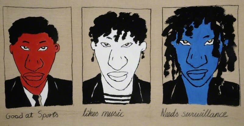
School Report: Tam Joseph
Tam Joseph's 'School Report' reminds us of how male black youths are stereotyped by society, however his drawings have just enough of a personality to them to avoid that demeaning characteristic of features exaggeration that Oscar Arredondo points to when he demonstrates the insults inherent in images of stereotypical Indian figures. "Chief Wahoo," the bucktoothed mascot of the Cleveland baseball team is transformed by him into a series of stereotypes of people of other cultures or religions. As Arredondo points out, none of them would be tolerated in contemporary America, except the image of Wahoo himself. Sadly Arredondo has missed some of the work which is promoted by certain extreme groups. Perhaps he should have stated, "none of them ought to be tolerated in our contemporary society".
The 8 portraits above from Oscar Arredondo's exhibition, "A Mile in My Moccasins," are cruel, simplistic, anachronistic and vulgar, but as part of an awareness raising campaign about the fact that Native Americans do not deserve to be denigrated as cartoon mascots, it has worked and the Cleveland baseball team has now dropped its use of the old mascot. However I think the work is still problematic as not only does it remind us of how easily stereotypes can be developed, it also reminds us of how hard it is to then remove them from our mental image banks.
Toyin Ojih Odutola
Toyin Ojih Odutola has responded in a very different way to being stereotyped. She read that in 1910 a German archeologist on discovering anatomically correct bronze sculptures in Nigeria, decided that Greeks from Atlantis must have made them, as he couldn't get his head around the
fact that Benin bronzes could have an aesthetic superficially similar to certain European traditions. Africa and its many peoples was seen as a stereotype at the time and in many ways that stereotype still exists. She therefore in response to the German archeologist's crazy invention, decided to create her own world, one where black women are powerful. At one point in her life Odutola had moved to Alabama and it was when living there she had been forced to question why she had become to be seen as a black stereotype that was aberrant in some people's eyes, and because she enjoyed drawing she turned to this as a way of dealing with these problems of 'otherness'. She also makes portraits, but she states, they are composites of multiple people and she says she is very fortunate in "having really badass beautiful people" around her to draw, but her 'composites' go beyond the stereotype and become people; people that in the Barbican exhibition, were made by drawing on black paper.
Toyin Ojih Odutola: Lonely Chambers (T.O.), 2011, pen ink and marker drawing on paper
Hardeep Pandhal is another artist that has explored stereotyping; in particular people from the Indian sub-continent. In his work Sikh painting traditions meet the English graphic traditions of the Beano and Viz and as they do, a cartoon image of a Sikh emerges and is used by Pandhal to question how the points of entry into culture operate, especially for those born and bought up in England, but who also live within a sub-culture that still retains many of the cultural traditions of a previous time and place.
Hardeep Pandhal
Cartoonists deal with stereotypes on a daily basis, this allows them to achieve a direct communication with their audience, but this also comes with dangers. Some of these dangers are intellectually problematic in that any stereotype misdirects its audience and allows us to think that a situation or individual is simplistic or without human warmth, but some are mortally threatening, as to poke fun and to undermine by using a cartoon like image can cause deep offence. Cabu, Charb, Tignous and Wolinski all worked for Charlie Hebdo a satirical magazine that attacked many targets in the name of humour and who caused deep offence in the Muslim community by both the stereotypical portrayal of arabs and muslims as well as of course irreverently making cartoon images of God. The anger caused by their work of course led to their deaths. You might argue that these are not fine artists, but in France the dividing line between cartoonists and artists isn't as fixed as it is in England, all are seen as image makers.
Honoré Daumier was imprisoned for six months in 1832 for his depiction of King Louis Philippe as Gargantua and Daumier as an artist has at times been compared to Goya and although some would argue to the contrary, I see all these images as attempts to illuminate the human condition, some might be better than others, but surely that is the case with all art and if we always shy away from confronting political issues, we will never achieve that better world which I'm sure we would all like to help bring to fruition. The line between cartooning, stereotyping and politics can be a very difficult one to control, where does it demean or undermine the humanity of those portrayed and where does it illuminate a power imbalance or injustice? Just because it is a difficult path to follow doesn't however mean that as an area of work it should be avoided, just that I would urge caution and suggest that you test out any work made in this territory with a few other people before going public.
'Toyin Ojih Odutola: A Countervailing Theory' is at the Barbican Centre's Curve Gallery from August 11th until the 24th Jan 2021.
Back in 2015 FAT (Free Art and Technology) died, in effect it put itself to sleep. What had begun as a space for hackers and programmers to interject and critique the online world had become a hyper aware arena that was beginning to crumble from the inside as everything around it was becoming either so corporate that its power was beyond cynicism, or the tropes and memes that FAT was playing with were becoming themselves appropriated to such an extent that in some ways their job was done.
The FAT site was archived and now when I look back at it I find it very like a museum and a very good one. FAT ideas and projects still seem fresh and alive, just in the same way that a Van Gogh drawing doesn't seem to date. Jimmy Cauty's conversion of police riot shields into smily faces, seems as relevant now as it did then.
Jimmy Cauty: Riot Shield
From fast art ideas to mini events designed to create a moment of serendipity, such as vacations in Paris, the FAT archive is a store house of irreverent and yet thought provoking ideas. If you are wondering why I am promoting this on a blog about drawing, I would argue that FAT is another example of contemporary 'disegno', I am thinking about drawing as a conceptual base around which other forms of art can emerge. Before painting, sculpture or architecture we had 'disegno', because those more solidified discipline specific concepts had to have a platform out of which to emerge. I can still remember when I was first introduced to the computer as a tool that could deal with drawing, I undertook a six week course on programming in BBC basic, after which I could determine points on a screen by indicating geometrical coordinates and then once I had written the correct the code, could join them. Every letter I am typing, has an associated code, that determines its shape and then another mass of code is used to determine where it goes, a simple word processor is using a deeply embedded set of codes for each typeface as well as code needed to control, spacing, kerning, indents, etc. etc. All of which is at its root linked to a type of drawing based on geometric principles, but we forget what lies beneath and FAT didn't. *
*That comment about forgetting what lies beneath gives me another link or entanglement back to my interest in object orientated ontology. Graham Harman wrote about computer languages in response to his own question about the relationship between OOO as a philosophical system and object orientated computer languages. He pointed out the fact that older computer languages were always holistic entities, but what programmers now do is put together independent programming 'objects' that are made to interact with other objects, whilst the older internal information belonging to each holistic 'object' remains discreet or hidden. In effect the reality that lies behind what programmers do becomes more and more hidden or locked deep down inside the structure. These 'objects' are also in Harman's terms 'opaque' to each other as well as to the end user. He then goes on to suggest that unlike other philosophical systems, OOO adherents believe that in a similar way to object orientated programming all objects are mutually autonomous and enter into relation with other things only via a mediator. (See pages 11 and 12 of Graham Harman's 2018 Object Orientated Ontology: A new theory of everything Pelican edition)
Sometimes the relationship between drawing and reality is itself a metaphor. In John Gerrard's virtual reality renderings there is a seamless dissolve between real life footage and virtual reconstructions which asks us questions as to what we know and assume and what is the reality we work with. In 'Farm' Gerrard has confronted one of the most obvious but somehow almost ignored issues of current life. Where are those 'clouds' of data that we so happily save to when we are building our online presence or saving our precious images.
John Gerrard
Gerrard asked Google if he could film their data storage farm in Oklahoma but he was refused permission. However Google don't yet own the airspace above their facility, so he hired a helicopter and had the building filmed from the air. He then had the entire facility rendered as a virtual reality construct using the filmed information. Using game engine software, he was able to construct a world that is eerily like our own. The camera pans slowly across the Oklahoma plains, its movement revealing the uncomfortable fact that all our data ends up somewhere in the USA lodged within a gigantic data server. It will be kept cool using huge air conditioning systems eating up energy and creating a sustainability conundrum. Gerrard has also made virtual reality films of mega sized animal farms and often exhibits both these types of farming building complexes alongside each other. Industrial farming of both data and animals suggests that we think in a similar way about both. We don't really want to know about either. If we really knew about the conditions that the cow had to endure before it was processed, we probably wouldn't eat beef and if we really thought about what is happening to our data, we probably wouldn't be using media so thoughtlessly and be consigning so much of our lives to these anonymous data stores.
The anthropologist Steven Gonzalez Monserrate has made a very interesting case study entitled, “The Cloud Is Material: On the Environmental Impacts of Computation and Data Storage,” He reminds us that the invisible cloud of data that we all work with has a very material presence. He asks us to 'unravel the coils of coaxial cables, fibre optic tubes, cellular towers, air conditioners, power distribution units, transformers, water pipes, computer servers, and more.' He asks us to 'attend to its material flows of electricity, water, air, heat, metals, minerals, and rare earth elements that undergird our digital lives.' The Cloud' he states, 'is not only material, but is also an ecological force.' I would hope you will go on to read his original article, where he reminds us that, 'Heat is the waste product of computation, and if left unchecked, it becomes a foil to the workings of digital civilisation. Heat must therefore be relentlessly abated to keep the engine of the digital thrumming in a constant state, 24 hours a day, every day.' I'm sure you are already becoming aware of what this means in terms of energy use.
When we emotionally think about colour, a culturally embedded object often shapes our response, the black of the executioner’s hood is different to the black of the blackboard, even if the wavelength we see is the same. The red, white and blue of the Union Jack flag, combining the older flags of England and Scotland with St Patrick’s saltire of a red cross on a white background for Ireland, is very different to the red, white and blue used in the flag of the United States of America. The citizens of the USA are told that white signifies purity and innocence; red, hardiness & valour, and blue vigilance, perseverance and justice.” In France “Bleu, Blanc et Rouge” is the linguistic order, being the colours of the French flag read left to right. The short sound-bite, “The red, white and blue” encompassing patriotism, valour and tribal belonging in an easily repeatable form, but meaning different things to different people. For Alberto Burri who used to be an army ambulance driver and medic, red and white were always the colours of blood and bandages.
Colour often comes with an accompanying text. Even colour charts have their messages, words linked to colours so that you will form an association between the two.
This colour range is designed to be upwardly mobile. A latte drinking, chic gourmet that sleeps in Egyptian cotton, and likes a touch of the exotic.
The 'arty' range, Italian style
In this range we have associations with 'nature'. Minerals, 'limestone, obsidian' or forests and jungles, food or drink or places, each colour suggestive of a certain lifestyle, probably of a traveller, who eats good food, loves wild nature and sees themselves as having strong connections or affinities with the wild.
If you can control the meaning of things, there will always be groups of people that will want to take that control or even "take back control".
The union flag headed flyer above was found discarded on the streets of Durham recently. After seeing that strange language, ‘British the Israel of God’, I was reminded of something I read over 25 years ago. There was an idea making its way around that a computer virus could ‘infect’ people just as it could infect your computer. It was based on how languages work at a deep level, and was derived from Chomsky’s work on universal language structures. The zeros and ones of machine code were seen as a ‘deep language’ and as such even though we could not recognise them, viruses were able to subliminally affect those that were coders because coders had already shaped their own brains by writing computer code on a daily basis. All languages in effect shaping brain structures as they are learnt. The ‘gibberish’ that resulted from being infected by a virus was seen as a sort of glossolalia when read by a coder or when a non-computer expert was affected as a type of xenolalia. This is a very old condition and relates to the fact that all languages are prone to infection, (something the French are always worried about). The Bible for instance tells of people infected by devils speaking in languages known to others but not to the speakers. In Greece this speaking of gibberish was associated with prophecy, as Dale Martin, in his study of the Corinthian body puts it, they "emit words which are not understood by those that utter them; for they pronounce them, as it is said, with an insane mouth”. The Sumerians were the first culture to recognise how a certain set of sounds could infect a whole language and they had a name for it, a ‘nam-shub’.
The way that people spoke when being interviewed on Brexit night made me think that these people were also speaking in tongues, they had in effect been possessed by a ‘nam-shub’. A nam-shub triggers six basic symptoms: loss of rational control; dominance of emotion, leading to hysteria; absence of thought or will; automatic functioning of the speech organs; amnesia and occasional sporadic physical manifestations such as jerking or twitching. In pre-biblical Sumeria a nam-shub was regarded as similar to an infection, or as we would now think of it, a virus attack. Common in many cultures under different names, it is essentially a string of words designed to eliminate rational thought and to replace it with mindless acceptance. In essence, a nam-shub is speech with magical force. Initially a Sumerian word and concept deriving from their agglutinative tongue that collected and grouped syllables together to form words. Magical phrases similar to the one we know as 'ab-ra-cad-ab-ra', were used to control whole populations. Language was understood as magical and was used by the ruling powers to shape minds by enforced repetition of key syllables, such as ‘take-back-con-trol’ or ‘get-bex-it-done’. This repetition was understood as a key element of classical rhetoric and it was well understood that when working with witches language was distorted to enable alternative truths to be woven into the fabric of what was reality, or as Shakespere would put it, “Fair is foul, and foul is fair”. I suspect Dominic Cummings having a classical education and being well versed in computer coding languages was very aware of this condition, he may even have read Neal Stephenson’s ‘Snow Crash’ back in the 1990s when these ideas were themselves viral and he was perhaps not adverse to concocting a language virus himself and trying it out. As it is, it is hard to cure once infected. In particular if you have ever had to write for the Sun newspaper, one of their style guides ensures that you never use polysyllabic words, they have developed a language consisting of ‘simple’ short words and phrases that is then very easy to shape into a nam-shub.
The rise of the Nazis in Germany during the 1930s was a time when the shaping of language into a state weapon was honed to a sort of perfection. A whole population's minds washed into believing they were fulfilling their destiny. But not everyone was convinced; Expressionist Art and Dada pushed back at a set of memes designed to cover up what lay beneath. The Nazi hierarchy perhaps saw more clearly than most, how artists' work operated in relation to the society that produced it. The work of these artists often exposed the dehumanising truths of 1930s German society, psychologically uncovering the iniquities perpetrated by the Nazis, exposing horror hidden behind the classical draperies of their favoured traditional art. The “degenerate” artefacts that they railed against, were in fact images of the unhinged reality that they had bought into being.
Otto Dix: Match seller
Otto Dix was one of many artists labelled as degenerate by the Nazis. He had been in the first world war and saw how horrible both the war and its aftermath were and so it could be argued that his work was in fact a sort of realism. When the works were shown in the 'degenerate art' exhibition it is interesting to see that they had to be labelled as degenerate using large wall texts to ensure the audience knew how to read the works the 'correct' way.
If you read what the artists who were singled out for derision by the Nazis had to say about their work, they were often seeking to tap into the deep unconscious roots of humanity. Either by looking for spiritual underpinnings, such as Kandinsky's interest in theosophical doctrines, or by developing a more 'primitive' or 'unconscious' side to their work. As part of his personal research into these issues, Kandinsky developed a circular colour chart whereby he stated; “As in a great circle, a serpent biting its own tail (the symbol of eternity, of something without end) the six colours appear that make up the three main antitheses.”
One again colour charts are central to an understanding of these issues.
This colour chart is taken from 'Thought-Forms' by Annie Besant and C. W. Leadbeater a text that was first printed in 1901, and was pivotal to the thinking of many artists at the time. The fact that you could have a colour related to 'religious feelings tinged with fear' or 'low type of intellect' is both fascinating and worrying at the same time.
It could be argued that what was again being looked for was the ‘nam-shub’, some sort of colour object that is like a song stuck in your head, an idea that might go 'viral'."It's the real thing"we were once told. The advertising industry was central to the development of these ideas as the twentieth century unfolded.
The colours of sweets
When you walk down the aisles of a supermarket you will find changes in colour coding as you pass different areas, sweets and biscuits have a different colour range to pharmaceutical products or cleaning materials. Again, colour and text are combined, we see the word 'Crunchie' or 'Maltesers' as a typeface, sound and colour all at once and it embeds itself into our thoughts.
So can art be like that? The Nazis obviously thought so, or they wouldn't have gone to the trouble to ban it. If you are looking at how to use colour to effect people it will be the world of marketing and advertising that is most confident in how to do it. Typicallycompanies will demonstrate that they know how to do it. Colour psychology in marketing is seen as a key tool.
I personally also think it is to do with the surface quality of the colour. Those sweet wrappers are printed on shiny surfaces, which are a combination of plastic and aluminium also known as metallised plastic.This is a very seductive surface, it would not feel the same at all if the sweet wrappers were made of painted linen in exactly the same colours. Is this why we are so seduced by Jeff Koons? Is this why we find certain paintings so dull when we see them in reality? Film stock can shape and change reality in the same way. This is what the Kodak people have to say about Kodak Gold film stock: "Gold has a slightly nostalgic look to it. It brings out the reds and yellows particularly, which are the warm tones Kodak is known for." So if you want your work to look slightly nostalgic you know what to do.
Just Paint An excellent resource for the painters amongst you. Everything from colour mixing to colour theory. The blog posts developed by a pool of bloggers really understand painter's needs, even down to the adjustments needed if you need to pour your paint.
If you want to mix colour accurately, try this short video as a starting point