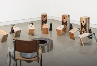
Renate Bertlmann
Renate Bertlmann exhibiting in
the Austrian pavilion was particularly interesting as her large wall
installations were complex collages of drawing, photography and text,
reflecting her long term program of “Discordo ergo sum” or “I dissent, therefore
I am”. She sets out to ironically subvert and redefine social constructs. In particular she takes symbols such as those for gender relations, role models or power structures and then examines how they can become enmeshed into diagrams for change. The
transformative potential of art within a sociopolitical context is something I am personally very interested in and even though much of her work is now over 30 years old, I still found it engaging and watching other people spending time closely reading her images, realised that others still found these complex diagrams for change pertinent to today. Her work reflects Ingeborg Bachmann’s proposition that, “Representation
requires radicalisation and comes from coercion.” We so often forget about the 'coercion' aspect of representation, but if you think about how the present government has been channeling monies away from the arts in education, you can see that they are very aware of the power of alternative representations. The image that was used by the pro-Brexit campaign of thousands of refugees potentially entering the country if we didn't leave Europe being a typical example of how political parties use representations to their own ends to coerce people into thinking like them.
It is impossible to escape from the socio-political context of art when going somewhere like Venice, every time you step into a national pavilion you are reminded of the various political issues that continue to circulate in readings of situations like these. The art world and its various fairs and associated constructs can at times seem to be at total loggerheads with the reality of day to day political oppression, war, media manipulation, data control, gender inequality and poverty. Especially in a time of post-truth, people don't know where to make a stance, how do you decide what is right and what is wrong? At the end of the day you have to trust in your instincts and have a belief in yourself, if not you would never get out of bed. I will leave you with my thoughts on what I found to be a very difficult to stomach art work. Christoph Büchel has had a ship that was raised from the bottom of the Mediterranean transported to the dockside of the Arsenale. Entitled “Barca Nostra” (Our Boat), the ship sank with more than 800 refugees on board, all but 27 of which drowned. I have read various estimates as to how much this decision to move the boat to Venice cost, all of which are in the millions of euros. Büchel says that he wants to raise awareness of the situation, but I find this very problematic. As this blog is about drawing, I would like to compare how one drawing was used to do something similar, but in a manner I find much more effective.
British library: Diagram of the 'Brookes' slave ship,
Detail: Brookes slave ship diagram
Each and every figure in this drawing is 'real', a realisation that coupled with the fact that there is literally no space between each figure, allows our imaginations to fill in the non-existent gaps with the horror of what we are looking at. This is something Büchel fails to achieve in presenting us with the empty boat. There is no way in Büchel's work that we are made aware of the physical conditions and associated horrible impact of this awful moment of tragedy as the ship sank, nothing to give our imaginations purchase beyond a spectacle for taking selfies. There was no text available, no story to raise awareness, in fact as I write I feel I'm giving the work more context than it deserves. I am also aware that if the work did cost as much as I was told, Büchel could have instead put the money to the development of a refugee field hospital or similar venture, something that he could have used to raise awareness as well as actually help people.
Christoph Büchel: 'Our Boat'
The Art Newspaper has a fairly balanced review of the piece. However I continue to worry about it, I'm not sure Büchel's account of it being something that is an integral part of the media storm, he argues that all of the various commentaries are simply an extended relational practice. This suggests that he is more interested in the work's position as a particular type of art. His decision for instance to have no signage suggests that he has a higher opinion of the general public's awareness of himself and his approach to his work than is warranted. Read the Art Newspaper for a much more balanced view.
It feels wrong to end my thoughts on a visit to Venice on such a negative note, but in difficult times or as the title for the whole Biennale stated, 'May you live in interesting times', the power of art to change things will always be contested, however hopefully by showing the Brookes slave ship diagram, I can also demonstrate that sometimes images do change things.


