Tuesday, 25 January 2022

Using Viewfinders

I know that some of the artists I am aware of like to use viewfinders to help them think about composition and selection. Some of them use these with a full and deep understanding of the implications of doing this, but others don't, so I thought I'd as normal ramble around the subject and see if I can pick out some issues that might help you decide to make use of them or not. 

A typical bought viewfinder 

The advantages of working with a viewfinder when making objective drawings is that you can use them to isolate your subject matter by limiting your field of vision and cutting away your need to scan and look at areas of visual information that could otherwise distract you. They also allow you to think about aspect ratio and how that might effect the compositional needs of your selection. All useful things, but they do come with certain implications. The first one of course is the impact of the rectangle itself. We don't see in rectangles but have become used to seeing compositions within them because cameras produce rectangular images and we look through a lot of rectangular windows, paper is cut into rectangles  and our paintings are usually displayed in rectangular frames; but just because these things are familiar doesn't mean they are right or the only way to do things. 

Looking within a rectangle also changes the way we see things. Our peripheral vision is cut off, our visual scanning processes are restricted and the situation we are looking at is made far less dynamic. We have in effect captured the view in a cage or trap. 

However they can be useful, for instance the one shown above, the 'Artist’s View Catcher', is 3 1/2 inches square, with a window opening that you can adjust by using a sliding panel. Markings along the side help you set common aspect ratios linked to sizes such as 8 by 12 inches or 11 by 14 inches. The sliding panel has a small hole that you can use to judge local colour or tonal value and as the viewfinder is a neutral grey, this gives it more use value. I must admit it's much better than the ones I have used in the past made from 4 strips of paper and 4 paper clips, or old 35mm projector slide mounts but it will often cost you over £10. The cheapest I could find was Jacksons. 

35mm slide mount

There are other viewfinders that also allow you to identify local colour, and make comparisons with set tonal values, such as the Guerrilla painter composition finder. 

You match up the colour strip on the left with a local or 'seen' colour and do the same with the tonal value scale on the right. The Pixiss Grey Scale Value Finder below then takes things to extremes, you get three cards to hang round your neck. One a squared off viewfinder, another a colour wheel and the third a tonal value finder. 


Pixiss Grey Scale Value Finder

If you want to make a small drawing so that you don't have to even think about transferring what you are seeing to a sheet of separate paper, the Tom Lynch 'Secret Composition Tool' allows you to draw directly over your gridded up view, so that you can see what you are picking out. I'm not sure how it really works and it seems overly complicated to me but you never know some people must find it useful. 
The Tom Lynch 'Secret Composition Tool' 

Jackson's viewfinder is a much easier compositional tool to use. You draw directly on it with a wipe away blue marker

Jackson's viewfinder

Artists have used viewfinders for hundreds of years and they are the basis of all image transfer techniques before photography and chemical image capture. 
Van Gogh's viewfinder consisted of three wires stretched across a frame to intersect in the middle, as shown in the sketch below that he put in a letter to his brother Theo to show how he planned to use it out on the dunes.

Van Gogh

Van Gogh would copy the viewfinder grid lines onto his canvases, and they can be seen with the naked eye if you get a chance to look at an actual painting in the Van Gogh museum in Amsterdam, where if you search long enough you can sometimes see traces of his drawn grids between brush strokes. As he said in a letter to Theo; 

"You will have seen in my last letter the drawing grid that I told you about.  I’ve just got back from the blacksmith’s, who made iron tips to go on the stakes and corners for the grid itself. It has two long stakes, and you can attach the grid either vertically or horizontally with solid wooden pegs".

The viewfinder as Van Gogh drew it in his letter to Theo, 5th or 6th August 1882

The Gridvu viewable grid system is one of the latest and has the advantage of also having diagonal lines printed onto the viewing surface. This does make it easier to use when using a viewfinder to draw portraits.

The Gridvu


Looking at a face through the Gridvu

Of course the mobile phone has replaced a whole range of tools, we use it to record sounds, take photographs, communicate and more recently to be a d
rawing grid maker


Drawing Grid Maker app

You have probably seen the Drawing Grid Maker app used on Portrait Artist of the Year, it is a grid drawing utility program which draws a grid on top of an image which you can then use to guide you when you want to translate the image onto a canvas or onto paper. It has a very simple 5 step to use set of processes. Load a picture from your device or web browser (press and hold picture to share with Drawing Grid Maker from web browser). Set number of rows and columns. Set colour of grid. Set line width. Save the image and print it out, or display it on your monitor/tablet/phone while you draw. (It also has diagonal line settings so you can use it like the Gridvu).

Another related device sold to help artists is the perspective viewer. It is similar to the viewfinder as it is transparent, but it also comes with perspective lines already in place, so that you can link a gradually growing knowledge of perspective with what you can actually see out in the world. 

Perspective viewer.

Landscape seen through a perspective viewer 

Again I have all sorts of problems with these perspective viewers as we don't actually see in perspective. These are usually about 8 by 4 or 5 inches in size, allowing you to move between your images and your views. However I have also seen students use these very effectively, so perhaps my personal views on the matter don't really mean anything, the reality is, if it helps use it, especially if what you are trying to do is to unravel the complexities that surround how we look and how and why certain visual conventions such as perspective work. 

Most people first come across the grid system in the art room as a device for copying pictures. This video is a typical school teaching aid. 

How to copy a photograph

I still find it interesting to think about grids and so do other artists. Betty Tompkins made the drawing 'Fxxk Grid #20' in 2005.

Betty Tompkins: 'Fxxk Grid #20'

Tomkins' drawing tells us a lot about copying from photographs using a grid system. It is as an image very flat, the angle of pencil stroke has little variation because the information does not come from surfaces that change direction as they move over a three dimensional form, the tonal values sit in a very narrow range and texture is diminished because there is no direct experience of a textured surface from which to draw from. It is in fact a very 'dead' image. Although this is not Tomkins' main point, this is not the image is of a dead person, it comes from a series of images about how women are used in pornography, but the way it is made in effect 'deadens' or 'kills' the image and for myself, gives this image an added poignancy. The grid becomes a trap or cage and the very flat copying of a photograph signifies that the images of women for pornographic uses, are in effect 'flattening' or 'killing' them. The dead hand of the pornographer squeezing the life out of the image, the women 'trapped' in their situation. 

Composition using rectangular frames is about selection. You can use 4 strips of paper to find new compositions within existing images, or to focus on one area with a view to changing it so that it pops out of the rest of the image. But selection can be done by making lots of small drawings from either existing work, photographs or reality.

Torn paper strips

Sometimes torn paper is a better solution, tiny drawings on awkward shapes can be a road to invention because you are forced to reconsider the frame as an organic rather than geometric form. You can of course make your viewfinder from a torn hole.

Torn hole viewfinder

Hundreds of years have elapsed since Durer made those images about drawings using frames and grids. At the time he was reporting on things he found on his journey to Italy, devices that he regarded as important new ideas as artists struggled to draw the world more and more accurately. 

Durer

19th century Table de L'Aquarelliste (Watercolourist Table with sighting grid)


However these devices have now entered the lexicon of art itself and can become integral to the making of images. 
Using a sighting glass: Ludovico Cigoli: 1610

Cigoli's image of an artist using a sighting glass could be a drawing for a performance, I like the fact that in this case the artist is the nude subject of the image, especially as it was made at a time when it was usually naked women that were subject to the male gaze. 

Pia Linz 

The artist Pia Linz has taken the idea of the drawing viewfinder and decided to build one that she can work inside. The small transparent room above is in effect a three-dimensional tracing frame. She sets these transparent acrylic objects up in places where she wants to draw and she marks her drawings onto the surface from the inside where she sits working. Afterwards the drawings are sharpened up and the objects exhibited as sculpture. The process now turning full circle, the capture device becoming far more important than the process of capturing the image. 

See also:

Notes from a drawing conference (see notes on the work of Catherine Anyango, who was making drawn images of 'last seen' surveillance footage of people that were either found dead or went missing. 


Tuesday, 18 January 2022

A straight line

In a city a straight line is something you confront on a daily basis, and it is central to our western European view of the world. Engineering and architecture both rely on the straight lines of geometry. Every room we enter has straight edges to it, if not it is something of an oddity, for instance Gaudi's architectural visions are seen as just that, 'strange visions', rather than the norm. Contrast this situation with the architecture of Burkina Faso.  

The straight line is an idea, a construct and as such it carries within it a densely compacted body of information that comes from its history.

The first straight lines produced by human beings would have been made with threads. The easiest line to make would be for someone to pull a thread held or tied at the other end, until it tightened.  The tightened thread would make a perfectly straight path.

Once understood as a principle, the next step would be to stick a length of wood into the ground. Do the same with a 2nd length at a set distance. Tie a thread between the two points and tighten, then that could be checked by looking along the line to see a straight. Once this principle was understood, you didn't need the string or thread any more because now the line was also an idea and you could 'sight' a line by lining up two things. 

Geometry begins with string, imagine the nails as posts set into the ground, huge 'sacred geometry' forms are then easy to envisage.

The Nazca peoples checked the straightness of their drawing lines through the landscape by putting a notch or hole in a length of wood pushed into the ground and using that to 'sight' another pole set into the ground at a distance. Stones could then be moved into place whilst someone siting the straight shouted instructions or indicated using arm movements, whether to move them to the left or right. 

Nazca lines

To make a perfectly vertical straight line, find a high point, such as a tree branch, tie a thread or string to it, and tie a heavy object at its other end. The path that the string runs through is always perfectly straight. This has been used to check whether a building's wall is upright at 90 degrees or a right angle, for thousands of years. We now call the tools for doing this a plumb bob and line.

Plumb bob and line

We live in spaces often defined by straight lines and because we know them to be straight, we also believe we see them as straights. I was first made aware of this by a drawing tutor, who would stand behind us with a long straight edge, he would hold it above our heads and advance it slowly until we could see its ends via peripheral vision. Suddenly its shape came into vision and it was a curve, but as it was pushed further forward and we could recognise it 'properly' as a length of 2 x 2 timber it reverted to being straight. 

Any straight seen, is seen by you as from the centre of a sphere. 

We in effect 'see' what we think is there and not what is actually there. The attempt to look at a straight line and actually measure it and draw it is such a basic activity, that it is rarely done, because it is in effect questioning everything we see. 

A drawing produced by someone looking at a straight edge set at right angles to them as in the line AB above.

Because the straight line is such a powerful idea, it can also be used to think about what ideas are and about what sort of ideas can be carried within visual constructions like lines or angles. 

The artist Cornelia Parker is a conceptual thinker. She likes making art that asks questions. She at one time made a series of self portraits using her own blood to draw basic forms, such as 'Self Portrait as a Line'. 

Cornelia Parker: Self portrait as a line

We think about the use of our own blood in very particular ways, for instance it reminds us of self-sacrifice, and ideas such as the transmutation of the body as in Christianity. The line is such an essential idea, it is suggested by Parker, that it is as a concept in a similar category to some aspects of religion. A straight line doesn't exist outside of the idea of it and the same could be said of religion, these things are all in our minds. 

Marcel Duchamp is often credited with the invention of conceptual art, (not that any one person could ever really be credited with such an idea, because the majority of art is and has always been conceptual, but perhaps this argument is for another day), and one of his earliest pieces was made as a response to the power of the measured straight line.

But first of all a bit of history. The Egyptians defined the 'Royal Cubit' as the length of the ruling Pharaoh’s forearm and hand. They had very big building projects and needed clear measurements in order to communicate ideas. The cubit was only a cubit if it existed along a straight line.  A yard was originally the length of a man's belt, something that could like the string, be pulled straight in order to act as a measure. In the 12th century, King Henry I of England fixed the yard as the distance from his nose to the thumb of his out-stretched arm. These 'rulers' would come and go but eventually the meter was decided upon as the standard we should all use because it was now science that ruled. First defined by the French Academy of Sciences as 1/10,000,000 of one half of a meridian, (the shortest distance from the North Pole to the Equator), after checking this, a platinum bar was made as the prototype meter for this new official distance which became known as the “mètre des Archives” and it was stored in the French National Archives. For every day use the meter was now literally set in stone, the “mètre étalon” being a small shelf of marble installed beneath the arcade at 36, rue Vaugirard, right across from the Senate at the Palais du Luxembourg. 

The mètre étalon

Duchamp's response to this was to cast aspersions on all this scientific decision making and to create his own versions of the metre. He had read of Alfred Jarry's 'Pataphysics' a concept that took the idea of science and bent it until it was broken by sex and other human emotions. 'Three Standard Stoppages' was an idea first constructed in 1914 and it consisted of a materialised idea. The idea was this: To take three metre lengths of thread and to drop them from a one metre height. Each length on landing was traced around and the tracing used as a template from which to cut a wooden 'ruler'. These three rulers and the threads would then be presented in a specially designed case, made to look as if it was of a similar sort to those already in use as 'metre checks' throughout France. 
Duchamp: Three Standard Stoppages

In England we had our own inch, feet and yard system, one that had to also be fixed.

British standard lengths set in a wall at Greenwich

Alongside the British standard lengths there are protrusions around which a length of string could be wound so that a 'straight' line can be stretched between two points and the measure taken away. The nearest equivalent site to where we are in Leeds is in Bradford city centre. The Standards of Imperial Measurement are to be found on plaques situated behind the statue of Queen Victoria, just over the road from the Media Museum. 


Bradford city centre: Standards of Imperial Measurement

All of these constructions would be unthinkable without the idea of the straight line. Perhaps it is time to look around you and to think about where these lines exist and what they might signify. In common present day language 'straight edge' means having an ascetic or abstinent lifestyle; hippy culture was often presented as bright psychedelic swirls; it is interesting how our visual language is often used to present lifestyle choices, think of those 'beige' people, those that are normal to the point of being bland. 
Lines in drawings are capable of so much more than just length measurement. Their materiality includes the substances of making, such Vic Muniz’s lines rendered in runny chocolate sauce when making a drawing of Jackson Pollock at work, or Motoi Yamamoto's intricate line mazes of salt.

Motoi Yamamoto

Do we think enough about the materials we use to make lines with? Sugar lines are so different to salt lines, pencil lines so different to those made using ink. 

A line also has direction, Vertical lines are straight up and down lines that are moving in space without any angular direction and are perpendicular to horizontal lines. They suggest height, uprightness, good health and strength. Width variation can suggest their moving backwards and forwards in space.
vertical lines example

Horizontal lines are straight lines parallel to the horizon that move from left to right. They suggest width, distance, calmness, rest and stability, but also lying down, sleep and death.
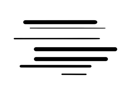
But what if the line has a certain quality to it?

Are these straight lines capable of holding ideas about emotional states or sounds or ...? 

A straight line drawn at an angle

This is a case of going back to square one. This post is a reminder that as we draw more we tend to forget the basics and in doing so lose track of what we are doing and the possibilities for communication. 

See also:

Drawing measuring and the body

Mathematical shapes of interest

Drawing with alternative materials

Oak gall ink

Graphite

Dotted lines

Signs of life in flowing line drawings

Technical drawing

Wednesday, 12 January 2022

Hokusai: The Great Picture Book of Everything

During the break I went to see the British Museum exhibition, 'Hokusai: The Great Picture Book of Everything'.  For anyone with an interest in drawing the exhibition is revelatory. These are drawings made to be used as templates for woodblocks and would normally be lost as the block cutters would use the drawings as guides for their cutting, cutting the whites away as they copied the images. But for some reason this series of 103 images were never made into prints, so we have a chance to see Hokusai in the raw and what an experience that is! 

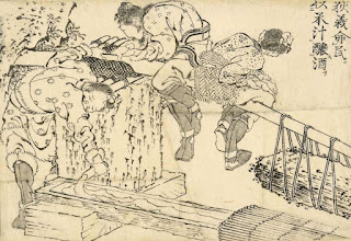
bolt of lightning strikes Virūdhaka dead


Images from 'Hokusai: The Great Picture Book of Everything'.  

The first thing that strikes you is the range of images. From genre scenes of everyday life, via wild life illustrations and mythic stories, to how paper is made. Every subject is handled with a total command of graphic invention, his small brush thickening and thinning its way through the making of lines and the creation of various surface textures. His linear elements are sprung in such a way that his figures have a coiled life, an inner energy that makes everything seem alive. There is action, such as the bolt of lightning that strikes Virūdhaka dead, which could be taken straight out of a present day manga comic, visual poetry as when the moon is reached by climbing up into the night sky using the clouds as a ladder and the everyday of two cats meeting and arching their backs in defiance. In 'how its done' images such as the one above illustrating the stages of paper-making, what could be a boring piece of factual description, is enlivened by inventive body movements and shapes taken up by the workers, workers who are totally embedded into their work environment and as much part of the process as the water and the shredded plants. 
I was lucky as it was a quiet day, so I was able to spend over an hour simply gazing in wonder at these amazing images. 


Images from 'Hokusai: The Great Picture Book of Everything'.  

The exhibition is on until the 30th of January 2022, so if you are in London and were thinking of visiting the British Museum, do go and feast your eyes on drawing after drawing that together demonstrate how inventive a visual mind can be and how skilful hand control can become and how above all the problem, 'I cant think what to draw' can be solved by deciding to draw anything and everything that is seen with your eyes and imagined in your head.

See also:


Wednesday, 5 January 2022

Curves

When we draw freehand we make curves by using various parts of our body as if they were the arms of a compass. Drawn curves can be thought of as segments of a circle and the centre of each of these imaginary circles being the shoulder, the elbow or the wrist of the drawer, (or any other part of the body for that matter that you can use as a fulcrum or pivot). This determines the radius of the circle and therefore the type of curve that is being made; a situation obvious, but often forgotten. 

Jasper Johns is an artist that once he has developed an image, pushes it through various print and drawing processes to test how far his image is a product of its media specificity. I find Johns' approach fascinating, and we rarely see such a control over image making. 'Diver' is one of his drawn images that isn't a drawing of a painting. The dark smudginess of the charcoal is more an intimation of death by drowning than perhaps a painted encaustic version would have been. In this image we can find various impressions of the artist, both his feet and hands appear, but above all we have an echo of a swimming stroke, the curve of the arms as they front crawl, being very similar to the curve made by the arms as they draw a circle, the drag of marks over the drawing's surface, echo the movements of hands struggling to swim up towards the sea's surface. Johns was thinking about the death by drowning of the poet Hart Crane, an event that happened some 30 years before he made the drawing, but a death that still resonated for Johns. He empathised with Crane's homosexuality, and he was interested in the way that Crane's poetry could sweep a reader along with swells of passion and the irrational language of love, something Johns was still struggling with in an early 1960s America that was yet to come to terms with homosexuality, something still treated as an unfortunate  condition rather than a fact of life. 
Jasper Johns: Diver


Periscope

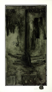
Jasper Johns: Fool's House

For Johns a brush could be a symbol for an artist. A paint brush is simply an arm extension with an artificial hand on the end. Fingers can be bristles, just as the arm can be the shaft of the brush. But brushes when they are brooms also sweep out the house, they can be central to a spring clean, as we brush away the cobwebs, we also clear our minds. Johns' interest in naming is also important, once an object is named or labeled, it has been "identified" as an thing and removed from its doing. The swing of the 'broom', leaves the trace of another arc or curve, something that is a sign of action rather than a fixed label. All of these issues could be regarded as tangental to the situation, a position that is of course a product of the geometry of curves, a tangent being a straight line that touches a curve at a single point. Each new subject or idea being tangential to the first subject; it touches it but then moves off in a different direction; which is sort of how I try to build the posts in this blog on drawing. 

Rembrandt 

Look at the drawing by Rembrandt above, you can feel his wrist turning as he makes a variety of curves to build the image. He pulls his curves into and out of the spaces that they sit in. Bodies open themselves to his movements, curves never quite closing into circles, because he needs masses to merge into spaces. The child's hat provides a rotating fulcrum for the image, whilst the two flanking people are tied to the child by energy lines that open out into mass indicators. The speed of his visual notation is awesome, we feel the moment of capture in the drawing's swift curvature and Rembrandt's sensitivity to the punctum* of the situation in the way he establishes what is most important with total economy. This is the curve experienced in perceived life, far less conceptual than Johns, but a powerful thought non the less. 
*Roland Barthes used the word 'punctum' first of all in relation to a photograph. He stated; 'The punctum of a photograph is that accident which pricks me (but also bruises me, is poignant to me). This could be translated as the aspect of an image that gets to you first, that something that triggers a particular reading of an image. 

Paule Vézelay: Curves and Circles 1930

Vézelay was one of the first British artists to explore abstraction. In Curves and Circles she brings together cloudy abstract shapes, with elegant, twisting curves, curves that could almost be taken from an old manual on good handwriting that describes and traces the movement of the writer’s hand. The background resembles a cloudy sky or milky sea, as if the lines were floating in air or water, the curves move through this fluid space as would swimming snakes or nematodes, twisting lifeforms in a sea alongside other emerging micro organisms. These are curved lines as simple life forms, the curve as a basic building block for form. 

Leonardo

Leonardo was fascinated by curves. His seated man is composed of curves, from the crossed legs to the folded arms, all is curved. Leonardo's interest in water and hair, is based on a similarity he finds between two ideas, the flow of a hair covered surface and the lines of water eddies. As he puts it: 
“Observe the motion of the surface of the water which resembles that of hair, and has two motions, of which one goes on with the flow of the surface, the other forms the lines of the eddies; thus the water forms eddying whirlpools one part of which are due to the impetus of the principal current and the other to the incidental motion and return flow.” P. 389 of Leonardo’s manuscripts, the Codice Altantico Available here
Leonardo's obsession with movement and energy emerges via a language of sprung curves that he began to see everywhere, the curve being in many ways for Leonardo a symbol for life's energy, or the élan vital, a creative principle that Henri Bergson believed to be immanent in all organisms and responsible for evolution; this was the 'vital force' or impulse of life. Bergson believed that immediate experience and intuition were far more important than logical thinking, rationalism and science as ways to understanding reality. There is something very beautiful in the fact that a simple curved line can therefore hold within it or represent, an idea that emerges as a principle that underpins all life.  
In the book 'The Curves of Life'Sir Theodore A. Cook, argues that the spiral or helix may lie at the core of life's first principle, that of growth. He points out that the spiral is fundamental to the structure of plants, shells, and the human body; to the periodicity of atomic elements and to an animal's horns; to microscopic DNA (the double helix) and to the Andromeda nebula. 

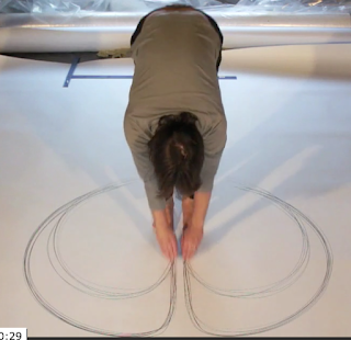
Tony Orrico

Tony Orrico's 'Heel as Pivot' drawings begin by pivoting the arms to feet flat on the floor and then with heels raised a second curve is made. The change in radius produces related forms, one inside the other, a form that reflects the bilateral structure of its maker, a structure that echoes the one Jasper Johns found for his image, 'Diver'. 

Anastasia Faiella 

Anastasia Faiella also uses her body as a set of anchor points and pivots in her performance drawings, and I would also argue that Van Gogh was doing the same, making marks as memories and traces of circular finger, wrist and elbow movements, his drawings the psychic traces of a body's rhythmic movements.

Van Gogh

The curve of life runs throughout the history of drawing, sometimes as a purely physical trace of human actions, at others as a controlled idea that seeks to construct a concept about what lies beneath superficial surface appearance. 

See also:

Euler spirals and road design