Monday, 26 December 2022

Celia Paul and Cézanne

Celia Paul: Figure approaching the British Museum

On a recent visit to London I saw two small images that have stayed with me, lodging themselves in my visual brain far more powerfully than any of the other art works out there in the commercial art world seeking attention. I had been looking around a few private galleries, in order to get a flavour of what seems to be going on in the contemporary art world and perhaps because of their relative insignificance, found myself staring long and hard at two images I had never seen before. In the Marlborough Gallery I found the first, a small etching by Celia Paul of a dark figure appearing to approach an archway in the fog and the other image that I found in the basement exhibition space of the Bernard Jacobson Gallery, was of a tiny pencil drawing by Cézanne of a sculpture of Atlas crouching.

Cézanne: Study of a sculpture of Atlas crouching.

I have no idea of the dates, but Cézanne was dead by 1906 and Celia Paul is a living artist, so there will be at least a hundred years between the coming into being of these two images.

Both artists were making representations of things I don't normally associate with them and both were making images that suggested to me that they were in one way or another trying to make sense of their relationship with history.

Celia Paul has a studio flat directly opposite the British Museum, high up on the fourth floor, so her small etching could therefore have been made initially from the direct observation of a building that for myself has long been a place of pilgrimage. This hallowed repository of the world's cultural treasures, is for Celia Paul the place on her doorstep. In fact the last time I went to the British Museum I did look up at the windows above the shops opposite to see if I could guess where she might live, but there were of course no clues, no windows that were framed in artist's paint marks or any other identifying features. 

Celia Paul's etching of a figure approaching the British Museum is but 12 inches high or less; an insignificant image behind glass. The museum doorway is hazily picked out in scattered ink marks, I wondered if she might have been directly scratching into the plate, as well as biting through a thin acid resist. The image might as well be a container transporter crane obscured by sea mist, as a museum doorway. All recognisable features have disappeared and it becomes something emerging out of an insubstantial cloud of unknowing that is at the centre of all the fogs and mists and vapours that have at different times acted to remind us that behind the sunlit world of clarity and intellectual knowing, is a twilit world of shifting uncertainty and unconscious dreams. It is as if the museum is hissing steam, hiding itself behind mist. Paul is perhaps reminding herself of the essentially Romantic nature of museums. She touches on the sleeping dormant power of world wide collections of stories; stories sometimes ripped out of the hearts of the peoples that handed over their many treasures to the collecting needs of a colonial power. Celia Paul's image also reminded me of the 1950s, a time before the Clean Air Act, when foggy days were frequent, when the mystery of things coming into and out of vision was an everyday occurrence. There was something exciting about trying to make your way home in a 'peasouper', things became partly imagined and partly seen, and this is perhaps what Paul's image is about. The museum is a place where we go to see things that have been imagined by others. It collects together the eternalised minds of thousands of peoples from various times and places, putting them together to create the mind of a dreaming giant. As you walk its various corridors you trace out the branching nervous system of a brain that carries ideas between things, linking myths and legends, connecting a chain of animist ideas, wrapping them around Christian, Buddhist, Muslim, Egyptian, Aztec, Confucian and Shamanistic totems. These are ancient visualisations of invisible energies, that like wires connecting empty batteries awaiting recharging, can easily be attached to a new power source. Energy is power, and Paul perhaps wants to negate the power of this old establishment; one that intimidates as much as nourishes, that appropriates as much as educates and that establishes canonical histories as much as tells tales of other times and cultures. In the long scheme of things this powerful building will one day be gone, it will like the classical Greek and Roman buildings it echoes, becoming one day a ruin; its contents scattered back out into the world, only ghosts remaining. If there is one thing this collection of objects tells us, it is that no culture lasts forever. The fact that the debate around Benin bronzes and the Parthenon frieze has reached a point where so many people believe that they ought to be returned to the places they were taken from, is indicative of a shift in attitudes, a move towards a more sensitive future and one that hopefully will see a celebration of otherness rather than a fear or destruction of it. 
Paul's sensibility can't accommodate the museum's monolithic presence, her work is more like that of Gwen John's, it is about the nature of quiet withdrawal, so she reduces the building to an insubstantial doorway. A small dark figure stands looking towards where the museum would be if it ever began to solidify, the figure acting as both measure and spatial indicator; a halfway marker that sits spatially between ourselves and the museum entrance. Many people have I suspect, stood in front of this huge imposing building, feeling small and fragile, uncultured in the face of so much culture, not quite sure of who they are and what they stand for when confronted by so many captured cultures; cultures that when they were in their ascendency had a strong belief in themselves and that made art objects that reflected those beliefs. How can, suggests Paul, a private individual make anything that can stand up to the carefully selected images that have emerged from history. How can a contemporary artist make something that has the same authenticity or gravitas as the objects found in this temple to colonial history?

Cézanne also confronts Classical culture. Atlas as a punishment was condemned by Zeus to hold aloft the heavens, he is often portrayed bent down beneath the weight of his burden. Cézanne was also weighed down by a consistent doubt that was always with him when trying to represent the process of looking. You feel that he is never sure, never allowing himself to finally come to a conclusion. Cézanne makes marks that attempt to define the surfaces of the model he is drawing. He is trying to 'feel' for the solidity of the forms that he is looking at. I suspect he is drawn to a small sculpture of the human body because a life model couldn't hold a pose long enough for him to get to grips with what he was seeing. When he painted a still life, the fruit or flowers he used would often wither and die and he would have to replace reality with paper flowers or artificial fruit. The dilemma he faced was that his work was on the one hand motivated by a visual search for sculptural weight and volume, but on the other hand he wanted it to be a 'true' record of the personal act of looking.  This led him to use mixed perspectives, each one linked to those small head and eye movements you make as you attempt to scan the scene in front of you. Movement and stability are difficult bed fellows and in his best work, the world is represented as something that is as tentative and perplexing as it is stable and tangible. This small pencil drawing is an excellent example of the paradox of existence. At first sight it is a small, very grey, insignificant, and even clumsy image. But then you look again and it increases in size and weight. The forms begin to have a rock like solidity and the sculpture could be hewn out of stone. But then as you begin to become involved in its mark qualities, it starts to dissolve back into the paper it has been constructed upon. There is something wrong with the darker marks in the 'V' of the gap between the arm and the leg right in the centre of the composition. It feels as if he pushed too hard on his pencil, as he tried to find shadow rather than form. In doing this the illusion of mass escaped him. Because on the flat surface of a drawing strong dark marks advance spatially, what was meant to be a receding space, or concave surface within the mass, becomes a tone broken out of the mass. The eyes find edges rather than continuous surfaces, his vision for a moment failing him. He probably stopped the drawing at this point, as this one decision had broken the gestalt of the rest of the image. He had worked hard on this drawing, as he always did. He would have spent hours finding the right directions for small clusters of pencil strokes; trying to find out how to make them sit both in space and reinforce a mass and at the same time be true to his 'petit sensations'. Cézanne would also have been very aware of what Atlas represented as a classical ideal. There had been much debate in artistic circles as to the relationship between classical art forms and present practices. Greek sculptural form being for the philosopher Hegel not just a matter of formal harmony or elegance; it was the sensuous manifestation in material form of spiritual freedom and life and this Hegel had argued was the purpose of art. Hegel was dead by 1831, but his intellectual legacy was such that artists were still in the late nineteenth century, trying to come to terms with what he had said. As Pippin (2015) has pointed out, Hegel had proposed that the soul of a society was rooted in a struggle involving conflicting notions of freedom and power. In a historical period marked by extreme uncertainty and change, understanding itself therefore became subject to questioning and most importantly, Hegel had questioned the continuing relevance of art. In this small drawing, I began to see the dilemma left by Hegel's proposition being played out in real time, without words. Cézanne's drawing and Paul's etching, although modest in scale, had together reminded me that I am right in the middle of a continuing struggle involving freedom and power. I am surrounded by contestations surrounding climate, ecology, gender, race, nationality, religion, colonialism and class; power struggles are everywhere I look and the political is inseparable from the aesthetic. I write from a position of privilege, no one is stopping me putting down these thoughts and I can use a platform of dissemination available to anyone who wants to access it. I am not subject to censorship and am still employed by a public body that trusts me to be fair and balanced in my teaching. 
It is a privilege therefore to be alive at this moment and to be able to have time to think the things I am thinking and perhaps, after remembering what Hegel proposed, I ought to therefore ask myself questions as to why I continue to believe in the importance of art. Therefore I shall spend some time putting together my first post of the new year as a reflection on why I still continue as an artist and art educator. In the meantime I wish you all a good Christmas break and hope that you will continue to find art in its many and various manifestations as fascinating and as nourishing as I do. 

Reference:

Pippin, R. (2015) After the Beautiful: Hegel and the Philosophy of Pictorial Modernism Chicago: University of Chicago Press

See also:

Thursday, 22 December 2022

Thinking with articulated body parts


William Kentridge

The William Kentridge exhibition that has just finished at the Royal Academy provided us with a wonderful example of an artist working across genres and being inventive in a wide variety of ways. One of the tools he uses when inventing compositions and movements for both human and animal subjects is to make cut out forms that can then be fixed to each other using simple joints. I love this articulated thinking, and have used it myself, both as something totally two dimensional and as a way to think about linking more three dimensional forms together. 

Making articulated figures is a very old way of working and Kentridge isn't the only artist who still uses this technique, Clive Hicks-Jenkins also uses it productively. 


In the image above you can see the various cut out body parts and their associated clothing being assembled. This is not about cutting out complicated forms, in fact the simpler the better, you do though need to have an idea of how joints will be made and where to place them. I use split pin butterfly clips to make my own jointed figures, but have also used paper clips, wire and string. 

Split pin butterfly clips

You can of course simply stitch a joint using thread, use a small piece of twisted wire, anything that allows you to make a joint. Once you begin working like this you can be very playful, perhaps you might make a short animated film of the movement possibilities. 
Don't forget overall image effect. Because you are cutting out shapes you tend to be much simpler or bolder in your thinking; the forms that make up a figure therefore become much clearer. We all have an unfortunate tendency to get trapped into details and this really does help to avoid this. When you begin to make any drawing or textural indications within these shapes it is therefore useful to maintain a simple but clear way of visual thinking. Look at the trousers in the figure below.


The movement of cloth and associated folds in the trousers has been reduced to a few bold marks, this allows for the trouser forms to sit comfortably within the dynamic of the overall composition of arms and legs and body parts; i. e. they are integrated into the gestalt of the whole image. 


You can see this process developing as the image evolves. The simple forms of a cut out coat are integrated into the totality by another set of marks that suggest both the edges of the coat's collar and the play of shadow across creased fabric. The problem would be if you tried to give the fabric a realistic finish, it would not sit well within the simple forms of a cut out. 

Simplified drawing on head and hands and torso, kept visually separate by simply changing colour

Clive Hicks-Jenkins 

Clive states that he begins with a maquette, starting with a paper template and working his way to a fully rendered figure. Once he has the figure made he can play and try out compositional experimentation. He takes photographs and makes sketches as he makes these changes, something that as students you all need to do, so that you can visually explain the processes that lie behind your decision making. Finally for Clive a drawing takes shape, and then in his case often a painting begins. The result will often be quite different to what he had in mind when he started out, as he points out, these things take their own directions. They are what they are. However, as they begin as flat, articulated figures, something of that origin has to remain in the final work.

Clive Hicks-Jenkins 

If you look closely at Clive's articulated cut out wolf, the language of animal hair comes from the same visual language set as folds in clothing. It is simple and bold enough to sit against the cut out shapes that make up the creature. 

This way of working was sometimes used by early animators, my own favourite being Lotte Reiniger.

Lotte Reiniger.

You can see 
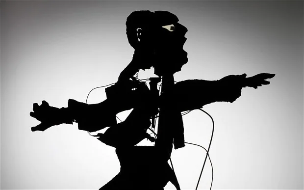
Lotte Reiniger's influence on William Kentridge, his own animations owing much to her sophisticated shadow play and of course all of these artists owe a debt to historical folk traditions such as Chinese and Indonesian shadow puppetry. 

Indonesian shadow puppetry

I'm very aware that several students have asked me about portraiture and this approach can be a very interesting way to break out of old habits in terms of facial depiction and composition. 
Tim Hawkinson. Emoter

I have posted on Tim Hawkinson's Emoter  a while ago and I think it is still worthwhile looking at his approach but this time in terms of portraiture. He breaks a face down into units, just as the body can itself be broken down. He uses blown up photographs of his own face to do this, so the type of simplification that drawing can produce isn't available to him, but the implications are still there. You could build a face in the same way that a body is constructed. 


Muscle structure of the face

Face mask with articulated jaw "elu" ("spirit") Nigeria, Ogoni

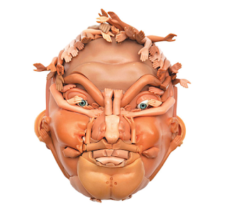
The degree of simplification you bring to this process will determine the visual look or feel of the images made. Compare the Nigerian face mask with an articulated jaw above, with a face made by Freya Jobbins from recycled dolls and the early 20th century paper toy face further below. 

Freya Jobbins

Paper toy face

The world of toys is another area of endless fascination in relation to these issues. Mr Potato Man has a wide variety of body and face parts now available to buy as extras that mean you can extend your Potato Man ideas even further. 

Mr Potato Man mouths

A Mr Potato Man mouth

When you look closely at the mouth forms that the plastic additions come in you may well find that they are very strange abstractions. The mouth above could be a design for an abstract painting. The more we separate a whole into parts, the more each part can become loosened from its original function. This process of atomisation is one that we are very good at, but which has also led us as a species to be able to cut up interconnected eco systems and divide the world into dis-functioning units. Every way of thinking has its effects on reality, and hopefully before we apply these conceptual models we think through their consequences. 

However it is in shadow puppetry that the most deeply mystical and spiritual of articulated images emerge. Like the cave wall that acted as a membrane between the world of the spirit and the world of the everyday, the thin sheet upon which the shadows move is another delicate membrane that sits between the world of the imagination and of reality. 

A figure from the Javanese shadow-puppet tradition of Wayang Kulit

Clive Hicks Jenkins has an excellent blog and he has given a far better explanation of the history of shadow puppets than I could ever manage, so do click on the link and read what he has to say about this wonderful art. 

Christian Boltanski 

Various contemporary artists have returned to articulated shadow puppetry, and as well as William Kentridge, Christian Boltanski and Kara Walker have made extensive use of the technique. 

Kara Walker

The Chinese pavilion at the 57th Venice Biennale saw the artists Wang Tianwen, Tang Nannan, and Yao Huifen working together to present ‘Removing the mountains from and filling the sea’, a shadow theatre performance. 


Wang Tianwen, Tang Nannan, Yao Huifen: Removing the mountains from and filling the sea

Wang Tianwen, Tang Nannan and Yao Huifen combined new and old technologies to make the work. Traditional skills in making the shadow puppets were combined with computer driven armatures, whilst some components were still fixed to bamboo sticks, such as the waves you can see in the image above. Their work reminds us that old and new technologies are in reality the norm. We keep using what works, whilst we invent new forms, and the one sits alongside the other. We forget that painting is an art form thousands of years old and happily go to exhibitions where it sits side by side with video projections and we have kitchens full of modern gadgets that sit alongside utensils that have changed little since Medieval times. 
It is not just artists that have thought of breaking forms down in this way. Detecting people in images is a key problem for video indexing, browsing and retrieval. The main difficulties are the large appearance variations caused by action, clothing, illumination, viewpoint and scale. Therefore the people that break down images for indexing, represent people use a 2D articulated appearance model composed of 15 part-aligned image rectangles surrounding the projections of body parts: the complete body, the head, the torso, and the left and right upper arms, forearms, hands, thighs, calves and feet. Each body part is numbered so that a numerical filing system can be applied to the images. 

From: Learning to Parse Pictures of People: Remi Ronfard: 2002

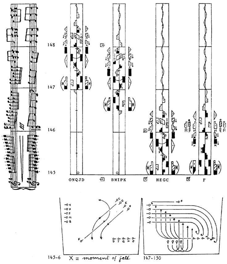
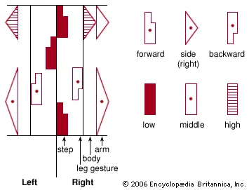
This way of visualising computer images of the body is now 20 years old and is no doubt in the scientific world of computing redundant, but it might be interesting to combine it with Laban notation. 


Laban notation

Of course once you begin looking at how to move a real body in terms of articulating it in sections you could take the idea out into performance and that could be a wonderful new beginning for the idea. What if we could extend or join certain parts?


Rebecca Horn: Finger gloves

See also:

Saturday, 17 December 2022

Drawing as theatre

Karina Smigla-Bobinski – ADA, 2010, sphere, helium, charcoal, installation view

One way you can look at certain types of drawing practices is to consider them as theatre. Theatre requires the activation of a space in such a way that an audience can experience a physically contained or constrained series of events, that are orchestrated to communicate particular ideas. In the case of Karina Smigla-Bobinski's drawing installation ADA for example, a box like room space is activated by a floating sphere with short spikes of charcoal attached to its surface. People are also allowed into this space as actants* and as they push or hit the plastic sphere it bounces around the space and 'draws' on all four walls, as well as the ceiling and floor. 

The ball is covered with 300 charcoal sticks with a spacing of 10 inches from one another.

ADA works very like a contact improvised dance performance, the audience being able to step in and out of what could be called an 'action drawing'. 

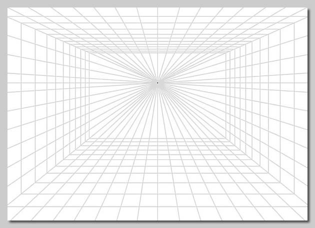
Performance is though usually associated with the theatre and the space of the theatre is often associated with perspective as a drawing mechanism. For instance perspective scenery is a scene design technique that represents three-dimensional space on a flat surface, creating an illusion of reality and an impression of distance. In effect perspective and theatre become fused into a new form, a form that like both theatre and perspective drawing creates an illusionary space for action to take place within it. This fusion was made possible by the introduction of the proscenium theatre. This involved the use of an arch, (sometimes curved and sometimes rectangular) which served as the frame within which the audience observed from a more or less unified angle the events taking place upon the stage. This 'frame' and separation of the audience from the performance, was in effect almost the same as one point perspective.  

The idea of the proscenium arch can be thought of as a social construct that divides the actors and their stage-world from the audience. In fact the seat that would be the perfect point from which to view the action, was often both the place where the person most powerful present would be seated and the spot opposite the controlling perspectival vanishing point. The curtain usually comes down just behind the proscenium arch, both hiding the stage from view when scenery is changed, but also reminding the audience of the reality that surrounds the illusion. 

The stage curtain was not introduced until the 17th century. When it was drawn back the plane it moved through was what became known as the imaginary forth wall. This was like a plane of glass through which the audience experienced the illusion of watching events happen from a distance. A situation that physically reinforced the fact that you could not intervene in what was happening, but God like, you could see what was going on, and therefore you were emotionally engaged, even though unlike the Gods you had no power to intervene. 

One point perspective

Proscenium Arch, Pantheon Theatre, London 1815

Palladio’s Teatro Olimpico in Vicenza

Because this type of stage fits the mathematical model of perspective, it also becomes very easy to use the various tricks of anamorphic perspective drawing to create further illusions. 
Palladio’s Teatro Olimpico in Vicenza exhibits an early use of anamorphic perspective, the illusion that the street is much longer than it really is, is created by a forced perspective. Forced perspective is a technique perhaps seen at its clearest in the Palazzo Spada, as created by Francesco Borromini. He designed a barrel-vaulted colonnade that looks much longer than it is by making the two sides of the colonnade converge and by reducing the height of the columns as they recede.
Palazzo Spada: colonnade: Francesco Borromini

Bramante’s Santa Maria presso San Satiro in Milan is another example of forced perspective, one that you can see easily when a photograph is taken from any point of view away from the one determined by the central vanishing point. 

Bramante: Santa Maria presso San Satiro in Milan

Bramante's perspective illusion choir viewed from the west transept.

In many ways paintings and drawings from this time could be regarded as silent theatre. Perspective created the illusion of a space constructed for action that sat behind a picture frame and the fact that theatres themselves were also now constructed using similar principles, for a while brought the two disciplines into close proximity, but there were other issues that also fused the two ideas. 

In painting there had been a long tradition of gesture as a way to indicate meaning. 
Representations of hand positions or gestures in portraits and paintings were some of the most effective ways of conveying messages. For instance the gesture of the blessing hand shapes the letters IC XC, an abbreviation for the Greek words Jesus (IHCOYC) Christ (XPICTOC) which includes the first and last letter of each word. Therefore the hand that blesses reproduces, with gestures, the Name of Jesus.
The blessing gesture

The language of gesture in Italy was firmly established and went all the way back to Roman times, when hand gestures associated with oratory were established and which were still understood in the 15th century.  


In the theatre, the Commedia Dell’Arte had flourished throughout Europe from the 16th through to the 18th century. (Our Punch and Judy is an English spinoff of this form of theatre). This was a theatre of improvisation which was undertaken within a framework of clearly established roles, with associated masks and stock situations. The professional players who specialised in these roles developed comic acting techniques that could be transported throughout Europe because they didn't rely on any one specific European language. The language used within a Commedia Dell’Arte improvisation was grammelot (nonsense and gibberish). Any audience member could follow the exaggerated physicality and the tone and pace of the voice. The languages of gesture, especially hand gestures, were vital to the construction of the required effect. Commedia Dell’Arte was a theatre style that heavily relied on physicality to build character. This acting style developed the concept of a leading body part (the body part that goes in a direction and the rest of the body follows). This incorporated the concept of centre of gravity in an actor’s body; for instance a bottom fixation could be contrasted to a posture centred on a nose. Imagine an earthy character constantly waggling a padded fat bottom always in confrontation with another character who always had their nose stuck up into the air in an attitude of constant aloofness. Add to this fast signing with the hands, especially with rude signs, as in a very vulgar version of present day British sign language and you can get an idea of the art form.

Watteau: The Italian comedians 

It is Watteau that brings the two traditions of visual art and theatre together again. I have posted about him recently because Watteau as a painter was someone who could deal with the visualisation of a society in a transitional state and I strongly believe that our society is also in a similar position. The people he depicts are set into liminal spaces and the space of the theatre is typical, as it sits between worlds. It is on the one hand 'real' as the actors and the stage are physically clearly in existence, but on the other hand it is an imaginary space, one that can be used to literally play out ideas. The relationships between people in Watteau's paintings and drawings are suggested by small gestures and body postures and you get the feeling that people's minds are suffused by a never ending series of unresolved actions and unfulfilled desires. They act out their lives but perhaps have forgotten their lines. You sense that the people in his paintings have lost direction, that they are unsure about the roles they should be playing and in compensation they turn to the Commedia Dell’Arte players who all know their roles and play them to perfection, day in, day out, to audiences across Europe. 

Deutschlands Geisteshelden: Anselm Kiefer 1988

Because of this understanding of theatre type perspectives being ones within which you can play out an idea, artists still use these one point perspective stage like spaces. Kiefer's large charcoal drawing on canvas, 'Deutschlands Geisteshelden' positions the viewer as if they are looking through a proscenium arch at a stage. Burning torches line the walls of a space that is empty except for the names of the actors scrawled above the fast receding, single point perspective floor. These actors (or actants) are German cultural heroes; Joseph Beuys, Arnold Böcklin, Adalbert Stifter, Caspar David Friedrich, Theodor Storm, and others. These are the actors of a painful history play and Kiefer sets out his image as a stage, so that he can make them perform as ghosts of their former selves. All are dead, Joseph Beuys, his mentor dying in 1986, just before Kiefer began drawing out the image. Kiefer I'm sure was well aware of the relationship between images made using one point perspective and the theatre, he is a well read artist and he cites many literary figures as past influences on German culture. The image as a stage whereby ideas are acted out continues to be a powerful idea and as more performative ways of working have emerged out of traditional drawing practices, I would suggest that the fusion of drawing and theatre is something that will become more and more the norm. 

So is Karina Smigla-Bobinski's 'ADA' part of this tradition? I would suggest it is. The large sphere is playing out the role of a performer, or actant, alongside the people that have to enter the space to move it around. Without the people, the sphere would just sit there. The resultant drawings, like in all 'draw to perform' works, are traces or recordings of the event. ADA is also in form very like the virus that has invaded our lives over the last few years, a fact that begins to give extra traction to the non-human character Smigla-Bobinski has invented. I have for some years now been interested in animism and I would argue that ADA operates within an animist framework, the sphere becomes an actant in the same way that any objects in an animist framework can become part of the interconnectedness of the life system that someone belongs to. The term 'actant' is itself a reminder that within an animist world we are all actors; landscapes, people, plants, rocks, animals and the weather and that perhaps by returning to these types of very ancient traditions, we might find that we begin to regain a much older and more productive relationship with all the things that surround us, but which we have for many years ignored because they were not other humans. 

* Actant: Is a term used in literary theory and is a way of referring to a person, creature or object playing any of a set of active roles in a narrative or event. This means that in this case the people who enter the space defined by 'ADA' are as much a part of the event as the sphere. By using this term you can suggest that both the actors and the scenery are acting out vital roles within a play. It is also a term that helps us think about how in 'object orientated ontology' humans and other things can be considered as having an equal footing on the bill of life. 

See also:


Life or theatre