Thursday, 27 August 2020

Graffiti was always a serious art form

BLU

I haven’t put up many posts on graffiti and yet as an art form it is probably the closest to pure drawing. I wonder if its my age or a certain unconscious bias that has kept me away from reflecting on an area of art making that surrounds me and where I can walk out and see good examples of it within seconds of emerging from the house. I did a few years ago put a book together about the streets texts of Chapeltown where I live, ‘Wits Breath Edion’, https://www.blurb.co.uk/books/2308745-wits-breath-edion and its still available on-line but I have not been alert to the latest developments of a movement that continues to be very powerful globally. However I need to remind myself of the issues involved because I have just been given an MA level graffiti artist to supervise, and so as I go through the process of preparation by reacquainting myself with some of the key background issues thought it would also be an opportunity to develop a blog post outlining what I think are the key issues surrounding graffiti art form practices.

You could define graffiti as an art form of the proletariat, being an old left wing socialist I have always thought of it as a way of making marks on a property canvas; by this I mean that walls or the surfaces on which graffiti is made, are usually owned by someone and yet the images made on them are usually produced by those who own little or nothing. This I do understand is an old trope or stereotype and as I pointed out just the other week, stereotypes are dangerous so perhaps I’d better broaden my definition.


A Marxist reading of graffiti would highlight how it works in terms of stages in the redistribution of property. In this case the use-value of a wall or other surface is becoming appropriated by the graffitist and the surface’s owner is losing control over one of the meanings of his or her property. However many current graffiti artists are using their style for commercial gain, the spray paints they use are expensive and the culture from within which they operate is much more complex than that attacked by certain urban revolutionaries. For instance a Banksy image stencilled on a wall can increase its value considerably and yet at the same time he is very critical of certain capitalist values and his work is often considered a left-wing critique of the establishment. 


In 2001 IBM employed graffiti advertising by spray-painting images on pavements.


Ogilvy and Mather: IBM Linux ad


The ad agency Ogilvy and Mather were using graffiti images to bring attention to IBM’s launch of a new Linux based e-server by linking in the idea of graffiti to the counter-cultural roots of Linux as open-source, community-driven software. This awareness of commercial possibilities was a product of capitalist appropriation and for some time before this there had been a gradual drift of street art into gallery spaces, the most notorious perhaps been the parallel careers of Jean Michel Basquiat and Keith Haring. 


Bansky comments on Basquiat

Basquiat's work was highly political, it questioned everyday racism and the fluid nature of identity and Haring supported rallies against apartheid and the campaign for nuclear disarmament as well as being an early AIDS awareness advocate. Both artists emerged from the New York graffiti scene, hence their left wing credentials and were taken on board by fine art galleries. It has been argued therefore that their early left wing stances were appropriated and neutered by being turned into commercial products. It is this argument that now lies central to the ambiguous nature of more recent writing about graffiti, is it truly a style of the streets or is it yet another platform for wannabe gallery artists? I don't have an opinion on this and think it's too complicated an issue to unpick as I don't know enough about the current situation, however anyone thinking of developing a graffiti practice does I think have to at least be aware of the issues. 


Advertising directed at your counter culture

When Sony decided to use graffiti type images on the streets of American cities, of urban kids playing with the PSP handheld device as if it were a street culture icon, there was an immediate backlash from the graffiti community. However the line had now been blurred and a number of graffiti artists, including Mike Giant, Pursue, Rime, and Noah have used their street credentials to support new careers in the design of skateboards, T shirts and other urban wear including shoe design. 

'Become a walking art installation with the Dr. Martens X Jean-Michel Basquiat collection. Iconic silhouettes are adorned with Basquiat illustrations to take your look to new levels' Text pasted from Doc Martin's website.


Doctor Martin's in the case above suggesting that by buying their boots decorated in imagery derived from Basquiat's paintings, the wearer can become a walking art installation. What this image also suggests is how much humans need imagery in order to brand themselves as belonging to certain 'urban tribes'. In this case the wearer can suggest an interest in creativity, urban style, black street culture as well as suggesting an edginess due to the fact that everyone knows that Basquiat was a drug addict and that he died young like so many teen icons. 

Haring seemed to understand the very ancient roots of graffiti, and as soon as you see his imagery painted directly onto his body, you get a sense of how 'tribal' some graffiti is. 

Keith Haring

A performer at the Ayres rock Tjungu Festival

Body decoration in many cultures including our own is usually part of a 'total art' or gesamtkunstwerk, which is an approach to using imagery, music, dance etc., all together, as a way of communicating what it is to be a human embedded into a particular culture at a particular time. Think of someone today going to the tattoo studio, hanging out on the street, wearing certain clothes, then moving on to a music scene to listen to a certain type of structured sound. It should all hang together for them and be part of the way they develop an identity. 

High Viz street culture festival Birmingham 

The idea of 'street culture' is now so embedded into contemporary consciousness that cities like Birmingham are now bringing together comic book, dance, skateboarding and graffiti as annual festivals celebrating the contribution of street life and culture to the city. 
Of course when this happens some will decry the artists as selling out, whilst others will bemoan the fact that the city is allowing graffiti and urban culture to become acceptable. All of these ideas are also mixed in with issues surrounding the fact that cities are multicultural and that they are melting pots of culture clashes, high art coming up against hip-hop, poetry against tagging, oil paint against the spray can. You are either excited by the potential of new hybrid art forms emerging from this chaotic mix or are worried that what you have always understood as culture is being eroded by something that you never even considered as art. What you cant do if you live in a city is ignore it. 
From a personal point of view I think that people will always want to celebrate their identity and that if you begin to elevate one way of doing this over another you begin the process of selecting out the culture of the elite or powerful. A healthy culture is not a fixed culture, it is one that is open to change and is confident enough to reflect that the only things that are constants in life are growth, death and energy transfer. 

Basquiat and Haring were followed into the gallery by many other graffiti artists, and as they transfer across and become more acceptable their work becomes appropriated by academia. In my own institution Sweet Toof has been a visiting lecturer and his work it has now being argued is a modern continuation of the 'vanitas' tradition, his teeth standing in for the full skull image that was used to remind us of the fact that death is always with us.

Sweet Toof

I opened this post with an image of Blu's work, one that if you click on it becomes an animation. I have been following Blu's practice for a few years now and his work attracts me for a number of reasons. First of all he reminds me that all drawing is in some ways a performance. He will be acting out the drama of these animations in such a way that they extend over several days, as he makes drawings, paints them out and remakes, over and over again as they make their way over buildings and along streets, each drawing being a clearly thought through follow on from the one before. Of course he needs a supportive team of people filming his drawings as they unfold, and the team becomes part of the street performance. He is also very inventive, and the invention begins with the environment within which he is working, as William Kentridge said about his own animation drawing, "there is always discovery in the making". In this case the drawing begins with outlining a single brick in a wall. Once the work is done we are left with a cleaned off surface, each drawing being wiped out as a new one replaces it. This means that the work is ephemeral, something that is enacted as street drama, but not left so that it becomes dated or inappropriate because the moment or issues it reflects upon has now gone. 


PHLEGM

More locally to Yorkshire PHLEGM, who is based in Sheffield, has been making images that I think work very well in an urban setting. He uses images drawn in black over a white silhouette. This is a very canny way of making his drawings stand out against a variety of different backgrounds.  

If you want to get an idea of how the New York graffiti scene changed over a period of time when some of its members became art stars, perhaps the film KENNY SCHARF: WHEN WORLDS COLLIDE, is the best introduction. It was made over 11 years and features interviews and rare archival footage with Kenny Scharf, Andy Warhol, Jean-Michel Basquiat, Keith Haring, Ed Ruscha, Dennis Hopper, Yoko Ono, Kaws, Marilyn Minter, and Jeffrey Deitch. 

See also:


The tattoo as drawing

KAWS

Underground comics

The idea of the mash up, where street art meets music in a gesamtkunstwerk,

Thoughts from the Los Angeles graffiti scene

When writing is not writing, the way that even the removal of graffiti creates meaning


Sunday, 23 August 2020

Léon Spilliaert at the Royal Academy

Léon Spilliaert's work is on exhibition at the Royal Academy until the 20th of September. This is an artist few of you will be aware of because it is only recently that critical opinion has shifted in his direction and work that was considered very inferior Ensor type imagery, is now celebrated as work that captured a certain type of mental anguish that existed at the time. Perhaps it's due to our own day's preoccupation with the mental pressures of being locked down and being constantly made aware of the invisible dangers of virus attacks, that has made critics re-visit Spilliaert's images and now see them as important.

Again we have a story of a once thought of poor or unimportant artist's work, being elevated into the parthenon of great art. On the one hand we all benefit by now being able to see his work, but on the other hand it makes me very cynical, as it is hard to resist thinking about the capitalist machinery behind all this reappraisal. Who will benefit from the sudden rise in auction prices and will any of the many struggling artists throughout the world gain anything from his travel from obscurity to fame, beyond a feeling of "well perhaps maybe"...?

The work is though interesting and it reminded me of Munch more than Ensor. The moody threat that lies behind certain types of image abstraction was I thought very potent. As we select out or abstract things from the world in order to envisage it, we are left with the things that reflect our own proclivities, in this case Spilliaert was obviously always aware of the threat that lies in dark pools of shadow, a half seen thing or a sinuous shape. All of which are things that we can flesh out through drawing and it is a certain type of reductionist drawing that lies at the root of his image making.


The image above of a bed covered in a white sheet could be a simple study in tone, but of course the white shape can also become a ghost like figure, we read the empty space as absence, and we are presented with a sparse composition that makes us think that someone has just died.

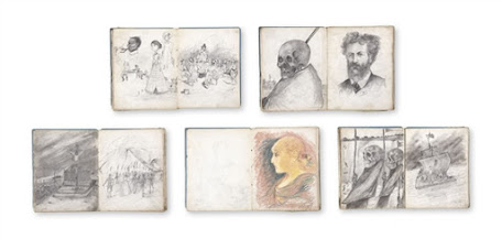
Spilliaert drew a lot when a child and we still have his sketchbooks.
Sketchbooks always help us to see how an artist thinks and in Spilliaert's early work you can see a certain morbid fascination coming through very early on; perhaps he was a sickly child.

For myself, I am mainly interested in the way that he can animate inanimate objects by drawing them in such a way that there is a certain ambiguity about their representation. 


The pair of gloves above could be anything from jellyfish to old people, they morph between one form and another, which I can see from Spilliaert's point of view made them slightly sinister; however I like the humour and playful possibilities suggested in the way these gloves are always on the edge of dissolving and becoming something else. I mentioned Flann O'Brien's 'The Third Policeman' recently as an alternative type of drawing theory and this is another image that I think fits into O'Brien's comedic model.

See also:


The Royal Academy details of the exhibition


Monday, 17 August 2020

Is drawing a language? Part four

The very idea of thinking of drawing as a language is problematic. We have long been accustomed to believing that the things that we take as being central to being a human being must also be central to the understanding of everything else. It has been argued by many that language is what makes human beings special and that the way that animals communicate is biological, or inborn. Human language it is further argued is symbolic, using a set number of sounds (phonemes) and characters, which allows ideas to be recorded and preserved. Animal communication it is argued is not symbolic, so it cannot preserve ideas of the past. Is that it then? 

This definition presumes that language is to do with phonemes and alphabets and that it is the use of symbols that singles humans out as being different. But what if a nest was a language event? Tailorbirds get their name from the way their nest is constructed. The edges of a large leaf are pierced and sewn together with plant fibre or spider's web to make a cradle in which the actual grass nest is built. Male weaver birds weave nests and use them as a form of display to lure prospective females, their efforts being both a protection for eggs and young chicks, as well as being part of a sex ritual. So we are happy about the fact that birds make things that operate as both protection and as sexual display, but we don't recognise their activities as including a language? So how do they communicate? Is not the nest structure something that is complex and robust enough to preserve an idea long enough for others of its species to consider its shape and construction in order to made decisions about future life paths?

A tailor bird builds a nest

An act of communication is the transferring of information from one thing to another thing. Every communication involves (at least) a sender, a message and a recipient, or a starting point, a movement between and an end point.  Communication includes the medium used to communicate and the location of the communication. So lets think about bees. 

The Roman poet Virgil had this to say about them, "Some, too, the wardship of the gates befalls, who watch in turn for showers and cloudy skies." An interesting piece of communication on Virgil's part because he is telling us that he has in some way been communicating with bees and that they in turn have been communicating with atmospheric conditions. The bees need to know when it is about to rain because they risk injury if they are caught flying in a rainstorm. Their navigation senses rely heavily on the sun and a rainstorm would in effect make it impossible for them to find their way around. 

Diagram of a bee's waggle dance

So there is a causal link between an inanimate thing, (atmospheric conditions) an insect, other insects and a human being. We know that bees communicate partly through the medium of dance and one way to think of that is as a living, moving diagram, a sort of mime or body language as us humans would translate it. In order to fly you need excellent sensitivity to changes in temperature, air pressure and wind direction, all attributes that could also be used to predict the imminent approach of rain.

I have been trying to learn more about Indian aesthetics and the more I research into the history of what is a very complex and fascinating aesthetic system, I become more and more aware of its roots in human body language, especially dance and eating. At the centre of Indian aesthetics is 'rasa', one understanding of which is the enjoyment of flavours that arise from selected ingredients and their preparation. The 'Natya Shastra of Bharata' is a complex drama and dance manual written about 2,000 years ago and it includes 108 codified units of movement,  including hand movements or 'mudras' which in turn have been preserved by being carved into sculptures now to be found in ancient temples. These hand movements could be read as a living diagram. 

Chin or Vitarka Mudra

The thumb touches the index finger, the meeting of the powerful grasping thumb with the sensitive index finger is meant to evoke mindfulness. 

Abhaya Mudra

The open hand, palm presented upright and frontally to others, is a gesture of fearlessness of reassurance and safety, a gesture which dispels fear.

Namaskara Mudra

The pressing of both palms together, a sign of joining and togetherness communicates reverence or a polite form of greeting.

Bhumisparsha Mudra

All the fingers of the right hand extend downwards to touch the ground. This gesture communicates grounded enlightenment. Originally in Buddhist traditions the earth pressing mudra is often found accompanied by the left hand held flat in the lap in the dhyana mudra of meditation. 


So going back to my original question, 'is drawing a language' I suppose I was really asking a another question, are all forms of communication languages? Is any effect by one thing on another a type of communication? Perhaps its simply a matter of focus. As communication includes the medium used to communicate with and the location of the communication, if we focus on this, we get very quickly to Marshall McLuhan's concept of 'the medium is the message'. He proposed that a communication medium itself, not the messages it carries, should be the primary focus of study. In the case of hand gestures the medium is located in the human body, so we would need to return to a close observation as to how the body moves and how we begin to develop meaning from an observation of the body in movement. This I suppose also suggests that a question such as 'is drawing a language?' is really redundant and that what is much more interesting is how is communication made between any two things and what sort of communication is it? 


The secretion of fungal volatile organic compounds (VOCs) are used by fungi as a mechanism to protect themselves from enemies or to manipulate their surroundings.  They can operate as a means of communication, but these chemical signals are also able to specifically manipulate the recipient. VOCs can reprogram the root architecture of symbiotic partner plants or increase plant growth, they can also enhance plant resistance against pathogens by activating phytohormone dependent signalling pathways. In this instance it is quite clear that the communication process is also shaping and changing the recipient of the communication. A fungi is changing and manipulating the life of a plant. Chemical change is central to how I work as a human being, and a lot of the chemicals I put into my body are derived from the plants that I eat. So I could argue that my drawings, which are the result of my own predilections, which in turn are chemically led and are in turn heavily influenced by the food that I have been eating and that this in turn has been shaped by a fungal volatile organic compound, are also the result of chemical changes within a complex electro-chemical organism. If my drawings are the result of chemical changes that are the product of this chain of consequences, it could be argued that it is the mushroom that draws. 


Beatrix Potter: A snail and its young


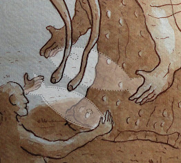
This image of a giant snail creature communicating with a man about the relative sizes of fish they had in their respective imaginations caught, is a result of a chemical memory, one that has carried within it an image for some time of the drawing by Beatrix Potter further above. For whatever reason I had to get it out of my system by redrawing it, but Potter would not have had me in mind as the recipient of her 'message' when she drew this image and would herself have been more effected by an encounter at one time or another with a snail. You as someone looking at both images have already begun to manufacture a chemical memory of the experience and you may or may not pass it on. The image below was part of my own chemical chain response to a process not unlike Chinese whispers.  


See also:


The pioneer plaque

Invisible worlds

Drawing and communication theory

Is drawing a language part one

Is drawing a language part two

Is drawing a language part three

Drawing and object oriented ontology 

References

McLuhan, M (1964, 2001) Understanding Media: The Extensions of Man London: Routledge

Schwartz, S. L.  (2004) Rasa: Performing the divine in India Columbia University Press

Werner, S., Polle, A. & Brinkmann, N. Below ground communication: impacts of volatile organic compounds (VOCs) from soil fungi on other soil-inhabiting organisms. Appl Microbiol Biotechnol 100, 8651–8665 (2016). https://doi.org/10.1007/s00253-016-7792-1

Thursday, 13 August 2020

Pouring water

I have just bought a new electric kettle and the instruction booklet came with the image below. I have put up several posts about water as a graphic challenge for artists, but have yet to devote anything to the visual ideas related to how water shapes itself when it is poured. 

Image from a Phillips electric kettle manual

I was particularly struck by the graphic invention of what look like some form of very thin tadpoles to portray the idea that the water spirals around itself as it enters the cup.  

David Hockney

Once more David Hockney comes to the fore when we come to think about various ways of depicting pouring water. His restless exploration of how to depict the things that are always in movement is central to his thinking about the continuing legacy of Cubism. This is an intriguing image that in its composition reflects a scientific diagram, but in its various renderings of water is a celebration of invention. It is interesting to compare Hockney's drawing with the one below taken from a scientific text. These drawings have been taken from photographs, and although they are similar to Hockney's, the invention is in the slow motion technology of fast film and a well adjusted camera lens focus, rather than long slow looking and drawing. 


Watching a cup of coffee being poured and then re-watching the liquid coffee as it travels from the lip of a cafetiere down into an empty mug, can become a wonderful series of intoxicating revelations. The design of the lip, the speed of pour, the make-up of the coffee, the height between the lip and the mug, the time of day, the angle of light as it illuminates the rich brown stream of coffee, your position in relation to the event, all of these factors are operating and are part of the miracle of seeing something. This type of experience is important because it sort of explodes an idea of what is in fact happening all the time. We are immersed in a field of constant change, movement is central to what it is to be. To become aware of this, is to become aware of being alive. But we rarely regard the table as being something in constant change, seen from the viewpoint of the rock on which sits the building, within which the table sits and where you observe it, the table could be considered a very flighty thing; one minute being a tree, the next some sawn planks and then a thing shaped by carpentry.  

Some drawings of water are simply just strange. I love the drawing below of water issuing from a tap. I comes out almost like a droopy sack and the fact that the tap itself just floats in the air and is made of the same drawn marks as the water, suggests that some sort of physical exchange has taken place, perhaps similar to that between the policeman and his bicycle saddle in Flann O'Brien's the Third Policeman. The water is no longer water and the metal tap is no longer metal, they are now a water/metal composite, a new hybrid thing that has never been seen before. 


Now that I come to think of it, if you have never read the Third Policeman you have missed out on reading what is probably one of the seminal theoretical texts about how to think about drawing. Look carefully at the drawing below and imagine what must have happened for the water to be poured at that particular angle into the glass, there is something of the physics of the impossible here.
Water pouring into a glass, emerging from a logically impossible position

Now read this extract from the Third Policeman by Flann O'Brien

“Did you ever discover or hear tell of the atomic theory?” the sergeant inquired.

 “No,” I answered.


He leaned his mouth confidentially over to my ear. “Would it surprise you to be told,” he said darkly, “that the atomic theory is at work in this parish?”

“It would indeed.”

“It is doing untold destruction,” he continued, “the half of the people are suffering from it; it is worse than the smallpox.”

He walked on, looking worried and preoccupied, as if what he was examining in his head was unpleasant in a very intricate way.

“The atomic theory,” I sallied, “is a thing that is not clear to me at all.”

“Michael Gilhaney,” said the sergeant, “is an example of a man that is nearly banjaxed from the principle of the atomic theory.

Would it astonish you to hear that he is nearly half a bicycle?”

“It would surprise me unconditionally,” I said.

“Michael Gilhaney,” said the sergeant, “is nearly sixty years of age by plain computation and if he is itself, he has spent no less than thirty-five years riding his bicycle over the rocky roadsteads and up and down the hills and into the deep ditches when the road goes astray in the strain of the winter. He is always going to a particular destination or other on his bicycle at every hour of the day or coming back from there at every other hour. If it wasn’t that his bicycle was stolen every Monday he would be sure to be more than halfway now.”

“Halfway to where?”

“Halfway to being a bicycle himself,” said the sergeant.

“Your talk,” I said, “is surely the handiwork of wisdom because not one word of it do I understand.”

“Did you never study atomics when you were a lad?” asked the sergeant, giving me a look of great inquiry and surprise.

“No,” I answered.

“That is a very serious defalcation,” he said, “but all the same I will tell you the size of it. Everything is composed of small particles of itself, and they are flying around in concentric circles and arcs and segments and innumerable other geometrical figures too numerous to mention collectively, never standing still or resting but spinning away and darting hither and thither and back again, all the time on the go. These diminutive gentlemen are called atoms. Do you follow me intelligently?”

“Yes.”

“They are lively as twenty leprechauns doing a jig on top of a tombstone.”

“Now take a sheep,” the sergeant said. “What is a sheep, only millions of little bits of sheepness whirling around and doing intricate convolutions inside the sheep? What else is it but that?”

Now that you have had a taste of the O' Brien text perhaps you have an inkling of why it is so central to the development of drawing theory. Art is about the making of the impossible possible, of creating new realities for the mind/body and woven straight through the middle of it all, is the fact that it can also be very funny. 


See also:


If you are wanting to develop your Illustrator skills there is a very good 'how to do it' tutorial here


Saturday, 8 August 2020

The portrait as stereotype

We are taught very early on to avoid stereotyping when making images of people because in image making stereotyping is associated with some of the most painful periods of human history. Because of my own awareness of family history and of how jews were portrayed during the nazi regime in Germany, I can clearly see that stereotyping is associated with removing individuality from people and treating them as if they have no individual human consciousness or feelings. This makes it so much easier to then take the next step, which is to treat people as if they are soulless objects, things that exist only to be done to. Stereotyping was a key element of the nazi process of trying to eliminate jews and others.  So why put up a post on the portrait as stereotype? 

The people that are visually stereotyped tend to be those that are 'invisible' or oppressed or simply belong to a set of people that can be categorised as 'other', or people not like me. In this category you do sometimes get stereotypes of powerful people, however the point about the stereotype is that these are faceless portraits, and its a lot easier to brand the disempowered with things we would like to not associate with. Stereotyping is a line that is easily crossed and one to be treated very carefully if you are going to go anywhere near it. When the powerful are stereotyped, somehow they seem less abject, we often see bankers stereotyped as suit wearers carrying large bags of money, or surrounded by symbols of wealth, yes their individuality is taken away but aspects of their power remain. 


The pin striped suit stereotype can be enough to stand in for great wealth and privilege, but interestingly there are no human facial features being shown in these cartoons, unlike the recent image below of a jewish banker based on a cartoon by Ben Garrison. I thought that these images were done with and a thing of the past but I was wrong, and the evil money grabbing jew as a stereotype still exists and is part and parcel of some right wing rhetorics. Notice how different this image is to the ones of the bankers, the body posture suggests weakness, rather than the more statuesque deportment of the cat\men above. This post is hopefully a warning about how easily these things come back into play. Poor Ben Garrison has no control over what people can do with his images and the PhotoShopped version of his original reminds me of another evil circulating around the internet; doctored imagery. CGI can undermine our notions of what is true and what is fiction. 

Ben Garrison's work above has been targeted by right wingers and they have even invented a fake right wing biography for him

The only time I have ever seen the stereotype used in such a way that it doesn't lead to dehumanisation is when it is deliberately used by those who have been stereotyped to raise awareness of the very stereotyping that they face. 

School Report: Tam Joseph

Tam Joseph's 'School Report' reminds us of how male black youths are stereotyped by society, however his drawings have just enough of a personality to them to avoid that demeaning characteristic of features exaggeration that Oscar Arredondo points to when he demonstrates the insults inherent in images of stereotypical Indian figures. "Chief Wahoo," the bucktoothed mascot of the Cleveland baseball team is transformed by him into a series of stereotypes of people of other cultures or religions. As Arredondo points out, none of them would be tolerated in contemporary America, except the image of Wahoo himself. Sadly Arredondo has missed some of the work which is promoted by certain extreme groups. Perhaps he should have stated, "none of them ought to be tolerated in our contemporary society".
The 8 portraits above from Oscar Arredondo's exhibition, "A Mile in My Moccasins," are cruel, simplistic, anachronistic and vulgar, but as part of an awareness raising campaign about the fact that Native Americans do not deserve to be denigrated as cartoon mascots, it has worked and the Cleveland baseball team has now dropped its use of the old mascot. However I think the work is still problematic as not only does it remind us of how easily stereotypes can be developed, it also reminds us of how hard it is to then remove them from our mental image banks. 

Toyin Ojih Odutola

Toyin Ojih Odutola has responded in a very different way to being stereotyped. She read that in 1910 a German archeologist on discovering anatomically correct bronze sculptures in Nigeria, decided that Greeks from Atlantis must have made them, as he couldn't get his head around the 
fact that Benin bronzes could have an aesthetic superficially similar to certain European traditions. Africa and its many peoples was seen as a stereotype at the time and in many ways that stereotype still exists. She therefore in response to the German archeologist's crazy invention, decided to create her own world, one where black women are powerful. At one point in her life Odutola had moved to Alabama and it was when living there she had been forced to question why she had become to be seen as a black stereotype that was aberrant in some people's eyes, and because she enjoyed drawing she turned to this as a way of dealing with these problems of 'otherness'. She also makes portraits, but she states, they are composites of multiple people and she says she is very fortunate in "having really badass beautiful people" around her to draw, but her 'composites' go beyond the stereotype and become people; people that in the Barbican exhibition, were made by drawing on black paper. 


Toyin Ojih Odutola: Lonely Chambers (T.O.), 2011, pen ink and marker drawing on paper

Hardeep Pandhal is another artist that has explored stereotyping; in particular people from the Indian sub-continent. In his work Sikh painting traditions meet the English graphic traditions of the Beano and Viz and as they do, a cartoon image of a Sikh emerges and is used by Pandhal to question how the points of entry into culture operate, especially for those born and bought up in England, but who also live within a sub-culture that still retains many of the cultural traditions of a previous time and place. 
Hardeep Pandhal

Cartoonists deal with stereotypes on a daily basis, this allows them to achieve a direct communication with their audience, but this also comes with dangers. Some of these dangers are intellectually problematic in that any stereotype misdirects its audience and allows us to think that a situation or individual is simplistic or without human warmth, but some are mortally threatening, as to poke fun and to undermine by using a cartoon like image can cause deep offence. Cabu, Charb, Tignous and Wolinski all worked for Charlie Hebdo a satirical magazine that attacked many targets in the name of humour and who caused deep offence in the Muslim community by both the stereotypical portrayal of arabs and muslims as well as of course irreverently making cartoon images of God. The anger caused by their work of course led to their deaths. You might argue that these are not fine artists, but in France the dividing line between cartoonists and artists isn't as fixed as it is in England, all are seen as image makers. 
Honoré Daumier was imprisoned for six months in 1832 for his depiction of King Louis Philippe as Gargantua and Daumier as an artist has at times been compared to Goya and although some would argue to the contrary, I see all these images as attempts to illuminate the human condition, some might be better than others, but surely that is the case with all art and if we always shy away from confronting political issues, we will never achieve that better world which I'm sure we would all like to help bring to fruition. The line between cartooning, stereotyping and politics can be a very difficult one to control, where does it demean or undermine the humanity of those portrayed and where does it illuminate a power imbalance or injustice? Just because it is a difficult path to follow doesn't however mean that as an area of work it should be avoided, just that I would urge caution and suggest that you test out any work made in this territory with a few other people before going public. 

'Toyin Ojih Odutola: A Countervailing Theory' is at the Barbican Centre's Curve Gallery from August 11th until the 24th Jan 2021.

See also: