Tuesday, 28 March 2017

Kenneth Armitage at the Stanley and Audrey Burton Gallery


Kenneth Armitage is an ex student of Leeds College of Art, who made a very powerful body of work in the 1950s, a selection of which is on exhibition at the Stanley and Audrey Burton Gallery over the road from the college.
Alongside his sculptural pieces, his working drawings for them are on exhibition, these are also worth having a close look at and they suggest that one way to think about his sculptures are as a 3D extensions of drawn forms.
He was very interested at the time in the human figure, in particular when seen in small groups. Therefore several of the drawings in the exhibition show him exploring the possibilities of figure and mass, in particular what happens when one body meets another. His drawings have a fresh directness that communicate an energy and a searching for a summation of a particular experience of bodies, that still feels relevant over 50 years after they were produced.
The exhibition brings together sculptures and drawings of the 1950s, which coincide with the time when he undertook the University of Leeds Gregory Fellowship and includes loans of work drawn from public and private collections across Britain.


Kenneth Armitage: studies for sculpture

For more information see the gallery web-site


Monday, 20 March 2017

Joan Jonas Drawing and Performance

Joan Jonas: Performance drawing

Drawings have long been integrated into performance but it takes courage and a lot of confidence in what you are doing. Sometimes this means just growing into the role. Joan Jonas is a mature artist and this video is typical of her work. Since the 1960s, Jonas has worked using space, movement, ritual and gesture. She pioneered the use of film and video in performance, and later began to incorporate fairy-tales and folklore into her work, turning away from the camera toward a more drawing led, narrative and text-based practice. She has always combined traditional and new media in her work and you often get the feeling that she has ‘just left the premises’ when you visit one of her installations. She has a way of leaving things as if she just stepped out of the room. When drawing she tends to just see what comes off the end of the brush, stick or whatever she is making marks with. As her work is as much about the ritual of tapping into the subconscious as it is developing a clear narrative, she just lets things happen.

This can mean that her work at first looks childish, but it is in fact child like. I.e. it taps into a freshness of discovery that is vital if you are to keep work alive and operating in the now. 
I particularly think her horses are very funny, I can almost hear them clomping along. The addition of the heavy black horseshoes is what always gets me, they are horse shoes or perhaps even horse slippers.


Joan Jonas: Horses

The power of repetition is also part of a performance ritual. By drawing things over and over again, they gain an authenticity and aggregated weight, which makes them more memorable. 

Joan Jonas: Dogs

The dogs are drawn with charcoal and chalk fixed to the end of sticks, They hold on to the action of each drawing as a performance, each image a trace of her arm making its way through a space of its making. As she gets older things get shakier and that's part of the point. 


Compare her performance ideas with the work of Caroline Denervaud.

Compare to these Robert Morris drawings of gestural mark making that are about the limitations of the body over time. 

The amazing performance magazine archive 


Friday, 17 March 2017

The practice and science of drawing


The Practice and Science Of Drawing, by Harold Speed was a classic book of its time. Published in 1913 it set out to give a fully rounded introduction to drawing, both as an observational practice and as a means towards developing composition and expression.

Speed has some interesting observations and is very opinionated when it comes to critiquing other artists. The book reads as if it comes from another world, an age well before modernism, but you need to remember that Cubism and early abstraction were already well established in mainland Europe when it was written.

However when he gets to unpicking why he doesn’t like academic approaches to drawing he has this to say about too much precision.

‘There must be enough play between the vital parts to allow of some movement; "dither" is, I believe, the Scotch word for it. The piston must be allowed some play in the opening of the cylinder through which it passes, or it will not be able to move and show any life. And the axles of the wheels in their sockets, and, in fact, all parts of the machine where life and movement are to occur, must have this play, this "dither." It has always seemed to me that the accurately fitting engine was like a good academic drawing, in a way a perfect piece of workmanship, but lifeless. Imperfectly perfect, because there was no room left for the play of life. And to carry the simile further, if you allow too great a play between the parts, so that they fit one over the other too loosely, the engine will lose power and become a poor rickety thing. There must be the smallest amount of play that will allow of its working. And the more perfectly made the engine, the less will the amount of this "dither" be’.

The concept of a drawing having life comes up yet again, as it did in the previous post. In this case Speed comes up with the idea of ‘dither’ to explain it. However he also warns against too much ‘dither’.

I can see what he means, energetic markmaking for its own sake can become a mannerism and when it does a drawing begins to lose authenticity.

I think Speed’s book is a salutary read. It comes from a time when people could have firm convictions as to what is right and wrong about art, convictions now long denounced as outdated and obsolete in this time of post-post-modernism. 


His sections on composition like the one illustrated above, take me right back to school and those art classes whereby we had to draw out the various underlying dynamics and geometries of a painting’s structure.
Even though no longer taught (well not in most undergraduate Fine Art courses in England), it is still useful to go back and look at how an awareness of these things was achieved. I have seen so many poorly composed images or even worse images that have no conception of a relationship between surface organisation and meaning, that I personally believe it would do no harm to look again at these things, even if simply to consign these ideas to history. At least people would be able to make a decision as to why no compositional construction is needed or how their approach to constructing a figure differed from more traditional methods.

Speed himself saw his approach as being modern. He wanted to free students from the tight constrictions of the academy. He is one of the direct descendants of the staff that now teach cutting edge contemporary practice at Goldsmiths. He indeed uses an example of student work done in classes there to illustrate a point. I went to art college nearly 60 years after this book was published, the book is now of course over 100 years old, so my art school experience should feel as out of date now to contemporary students as his did then to me. 

England was slow to take on the lessons of Modernism, but when it did it took the teaching of the Bauhaus to heart and the institution I now teach in was at the forefront of the radical change to art education when it finally happened in the 1950s and 60s. 

However I’m always worried about throwing out the baby with the bathwater and when you look back, you can always find things of interest. So why not read this book and see if there is anything in it that still makes sense to you?

Download here The Practice and Science Of Drawing, by Harold Speed 

Compare Speed's book with earlier writings that influenced him.

In particular Hogarth'sThe Analysis of Beauty  and SirJoshua Reynolds's Discourses

The further back we go the firmer in their convictions art educators become. As Reynolds states in relation to the setting up of the Royal Academy: 'The student receives at one glance the principles which many artists have spent their whole lives in ascertaining; and, satisfied with their effect, is spared the painful investigation by which they come to be known and fixed.  How many men of great natural abilities have been lost to this nation for want of these advantages?' 

Compare this situation to contemporary books on drawing practice. For instance 

'Drawing Ambiguity: Beside the Lines of Contemporary Art' published by 'Tracy' the collective name for the centre for recent drawing in 2015, has this to say about drawing; 

'A position of ambiguity, a lack of definition, is not only desirable within fine art drawing but also necessary - having the capacity to enable and sustain drawing practices.' 


See also:

Tuesday, 14 March 2017

The hard won image

Wollheim suggests that art is a form of life, if so what makes it's heart beat? One sort of drawing is that which seeks to recapture the essence of the contact with another human being. The result of this encounter is one you could argue according to Wollheim, that is another form of life. If so, how do we read this life? How do we separate out those encounters that deaden the experience from those that embody it?
Drawings that record the struggle of the encounter always seem to offer to myself a more rewarding experience. So I thought it worthwhile looking at a few artists that still work in the traditional field of perceptual observation and that use the human figure as their core subject.


Ginny Grayson 'No conclusions drawn: self portrait'

Ginny Grayson states that she slowly feels her way through the forms that she perceives, comparing her approach to a surgical process. She says this reflects the difficulty of pinning down reality or identity, and states that she often finds the ghostly residue or erasure preferable to the actual drawing. Grayson’s method involves numerous corrections using eraser and gesso, and by adding paper to areas worn thin by overworking. The worn and fragile surface of 'No conclusions drawn: self portrait' attests to the difficulties generated by her investigative process. The right panel of the diptych contains photographs showing earlier stages, lost as an inevitable part of her method, while date stamps on the drawing are intended as an ironic comment on the absurdity of trying to draw what one perceives.
See

Grayson sums up the problem of a perceptual encounter as being something virtually impossible, however in trying to record the event the image gradually evolves and as a viewer you can trace back the encounter by reliving the various stages of the drawing. I'm not so sure she needs to also give us the stages of its making by including the photographs but perhaps in this age dominated by the photographic image, new audiences need to be reassured by the photographic record. The grid of her looking is for me the main entry point into this work together with the way the drawing intensifies as it reaches the figure. The way the stomach gets blacker and blacker as she discovers where her weight lies, (I don't mean poundage, just visual focus) draws me to an off centre intensity. It's as if the drawing moves from a first of all 'it's not what it is but where it is' encounter, gradually into a second stage whereby she discovers what it is by looking for where it is. The marks and traces of looking change as she encounters her own image, outside of the figure they assert the underlying geometry of relationships, but once the figure is entrapped it begins to generate a new energy of internal dynamics, but an energy that is loosed into the surrounding space by the way the left arm in particular is broken by the rubber and therefore cut back into the space behind her, whist also being pulled into the growing mass of the body. It is the unravelling of the process that reveals the life of the looking and at this point this is what for me gives the drawing life. Notice how the long straight of the table in the foreground is broken several times. If the line had no interruptions it would flatten the foreground space, but as it is, the broken line allows the eyes to inhabit both the established foreground space and also travel back into the rest of the image's spaces. As you look into the space behind the table a rhythmic play of partly revealed rectangles begins, rectangles that are partly a response to things seen, (edges of boards, canvases etc) and partly a response to the imagined grid of looking. A grid she has either developed from the use of perhaps a plumb-line or a horizontally and vertically held pencil measure, a grid that in the process of the actual drawing has a history in the way she has come to do the looking. As someone who has drawn for a long time I now no longer use my aids to measurement such as plumb-lines and verticals and horizontals, it's as if that grid is locked into my head and I 'see' angles and relationships as if the physical checks were still there and it may well be a similar situation with Grayson when she draws, not that it really matters. What does matter is that in order to try to capture the ephemeral nature of looking, an artist needs something to hang on to. All is chaos until something is brought into the situation to stabilise it.

Ginny Grayson

It's interesting to compare one of Ginny Grayson's head drawings with one of Frank Auerbach's.

Frank Auerbach

Auerbach is looking for something else here. The grid you feel is not there, he is searching for the monumentality of the encounter. Looking I suspect now as much at the drawing as at the image. In comparison with Auerbach's drawing, the 'space lines' that suggest perhaps a collar that Grayson uses to create a space for the bottom half of the drawing to exist in, feel almost mannered. Grayson is still in an intellectual control of the drawing, while Auerbach after a long time of searching for something has just at some point had to stop working, you get the sense that he is always feeling for the image, rather than trying to arrive at a 'look' or preconceived idea of a resolution. The drawing has almost disintegrated under his searching for some sort of reality. Black marks seep into the solid of the body but this time ooze into the space behind rather that slit the space open. Both artists use the frame of the drawing to give their sitters a strong presence, Grayson in particular pushes the mass of the head out into our space, whilst Auerbach's head appears to be wanting to knock its solidity against its frame. These drawings reward close and slow looking, both artists have given us a rewarding experience based on an encounter with another human being. I'm personally more drawn to the Auerback image, in the end because it is more awkward, more difficult, but Grayson's image can be equally rewarding, as it has a strong grasp of how dark light reversal can be used to heighten an awareness of form. The facial modelling is much more subtle than Auerbach's and suggestive of individual character, Auerbach's suggestive of a more universal encounter with a human being, rather than with a particular person.

Ginny Grayson

The two drawings above are also date stamped, the printed dates playing off against the marks that determine the space within which each head sits again coalescing around the areas of perceptual focus. Each drawing begins to set up its own vibration patterns, reminding us that we are all at a microscopic level simply a vibrating mass of atoms and electrons.
The portrait drawings of Ann Gale fit into this same category, but there are subtle differences.

Ann Gale

The frame of looking is established right from the start A drawn rectangle surrounding the image is used to establish almost a weaving frame support. The mass gradually emerges from the space, each horizontal or vertical finding line trying to literally pin down the image. Secondary marks attempt to find their way onto the surface of the figure, bending out of the rigid mesh of woven grid lines. A totally different rhythm is established, even though the perceptual problem is similar. The looking is much more fragile and tentative, the marks less substantial and less energetic than those used by Grayson in the two portraits above.

The framing of space and the finding of that frame are most clearly seen in Gale's most famous artistic predecessor, Giacometti.


Giacometti

Giacometti's drawings often use a space frame to locate the image, but the frame itself is often re-established several times as he seeks to find the space that his figures exist in. The image photographed in its presentation frame, has in particular had several drawn frames established as the drawing has evolved, to the extent that they now operate more like a doorway into the space. Again the figure appears as if it is pinned into the space, this time thin paint is used  to erase the lines of looking rather than erasers. However in both Gale's work and Giacometti's it is the story of the finding that lives on in these images.

All of these artists have an artistic forefather in Cezanne, his attempts to put together his 'petite sensations' were always struggles to grasp what he was seeing rather than attempts to depict a subject and he pioneered a way of drawing and painting that left open to the viewer the various changes and differences that take place when you look at something over time. 

Cezanne
See also:


Monday, 13 March 2017

SKETCH 2017


Examples from 2013 exhibition

SKETCH 2017 is the fourth open sketchbook drawing prize of artists’ sketchbooks. The aim of the exhibition is to promote the diversity and importance of drawing and the role of the sketchbook in contemporary fine art practice. The sketchbooks are chosen for the exhibition through an open submission process by a panel of three selectors with subject expertise who represent the perspectives of writer, practitioner and curator.

SKETCH is not intended to be a survey of the sketchbook, but a to generate creative impetus and provide a forum for debate, viewing the sketchbook as a place for impossible experiments alongside the ordinary and the observed. Viewing the sketchbooks for this exhibition is a journey through the most intimate studio space of the artist.


Deadline for entry: Mon 27 Mar 2017 17:00 GMT


Click here to apply.

Thursday, 9 March 2017

The drawing and ceramics

Kerry Jameson

Kerry Jameson is a ceramicist who also draws. Her work touches on certain primitive and earthy delights in both image and material. What I find interesting about her work is that in both her drawings and ceramics she allows the materials used to find a form. She allows ink and other materials to suggest possibilities without having to 'illustrate' what she might do in ceramics, the two practices work in parallel and can stand alone, even though they are closely related. 

Kerry Jameson

I sometimes work in ceramics myself and see what I do as drawing in clay. However Jameson is someone working with a much more profound knowledge of ceramics, unlike myself, a relatively late starter when it comes to using clay. Jameson is also very good at using other materials in conjunction with her ceramic surfaces, carefully judging how surface textures can be combined to create a feeling of something that has escaped from a magical ritual, something primal. 

Kerry Jameson: Ceramics

Drawing and ceramics have been closely connected throughout history and there are wonderful examples of the two in combination to be found from virtually every culture that has ever made ceramic vessels.  


South American

Greek

Minoan
English

Bernard Leach


Bernard Leach looked at both Chinese and Islamic traditions of pottery decoration, as well as studying the older craft traditions of English ceramic decoration. In the image above you can see him referencing all three traditions.

Islamic

Contemporary Japanese

Sometimes taking your drawings into ceramics can make you think more carefully about the relationship between the mark and the surface, it also asks questions about composition, circular or more organic forms demand a different approach to designing within a flat rectangle. You can incise your drawing by scraping and scratching into the clay, use stencil techniques or paint marks directly onto the surface using slip or glazes. 

Picasso ceramics are always worth looking at, look at how much fun he was having with this drawing of a bull on a jug.

Picasso: Bull from behind

Picasso in his ceramics workshop

Picasso drawings for ceramic owls

An artist that was often overlooked because of the high profile that her one time lover Marcel Duchamp had is Beatrice Wood. Her drawings were made to visualise ideas that would eventually become ceramics and need to be seen in conjunction with the pieces made. They are very simple condensed ideas, made in such a way that the ceramic form can easily be interpreted from the drawing. Her ceramics are well worth looking at, in particular if you have narrative ideas and want to use a medium that forces you to clarify your vision. 


Beatrice Wood


Drawing with or through clay is another way you can think about these issues. I shall at some point put up a post dedicated to this, but in the meantime this article is a good introduction to how to think about drawing through clay.

See also:


Sunday, 5 March 2017

Bodleian Library drawing resources


I have been looking at the new digital resources put on-line by the Bodleian library. I was in particular interested in their collection of old political cartoons. These digital libraries are wonderful resources, the hard thing is to be be focused enough to use them profitably.

Digital Bodleian

These are such beautiful plant drawings, it's worth it just for them.


Wednesday, 1 March 2017

Jorinde Voigt: Drawing as abstraction and notation


Jorinde Voigt


Jorinde Voigt is a German artist whose practice centres around drawing as a way to document process. In her case she began as a photographer and then decided to see if she could document the process of thinking about how she thought about the dynamics of image selection. She had memories of musical notation which helped her to think about how to develop a language to describe how she understood certain experiences. For instance when we look at an image our eyes scan from one area of the image to another. These movements take place whether we are looking at the world or another artwork or reading a text. We constantly scan for information and for Voigt this process underlies how we construct meaning from the chaos of existence. As she draws she often uses technical drawing instruments, such as Rapidographs, rulers, French curves, compasses and set squares. The repeated lines and annotations often build a complex matrix reminiscent of contemporary music annotation mixed with diagrams of complex electrical circuitry. 


Jorinde Voigt

Recently Voigt has begun to add more colour and cuts into her papers, as well as adding cutout shapes, allowing her to build a further layer of associations into the images. 


Jorinde Voigt

In the image above it is much easier to see the influence of musical notation on her drawing and the image below is of a more recent drawing with colour inserts. You could think of these drawings as conceptual abstraction. She is trying to in effect develop a visual score that is a personal notation of her responses to situations. 

Jorinde Voigt


Voigt has spoken about her work on video and in order to get a proper idea of how she works and why she does the things she does follow the links below. 

Jorinde Voigt 1
Jorinde Voigt 2
Jorinde Voigt 3

Find examples of experimental musical notation here.

If interested in this area of drawing and musical notation there are useful links in my earlier post on Eye Music.

Compare her drawings with those of Daniel Libeskind. 


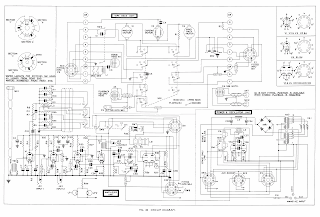
Diagram of electrical circuitry 

The diagram of electrical circuitry above points to the fact that what Voigt is doing is something that is common to any activity or way of thinking that needs to focus on one thing at a time in order to understand what's going on. If an electrical engineer became distracted by anything else except the electrical circuit, he or she would begin to lose track of what is already a complexity that most of us could not follow. A diagram allows us to abstract out of the world's infinite complexity a particular aspect that we are interested in. The art is in the invention of a language that helps to explain what is happening. 


John Coltrane. Untitled (circle of fifths), 1967

See also: