Friday, 24 January 2025

Solidifying thought

Drawing state

Ceramic state

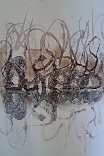
My work is drawing led. By this I simply mean that ideas tend to come via the process of drawing them out, of visualising things through a process of moving materials around on a flat surface. I'm not sure what an idea is until I begin the process of making it visual by using various materials to externalise my thinking. 

However I also make ceramics and the ceramics work in a different way to the drawings. I have been looking at quantum theories in relation to thinking again and perhaps I could call the difference between my thoughts existing in the form of being in my mind, or captured in drawings as opposed to ceramics, as them existing in different states. In a similar way to water being able to switch between the states of liquid, ice or steam. 

I've been reading 'You are the Universe' by Deepak Chopra and Menas Kafatos, an interesting take on how to think about our relationship with the universe. They posit a universe that is itself conscious and suggest that we can only engage with this universe via our own consciousness, as what is out there is consciousness itself. They use lots of metaphors to make their point, some of which personally rang true. For instance my continuing difficulty with photographs as indicators of reality, was reinforced by their image of a photograph of a surfer riding a wave. They point out that by cutting the surfer and the wave out of the context of events moving through time, we have no idea of the reality of the situation, is the wave moving at 20 miles an hour or 30? Is the surfer about to fall or ride the wave? Time is an essential part of the perception of experience and by cutting an event out of time, we lose an essential aspect of the reality of the situation. However the most interesting aspect for myself was that as all things participate in this consciousness, I could see a clear link between what they were arguing and my own interest in a return to a more animist way of interacting with the world. We are in effect made of the same stuff, or composed in a similar way to everything around us and as such what we think of as consciousness, is actually the way the physical materials that make up the universe operate. So for myself, when I have an idea in my head and I find it hard to grasp what it is, I give it some form of a physical existence as an externalised thought. A thought arising out of my own consciousness, is given another form as it wraps material around itself, and that form is another form or state of consciousness. My perhaps misunderstood reading of 'You are the universe' was that if the observer principle effects whether or not light is seen as a photon particle or a wave, it must be consciousness that determines the particular 'state' that we find these things. As there is no other way that we can be conscious except as the being we are, we are always in effect creating the world as we see it. As soon as we die, the world disappears. 

On a more basic level in relation to my own thinking about how art works, the things I make are extensions or embodiments of my thought as it materialises in conjunction with whatever materials I am using to think with. The particular state of two dimensionality seeming to carry ideas in a way that leaves them more fluid, whilst when made as three dimensional objects the ideas seem more fixed. 


Two Drawing States

Ceramic state

It's not that the ceramic state is an attempt to copy what has happened as a drawing state, it is more that the idea is going on a journey, as various manifestations form as drawn images, they follow the implications of whatever materials I'm using and the same happens when I'm making three dimensional forms. 


Ideas for tranculments

In the Black Country, which is the particular part of the English West Midlands where I grew up, the word 'tranculments' was used for all those various nicknacks such as ceramic dogs, horse brasses and other ornaments that could clutter up mantlepieces and fill glass fronted cabinets and dressers. My job was on a weekend to clean them and I now see those tranculments as part of some sort of elaborate ritual involving fetishised objects, not dissimilar to some sort of Voodoo practice. These drawings and ceramics are my 'ritual' objects, designed to tap into the past and exorcise old traumas.


A series of movements between drawing and ceramic forms

Sometimes I make models to draw from, then the state changes from 3D to 2D. The image below was produced like that. I had been holding conversations with recent migrants to Leeds, who had various stories relating to what it was like to arrive in a country of your dreams and to quickly find that you were not wanted. I made a small island to represent the UK from old plastic toy components, including a plastic flag from a set of plastic soldiers. The sea and the boats were invented and the curved slide was made of broken bits of a cut up fat plastic straw. The drawing brought the idea together in a much more effective way than the model and the three dimensional realisation was thrown away, but without it the drawing would not have been as clear. 

Slippery values

All of these images are externalised thoughts, some being more solid than others. What happens as a thought emerges is a mystery. I still don't know what I'm going to say until I say it. This sentence has emerged from it feels nowhere, I didn't think it up beforehand, it just came out. I look out the window and decide it's a grey day, I know I have to go out at some point but not just yet as I don't want to get cold. I now begin to wonder whether or not my small drawing of an island is really a self portrait. This blog is I think like a bin for my thoughts; how can I get anyone else to see what I'm getting at?

World views coincide

When someone looks at any of these images, I have to hope that some area or aspect of their personal world view might coincide or overlap with mine, if not everything will be met with total incomprehension. In the image above what is within the centre circles overlaps, even though the main interests of the two observers are different. But the two circles don't overlap precisely, something I'm suggesting never happens, so that we never quite communicate exactly what we are getting at, but even so, a fair amount might get through. 
It is only by solidifying my thoughts that they can get communicated, and of course I'm at the same time as constructing a diagram, drawing visions and making things, as well as writing and speaking about these ideas. Hopefully as they all come together, some sort of communication is made.

See also:

Friday, 17 January 2025

Somatic awareness: Texture and emotion


Visualisations of the surgical removal of uterine polyps: (c) Nora Kennally: 2025

I have been sent images made by a friend of mine, who has visualised how a recent surgical experience felt. At the centre of the communicative effect of these beautiful and at the same time difficult images is texture. Their visceral nature is reinforced by an awareness of the paper being folded, creased, stained and re-flattened; Rorschach tests for inner pain. 
In 2016 Stephens and Hoffman published a paper in which they looked at why people might react to different visual textures in different ways. Fur feels soft, tree bark feels rough and silk feels smooth and when we look at these surfaces we conjoin our tactile knowingness with what we see. Our tactile knowingness is built from a one to one correspondence with our bodies and is deeply connected to the emotional associations we have had with different textures. For instance we may well have cut ourselves on something sharp, have felt deep comfort by being pressed into our mother's breast, or have reacted strongly to having to touch the decaying corpse of an animal. Both pain and comfort, usually begin with a tactile experience. As our brains join up memories of touch with visual experiences, we then think that fur looks soft, tree bark looks rough, and silk looks smooth. These types of connections can then hopefully be used by a visual image maker to evoke emotion. Texture in a visual image being not just something that helps create illusions of reality, it can be used in the development of forms that can stimulate emotion.
Stephens and Hoffman (2016) asked, what visual textures do people like and why? In order to research this they used an ecological valence theory as developed by Schloss and Palmer (2009) in order to explore colour preference. Schloss and Palmer had realised that colour preference was an important aspect of human behaviour and they wanted to find out how individual colour preference was developed. They argued against a physiological explanation, presenting an ecological valence theory, which posited that colour preference reflected a cumulative emotional response to objects and experiences strongly associated with particular colours. Then, Stephens and Hoffman when going on to use ecological valence theory to test for people's textural likes and dislikes, presumed that people would in effect, like visual textures associated with positive things and dislike visual textures associated with negative ones. All of which seemed pretty basic stuff as far as an artist was concerned, but being an artist I had never had to test out a theory, I would simply use an idea. The basic idea being that there was a connection between texture and the expression of emotion.

But how to test this out? I had when working with an older man who had spent a lifetime smoking, produced images of how he felt his lungs seemed to him. He was a wheezer and knew that it was smoking that had damaged his lungs, even though he continued to smoke. The image we decided upon that for him felt the closest, had a certain 'smoky' feel to it and its colour was influenced by association with the brown stain that a smoker's finger's can take on. It was made on grey paper, using brown inks that were 'bled' into a surface which had been wet with clear water beforehand. 

Interoceptual awareness of a smoker's lung

The image seemed to work well and it was chosen as one of several images used as a stimulus for other people to think about how they might visualise internal body experiences. 

However when the image was shown to other people, it didn't always evoke a similar response, and an alternative image was developed, this time using print processes and making it much more screen and print friendly, so that the texture was not lost when the image was seen on screen or printed off.  

Interoceptual awareness of damaged lungs

The basic triangular form was maintained, but the brown colour was dispensed with and the feeling of a lung being broken or made unworkable, was developed using a more geologic way of thinking about texture. The gaps in the lungs were seen as in effect caves. This image was for some people far more effective than the previous one, several people noting that the unnatural colour made them more aware that something was wrong. 

Bronchitis lung

The feeling tone associated with the harsh reality of bronchitis was the next image to be developed, this in conjunction with someone who really had thought they might die as their lungs filled and they became breathless. Initial drawings made during one to one conversations about the experience and how it felt, were made using ink washes and these were scanned into Photoshop and developed as digital prints.

Interoceptual image of restricted breathing due to covid19

A while after making these very different images of damaged lungs I was making another lung image, this time trying to visualise the breathlessness that resulted in a covid19 attack. The feeling of ribs holding down the squashed mass of lung tissue was made this time by using felt-tip pens, alongside a variety of water based pigments dissolved in water. 

Each image has an emotional resonance, they all suggest in one way or another that something has been damaged, but it is only in conversation with groups of people who are introduced to the history of these images, that any more refined mediation can go on. However when it does, I have found that very quickly people grasp the metaphorical potential of the work. Once they get it, they can own it. 

One of the most interesting aspects for myself has been the degree of abstraction that people will accept when confronting these images. People who have previously stated that they have no interest in abstract art, will quite happily argue the merits of a shape, surface texture or a colour's ability to carry emotional meanings, when they are engaged in an interoception workshop. 

What I presume I need to do is to develop a much more comprehensive data base of images related to different inner body experiences and to find a way of making these images readily available to any interoception workshop participants. At the moment I'm thinking about making books developed on the model I was using when I first began hosting these workshops. See:  On reflection though, I now realise I will need to develop a much wider range of textural surfaces if I am to tap into the full width of people's emotional registers.

References:

Schloss, K.B. and Palmer, S.E., 2009. An ecological valence theory of human colour preferences. Journal of Vision9(8), pp.358-358. Available from: https://citeseerx.ist.psu.edu/document?repid=rep1&type=pdf&doi=5940b3758ccb9291cf7e7fad7aad1b16364f82e7#:~:text=The%20ecological%20valence%20theory%20thus,situations%20associated%20with%20each%20color. Accessed on 18. 12. 24

Stephens, K. D., & Hoffman, D. D. (2016). On visual texture preference: Can an ecological model explain why people like some textures more than others? Perception, 45(5), 527–551. https://doi.org/10.1177/0301006616629026

See also:

Texture: Part one

Texture: Part two

Surface perception in an age of CGI

Analogue and digital processes

The emotional line

Measuring emotions and colour

Saturday, 11 January 2025

White

Snow lines

A white cloud descends on the city

On a day when you wake up and it has been snowing, when you begin thinking about drawing, you tend to think of white and black. Drawing is at its most abstracted when made out of this basic opposition. When drawing, the ground is white and the white is usually made of paper. The marks that are put onto the ground are black or at least darker than the white ground, either made of ink or a dry substance such as charcoal. Rarely of course are actual drawings this easily categorised, the whites of various papers are never mid white, they are warm or cool, tinted towards yellow or green or blue. Blacks are rarely black, they are dark purples, browns or greys, but in some Platonic universe, drawings are always black marks on white paper. However when nature draws, it is often the opposite way round, white blanks out what lies underneath, it being the ground that is black or coloured and marks are made when that ground breaks through its white covering. 

A line drawn in the snow by a dry stone wall

I have just read Han Kang's 'The White Book', a book that begins with a list:

Swaddling bands
Newborn gown
Salt
Snow
Ice
Moon
Rice
Waves
Yulan
White bird
'Laughing whitely'
Blank paper
White dog
White hair
Shroud

Han Kang reminds us that white is not just a colour, it is at the same time an absence of colour, a carrier of particular physical meanings that are just as much embedded into the word, 'white', as the colour. I write these words lying in bed upon a white sheet. The sheet needs changing, and it reminds me of the last word on Kang's list, the winding sheet, the burial shroud that will at some point cover me. Not this actual sheet, but one of its cousins, one specially made for the purpose of shrouding the body. Kang begins her list with white swaddling bands. Swaddling clothes were used to wrap infants tightly, so that the movement of their limbs was restricted. It was believed that this made them feel safe and that it took away the trauma of their tiny bodies suddenly feeling that they were surrounded by an open expanse of emptiness. The wrapping was supposed to mimic the feeling that they would have experienced when held tightly in their mother's womb. I wonder if the winding sheet operates in a similar way, reminding our dead selves of where we came from and offering us a final comforting hug. 
When we were children we would play 'ghosts', by wearing old sheets we could transform into spirits. We would cut slits where the eyes were and simply pull the sheet over us. Sometimes we would scare ourselves, what was play and pretence, for a moment became reality. That shift from one state to another is I believe central to the idea of animist thinking. Han Kang has a similar belief, but puts it so much more poetically. I'll set out in full page 77 of 'The White Book'.

Lace Curtain

Is it because of some billowing whiteness within us, unsullied, inviolate, that our encounters with objects so pristine never fail to leave us moved? Her passage through the frozen streets brings her to the building, where her gaze lifts to the first floor. To the flimsy lace curtain hanging there.
There are times when the crisp white of freshly laundered bed linen can seem to speak. When that pure-cotton fabric grazes her bare flesh, just there, it seems to tell her something. You are a noble person. Your sleep is clean, and the fact of your living is nothing to be ashamed of. Such is the strange comfort she receives, at that in-between time when sleep boarders wakefulness, when that crisp cotton bedsheet brushes her skin.


Han Kang finds something within us that chimes with the external world, in this case a 'billowing whiteness', one that I sometimes find in myself as I breathe in a new winter's day. The woman's conversation with the bed linen, echoing those conversations had thousands of years ago when we slept in caves, conversations with stones and old bones, animist thoughts that animated those stones and bones and gave them spiritual flesh and blood. 

I'm staring up at fast moving clouds, a mass of fleeing creatures, passing through before the storm that we all know is coming. Like the boy I once was I still see cloud creatures and landscapes unfolding and becoming and dissolving, a constant metamorphosis of one image after another, nature's Ovid, written by the wind and water droplets. 

The sun has just broken through and dazzled my eyes, so that I cant look any more, a dark shadow replacing the bright flash of white. Every white, in order to be seen as white, needs a dark companion to measure itself against. 

White and black are constantly swapping over in our perceptions. Rods set into our retinas are primarily responsible for vision in low-light conditions and are highly sensitive to light but do not discern colour. They easily become over stimulated and in effect get tired and so we see afterimages, whereby black becomes white and white becomes black, as the rods recharge themselves. Stare for a while at this negative face below.

When viewing focus on the crosshair in the middle for about one minute. After this, close your eyes. Briefly, an afterimage will appear. Subsequent blinking may bring it back, as it becomes less and less distinct. The larger you can make the image before staring at it the better. 

We also see the Colour White when all the cones at the back of the eyes are stimulated equally; when they are, the brain perceives white. We also perceive white when our rods are stimulated during low light conditions. Unlike cones, rods are able to detect light at a much lower level. This is why we see only black and white in dimly lit rooms. It is rare to see in a more mono-chromatic scale during the day, but there are times in winter when it snows, when it can feel as if the world has been reduced to white and black. 

When it snows it is as if a giant eraser is applied to the world. A whiteout being a dense blizzard especially in polar regions, however whiteout is also a white correction fluid for covering typing or writing mistakes. The two homographs (words that are spelt the same but which mean different things) are very closely related, snow, like whiteout fluid, does in effect erase everything that it covers. 

Paintings can be homographs too. White on White (1918) is an abstract oil-on-canvas painting by Kazimir Malevich. It is an example of a painting produced by Malevich when he was a member of the Russian Suprematism movement. His white on white reflects his interest in spirituality.

Kazimir Malevich: White on White

Mark Tansey: White on White

White on White, 1986 is a painting by 
Mark Tansey, whereby Eskimos meet Bedouins in a snow/sandstorm. His white on white reflects his interest in visual paradoxes. 

Piero Manzoni, Achrome1958

Manzoni wanted his white paintings or 'Achromes' to be valued for what they were as physical things, not what they might represent.
Pure white monochrome far from limiting artists, often opens up a rich and versatile area of investigation. As well as offering an arena for emotive and philosophical statements, it draws attention to techniques, materials, textures, surfaces and structures. It also emphasises the surface's responsiveness to light and shadow. White can suggest contemplation, emptiness, the void or infinite space. It can induce calm or terror, it offers itself up to the observer in such a way that it draws us in and at the same time draws us out.

Robert Rauschenberg 1951 White Painting

Robert Rauschenberg 1951 White Painting

Robert Rauschenberg's 'White Paintings' were a series of modular canvases, made with five variations: one-, two-, three-, four-, and seven-panels. They were intended to have pristine, smooth surfaces unmarred by handling, and some of them were hung as set décor for John Cage’s Theatre Piece No. 1. Cage said that the paintings were the inspiration for his signature “silent” composition 4'33" (1952). Rauschenberg's white canvases reflect his interest in creating a situation that allows people to closely observe the play of light and shadow. 

When snow falls, it is often the accompanying silence that impresses us most.

In the home, the most often encountered white images are those woven into the forms of the net curtain. 

Cupid: Net curtain

For myself net curtain images have even more meaning than white on white artworks. They evoke submerged domestic worlds, half seen images, fragmented glimpses of what is going on behind them.

A something half seen behind the net

We can never be sure of what we are seeing behind the net curtain and because of this for me they are a domestic version of the shadows on the wall of Plato's Cave. If he had been brought up and spent his early years in a council house in Dudley, and spent a lot of time at his grandmother's in Pensnett he would have often looked out of windows shrouded in net curtains, curtains designed to let light in, but to prevent anyone seeing what was going on inside. They could have given Plato an alternative metaphor, one that had the added value of a feeling tone wrapped around a particular idea of a working class home and 'domesticity'. 

In my mind's eye I see that flimsy lace curtain seen by Han Kang's protagonist, as a net curtain, one that I remember seeing many years ago, that was woven with white images of the cosmos; planets, comets, moons and stars, caught within a gigantic net, just as cupid is captured in the net curtain above. 

A net curtain drifts in front of my view like falling snow, I see the world through it, glimpses of possibilities, vision whited out but never completely and like the monster never actually seen, the world becomes more frightening in its possibility, than it ever could in reality. 

See also:

Tuesday, 7 January 2025

RIP Tony Tomlin

I have just heard that Tony Tomlin has died. He had Parkingson's and I hadn't seen him for a couple of years but every now and again I would still think about him and his work, as his life had often impacted upon mine, just as it had so many other people in the local arts community.

His art tutor, supporter and mentor at City College for many years Kevin O'Hare once fondly called him 'a craftsman and master of crappy materials'. Tony came to the old Jacob Kramer College (Soon to be Leeds College of Art and then Leeds Art University) in the 1980s and was on the part-time Fine Art and Craft course. He had a unique vision that never left him of a world where media celebrities cohabited with the people of Chapeltown; where his particular take on religion was mixed with his respect for art and artists and where the various tutors and lecturers of the courses he would take, were drawn and annotated by Tony, in his attempts to measure and tie down why these 'educated' people were themselves artists. He was often on a quest to establish the source of 'genius'. This could be the reason behind sports success or it could be that someone he knew personally had achieved a level of educational clout, that must have as far as he was concerned, have been because they too were a genius. The fact that they were now in a position to teach him, was something he needed to interrogate. His quest to find some sort of truth was at times heartbreaking, as it mixed an instinctive grasp of how society branded some people as outsiders and others as insiders, with a failure to see how he himself had been categorised. For many he was an outsider artist, but he was always trying to get the qualifications that would give him a licence to be a professional artist, an insider.

Tony operated as a reminder that the making of art in many ways cant be taught and that creativity is something that can be owned by anyone. He could make even the most basic drawing interesting, his comment on the drawing of scissors below is sort of blindingly obvious but at the same time confusing. He would have been proud of undertaking the exercise and his use of shadow is dramatic and clearly visually observed. He tells us, "DRAWN WITHOUT THE USE OF A RUBBER AND PENCIL", so how was it drawn then? Is this a biro drawing? The exercise was for Tony proof that he was undertaking a professional program of study and the shadow cast by the scissors is indeed proof that he could objectively observe the world around him when he had to.

Tony Tomlin: Scissors

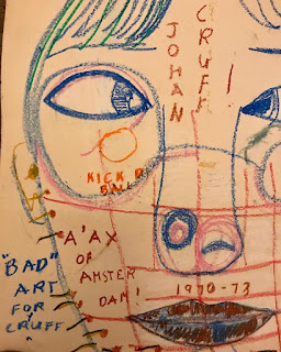
Tony Tomlin: Johan Cruff

Tony was well known for his text and image work. They combine so that the text not just annotates the image, to both inform us of what it is and how Tony thinks about it, but it also develops a textural surface, one that his line drawing is physically embedded into. In the image above, 'Kick a ball' would have been a reference to playing football as a child on the street of Chapeltown, the dates are both Cruff's time of greatness as a player for 'Ajax of Amsterdam' and a time when Tony was young. Tony comments on his own attempt to create this homage, "BAD" ART FOR CRUFF. The way that Tony could seamlessly integrate a childlike memory with the facts of a football fan, his amused commentary on his own work and directness in drawing eyes, noses and mouths as symbols rather than portraiture, make his Johan Cruff drawing, a product of both an everyday experience for Tony and an attempt to portray an emblematic presence of a wonderful footballer. The wisps of hair, he has drawn, that frame the top of the image, do though somehow conjure up something of Cruff's look from that time; a boy like presence behind the genius who took ball control onto another level. Tony, as has already been pointed out, was a romantic, always trying to measure himself against the attainment of the lone artist.

Tony asked questions of those around him, questions that I found difficult to answer. Who was fooling who? In the 1940s Cecil Collins wrote his text 'The vision of the fool'. The fool was a role that Collins identified with the artist and the poet. He stated that 'the fool' embodies ‘the eternal virginity of spirit, which in the dark winter of the world, continually proclaims the existence of a new life, gives faithful promise of the spring of an invisible Kingdom, and the coming of light’. Was this what we all saw in Tony's work? Perhaps, but I doubt it. Tony was a messy man. I had problems with him sometimes, as he did at times present difficulties for others around him, particularly young women. He had no 'turn off switch' and his texts were at times very disturbing, a quasi religious take on women in particular could be read as misogynist. Whether he intended it or not, he could cause considerable offence. There was another issue and that was how his favourable reception by the established Leeds art community, was read by those who stood on the edge of that community and who felt slighted and mis-represented by the fact that Tony was black. I was asked several times why were white people praising the work of someone that was obviously mentally challenged? This was a difficult question to answer, did I not think that by showcasing his work black people as a whole were being positioned as 'outsider artists', who made work by some sort of intuition, as opposed to the reality of many black artists who made work to directly challenge and seek to highlight how a white dominated post-colonial patriarchal society had treated them. Exhibiting Tony's work, it was argued, was an easy way out for the white establishment, as it didn't challenge the status quo and reinforced the notion of the black artist as an outsider and not being capable of being a 'professional' practitioner.

Tony's work when read as a type of outsider art, did show us new ways of seeing things, but did this simply titivate the jaded taste buds of overly sophisticated, well educated arts professionals? I have in the past had to question myself several times, as to why I was fascinated by his work. Perhaps his very existence was a challenge to my own reading of myself as an artist.

I was spoken to once by a disgruntled artist, and told that some people within the Leeds arts community treated Tony as if he was a pet, 'Wasn't it lovely that he could perform such tricks?', they said. I thought they had read the situation in the wrong way, but I could also see why they might have. On the other hand I knew that several people treated Tony with great respect and that they really valued his vision and personal stance on what it was to be an artist. For some his work gave them a unique insight into a mind that was different, a visual mind that had emerged from the streets of Chapeltown, but which had also engaged passionately with the art educational system. It was an engagement that had thrown up a strange anomaly, the fact that originality and difference did not achieve high grades and that the reality was that to pass an 'A' level or other art qualification at that time, what you had to do was show that you knew who was part of the accepted art canon, and that you could in effect 'copy' the work or processes of those artists that you had academically studied. These were all hard questions for someone like myself who was firmly fixed into that art education system and who had a strong belief in the power of art as a transformative discipline.


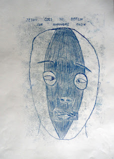
I drew his portrait once. He looked at me strangely and made me uneasy. His glasses had such thick lenses that they reflected the outside world back at you. As I drew I fell into his whirlpool eyes and realised I had been hypnotised. He told me I was a genius and then asked me if I wanted to buy a piece of his work. Somewhere I still have his mono-print drawing of a Mexican wrestler's face mask, entitled 'Jesus goes to Berlin for Hardcore Music'. I don't know what it means but it challenges me in ways that Tracy Emin's mono-prints have never done. Jesus operating in disguise as a Mexican wrestler, opens up a reading of Christianity that I had not previously thought about, and perhaps that is the point; Tony for all his confusing ways, was always going to challenge us and our assumptions about the world. 

Tony Tomlin: 'Jesus goes to Berlin for Hardcore Music'. 

So rest in peace Tony, a unique individual who in my life caused much heart searching, and who also gave much joy and richness. He left us with several conundrums, such as; 'who can be an artist', 'what is it that artists should do', 'who says what is good or bad art' and 'can art be taught?'  He was a reminder that the pattern of humanity is sometimes cut as a difficult fit. 

See also: 

RIP Tony Baker In many ways Tony Baker understood Tony Tomlin and supported him far more than I ever did and they are now joined in that post life world of the dead, I hope they have found each other again and that they have been joined in their companionship with Graham Head; Tony Tomlin's tutor when he was at the Jacob Kramer College and who was a long time advocate of his work and who passed away this time last year.

Wednesday, 1 January 2025

Blueprints of thought

Vanuatu sand drawing

In her discussion of how to read pre-historic art and the 'abstract' work of contemporary hunter gatherer societies, Esther Pasztory uses the phrase 'blueprints of thought' in order to steer us away from an idea that these are works of aesthetic high value. In her classic text, 'Thinking with things', she is always at pains to get us to think about how images are used to carry ideas and information. 

I do think her approach to understanding visual imagery is an excellent one, because it always forces me to ask myself questions as to how my own work comes to have meaning. For instance when discussing what pre-historic images might mean, she cites the importance of storytelling to several cultures and of how visual imagery is used alongside storytelling to reinforce spoken narratives. 

I have referenced the sand drawings of the Vanuatu islanders before; ephemeral drawings that are made as stories are told. At one point when I was watching a video of a story teller at work I was captivated by the fact that the sand drawer used both hands. A left hand could trace significant moments of one character's story in the sand, and the right hand could be leaving a story/map of another character. Significant changes of direction in a line, would signify fulcrum points related to important action in the story and the drawing would link up its left and right halves at points when the two stories came back together. In this way a dot, or finger pushed hole in the sand, could just as easily represent a water hole where someone drowned, as a place where everyone sat down to eat. These types of drawings use multivalent symbols, that only make sense to the small groups of people who were there at their inception. 

I was reminded of this when I was hosting my workshops on the visualisation of interoception. At the end of each workshop we had lots of animated discussions about what each drawing represented. Each maker had a story and as people had been working in pairs, often their partner would chip in to add an explanation as to what their marks represented. By the end we had often achieved a good level of communication, the drawings acting as supports for the stories told by the participants. But when taken out of context, when I tried to create further images from the drawings, the consensus of understanding began to fall away. My grand idea that there was some sort of universal visual language that could be used to communicate inner feelings, was questionable and perhaps I needed to rethink what I was doing in terms of how conversation and storytelling worked. 

This has led me to re-think how a gallery could work as a space for the reception of visual thinking. Instead of seeing it as a neutral place, where people are given time and space to work out their own understanding of artwork, to position the gallery as a psychic centre, whereby people come together to tell somatic stories and to hear new ones, the work in the space operating as supportive material to give flavour and grounding for thoughts as they arrive. The gallery then becomes an active space for the generation of meaning, rather than a passive space designed for the reception of aesthetic value. 

A workshop participant visualising an interoceptual experience

This new year, is perhaps a time whereby I will be able to integrate a more performative aspect of my practice into and alongside what I am doing already. 

In the meantime I hope that this new year brings health and wellbeing to all the readers of this blog and that during the course of the year my various ramblings begin to make sense to you. 

Reference:

Pasztory, E. (2005) Thinking with Things University of Texas Press

See also:

Drawing it all together

Kurt Vonnegut diagrams the shape of stories

Drawing for site specific proposals