Monday, 28 March 2022

ARTocracy, Social Sculpture and Sustainability

ARTocracy

If as artists we are to embrace sustainability we will have to re-examine the practices that we call art. This isn't something new and I have looked in the past at how the word 'art' has changed its meaning over time. The stem 'rt' from the old Indo-European language root meant, 'the dynamic process by which the whole cosmos is being created.' A powerful idea that suggests 'rt' and its successor 'art' are much more to do with being involved with unfolding events than making objects, a concept that celebrates the interconnectedness of everything, rather than something just about painting and drawing. Perhaps our society needs to think again about the way art is used or perhaps we need to revisit a much older tradition. Art under capitalism has become about the exchange value of objects, unfortunately the news media now concentrates on the amount of money that an art work achieves at auction and rarely on how art might be used to add value to society. In 2017 the Wall Street Journal reported that the painting 'Salvator Mundi' by De Vinci had been bought for $450 million by Saudi Culture Minister Prince Badr bin Abdullah. A figure so huge that it is almost impossible to begin thinking about what this means. In a time of war, migration of displaced peoples, global warming and planetary wide instability, somehow the putting of so much money into an art investment seems not just futile but criminal, a sign that something has gone wrong with our idea of value. 

So it is perhaps time to look at alternatives, of ways of approaching art in such a way that its relevance to our collective understanding or feeling about the world goes beyond whether or not a drawing or painting is suitable to be shown on a gallery wall. 

In connection with my earlier posts on sustainability and the linking in of artists associated with eco-awareness, I'd therefore like to add another strand of practice, and in doing so perhaps open out alternative models that some of you might find useful or at least thought provoking.

The term ARTocracy, a sort of 'how to do it' brand name, was first used by Nuno Sacramento and Claudia Zeiske in their 2010 book of the same title. The book systematically shows how creativity could be applied through a sensitive interconnecting of people, context, processes and outputs, all of which it is argued will need to work together if we are to develop more sustainable communities. 

The book is about the organisation of collaborative projects and it is designed to raise awareness as to how projects get off the ground. It provides practical guidance about funding, communication strategies, education and the making of art in community contexts, and in particular it looks at the balance between artistic quality and social consequence. I thought this was interesting because these issues go deep. For instance I remember being told very early on in my career that I was to avoid being didactic. I.e. that I should not intend to teach or give moral instruction through my artwork, if I did my art teacher told me, it would not just be detrimental to its aesthetic value, it could actually stop it being considered as art. Years later I was to meet Joseph Beuys and the first thing he said to me was that he was a teacher and that his artwork was designed to educate and provide a moral framework for others. Beuys used the term 'Social Sculpture' for his work, a term he used to describe an expanded concept of art, in particular to advocate art's potential to transform society. The fact that Beuys was co-founder of the German Green Party, illustrates how deeply he wanted to integrate politics and social awareness into his practice. In 1982, which was the year he was in Leeds; for documenta 7 he proposed to plant 7000 oaks, each one paired with a basalt stone. The 7000 stones were piled up on the lawn in front of the Museum Fridericianum in Kassel with the idea that the pile would shrink every time a tree was planted. The project, seen locally as a gesture towards green urban renewal, took five years to complete and it eventually spread to other cities around the world. If you stand outside the Henry Moore Centre in Leeds and look slightly to your left for an oak tree, you will see one of those Beuys oaks still standing next to its basalt stone. 

I thought it useful to begin with ARTocracy simply because it is subtitled; 'Art, Informal Space and Social consequence: A Handbook for socially engaged practice', and we all need to start somewhere and this is a handbook. The first premise it establishes is that the town is the venue. I.e. the place you live is going to be where you develop an audience, find participants, seek content and be a place to both make and present or exhibit work. Your art practice is in effect embedded into the society and particular locality in which you find yourself. This is a very different approach to the idea of the artist as outsider, or cool observer of reality. It also questions the role of the artist as individualist or 'genius', looking at the artist's role as cultural activist, rather than artistic producer, exploring how an artist can energise people and local communities, rather than provide images for contemplation. Art processes it is suggested can be employed to untangle and overcome real-life challenges, defuse conflict, solve problems and open up new possibilities. Sometimes though its good enough just to help people see what's there. 

You can read all about it by downloading a pdf from Deveron Arts Projects.

Socially engaged art practice is collaborative and participatory and how you involve people in the work is central to the process. You can involve people and communities in debate, collective action and social interaction. The term 'new genre public art' is another way of thinking about it, a description that was coined by Suzanne Lacy, who wanted to find a way of making public sculpture that wasn't putting up statues of high achievers onto pedestals, as she wanted to show how 'ordinary people' could participate in collective decision making. 

City conversations: Suzanne Lacy

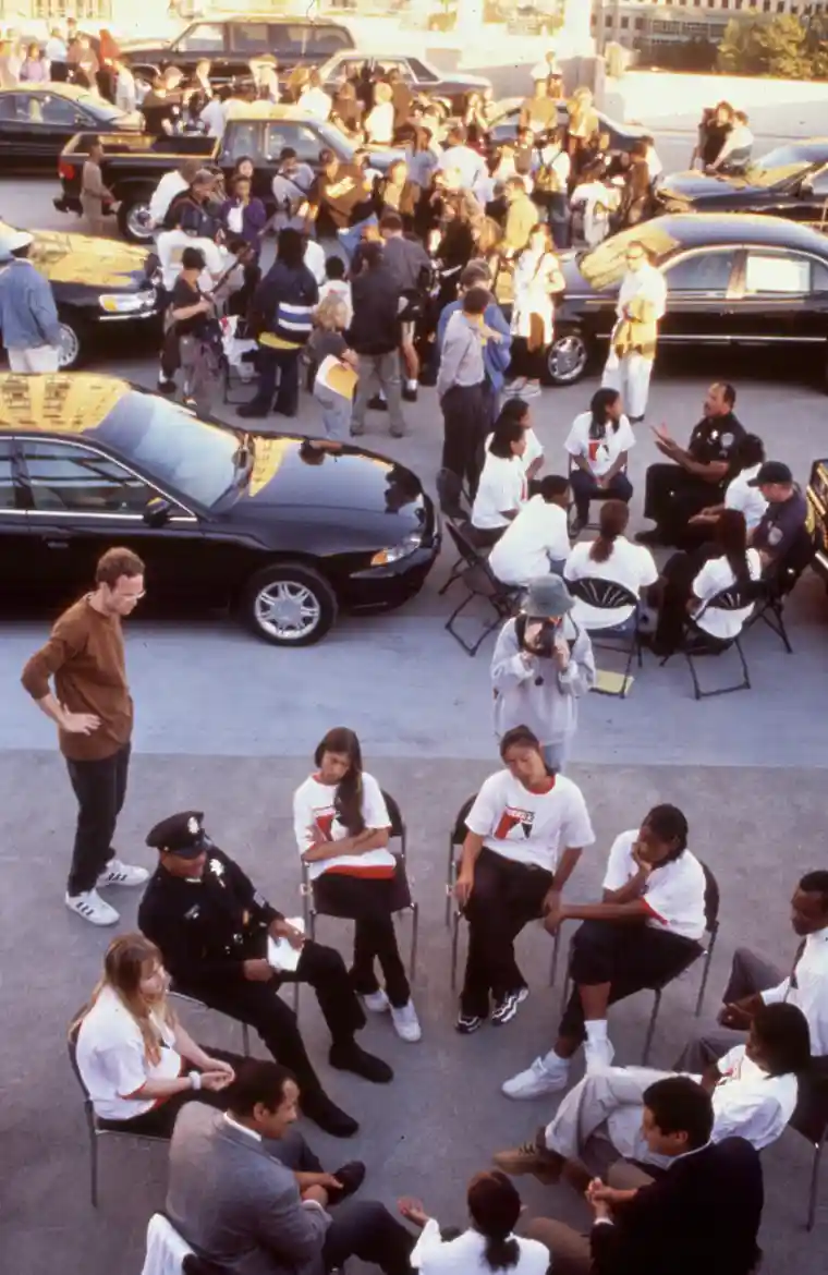
What Kind of City? is the title of many of Suzanne Lacy's conversations, she has visited Leeds in the past, and this question was the title of her presentation at the art gallery. 
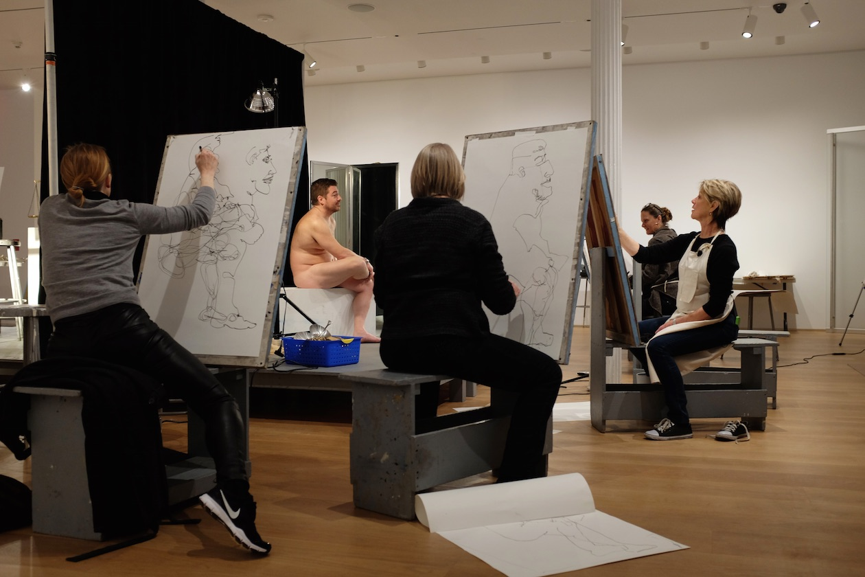
Lacy has also engaged directly with drawing in her work. She undertook a collaborative project with the artist Andrea Bowers called appropriately enough; 'Drawing Lessons'. This was a nine-day installation at The Drawing Centre, New York, during which artist Andrea Bowers attempted to teach Lacy to draw. Each day for nine days, Bowers offered Lacy lessons, which were also open to the public.  Working together under the scrutiny of the audience, Bowers and Lacy explored the questions, in work and conversation, that they engage with in their individual practices. This really interested me, because I am convinced of the power of conversations as being central to social integration and sensitive action. The project served as a platform for extended conversations with curators, union organisers, people who attended from the area and other artists who draw or do performances.  The conversations reflected on feminism, performance art, drawing, and socio-political issues of concern to the artists. For example: what are the roles and problems of representation in public art practice? How do artists reconcile activist and field-based practices with the necessities of production for the gallery and museum? What is the relationship between first and second generation Feminism? What is the role of venue, object, and style in the identification and evaluation of art? 

Suzanne Lacy and Andrea Bowers 'Drawing Lessons'

The pulling down of the Colston Statue in Bristol last year, raised many issues about the role of both artists and public statues. If the making of statues is problematic, then what can artists do when they work in public? One project I remember in particular that helped me to think about the possibilities for making art-work in this area was, 'Where The Heart Is' by Graham Fagan. As part of his work with the community of Royston in Glasgow, he discovered that the one thing most people enjoyed or could appreciate was gardening and in particular many people liked roses. Fagan purchased a new rose that had no name, originally known only by a code, JC30518/A. It was named through a consultative process across the entire area of Royston. A pupil from St Roch's Primary School eventually selecting the winning name. Cuttings of the rose were then given to any local people that wanted one and its lovely pink blossom and fragrant scent was the following year to be seen throughout the area. 

Graham Fagan: 'Where The Heart Is' 

Graham Fagan: Local children's images of the rose

Fagan's work was part of a much larger project. It is interesting to look at how it all fitted together and at how many approaches to community development were used. Check the overall project out at the link below.

So what's this got to do with drawing you may be asking? I have written about how drawing can be used to facilitate conversations in several ways. For instance as a way of developing stories around and for a community. See: 

Barker, Garry (2017) Drawing as a tool for shaping community experience into collective allegory. In: Collective and Collaborative Drawing in Contemporary Practice. Cambridge Scholars Publishing, pp. 192-215. lau.repository.guildhe.ac.uk/17315. My contribution to the book on Collaborative Drawing in Contemporary Practice, is mainly centred on how drawing can be used as a focus for conversation and how different types of drawing facilitate different types of conversations. For instance, I'm currently drawing ideas for a permaculture garden, but the real issue is that this activity will facilitate conversations and these will explore whether or not permaculture ideas can be used within wider contexts of sustainability, in particular whether or not perception and interoception can themselves be shaped or inflected by a permaculture awareness. I'm also developing a paper for an architectural magazine that brings together permaculture with perception and looks at how permaculture principles such as 'Observe and Interact' or  'Integrate Don’t Segregate' can be applied to the way we think about architecture.

Marjan van Aubel

But of course there are other approaches to thinking about how to operate sustainably as an artist. I'm always interested in how ideas can be visualised and made real. This is what so much of drawing has always been about. The problem is that we categorise things in such a way that some ideas are seen as design and others as art. If we take away the distinction, we simply have people visualising ideas. Marjan van Aubel is a wonderful example of how to do just that, in this case her ideas use light fittings in a not dissimilar way to how nature itself harvests the energy of the sun via photosynthesis. She demonstrates that there are alternatives to existing paradigms and exciting new ways of thinking about solar energy that reflect how energy is collected and used by biological entities other than ourselves. 

Olafur Eliasson: Sketch for 'Beauty'

A lot of eco ideas seem to emerge from Scandinavia, perhaps this is because the winters are so cold, and you therefore need to think carefully about how you will survive them. 'Beauty' is a typical work of Olafur Eliasson. You walk into a dark room and a fine mist is falling illuminated by a single light bulb. As you walk around the room from some angles you can see a rainbow. You also see a hose pipe that the water falls from, you see the things creating the rainbow at the same time as the rainbow. You are having an experience, and are conscious of having the experience. As you are made self-aware you go out into the world with that awareness and will hopefully make future decisions more thoughtfully. 

Beauty

Eliasson is interested in the connection between an experience that might take place in a gallery and the way it might affect your behaviour when you leave that gallery. 
Olafur Eliasson is an artist who also uses design skills to solve projects, which again highlights the artificial divide between the two disciplines. His team at Studio Olafur Eliasson consists of craftsmen and specialised technicians, architects, archivists, art historians, web and graphic designers, film-makers, cooks, and administrators. Eliasson and the studio also work with structural engineers and other specialists and collaborate worldwide with cultural practitioners, policymakers, and scientists. His climate change activism has inspired many and his approach suggests that as an artist you can both make things and be engaged in community activism. He is able to make art from the poetics of a situation, as well as from an understanding of the ecological condition of it, as well as from the constraints of physical materials and the possibilities that they offer. 


Thomas Hirschhorn: Too Too - Much Much

Thomas Hirschhorn is another artist that has responded to the problem of how to avoid the 'statue' issue, he uses everyday and found materials such as plastic sheeting, cardboard, aluminium, packing tape and magazine images to create environments for change. The process of making remains clearly visible and becomes a metaphor for the individual and collective struggle to establish local democracy or to build a space within which people could debate ideas. People are implicated in Hirschhorn's work, viewers are obliged to reflect upon that which they may have hitherto been able to ignore in their daily lives, by having to take part in conversations, often with others who they would not normally meet or engage with. Hirschhorn's practice facilitating conversations, as much as making metaphors for change. 

If I was going to cite one example of social sculpture that sparked my imagination it would be the work of Pedro Reyes, who for the artwork 'Palas por Pistolas' (2008) collected 1,527 weapons from residents of Cuiliacán in Western Mexico, which were exchanged for electronics. The artist then melted the weapons down into shovels, which were then used to plant 1,527 trees. This is real alchemy, the transformation of guns into shovels a beautiful metaphor as well as a real intervention. Reyes is also interested in drawing as a way to communicate ideas, the work 'Collective Hat' is a very funny as well as conceptually interesting work. 

Pedro Reyes: Collective Hat: pleated palm collective activity

Reyes puts it like this:

Wittengstein stated that if we were to imagine a book which contained only the truth it would have to be entirely composed with jokes. I think in jokes you are led to the truth so quickly that the only way to handle the shock is laughing. Not all jokes produce laughing, there are also slow-smiling jokes, visual puzzles and graphic puns, some jokes are diagrams.

You may remember this one...


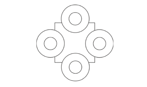
...a Mexican riding a bicycle. They are often a child's game but in fact very abstract and concrete depictions of social or spatial situations, like this one...four Mexicans sharing a table:


The design process in architecture is concerned with drawing the object, but we often lack tools to draw the social interplay. How do you map individual actors? How do you represent collective entities? This figure below for instance...


I drew this diagram of a collective sombrero and it became the blueprint for a sculpture. It was one of my early participatory sculptures. I took it to different plazas in Mexico city and asked people to wear it. What happens is very curious, for me it represents a paradox of democracy, the huddle has to deliberate endlessly where to go, and they have to walk very slowly not to stumble.

Pedro Reyes

'Collective Hat' reminded me of Lucy Orta's work. In the piece below for COP 26 Orta states, 'the ripple and the chain of solidarity clearly manifested our interdependence', and I can see clearly what she is trying to visualise, the fact that we are as in Reyes work all connected in some way. I do though personally respond more to Reyes because he realises that it is also funny, our situation so stupid, that we need to collectively laugh at ourselves before perhaps we decide to make some changes. 

Lucy Orta

See also:

The Royston Road Project

Reflections on The Colston Statue

Sustainability Resources

Cheap materials

Sustainability 1

Sustainability 2

Drawing and the 12 Principles of Permaculture

Pollution, art and making pigments

Drawing and politics

Object orientated ontology

Art eco awareness and OOO


Saturday, 19 March 2022

A steady hand

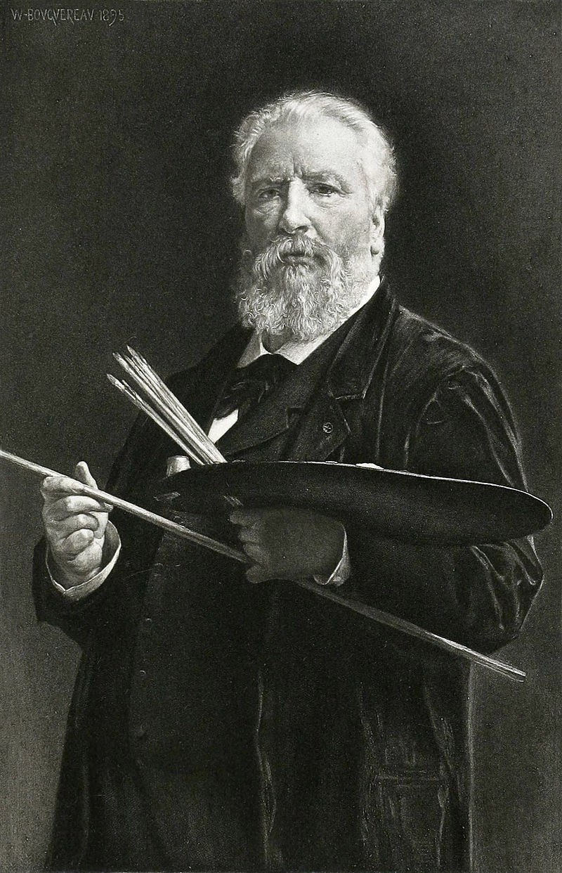
Artist's bridges and mahlsticks* have been used for as long as artists have had to keep a steady hand when drawing details or fluid curves. The mahlstick is probably the most familiar of the two, being central to many an artist's self portrait. 

William-Adolphe Bouguereau:1895

Notice how Bouguereau holds onto his mahlstick with the little finger of his left hand, whilst with the same hand holding his brushes and steadying his palette. There is rather fine series of hand adjustments being made here, and I'm sure he would have had a lot to say about the correct way to hold a paintbrush. 

Caterina van Hemessen: Self portrait: 1548

Caterina van Hemessen is also a dextrous controller of her materials, once again we see an artist holding brushes and a palette, but this time we can see the mahlstick in use and the artist's very typical thumb index and forefinger grip on a brush. 

Sofonisba Anguissola: Self portrait: 1556

Sofonisba Anguissola in comparison has a very light grip on her mahlstick and is resting her wrist rather than her hand, suggesting that she is looking for a more lose or free paint handling technique.  

Mahlstick

Using an artist's bridge as a marl-stick

Paintings of objects like buildings, furniture etc will require you to paint straight lines. The best brush to paint these is a rigger. These are pointed round long haired brushes. They are made to paint details, these long bristled brushes giving you far more control than shorter bristled ones.

Rigger brushes

Typical grip for using a rigger brush

Notice how the little finger is used to steady the hand. You just need to use the tip of a rigger brush, mixing your paint using a figure 8 movement, until you reach a paint consistency that allows you to move the brush without having to bend the bristles hardly at all. If the paint looks blobby or thicker on one part of the brush than another, you need to keep mixing. If you find using the little finger as a support hard to master, then you would use an artist's bridge. 


Using an artist's bridge

For many years I have been teaching students how to hold a pencil, or at least asking students to think about how they hold one and how alternative ways might help them with the development of their drawing skills. If you are using an artist's bridge then you might get away with holding your pencil as you would when you write. As you can see in the drawing above, in order to draw a straight line the artist is using a straight edged bridge as a ruler like control guide as well as a hand rest. The wooden bridges in the illustration further above have slightly curved edges, these bridges are for delicate hand control that facilitates the curvature of the wrist/finger relationship, so for instance if you were drawing a series of controlled short curves, as in certain types of cross hatching, then you might use one.  

George Grosz

George Grosz pictures himself using an artist's bridge but in a sort of off-hand way, as if it's incidental to his musings, his imagination flying around everywhere, the bridge almost an after thought, but it is still something he must value as part of his artist's equipment, or he wouldn't have felt a need to draw it. He feels in control of his world, he inhabits it centrally, a rock like ark out of which the bird of invention might fly and look for new land. 

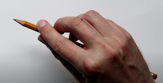
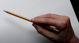
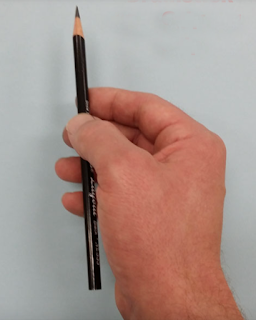
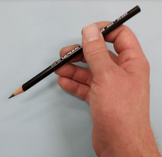
Artists have to vary their grip in order to use their pencils, pens, crayons and brushes in ways that make sense. For instance the way you are taught to hold a pencil at school is more about gripping it tightly, so that you can control your handwriting. However this means that you are not able to use the full dexterity of hand and wrist muscles, and the finger/thumb grip often means that the pencil tip is hidden as the hand can block the line of sight between the pencil tip and your eyes. Below are some alternative grip strategies, all of which have positives and negatives, and as a drawer you need to try them all out and see which ones are useful, in which situations. 


I personally like to use the typical grip for using a rigger brush, with my little finger used as a rest, but I use a looser hold more like the image directly above. This allows me to make good use of my little finger like a spring, which allows for pressure changing as well as support for an unsteady hand and if I have an extremely difficult curve to manage, I rest my ring finger on the paper as well as the little finger. This usually means I'm controlling my hand movements from my elbow rather than my wrist.  

Carracci: Artist cutting a feather quill 1600, pen and brown ink

Carracci's drawing makes us aware that he was very aware himself of the importance of grip. Grip is involved in so many of an artist's actions and the making of our tools often influences how we might hold them later when we want to make marks with them. 

Pierre Dumonstier IIRight hand of Artemisia Gentileschi holding a brush: 1625

Artemisia Gentileschi holds her brush as if she is about to throw a dart, a precision gesture, one about how to approach the canvas when you really mean it. 

Artemisia Gentileschi: self portrait

In her self portrait Artemisia Gentileschi rests her left arm on a narrow table top, in order for her right hand to maintain control, the whole body being steadied by this action. Gentileschi appears to get far more physically involved with her painting than Caterina van Hemessen, but in their own ways both need to use supports for their brushwork control. 

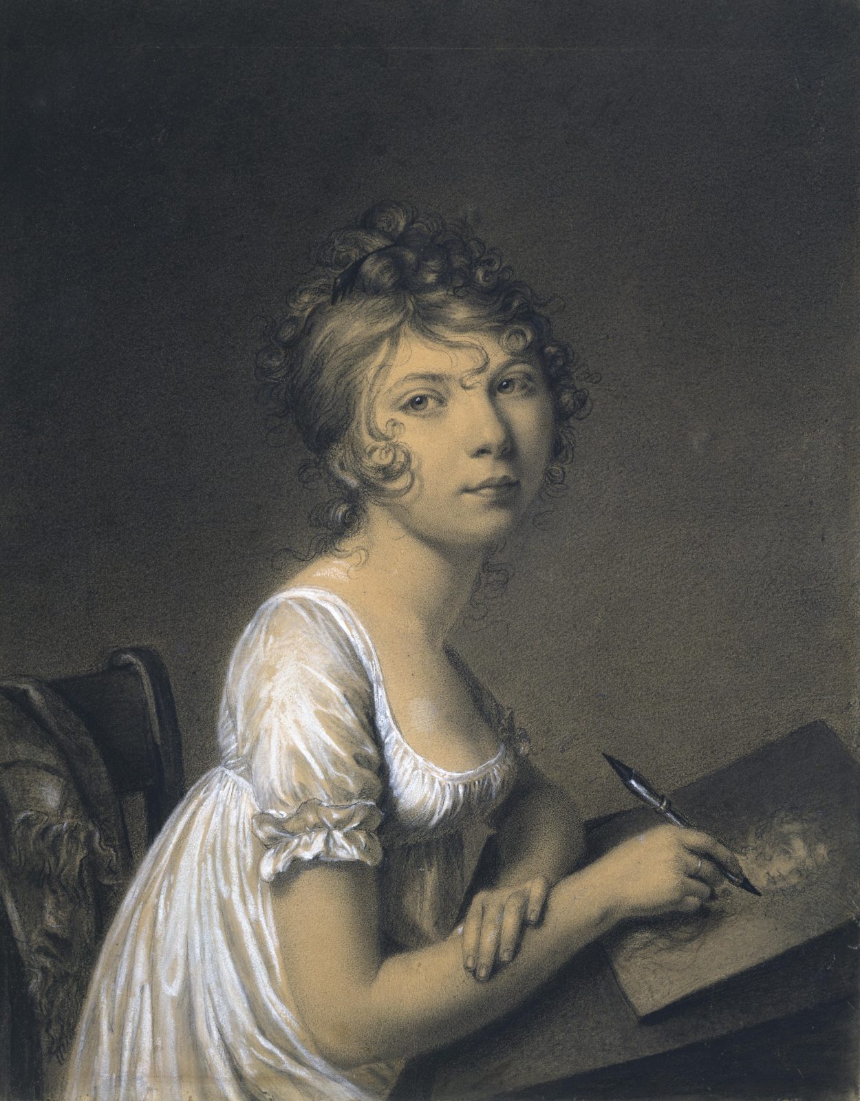
Louis-Leopold Boilly (1761-1845), 
Portrait of a Young Woman drawing Herself, black chalk heightened with white

The young woman in 
Boilly's drawing is holding her drawing implement in the same way you would hold a pen for writing. This immediately identifies her as an amateur artist, she stares out at Boilly rather than concentrating on her own drawing, resting her inactive left arm on her active drawing arm. 

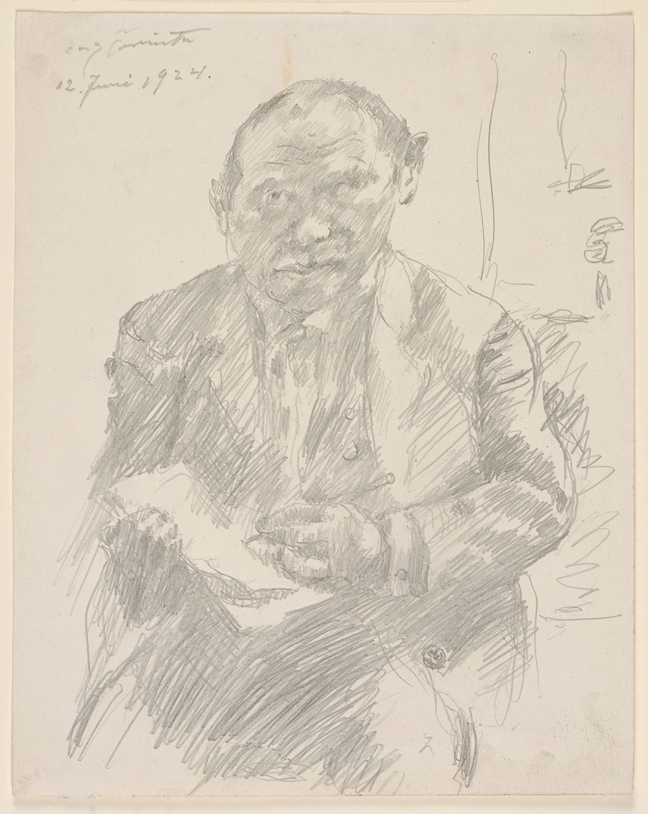
Lovis Corinth: 1924 

In contrast Lovis Corinth stares hard into the mirror and his drawing hand grips the pencil roughly, whilst his other hand holds onto the sketchbook, you get the feeling that this is not a very steady or secure platform on which to make a drawing and the resultant image reflects this. 

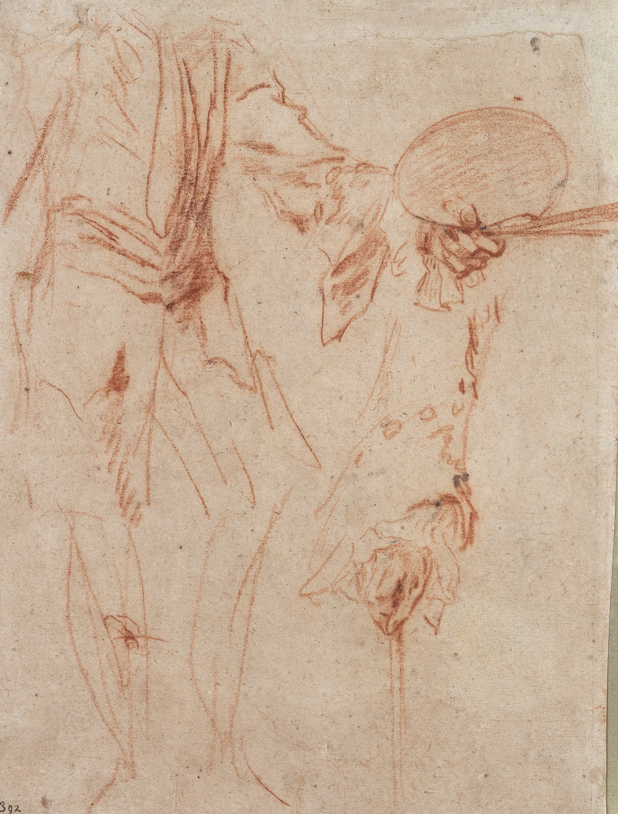
Watteau

Watteau draws his artist holding palette and brushes as if they are about to perform an exquisite dance, a sensibility about as far from the one Lovis Corinth displays as you can get. 

Émile Friant – Self Portrait

Émile Friant's self portrait is a beautiful study of balance, his hand and eye control co-ordinated delicately as the tip of his brush just touches the canvas. You can imagine his hand quivering as it moves in response to the nuances of what Friant believes he is seeing. This too is a sort of dance. 

Menzel: Studies of a man painting

Menzel: drawing of a paintbrush

In comparison to 
Friant, Menzel is a ruffian, he is painter who uses hog's hair brushes and not just uses them but destroys them in their use. No fine balance here just brute force and honesty. Look at the way he pushes the brush down to splay out its edges, he works with the image horizontal so that he can be on top of it, if the painting had been set on an easel it would be pushed over by his hand's weighty engagement with his image making, no wonder his brushes were worn down, mangled and pulverised. He must have understood this aspect of his approach as being of significance or he would not have been drawn to make an image of one of his brushes. He has a similar bluntness and direct honesty when it comes to making a self-portrait, just as a painting relies of the nature of the brushes used to make it, so a human being relies on a good set of feet, or plates of meat as my grandad used to call them, to hold them steady. 

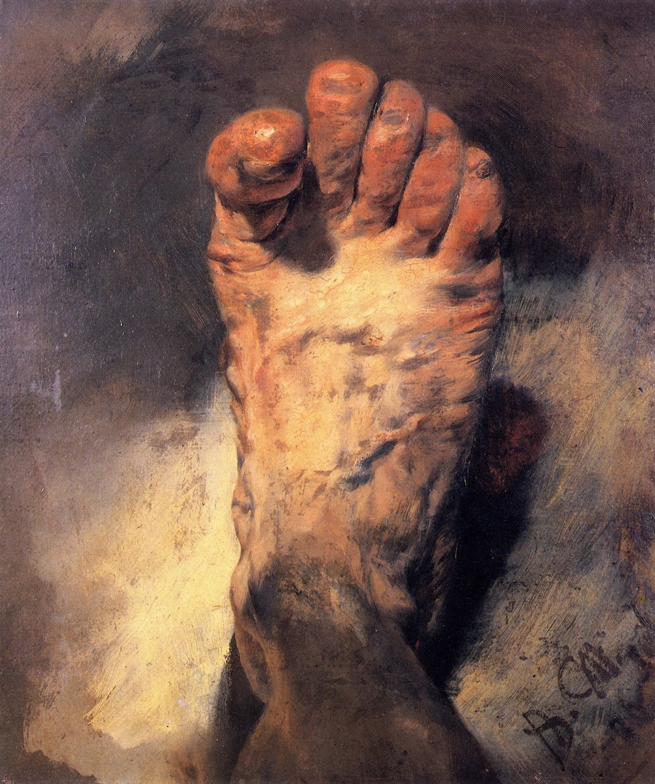
Adolph Menzel: Self portrait

When looking at this painting by Menzel I can imagine him looking down at the painting and at the same time shifting his gaze to look down at his foot. Every painting or drawing is rooted in the way an artist uses their tools, this coupled with the fact that everyone is a bundle of nerves and muscles and blood and bones and microbes and the difficulty in co-ordinating all that stuff into a smoothly running machine, that can hold a pencil or a brush. In many ways it is in the control of all that bodily mass that meaning is made, and part of that meaning is in how we hold our applicators and move our hands, and deciding whether or not to steady them. 

Joshua Reynolds: Self portrait

I'll leave you with 
Joshua Reynolds, holding his mahlstick like a sword, shielding his eyes almost as if having to protect them from the brightness of his own reflection. He is a young man setting out to make his name as a painter, he doesn't really need the mahlstick to rest his arm, notice that there is no leather pad on its end, the mahlstick is more like a symbol for the trade he is entering, he needs no support.

*A maulstick, or mahlstick, is a stick with a soft leather or padded head, used by painters to support the hand that holds the brush. The word is an adaptation of the Dutch maalstok, i.e. the "painter's stick", from malen, "to paint". 

See also: 

A link to an excellent glass painters guide to how to use grip when using specialist brushes 

Drawing hands

The finger and mobile phone screens

Hands, hygiene and hope


Sunday, 13 March 2022

Drawing as portable sculpture

Do Ho Suh

Do Ho Suh was exhibiting at the Henry Moore Centre in Leeds not that long ago. I have looked at his work before as a cross between drawing and sculpture, his material meshes working as if they were assembled from full scale technical drawings of architectural environments. However you could also think of his work as a very portable way of carrying information around, and as such to begin thinking about certain sorts of drawing as portable sculpture.  


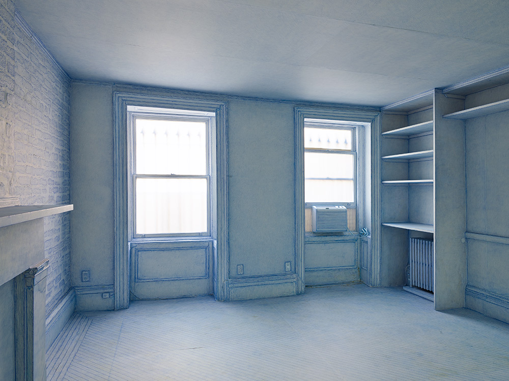
A few years ago Do Ho Suh papered over much of the interior of a four-storey New York townhouse. He used thin paper, stuck down with a soft glue, and delicately worked the paper over fixtures such as radiators or pipes. He was sort of caressing the surface, treating it as a kind of second skin. Finally he coated his fingers in blue pastel and rubbed himself into the walls, and floor and fireplace and shelving, ‘caressing them’ as he put it. He went on to rub different colours into the surfaces of the other rooms. The rubbing got less intense the higher up the house he got and the rooms less familiar. Suh remarked on observing he rubbed away his fingerprints; ‘I gave part of my body’ 

 
Do Ho Suh: Papered and pastel coated room

I was in particular fascinated by photographs of Do Ho Suh's rubbings of fixtures and fittings, such as the one below. It operates in a very strange space that sits between photography, drawing and sculpture.

Do Ho Suh: Photograph of a paper covered sink that has been rubbed with a blue pencil crayon

Photograph of a paper covered radiator

The paper covered radiator is more sculptural and if the paper surface was carefully removed from its metal underpinning, it could become a free standing sculpture. Because the sink photograph has no visual edges to it, we become more aware of the direction of marks taken by the rubbing process, and this makes it more like a drawing. In either case the idea of drawing as portable sculpture still seems viable, so perhaps its worth opening the idea out a little further. 

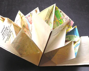
Frances Richardson remarked that she thought of some of her drawings as thin sculpture. Blueprints can be thought of as thin plans for sculpture. When we make a map we think of it as a flat drawing. However when you buy an ordnance survey map it comes as a folded object. 

Opening out a folded map

The folded paper is very sculptural and of course the art of folding flat paper into complex three dimensional forms can reach extremely high levels of complexity. Arisawa Yuga's design for an origami dragon being typical of the thinking processes that allow us to think about the relationship between a flat drawing and a sculptural form. 


Arisawa Yuga: Dragon

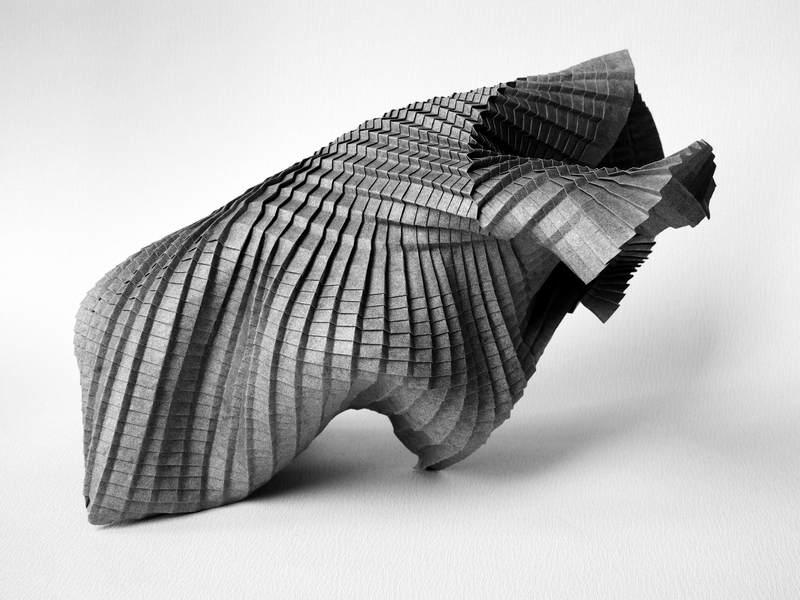
So could we think about Arisawa Yuga's design for an origami dragon as another form of portable sculpture? If we look at a very formal set of folds by Paul Jackson, such as the parallel, but unequal v-pleats below, we see a more engineering than sculptural set of concepts in action. In fact the conceptual thinking around paper folding is even more interesting than simply thinking of how two dimensions can become three. A 'No' crease is a one-dimensional point which creates a dent in the paper called a 'Break'. This generates complex curves in the paper, which can change from convex to concave and back again. So we have a one dimensional point, leading to a fold in a two dimensional surface that allows the maker to create an object with three dimensions. In this case engineering becomes art.

Paul Jackson: Parallel, but unequal v-pleats

The current more sculptural understanding of origami stems directly from Akira Yoshizawa's work. He pioneered many different origami techniques, including most importantly wet-folding which involves slightly dampening the paper before making a fold, which allows the paper to be manipulated more easily, resulting in finished origami models that have a rounder and more sculpted look.

Akira Yoshizawa: origami self portrait

Goran Konjevod: origami 

Yoshizawa's work paved the way for artists such as Goran Konjevod, who explores paper folding as a pure sculptural device, the potentiality of a flat sheet of paper being what this type of portable sculpture is all about. 

Perhaps we could think of architects' drawings as another form of portable sculpture. The drawing of an idea of a building is something that gradually coalesces and accumulates around itself plans and elevations, physical materials and associated actions that eventually make the concept become solid. I'm reminded of a north American Indian description of thinking as crystallised air. 


Frank Gehry: Drawings and final resolution of Guggenheim in Bilbao

The bringing back inside one building the elements of another building, suggests something akin to a 1 to 1 scale map. Michael Rakowitz's rubbings of architectural details as in his exhibition 'The Flesh Is Yours, The Bones Are Ours', highlighted the traces left in Istanbul of the Armenian craftsmen who shaped Istanbul’s ornamented facades, until they were massacred with the rest of Turkey’s Armenian population. The buildings in Istanbul keeping memories alive, when written historical documents don't. 

Michael Rakowitz: 'The Flesh Is Yours, The Bones Are Ours'

In the very short story 'On Exactitude in Science', Jorge Luis Borges writes; …'In that empire, the art of cartography attained such perfection that the map of a single province occupied the entirety of a city, and the map of the empire, the entirety of a province. In time, those unconscionable maps no longer satisfied, and the cartographers' guilds struck a map of the empire whose size was that of the empire, and which coincided point for point with it. The following generations, who were not so fond of the study of cartography as their forebears had been, saw that that vast map was useless, and not without some pitilessness was it, that they delivered it up to the inclemencies of sun and winters. In the deserts of the west, still today, there are tattered ruins of that map, inhabited by animals and beggars; in all the land there is no other relic of the disciplines of geography'. 

Borges' short story is a sort of inverted idea of a map, which is usually meant to operate as a portable landscape, something that allows us to conceptualise our position in the world and therefore be able to navigate it. However the most exact scale map is 1 to 1 and this is reality itself, which as Borges intimates, can suffocate us with its weight and enormity. 

We are left with ideas as portable objects. During the early Renaissance, Filippo Brunelleschi came up with a way of making images that enabled architects like himself to make flat copies of buildings built. 


Brunelleschi  (1377-1446)  painted two panels in the course of an experiment that marked an event which was to change the way we would all begin to look at the world. These two panels are probably the first pictures to correctly embody linear perspective.  This is how Antonio di Tuccio Manetti, a man who was there, explained how the images made by Brunelleschi were made to come alive: "In order to constrain the viewer to place his eye at the centre of projection, Brunelleschi had made a hole in the panel on which there was this painting; ... which hole was as small as a lentil on the painting side of the panel, and on the back it opened pyramidally, like a woman's straw hat, to the size of a ducat or a little more. And he wished the eye to be placed at the back, where it was large, by whoever had it to see, with the one hand bringing it close to the eye, and with the other holding a mirror opposite, so that there the painting came to be reflected back; ... which on being seen, ... it seemed as if the real thing was seen: I have had the painting in my hand and have seen it many times in these days, so I can give testimony."

In effect an image could now be made of something, which acted as an exact copy. This meant someone like Brunelleschi could take an image of a building he had designed and had built to another city and use it to explain what he could build for that other city. A sort of portable architecture. The great grandchild of this event was of course photography, the implication of my question finally being to ask whether or not a photograph could be considered some form of portable sculpture. 

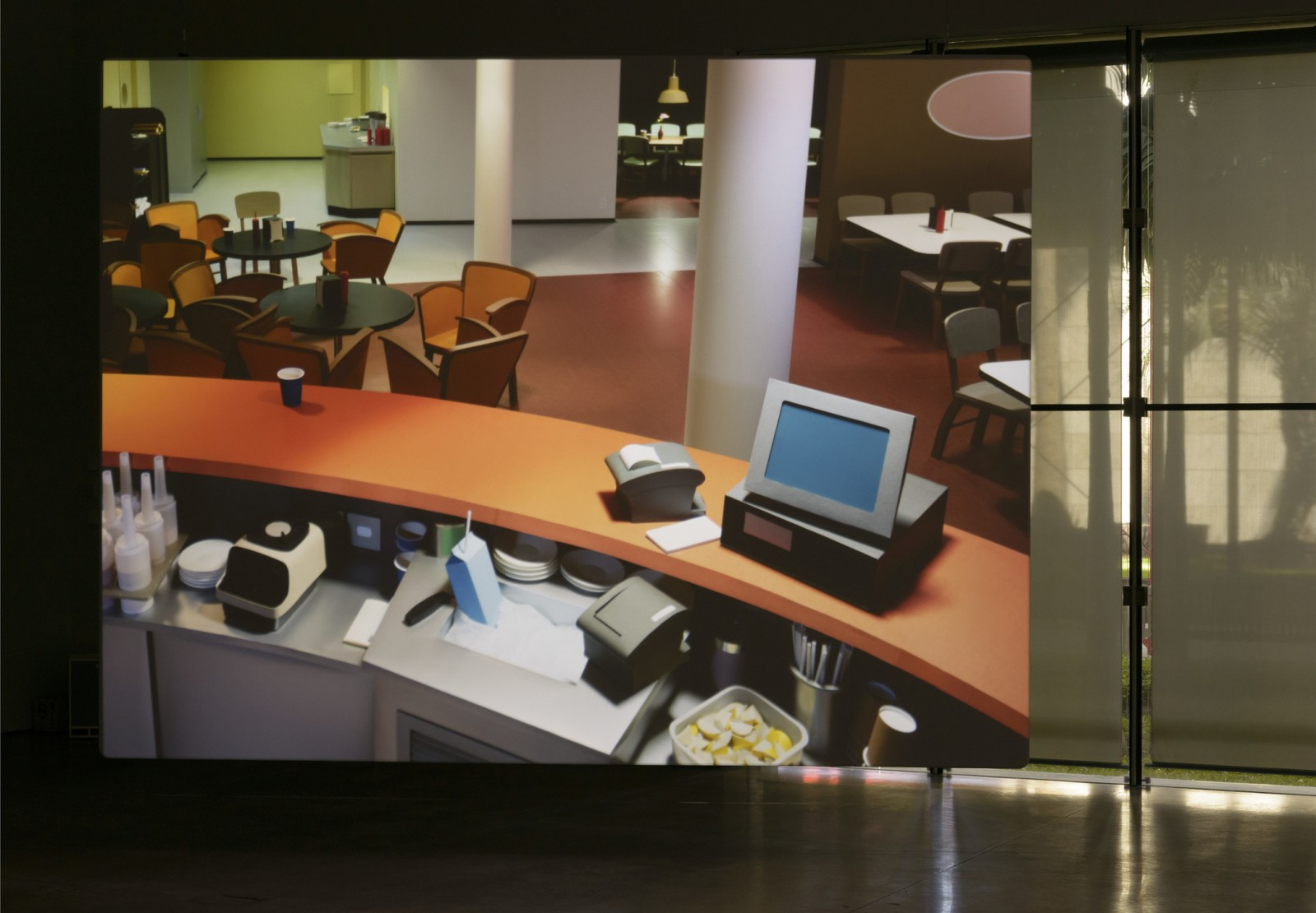
Thomas Demand uses paper to make fragile models of familiar objects that he turns into photographs. The photographs complete the work, the paper objects being thrown away once the photograph is printed. 

Thomas Demand

In the case of Thomas Demand the photograph carries all the information needed to understand the sculpture, in fact it is the only information available, the three dimensional reality of the paper environment compressed into the photographic surface. Is this then the ultimate in paper based portable sculpture?