Kaye Donachie: Monotonous Remorse
I've recently returned to Leeds after a week's walking and drawing on the South Coast near Chichester. While away I went to the Pallent House Gallery and there were two exhibitions on there that made me think about portraiture again. On our first day in the area we had been browsing the Chichester charity shops and I bought an old copy of James Gleeson's 1969 Thames and Hudson biography of William Dobell, an Australian artist that I had never really thought about before. He had had a long painting career that was centred around portraiture, and as I was reading about him, images of his work were floating around in my mind when I visited these portrait focused exhibitions. I was also due to spend a session working with a group of other artists looking at making portraits the following week and I had my doubts as to whether or not I would be able to get anything worthwhile from the activity.
Gwen John's and Kaye Donachie's portraits are very different and Donachie's in particular ask questions as to what portraiture is and can be about. At the centre of James Gleeson's text on Dobell is an extended account of a 1944 court-case, that had a profound mental effect on Dobell, and which raised even more questions as to what a portrait actually was.
William Dobell: Joshua Smith: Winner: Archibald Prize for Portraiture 1943
Photograph of Joshua Smith: 1943
William Dobell: Preparatory drawings for the painting
Dobell entered his portrait of Joshua Smith into the Archibald prize in 1943, and immediately on his winning of the first prize, two disgruntled unsuccessful exhibitors, who were at the time also members of the Royal Art Society, decided to take legal action aimed at setting aside the trustee's decision. All of this seems a long time ago now, but if I think about how powerful a grip a TV program such as Sky Arts 'Portrait Artist of the Year' has on the general public's idea of portraiture, I suspect a similar argument could still be made in relation to how portraiture is thought about today, especially as most of the painters seem to work from gridded up IPad photographs of the sitters. The arguments in the court case surrounded the relationship between a portrait and a likeness or caricature. Some distortion, Dobell asserted, is essential when we have to get a visual image to reveal the 'real' inner character of a person. For myself, this particular issue is another aspect of the question, how can we visualise what is invisible or in this case how can what is visible reveal what is invisible? How does the external physiognomy of a face or body shape reflect the life that an individual has been through and how does this relate to their 'character'? What sort of inner 'truth' can we discern from our readings of the shape of an external body? Can we build exaggerations of perceived visual form in order to heighten character? Or, are the best portraits simply very accurate copies of what is there? As usual I need to ramble around this set of ideas in order to see where they are going.
Dobell know Joshua Smith, a fellow artist, before undertaking to paint him, and they both applied for the competition. Dobell had reminded Smith on commencement that he used "an element of distortion in order to make the portrait more like the subject than he is himself"; which is a very interesting statement, how, I ask myself, is something more like the subject itself? This suggests that in some way a painting can be more 'deep' or 'profound' than the person that the image is made from. A doorway to a thought that suggests that art (for instance the Mona Lisa) carries far more cultural weight than the individual humans that are portrayed in its making. At the time the arguments were mainly laid out in the daily newspapers.
"Joshua saw the progress of the portrait all the time I was painting it," Dobell was quoted as saying in the Sydney Sun. "He gave me every facility and was in no way critical when he saw the finished work ... he congratulated me on the portrait." So as far as Dobell was concerned not only was he happy with his portrait's 'likeness' but Smith was too. However the painter Wolinski declared of Dobell's painting, "If this is meant to set a new standard in art, it will start a revolt. Someone likened it to a praying mantis. I can think of no better description. I couldn't sleep after seeing it the first time." Another artist Mary Edwards declared, "Grotesquerie has been awarded the prize" and "it is a Pearl Harbour attack on art". She went on, "Not a child or an expectant mother should be allowed in the Art Gallery at present." Of course, record numbers visited the gallery to see what all the fuss was about. The gallery had to extend its opening hours, and then it prolonged the exhibition by a month. The question - Is this even a portrait? - was central to the debate. The Contemporary Art Society declared it the most important work of art entered in the competition, to others, this was the ugly face of modern art.
Melbourne newspaper critic James Stuart MacDonald, wrote a scathing newspaper review of Dobell's portrait. Using the headline "Circus Freak Exhibit", he lambasted the work as not a portrait but a "fantasy", stating, "Mr Joshua Smith looks like a man naturally deformed or crippled, and suffering, in addition, from malnutrition." The portrait being the "epitome of ugliness, malformation and gruesome taste". In response to all this invective, eventually the key element of the argument taken to the courts was that this was not a portrait, but a caricature.
So another digression. Back in 1938, but only 5 years before Dobell painted his portrait of Joshua Smith, E. H. Gombrich wrote an essay on caricature, in this essay he states, "Freud's Interpretation of Dreams (1913) marks a turning point in the history of aesthetics just as it does in psychiatry. But more than this, psycho-analysis, though it has up to the present only registered the fact that there must be psychological laws of art-construction as there are laws of dream-construction, is proving of great value to the student of aesthetics, because it deals with man as a creature of conflicts and troubles". (Gombrich, 1938, p. 319) What both Gombrich and Dobell had both recognised was that aesthetics had moved on to be able to incorporate the thinking of Freud, and that 'psychological laws of art-construction' were now in place and that they needed to be taken into consideration in a similar way to the laws of dream-construction. Further more 'caricature' was seen by Gombrich as being a particularly effective trigger, that could enable us to enter into an awareness of these issues. Gombrich goes on to state that, 'it is a likeness more true than mere imitation could be' and that 'caricature, showing more of the essential, is truer than reality itself.' (Ibid) Gombrich then goes on to make a clear statement about what a portrait artist was supposed to be doing. 'By the seventeenth century the portrait painter's task was to reveal the character, the essence of the man in an heroic sense. The caricaturist has a corresponding aim. He does not seek the perfect form but the perfect deformity, thus penetrating through the mere outward appearance to the inner being in all its littleness or ugliness.' In doing so he makes a very interesting distinction between the portrait painter and the caricaturist, who he says looks for the 'perfect deformity', (Ibid) but in a way he brings them both together by stressing that portraits seek 'the essence' of someone, whilst caricature needs to 'penetrate through mere outward appearance'.
The late 16th century marks the time when for Gombrich the work of art is, 'for the first time in European history—considered as a projection of an inner image. It is not its proximity to reality that proves its value but its nearness to the artist's psychic life. Thus for the first time the sketch was held in high esteem as the most direct document of inspiration'. (Ibid)
Sketch of a man: Presumed study for Billy Boy
Billy Boy: William Dobell
When preparing for a painting Dobell would visit the sitter and make sketches, he did not however work directly from them, he would put them up on a wall behind him whilst making the actual painting. The sketches were his attempt to find a way in to a visual trigger that would reveal an essence of some sort. In this way he made sure 'verisimilitude' did not get in the way of psychological 'truth'. If we look at his preparatory sketch for Smith's portrait we can see that the sketch is less distorted than the final painting, but the features that Dobell picks out as being essential to the character are already evident. The sketch's exaggeration of forms sits roughly halfway between the more attenuated figure produced for the final painting and the black and white photograph of Smith. This psychological approach it could be argued is yet another example of the continuing Romantic tradition. However in portraiture the most extreme examples of psychologically intense exploration have traditionally been self portraits, whereby the artist does know something about the inner mental life of the subject because he or she has to live out that life.
In English, the first use of the term “self-portrait” was in 1810, and it was derived from the German “Selbstbildnis” itself a term that had come into use only a little earlier. The French word “autoportrait” did not gain currency until the 1920s. This suggests that there had been a fundamental change in how the portrait was thought of. Artists had of course in the past made images of themselves, but as a genre, they were not picked out, so what had changed? Our interest in the self portrait I would suggest was heightened by Romanticism. Romanticism, a Western European intellectual phenomenon, celebrated the individual imagination and intuition as well as advocating individual rights and liberty. From approximately 1800 to 1850 it was at its height as a movement, and its influence continued well into the late 20th century and many would argue it is still one of the dominant ideas behind our current difficulty in reconciling a celebration of human individuality with a need to let the non human world have its say. In my mind the key self portrait in relation to this shift in thinking is Chardin's pastel of 1776.

Jean-Baptiste-Siméon Chardin, Portrait de artiste peint par lui-même, 1776. Pastel
Chardin's self-portrait, is a very private, self-aware image. He sits hunched at his easel, lost in the activity of looking at himself and in that absorption he avoids trying to make an image that reflects the gaze of others. This portrait is not just showing us a truer image of the artist, it also suggests an inner mental life whereby he is unmasked, no longer playing out his social role of artist/gentleman, he is now exposed as Chardin, the troubled man. After this point the self portrait I believe becomes more self conscious and as it does so it opens itself up to the need to become more expressive, rather than representational. This situation is of course exacerbated by the fact that in 1839, Robert Cornelius had shot the first successful photographic portrait using the daguerreotype and artists were becoming freed from the need to make accurate representations, because photographs, it was believed, could do this far quicker, cheaper and far more accurately.
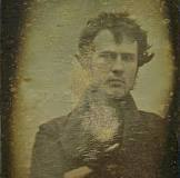
Robert Cornelius: Photographic self-portrait: 1839
The debate at the centre of the Dobell trial would seem to be really about a much wider issue, that of Modernism itself and its decoupling of the making of art images from their need to be accurate visual representations or copies of what people could see.
But there are other strands to this set of ruminations and before I get round finally to considering the work on exhibition at the Pallent House gallery, I want to throw into the arena two other issues. The idea of the living reality of a portrait was put forward by Oscar Wilde in his 1890 novel 'The Portrait of Dorian Grey', in the novel a young man sells his soul for eternal youth and beauty, as he pursues a debauched life. The effects on his physical appearance then slowly change his painted portrait which he keeps locked up and hidden from everyone else's view. This malignant portrait of the effects of evil and debauchery on a young aesthete in late-19th-century England is both a classic work of art in itself and the model of a idea, whereby we feel we should be able to spot the effects of life's experiences on someone's face. Conversely we are easily fooled by an evil heart inhabiting an innocent looking body. The painter Ivan Albright was chosen to make the painting that was used for the 1945 movie adaption of the story and he was chosen because at the time his work was seen as a clear example of a painter who was able in his portraits to depict the effects of life's experiences on someone's face.
If you look at two self portraits by Albright you can see two very different attempts to do this.
Ivan Albright: Self portrait before a stroke

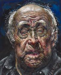
Ivan Albright 1983 self portrait made after a stroke
Albright at work on the portrait of Dorian Grey
Ivan Albright: Portrait of Dorian Grey 1944
Oscar Wilde's story brings to a head the relationship between a portrait and the idea of an artist's ability to dig down deep into the 'real' character beneath a face's external appearance. In Wilde's story a myth was made into a narrative reality. Albright would have had to paint his Portrait of Dorian Grey before commencement of the shooting of the film, so it was probably painted during exactly the same time that Dobell was working on his portrait of Joshua Smith. Judging by the reactions to Dobell's painting at the time you could easily swap one for the other. Albright intending to portray a base inner character and Dobell perhaps innocently achieving a similar thing, his portrait being seen as an "epitome of ugliness, malformation and gruesome taste".
The portraits of Maria Lani
If though we compare Wilde's tale with the story of Maria Lani a woman who was painted by many artists, we could come to a very different conclusion. In the late 1920s she was portrayed in paintings and sculpture by over fifty artists, including Bonnard, Chagall, Cocteau, Derain, Matisse, Rouault, and Suzanne Valadon. When we look at their various portraits of her, we can only come to one conclusion, each artist is expressing themselves 'through' the face of the sitter. They are in effect using the portrait to express themselves and what is revealed is the character of the artist rather than that of the sitter.
Kees Van Dongen: Maria Lani
Picabia and Rouault: Maria Lani
Matisse and Soutine: Maria Lani
What is wrong with Modern Artists?
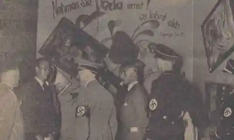
The aspect of contemporary art that allows for 'expression' also allows for distortion. This has confused and baffled people for over a hundred years and the newspaper article above is typical of the reaction the press in particular have taken to the artist's licence for distorting reality. The various lenses that each artist applies to the world are their passports to fame, and when you look at the images above, the Soutine painting is clearly a 'Soutine', and the Picabia a 'Picabia'. These artists are known for their 'signature' styles and if you couldn't identify them from their way of rendering form, they would have failed in their various attempts to be 'true' to their own sensibilities. The newspaper headline, 'What is wrong with the heads of Modern artists', is also a reminder of how easily newspapers can fan the flames of division and hatred of anything seen as different or not fitting in with what is seen as established taste. We must never forget that a denunciation of visual exaggeration and formal inventiveness as forms of expression became central to the Nazi project of stigmatising certain people as 'degenerate'. Classical styles are also 'styles', but like the fish swimming in water who cant see it because it is just 'there', many Western civilisations have held classical art up as a model that is the only one to follow. In the case of the Nazi party, the classical model was a measure that was used to help fulfil the dreams of Adolf Hitler who stated in 1935, "It is not the mission of art, to wallow in filth for filth's sake, to paint the human being only in a state of putrefaction, to draw cretins as symbols of motherhood, or to present deformed idiots as representatives of manly strength."
Adolf Hitler and other Nazi officials at the Dada wall of the Degenerate Art exhibition: 1937
In 1937 a commission led by Adolf Ziegler, Hitler's favourite painter, was charged with purging German museums of unacceptable art. The model that all artists were told to aspire to was Ziegler's particular brand of sleazy classicism, a type of painting that when we look at it now, we cringe at its celebration of the male gaze and soft porn portrayal of women.
Adolf Ziegler (1892-1959) The Four Elements: 1937
It is worthwhile reminding ourselves that Dobell was painting his portrait during the Second World War. His painting of Smith was painted only 6 years after Ziegler's 'Four Elements' and in many ways Hitler's rhetoric parallels that of the Melbourne critic who wrote about Dobell's image as being 'deformed or crippled'. How easily we can be seduced by rhetoric to believe that there must be something wrong with people, (artists) that don't see the world in the same way as everyone else. It is a continuing issue, this is a Daily Mail headline from 2012, 'Moral vacuity and rancid opportunism. Sorry Damien, but you're a FRAUD', the Mail arts reporter Quentin Letts goes on to say, 'London's Damien Hirst exhibition stinks. Literally. From a work called A Thousand Years seeps the pong of rotting flesh. This may be because its large glass box contains the severed head of a cow. It has oozed a small, drying patch of blood and the box is full of flies.' When I first saw 'A Thousand Years' I realised Hirst had made a very powerful statement, and no matter how much I might find some of his work a little thin, there is no denying that at his best he has made some of the most significant statements about mortality of our times. The use of phrases such as 'Moral vacuity and rancid opportunism', once again reminds us of how newspapers use emotional triggers to push people's buttons.
Perhaps after my digression its now time to return to the two exhibitions. The art critic Waldemar Januszczak states of the Gwen John exhibition that these paintings are, 'works of control, self knowledge and immense feeling'. Although many of the works displayed are portraits there is no mention of insight into any of the sitter's characters, these paintings are about Gwen John's control of colour, her obsession with certain paint handling qualities, often leading to her addition of chalk into her oil paint mixes in order to get a 'dry' surface appearance, her close control of tonality and use of centralised compositions to achieve a sense of timeless stability. All these things combine to ensure that her 'immense feeling' for life is communicated through these images. These qualities being what we recognise as her 'style'.
Gwen John: Portraits
Gwen John is also well known for her delicately painted interiors which again communicate a very particular sensibility to the world. If fact if you squint your eyes up and let some of her portraits go out of focus and then do the same with her interiors, you could be forgiven for confusing one subject with the other.
Gwen John: Interior 1926
Gwen John's paintings are reflections of her sensibility and sensitivity to her experiences, she regards her world through colour desaturation glasses; looking at her art materials, as well as the composition and subject matter for her paintings through the same unifying lens of a personal vision.
Kaye Donachie is a very different painter and yet she also has a particular lens through which she regards the world.
Kaye Donachie
Kaye Donachie’s paintings in her exhibition 'Song for the Last Act', celebrate the lives and works of women. Her portraits are not exacting copies of photographs of these women; drawing on literature, biography and in particular archival photographic imagery of women poets, writers, and artists. Donachie then reimagines these historic women in contemporary portraits, that use her very particular sensibility to oil paint. By using oil paint's ability to be manipulated whilst wet and controlling its flow qualities, she presents us with images that are invigorated by her handling and which therefore emerge into a painterly present tense. Her colour choice is often 'un-natural' therefore also emphasising the ghost-like quality of the images, her palette conjuring up colour visions of old black and white frozen photographic portraits of often forgotten women.
As these portraits are not of 'real' women, they could be distorted in many ways and no one would be there to cry 'caricature!' They are coloured using a palette designed to remove these images from perceived reality and the paint handling means that it is hard to decide where for instance the mouth ends and begins. However I'm sure no one would argue that these were not portraits because they were too distorted, she obviously takes time to render her images as accurately as possible. Donachie has a clear project, her paintings illustrate a concept about the revisiting of women in history and she is celebrating these women using a personal palette; using colour to suggest the fact that she is rediscovering these women from old archives of photographs.
Donachie's images are sensuous paintings to look at and in their very painterly liveliness they bring back to life the women found within the archives she has been exploring. This is in direct contrast to Gwen John's paintings that I feel are powerfully controlled so that they achieve a timeless quality, the sitters individuality replaced by a way of painting that unifies everything and that aspires to timelessness. Reserved nuns occupying a similar compositional and desaturated colour sensibility to other seated women; quiet strength being the main feeling tone that Gwen John evokes; however I left her exhibition with a sense that in one way what Gwen John was doing, was building up her own personal archive of other women who she had managed to shape into various images of herself.
References
E. H. Gombrich, (with Ernst Kris) The Principles of Caricature, British Journal of Medical Psychology, Vol. 17, 1938, pp.319-42
Gleeson, James (1969) William Dobell London: Thames and Hudson
See also:
Painting and photography A post on the work of Adam Stone who has worked from archival footage of photographs of buildings. In particular my thoughts on the concept of duende, a quality that the poet Lorca saw as essential to the recreation of a lived experience, could be applied to Donachie's paintings.