At the end of the last post on illusion I left a blog link to the type of exercises that used to be undertaken on the foundation course at Leeds back in the 1980s. One of the key artists that were referred to at that time was Georges Rousse.

Georges Rousse
In the image above the red rectangle appears to float across the interior of a building that has been blackened by fire. The illusion of coherence is created by controlling the optical viewpoint and is only visible from one specific view point. Outside of this viewpoint, the shapes deconstruct and the viewer can see them for what they really are, patches of colour placed on various surfaces that are designed to line up when seen from the position from where the photograph was taken. Rousse would have used a camera viewfinder set up on a tripod to constantly check the construction of the piece, instructing his construction team to make a drawing that would line up from the point of view of the viewfinder, which when finished would be coloured in red. Some of the more complicated versions of these constructions which involve deep space also have to contain colour adjustments to overcome the way that atmospheric colour space operates. The areas much further back having to be painted in slightly brighter tones so that they optically move forward into the same space as areas painted on much closer surfaces.
An artist that operates in the same territory as George Rousse is Felice Varini.


Felice Varini
In the images above you can see that Varini's illusion only operates from one point and as you move away from that point the shapes that make up the image distort and break down into their individual forms. This type of illusion is totally site specific and can't really be appreciated unless you experience one 'in the flesh'. Varini at times works on a huge scale and the project management skills needed as well as the technology and workforce required are tremendous, but he would have had to start somewhere and I would suggest he developed these ideas by researching the history of anamorphosis.
Anamorphosis is a distorted projection or
perspective requiring the viewer to use special devices or occupy a specific
vantage point to reconstitute the image. The word
"anamorphosis" is derived from the Greek prefix ana‑, meaning back or again, and the word morphe,
meaning shape or form.
Leonardo was supposed to have invented the first anamorphic image, called appropriately 'Leonardo's Eye'. I'm pretty sure a lot of artists around this time would have discovered anamorphic projections because they were all playing around with perspective, which was the new 'tool on the block' so to speak. If you look at Durer's images of perspective frames such as this one below, you can see how vital it was to have a fixed point of view.

 We have a dislocation in space because of the side view of the situation and the actual view point of the artist are different. Two separate viewpoints of the same situation exist, one showing spatially the relationships between all the elements in order to show how it was done and the other from the viewpoint of the observer which is meant to show us how the completed image would look. Compare this situation to the Varini photographs.
Jean François Niceron in his book 'La Perspective Curieuse' is the first artist to formalise these issues.

As you can see in the image above the situation as set out by Durer has been reconstructed but this time in a long corridor space. The wall would have been strung (we have looked at the importance of chalk lines before) and instead of the artist filling in a flat regular grid, the artist works in a distorted grid that only lines up correctly when you look at the image from the end of the corridor. However when seen from the front the drawing is so 'pulled out' or elongated that it is almost like a landscape.
If you ever get the chance visit the Trinita dei Monti Convent in Rome you will find that the original anamorphic fresco is still in place. The fresco is of Saint Francis of Paula praying under a tree and it turns into a landscape as you walk down the corridor.


What's so wonderful about this image is that you can go back and look at Niceron's 'La Perspective Curieuse' and work out exactly the process that he would have used to construct the fresco. I also think the way he added tiny boats and other landscape details is really well handled, to ensure that the gradual change from image of saint to landscape is extremely subtle.
In the 16th, 17th, and 18th centuries anamorphic images became extremely popular, and supplied an ideal means of camouflaging dangerous political statements, heretical ideas, and even erotic images because only those in the know would be able to select the right 'point of view'.

Perhaps the most famous example in this country is Holbein's 'Ambassadors', a painting that was originally meant to hang on a stairway, so that viewers would first of all see the painting from above, close to and from an oblique angle.


The image of the skull above is what you would see as you descended the stairway, perhaps a reminder of the way all worldly things will pass away. This leads me to that other aspect of point of view, the fact that this is not just about a fixed point in space but that it is also about a view taken about how we think about the world. Several contemporary artists have extended the purely optical aspects of viewpoint into more political or contextual concerns.
Rub Kandy straddles a
territory between graffiti, community art practice and point of view dependent
illusion. He opens the issues surrounding illusion into a socially critical and
political set of agendas and in doing so returns to a way of working with anamorphic
illusions that was current in the past during times of political unrest. As he
states; ‘In my anamorphosis works I
always try to put ‘the illusion’ (the anamor- phosis is a paradigm of illusion)
next to a wrong element that unmasks ‘the illusion’, in order to reveal ‘the
real’. I try to find a bug, to generate a short-circuit. I don’t want my works to be
a showcase of virtuosity. The simpler, the better. My hand is not firm, my
paint is not fine, my line is not thorough. With my rough style I try to use
perspective destroying perspective. I just want to communicate my religious
wonder about the mystery of space and perception’. Point of view in this case
referring to both the way that optical illusions are point of view dependent
and that fact that a political stance demands a ‘point of view’. Anamorphic projections demand a certain amount of geometric control, Rub Kandy contrasts this with the uncontrollability and reality of poor social conditions.Leonardo was supposed to have invented the first anamorphic image, called appropriately 'Leonardo's Eye'. I'm pretty sure a lot of artists around this time would have discovered anamorphic projections because they were all playing around with perspective, which was the new 'tool on the block' so to speak. If you look at Durer's images of perspective frames such as this one below, you can see how vital it was to have a fixed point of view.

Durer
This (below) is what the artist could see. Jean François Niceron in his book 'La Perspective Curieuse' is the first artist to formalise these issues.

From: 'La Perspective Curieuse'
As you can see in the image above the situation as set out by Durer has been reconstructed but this time in a long corridor space. The wall would have been strung (we have looked at the importance of chalk lines before) and instead of the artist filling in a flat regular grid, the artist works in a distorted grid that only lines up correctly when you look at the image from the end of the corridor. However when seen from the front the drawing is so 'pulled out' or elongated that it is almost like a landscape.
If you ever get the chance visit the Trinita dei Monti Convent in Rome you will find that the original anamorphic fresco is still in place. The fresco is of Saint Francis of Paula praying under a tree and it turns into a landscape as you walk down the corridor.


Jean François Niceron: Saint Francis of Paula praying under a tree.
What's so wonderful about this image is that you can go back and look at Niceron's 'La Perspective Curieuse' and work out exactly the process that he would have used to construct the fresco. I also think the way he added tiny boats and other landscape details is really well handled, to ensure that the gradual change from image of saint to landscape is extremely subtle.
In the 16th, 17th, and 18th centuries anamorphic images became extremely popular, and supplied an ideal means of camouflaging dangerous political statements, heretical ideas, and even erotic images because only those in the know would be able to select the right 'point of view'.

Erhart Schon Vexierbild 1535
The artist Erhart Schon's Vexierbild 1535 disguises the comic portraits of Charles V, Ferdinanc 1, Pope Paul III and Francis 1. When viewed from the front the picture appears to be of landscapes with coastlines, ships and villages and from the side you can see the four portraits stacked one above the other. (We have come across Schon before in relation to artists' attempts to measure and grid the figure. Artists that have a strong understanding of the mathematics of perspective are also very aware of how perspective is not reality, simply a device to control a depiction of spatial relationships from one point of view)

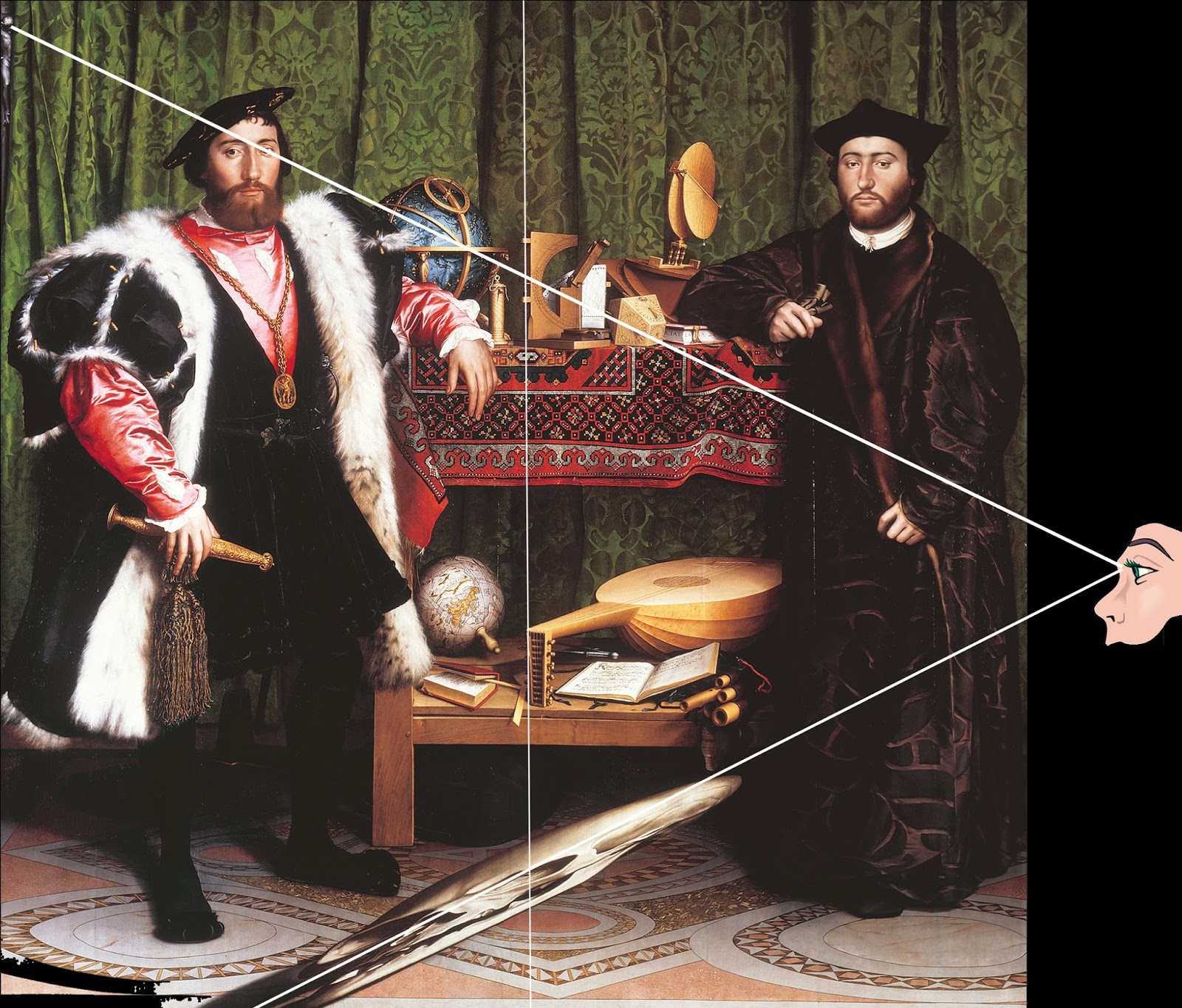

The image of the skull above is what you would see as you descended the stairway, perhaps a reminder of the way all worldly things will pass away. This leads me to that other aspect of point of view, the fact that this is not just about a fixed point in space but that it is also about a view taken about how we think about the world. Several contemporary artists have extended the purely optical aspects of viewpoint into more political or contextual concerns.


Rub Kandy
William Kentridge's film ‘Whatwill come’ is a combination of anamorphic projection and animated film projection. Kentridge uses the mirrored cylinder anamorphic illusion to reflect the various states of emotional disturbance brought on by political tension.

William Kentridge: On Perception
Kentridge has used the mirrored cylinder anamorphic effect several times and was himself influenced by Scottish images of Bonnie Prince Charlie. In response to the brutal English crackdown on his followers when Scottish households who were found to contain a portrait of Bonnie Prince Charlie were imprisoned or worse, supporters turned to anamorphic portraiture.


Anamorphic portrait of Prince Charles
Again these distortions relate to the way images can be 'hidden' so that in times of political tension images of political favourites could be hidden in plain sight.
These ideas don't always have to be about difficult emotional or political issues, they can sometimes simply be used to entertain.

The use of anamorphic projections is seen across a wide spectrum of art and artists, including some artists that you wouldn't suspect would have an interest, such as Chuck Close. Perhaps what unites them all is research into how images are visually constructed.


Chuck Close
The Hungarian artist István Orosz specializes in these mirror anamorphoses, whereby conical or
cylindrical mirrors are placed on the drawing to transform a flat distorted image
into a three dimensional picture.


István Orosz
Another closely related area of illusion is shadow play. Because shadows are the result of light being projected from a single light source, a shadow is in effect an anamorphic projection of the object that casts the shadow. Tim Noble and Sue Webster are perhaps the most well known of contemporary British artists to have explored this area.


Tim Noble and Sue Webster
Richard Wright (Anamorphic projections)
Rub Kandy pdf download of a wide range of his recent projects
This short video of 'Perceptual Shift' by Michael Murphy clearly explains how point of view works as well as illustrating how carefully a construction has to be built in order to make it work.
Earlier blog post on Architectural perspectives
Earlier blog post on Architectural perspectives


