I have been working for a while on how to visualise 'somatic' or inner body experiences. But of course many have been there before me and I have just discovered another artist who has done some very powerful work in this area. The artist Ibrahim El-Salahi, took a closely related but very different approach to the subject and I have found it useful to compare differences. I have been trying to visualise the pain or inner feeling tone of other people as well as myself; usually looking for an area of commonality, between my own perception of feelings such as physical pain or emotional trauma and the way others may visualise them. This has been a very difficult endeavour and has made me very aware of the problems inherent in trying to nail down visual communication between people, mainly because we have no agreed codes or sign systems for these things, which means that everything is open to personal interpretation.
Ibrahim El-Salahi: Pain relief image: Unique screenprint on linen
Ibrahim El-Salahi is older than I am, he is now in his 90s. He gets sciatica and chronic back pain, and says that it is only when making images about his pain that he gets any relief from it. This immediately interested me as it suggested once again that the externalisation of a feeling by making an image of it does help to remove it.
Between 2016-2018 El-Salahi a Sudanese artist who also has a base in Oxford, created a body of work that he had to make whilst confined mainly to an armchair. However this physical restriction in many ways drove, as it often does (think late Matisse), a high level of invention. He has made around 200 tiny drawings in pen and ink, each one drawn on the blank inside of the many medicine packets that he has had to open during the time of his suffering. These 'Pain Relief Drawings' have now been exhibited at the Drawing Centre in New York.
Ibrahim El-Salahi: Pain relief image: Unique screenprint on linen
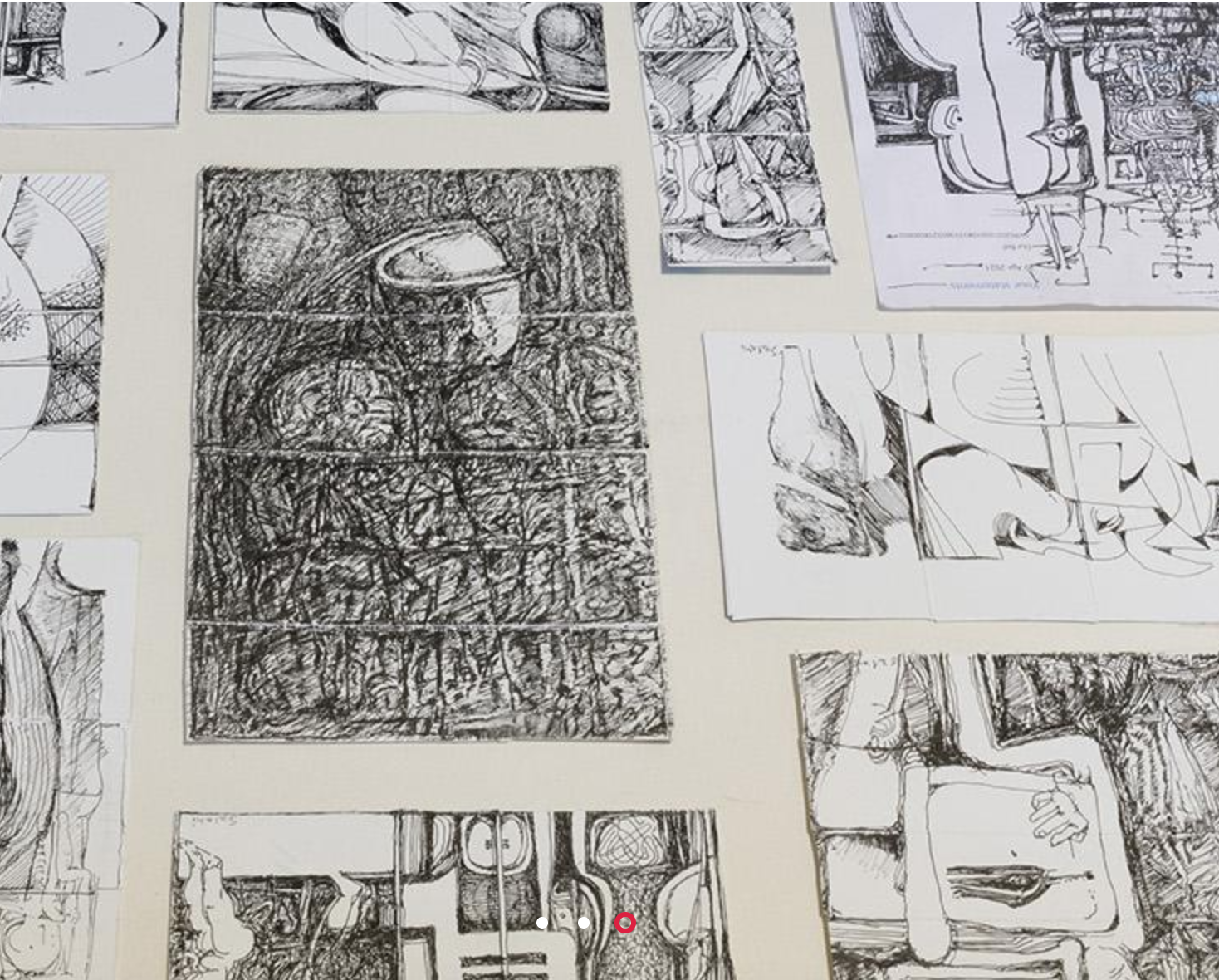
The small drawings El-Salahi made were processed by him as silkscreen mono-print images. Silkscreen stencils were made from the initial small drawings by them being scanned and then enlarged for transfer. However he worked with the silkscreen process in a unique way. Once transferred, the initial drawings, because they are so small are in the process of enlargement 'roughened up'. This allows for further textual intervention, if you are used to making silkscreen prints you will be aware that the photo-stencil is a reverse image, the gaps in the image are the areas that allow ink to be squeezed through the mesh. In El-Salahi's case, the transferred image is reconstructed by him pressing ink through the gaps in the gauze by hand (rather than using the traditional squeegee) onto a woven linen canvas. However because this method is so inefficient it has to be done over and over again, until the thick inky texture he wants is achieved. This both amplifies the character of the original marks and gives a renewed physical substance to a process that could have diminished the intensity of the original drawings. The movement between the photographic process of copying and transforming the drawings and the reinsertion of the hand techniques of pushing ink through the silkscreen gauze has particularly interested me, because I also want to work between analogue and digital modes and have worried about losing 'authenticity' or material gravitas in doing so. El-Salahi had this to say about his drawings. “I am surrounded by packets of medicine so I said ‘What a waste. Why don’t I use them?’ and I started opening them and chopping them to size and working on them. I had a number of pens with waterproof and fade proof ink, which the material of those kind of packages takes very nicely. It reminds me of the time when I found paper in prison, and did sort of little images as the nucleus. So I pray and bring peace and calm in my mind that I use as imagery, which can be transmitted to other people when they see my work.” He adds, “A small drawing is an artwork by itself, but at the same time when it is enlarged it works very well indeed. It has a great potential of moving from a small size to a large size – the organic growth of a picture, the work is alive. That is the nucleus. The idea of the nucleus, like the seed, if you have water and enough sunlight it can grow into a larger size. It’s the origin, that’s the main thing.”


Ibrahim El-Salahi: Installation of drawings at the 2022 Venice Biennale
I had seen El-Salahi's work at the Venice Biennale and was interested at the time in the way his drawings were displayed in long horizontal vitrines, a method I had been considering of displaying my own work. But most importantly for myself was the fact that his drawings, no matter whether tiny or large scale and printed onto canvas, were attempts to visualise those invisible sensations that we all have but find it very difficult to communicate to others because they remain inside the shell of our internal selves.

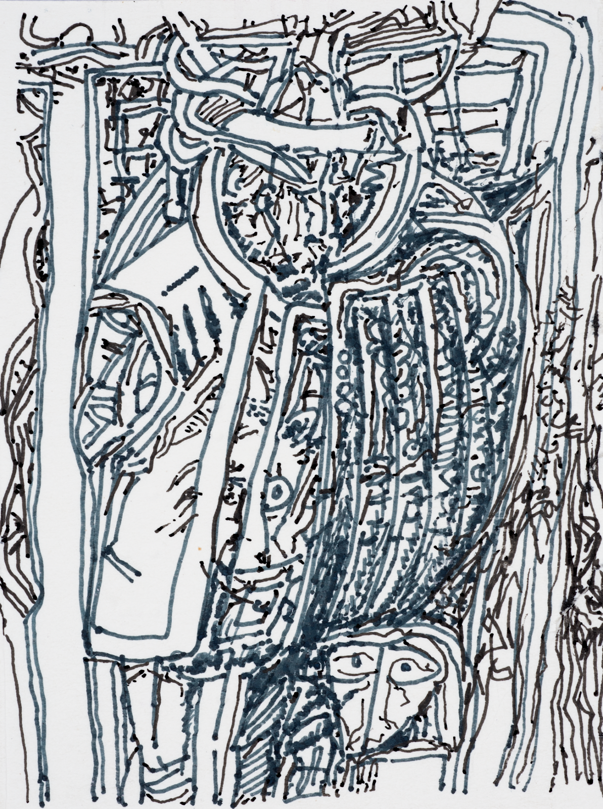


Drawings by Ibrahim El-Salahi
Drawing made on the back of a medicine packet
El-Salahi’s drawings are also deeply connected to postwar European modernism, and yet at the same time they are embedded into a tradition of African and Islamic art history. Because of this he also raises our awareness of how hybrid cultures could be used to help the project of global communication. His work is inspired by Arabic calligraphy, as well as Surrealist figuration and geometric abstraction, a blend of traditions that could never have happened before, but in a post-colonial period, it is expected that artists will emerge from cultures right across the world with fascinating blends and mixes of visual modes and approaches. This is I believe something to be celebrated and it demonstrates the interconnectedness of everything and a move towards a much more non-binary understanding of cultures. They are not fixed things, but are constantly evolving processes.
It is also useful for myself to have images to compare with my own. So here is what I think of as one of the best of El-Salahi's pain relief image silkscreen monoprints.
Ibrahim El-Salahi: Chronic back pain: Mono-print on linen
Below is one of my first drawings whereby I tried to visualise my own toothache. It is watercolour with pen and ink and was an attempt to fuse the 'socket' feeling of teeth, with the pain feeling that eventually seems to shift to being behind the eye. Looked at from a distance I am not happy about my fusing into the image a pained eye, but even so, it communicates something of discomfort and I was fascinated to see that El-Salahi had also invented a sort of 'internal' eye or eyes, in order I presume to suggest that he was observing his own pain. Even when we cant see something we try to 'see' something. For instance when you grasp what someone is trying to tell you, you often say, "Yes, I see."
Garry Barker: Toothache: Watercolour on paper
The image immediately below is much more recent and it was initially a watercolour whereby different stains were pooled across unstretched paper. The image was then scanned into Photoshop and the element representing the pain's focus had its colour intensified, whilst a layer of more diagrammatic inserts was used to represent the way the pain both passed out of and was also at the same time held within the body. This was one of my first attempts to visualise what I eventually came to understand as a Markov blanket effect. An unfixed area of significance needed to have broken boundaries, because it allowed for percolation between one thing and another. I.e. it stopped me from thinking that there were always hard edged boundaries between things, only a constant transition between them. Perhaps the key issue here was time. If time was slowed down, as in a drawing, an instant of time frozen between the stages of a process could be captured, but in reality this was always part of a process of constant becoming.
Garry Barker: Throbbing intermittent stomach pain: PhotoShop processed watercolour image
Ibrahim El-Salahi: Sciatica: Mono-print on linen
I had never seen El-Salahi's work before, but quickly realised I was working a very similar territory and that certain aspects of our visual languages do overlap. I get a sense of compression and the permeability of surfaces from the red image printed onto grey linen above. Perhaps he is trying to represent the way that sciatica pain travels from one place to another and as it does the compression of the lower back or bottom, transfers itself into a pain spreading down a leg. An image of a process rather than a thing. El-Salahi had begun with a small drawing made on the insides of a small cardboard box, it had then been digitally transferred and enlarged, and finally remade using a monoprint process. I had also been moving between analogue and digital ways of working. Did I also now need to revisit my own digital images and look at transferring them back into an analogue process in order to ensure they have the 'right' feeling tone? At the moment I'm making my analogue response in three dimensions, usually using clay and glaze technology, as in the images below but it is always a good idea to keep questioning what you are doing.
Lung votive
Post cigarette lung
Arthritic fingers
See also: