I have just been to see the exhibition 'Pushing paper: contemporary drawing from 1970 to now', which is on at the Cooper Art Gallery in Barnsley. We rarely get to see drawing exhibitions of this quality in Yorkshire, so I would advise anyone living locally to go and see this carefully curated show.
There are so many interesting drawings that it's hard to know where to begin, but perhaps simply because I know that every year Fine Art students at the LAU are given the opportunity to take part in the British Art Medal society's design a medal competition, I'll begin with Ellen Gallagher's 'An experiment of unusual opportunity', a drawing done as a design for a medal to raise the profile of the difficult to face life and work of Eunice Rivers. This small pencil drawing fascinated me because it was dealing with similar interests to my own, how do you communicate ideas through depictions the human body? In this case the carefully knotted hair of Rivers, is pushed right up against the ear and greatly enlarged eye, which replaces the rest of the face. In fact the eye punches the face away, its pupil a conker shaped stone at its centre, all of which works against the delicate tracing of light pencil lines that make up the hair and eyelashes. It was perhaps this conjunction that drew me in. The pencil drawing was light and airy, almost etherial, but the visual logic was of a clunky juxtaposition, a drastic short cut to bring the viewer up short.

Ellen Gallagher: An experiment of unusual opportunity
This small drawing set the tone of the exhibition for me and I began looking for embodied moments in drawings, searching for visual ideas that I could take back into the studio where I'm working on a range of drawings that attempt to communicate various concepts about my own and others bodies. Hanging high on an adjacent wall to Gallagher's small image was Glenn Brown's 'Children of the Revolution' (after Rembrandt). This large image is a type of Brown drawing I had seen before in the British Museum and had remarked on in an earlier blog post, but this time I was interested in another aspect of how the body could communicate an idea. The subject is Rembrandt's etching of the goddess Diana, but Brown has left the head off. As in Gallagher's drawing, a process of removal focusses attention on the rest of the body, that has itself been elongated, Diana's solidity and human weight as given to us by Rembrandt, is now made more El Greco like, her body flickering upwards in white ink pen lines, made all the more sharp by the drawing being done on transparent polyester film and mounted on brown cardboard. Some tonal effects are introduced by playing off the white lines with black ones, and the body is being given form more by white lines acting as cross contour definers, than by tonal massing. The curve of the inner frame in effect replaces Diana's head and the sinuous lines demarcating the body, dissolve back into background supporting lines, almost as if they are drawing a rock being pulled out of flowing water. The headless figure has its arms cradled around what is in the Rembrandt etching almost a void, and which in Brown's image becomes a trapped swirl of black curled marks, as if the figure was attempting to cradle or hold on to the top of its recently lost head. Brown's reflection on an old master image intrigued me, perhaps above all because I had always loved the original's ability to bring the gods down to earth.

Rembrandt: Diana at her bath: Etching 7 x 6 in
Glenn Brown 'Children of the Revolution'
By taking Diana's all too human head away, Brown had somehow released the idea back into a more spiritual understanding; Brown's flame flicker of body energy, releasing the image to burn itself out in an intellectual frame, whilst Rembrandt's original was still reminding me of the inescapable weight of the body as it ages, and that if the gods made humans in their image, they must themselves therefore be subject to the same ageing process that we mortals have to inhabit.
One of Claude Heath's head drawings done by touch whilst blindfolded was exhibited not too far away from Brown's. This was another meditation of what was missing, this time sight itself was taken away, and the way touch can be used to gradually inform us of what is there was indicated by changing colour each time a new inquiry took place. The artist used a cast plaster model of his brother's head to work from. Another absence; in this case the solid, intractable cold plaster cast, replacing the warm hard/soft surfaces of a real head, resulting perhaps in the more 'measured' ball point pen tracing of lines that recorded touch. I could still see the 'looking' behind the 'touching', the empty space of the drawing suggesting a 'visual knowing', so inbuilt into our awareness of what a head is, that even when blindfolded we seem to almost instinctively know what a face is. Would the drawing have been so much more 'emotional' if Heath had had to feel his brother's actual head? Would he have had to invent a much wider range of marks to cope with touching real hair, or skin or the gristle of nose cartilage or the dampness of eye corners? Even so the pouring of the drawing's lines from a single fixed point, seems to echo the movement of a waterfall as it drops from height onto rocks. Reminding me of the flowing lines surrounding Brown's drawing and my own long preoccupation with how to draw water. Water being a fluid, a fluid like the air we breathe, something that can invisibly surround us, and which when drawing we often forget to include.
Bad photograph of Claude Heath's Drawing Head 100
Could Heath's drawing also operate as a metaphor for those intakes of breath we all need to take when rethinking. The air pouring down the throat and out into the lungs, which in turn shape the air into an invisible cast of our insides, before we push it back out again. As I think this, I am mentally drawing it, trying to nail down an image that I'm still searching for in my own drawing. I'm looking for an entry point like the mouth that takes you down into the body, a topological journey that begins on the skin's outer surface, and then continues over the mouth's lip and into the body's interior.
Hew Lock's 'Sovereign 3' an image of the queen made from green and red eyes bunched together and fighting for space, surrounded by grinning skulls, was a timely reminder that any image, even one as familiar as the queen on my banknote can be reclaimed and reused if you have a strong enough visual language. In Lock's case, this was I felt a sort of reverse colonisation, the queen now constructed from a language 'spoken' by one of her colonial subjects, rather than the queen's English being the exported language of the coloniser.
Hew Lock 'Sovereign 3'
Lock's colour drawing gave me an insight into the potential of the body to contain complex forces, Walt Whitman, in his 'Song of Myself' gave us the image, 'I contain multitudes', an image returned to us again much more recently in the album 'Rough and Rowdy Ways' by Bob Dylan. The refrain, "I fuss with my hair, and I fight blood feuds, I contain multitudes" reminding us that both the inconsequential and the mythic are at the end of the day, both interwoven into the cloth that makes up the fabric of our lives and that we are the consequence of all the people who have made an impact on our lives and that they continue to live within us.
Gwen Hardie's 'untitled' charcoal drawing of a female figure was another image that drew me in; I was interested in her drawing as an example of how to conjoin interiority with exteriority. Her nailed or pinned exterior linear surface line surrounding what could be read as a vaginal/fallopian tube/breast/lung synthesis, or 'waterworks' as my mother would say, when talking about anything related to a woman's interior parts.
Gwen Hardie 'Untitled'
The head is in this case there, but its surface features are totally eradicated, the simplification of the body being almost pre-historic in its direct, map like deportment.
As you can see, my initial entry into this exhibition was directed by my particular interests in making drawings about the body. This is I would argue quite normal and most artists I know would do the same and I would expect you as students to begin looking around an exhibition of this sort in a similar way. But once the initial excitement of looking at new images is over, then a secondary set of reflections begin to come through and their effect is perhaps more subtle.
I became interested in Jan Vanriet's 'Ruchia' after initially just giving it a cursory glance. I think I had subconsciously dismissed it as yet another portrait made from a photograph; but on re-looking found that this drawing could help me think about how you could work from a photograph and still engage with an emotional intensity worthy of the subject. Again this is something I've tried to look at before and in my review of Adam Stone's work I tried to use Lorca's term 'duende' as a way of thinking about how additionality could be added to a photographic image by working from it. In this case Jan Vanriet's images are an attempt to give back life to the victims of the Holocaust. Old black and white photographs are the source material for watercolour portraits. Jan Vanriet's portraits using watercolour's propensity for staining and bleeding past edges to suggest an alternate life. The material language of watercolour on paper speaking out in an alternative voice to that of the faded photographs that Jan Vanriet works from. I am fascinated by the idea of the stain, and how we use written or verbal language to inflect meaning on something that could be simply a darkening or colouration by one thing impinging its material presence on another by means of a liquid transfer. But we are creatures of the external body, we are animals that worry about our insides and their watery, squidgy nature and whenever we see stains we are reminded of those bed stains of vomit or blood, of those times of first menstruation, wet beds, illness or death, when we don't know what is happening and feel besieged by unknown forces from inside us. This is the flip-side of those lovely watercolour landscapes of the Yorkshire Dales, this is the stained presence of bodies, the Turin Shroud of the bodyscape and the bits we don't really want to talk about. So once again I return to the body and its possibilities as stimuli for representation.
Finally, even though I could go on to talk about several more drawings, I ought to mention Andrzej Jackowski's watercolour, charcoal, graphite and gouache drawing on buff textured Indian paper; 'Voyage 5'. I have had along time respect for Jackowski's work, first seeing his painting 'The Beekeeper's Son' in the Walker Art Gallery in Liverpool back in the early 1990s.
Andrzej Jackowski: The Beekeeper's Son
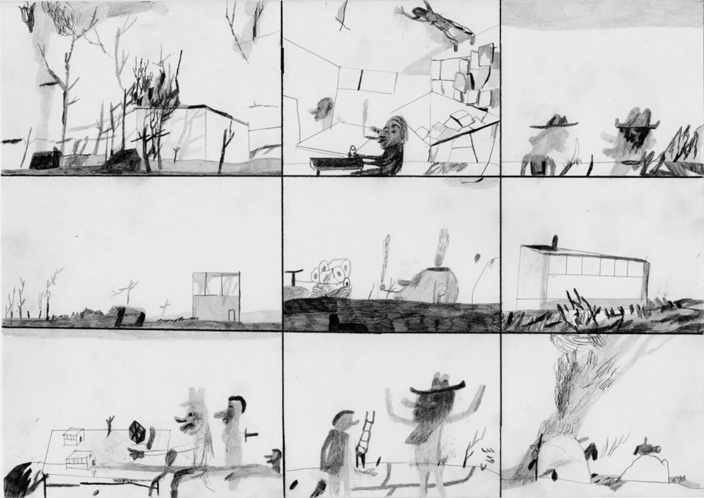
Andrzej Jackowski: Voyage 5
Jackowski paints how i would like to be able to draw, his images appearing to emerge out of the picture plane as if from a dream and not just any dream, an archetypal one that as Jung pointed out we all need to belong to. The drawing in this exhibition feels much more about the way everyday moments drift into mythic ones. The father perhaps comforting the child because they have had to pack away Christmas, the empty box on the side a reminder that all the presents were opened and there will be no more until next year. The boy is an echo of the father, both established by a single line that divides them in half, a line that also helps form what might be the father's long coat and the boy's shorter one. But that Christmas tree is also something else, it is one of those images that slip between things, at one moment a burning tree and at another a stylised vulva, perhaps evoking the ancient belief that exposing one’s vulva could ward off evil and defeat the devil. Are we looking at a moment in a boy's passage towards maturity where the father inducts him into some sort of ritualised maleness? Is this an image of some sort of cultural shaping of gender? By being so simply drawn the man is reduced to an upright member, but is that an escape ladder behind the two figures, and if so what are they supposed to escape from? Jackowski titles his image 'Voyage 5', is this the voyage of life? Are these two setting out on a journey into manhood? The drawing allows us to develop a variety of suggested narratives, it triggers our innate ability to discover stories in ourselves and that is something I have always valued in Jackowski's images.
If you go to the exhibition you will find the drawings broken down into several categories, 'Systems and Process', 'Identity', 'Place and Space', 'Time and Memory' as well as 'Power and Protest', enough categories to be of interest to most people. Barnsley is easy to get to by train from Leeds and the Cooper Art Gallery is only 5 minutes away from the station, it also has a good cafe and room enough to show a variety of other art work as well as a contemporary gallery space for exhibitions upstairs.