Showing posts with label writing about drawing. Show all posts

Friday, 26 November 2021

Deanna Petherbridge and Drawing Matter

Deanna Petherbridge

Deanna Petherbridge is an artist and writer on drawing who has contributed deeply to the way that drawing is thought about as a contemporary art practice. However her work and her interests overlap two drawing categories, both fine art and architecture come within her remit as a draughtswoman. In her large pen and ink drawings architecture becomes a metaphor for the human condition and the hubris of humans. Perhaps it is this hybridity that makes her drawings interesting, the slippage between disciplines allowing her to make drawings that are not easy to pin down, as they are clearly not plans or ideas for future building projects and on first impression they remind us of Piranesi's exploration of what were known at the time as 'capriccio' images, in his case drawings and prints representing a fantasy or a mixture of real and imaginary buildings. 

Deanna Petherbridge

Piranesi

I was reminded of Deanna Petherbridge's work because she is in the same 'Step and Stair' exhibition as myself in the Art Space Gallery at Michael Richardson Contemporary Art in London. Then, as my mind tends to work by drawing loose threads together, I was further reminded that she often writes for 'Drawing Matter' an organisation that explores the role of drawing in architectural thought and practice. I have not mentioned Drawing Matter before, because it tends to be seen as something belonging to the world of architecture and not fine art, but as my belief is that drawing should be seen as a problem solving and communication tool that steps right across and over various discipline boundaries, that doesn't bother me, and I think the world of architectural drawing has a lot to offer fine art practitioners, especially in regards to spatial metaphor and drawing as idea visualisation.

The Art Space Gallery is devoting the exhibition after 'Step and Stair' to Deanna Petherbridge's work and the gallery will be publishing a catalogue of her drawings, and I will be very interested to both see and read that. Petherbridge's drawings use imagined architectural imagery as a metaphorical means to deal with social and political issues. Her drawing 'The Destruction of the City of Homs' beginning a long series of images commenting on migrations, walls, barriers and threatened peoples, things that I have also tried to respond to in drawing. 

Deanna Petherbridge: The Destruction of the City of Homs 

Go to the Drawing Matter site to read what Petherbridge has to say about her work, this is an excellent introduction to writing about drawing and the more you work your way into the site, the more you will find of interest, especially if like myself you have an interest in drawing's wider possibilities. 

See also:

Online catalogue of the Step and Stair exhibition

Deanna Petherbridge at the Whitworth

Writing on drawing

Writing about drawing

Tone and emotional value

An old exhibition dealing with similar issues


Sunday, 24 May 2020

Writing about drawing

There are as many ways of writing about drawing as there are drawings. Recently 'Soanyway' the online magazine had a call for entries for their LIQUIDITY >|< VESSEL issue, so I put something forward. It wasn't accepted but by writing the submission I had to formally organise some thoughts, which is always a useful exercise. The activity of writing a submission is nearly always rewarding and if it is rejected you can always use whatever it is you have written in another context, in this case as today's blog post. As a student it can be a good exercise and sometimes you find you have written something that you never expected yourself to write. 

Submission title: ‘An Oak Tree’

How the submission related to the set theme.

‘An Oak Tree’ is a short story that reflects upon the drawing of a glass of water, using a dip in pen and oak gall ink on paper, a technique that has been used by artists for many years. Drawing using liquids is very different to drawing using solids, the act of shaping a drawing being as much a product of material possibilities as of the drawer’s intention. Exhibited at the Rowan Gallery in 1974, Michael Craig-Martin’s ‘An Oak Tree’; a glass of water on a high shelf, was a conceptual art piece. Drawing at the time had seemingly become redundant as an art form; contemporary art ideas appeared to have separated themselves from material making. 


Michael Craig-Martin: ‘An Oak Tree’

An oak tree

Encounters between things are always interesting, especially if things can never touch each other in reality. There are events that we as human beings think about as encounters. However this is because our thoughts are structured in an encountering manner in order for us to operate in particular ways. Ways that in relation to other things and how they commingle and become entangled with the world, are strange and materially confusing. I'll try and explain what I, (as a moving bag of water with hard bits inside), mean in relation to what something that isn't me might experience. 
As part of the act of making a drawing, I am holding in my hand a half full glass of water, looking at its particular ability to refract light and cause a slight distortion of the world that passes behind it. I dip my finger into the water and feel its cool dampness, and as I place the glass back down onto the table I hear a reassuring quiet thud. However, all of these actions are a complex and very convincing fiction, played out for my benefit by my own brain.
There is no such thing as a direct encounter between myself and this glass; the colours I see refracted across its surface are my own invention, photons of light have no colour, just as sound waves have no sound, coldness has no temperature and chemical molecules no odour or taste. But it does seem to me that I am touching this glass, how else could it be defying gravity and floating above my drawing table? Most of the mass of the atoms that make up my finger ends is concentrated into various nuclei and the same situation exists for the glass I’m holding. Surrounding these many and various nuclei is empty space, except for where electrons orbit around protons and neutrons. As they do so we can count them. The number of electrons surrounding a nucleus depends on the element and here are two shells of spinning bodies, one consisting of four electrons and another with two, a sign of the element carbon. Each carbon atom can form bonds with up to four other atoms simultaneously and is ripe for joining in with the development of complex molecules such as those that fingers are made up of. But silicon is also present in this situation and it is much more commonly available than carbon, so perhaps we are looking at a nascent life form, as well as a developed one. These subatomic particles also have a negative charge; stubborn by nature, they are only attracted to particles with an opposite charge, and are repelled by similarity.  This prevents electrons from ever coming in direct contact with each other. It could be argued that their wave packets can overlap, but they can never touch; the electrons in these fingers repel and are repelled by the electrons in the glass. This glass is actually levitating using a wonderful conjuring trick designed by the glass and the human's fingers in conjunction with each other, a collective mind / body mass, engineering a moment of fantasy. Touch is something else’s repulsion, a repulsion from an electromagnetic field permeating local spacetime is psychologically perhaps difficult to cope with, especially that Pauli’s Exclusion Principle is also at work. Electrons know where every other electron is, and they try to avoid each other as much as possible. Pauli, a standoffish individual, was responsible for the fact that some humans think they know why ordinary lumps of matter are stable. He suggested that atoms occupy a volume and cannot be squeezed too closely together, which could have been related to the fact that he had problems with his own body image and had no friends. However attracted these fingers are to this glass, I’m not sure they want to be responsible for its collapse; all I can say is, it does seem to me to be a reasonable presumption that in my world two solid objects cannot be in the same place at the same time. I usually think of other things as being separate from me. I like the distance perception and consciousness appear to offer me, they make me feel special, a distinct being that can have encounters with other things, I like to think I have agency.

I’m pretty old fashioned and still use the same type of dip-in pen and ink to write and especially draw with, that I was introduced to at my junior school. I intuitively feel as if there is a sensitive and yet straightforward encounter between the ink and the paper as I put my thoughts down. Today I am using water-based ink on paper as my preferred drawing material. I categorise my mark making materials into those that flow in water as if in a primordial sea and those that are scraped off of hard surfaces like some form of geological attrition. When I choose ink as my medium, it can feel as if I am working with something akin to my own life-blood. However I am aware that I can use metaphor to fool myself and that illusion is very much to do with relative scale.

In order for the ink I use to ‘stick’ to the paper, or at least appear to be attached to it, certain things need to align, such as polarity. For instance I am using water based or hydrophilic ink; a polar ink, not to be confused with Noodler's Polar inks, of which I am very fond of the brown.  I choose certain types of paper because the surface is smooth enough to allow me to move the nib across the paper without it getting caught in the grain, but textured and thick enough to allow me to add further diluted ink, if I feel the need to embellish the drawing with a tonal wash. However my thoughts about why I choose paper are very different to the ink’s affinities.
If you pour mercury over paper it will not wet it, mercury's surface tension is so great it adheres to itself. But if you pour water-based ink onto paper it will wet it, because the surface tension of water is much less than that of mercury.  But this is not always the case. For instance, if water soluble ink comes into contact with lipids, (organic compounds that are insoluble in water, such as fatty acids or grease), the water molecules become more attracted to each other than the lipids, and will therefore, like mercury run off the paper and leave it dry. When ink is drawn onto a surface that it doesn't like, it aggregates, clumping together to avoid all interaction with the surface. In this case the term ‘like’ being both a foster parent of metaphor and feeling.
The ink has a certain flexibility of movement, is mobile in its solvent, and will remain so until the solvent evaporates. Whilst its mobility is active one can engage with the ink via a mediator, which is in this case a nib made of a 14 carat gold alloy, a substance that like glass, will not chemically interact with it. Water allows the ink to form in solution, it acts as a carrier and when its job is done it evaporates away. Water is a life-enhancing medium, as the carrier for blood, it not only gets nutrients and oxygen to cells and transports waste products away; it also carries the white cells that protect us from diseases. Water supports the making of the complex molecular bonds that are needed to create amino acids within an animal body, the chemistry of which being not that dissimilar to that which allows ink to stick to paper after the water evaporates. It is in the spaces between surfaces where we will find ink's direct encounter with paper, but human eyes will never be able to see it. When ink does favour the substrate or surface that it has been applied to, it will attach via inter-molecular forces, such as h-bonding, London dispersion, and most interestingly, van der Waals forces. Johannes Diderik Van der Waals, a human with a large family network, realised that forces arise from interactions between uncharged atoms or molecules, leading not only to such phenomena as the physical absorption of gases, but also to a particular understanding of universal forces of attraction between macroscopic bodies. Indeed it has been argued recently that gravitational force is actually van der Waals force; gravitational force being related directly to quantum mechanics, the networks of quantum fluctuations of electron clouds in atoms both holding everything together and creating space-time. The behaviour of sub-atomic forces and the fact that these are shaping everything we do is  unseen because our viewpoint is focused on a human scale. Just as our eyes are only tuned to a certain part of the electromagnetic spectrum, all our other senses are operating within very narrow perimeters. The fingertips holding this pen can feel the difference between a smooth surface and one with a pattern embedded into it of only 13 nanometres deep. However the edge of our ability to judge surface change is nowhere near the diameter of an atom, which ranges from about 0.1 to 0.5 nanometres, a scale far beyond our perceptual abilities. Therefore the idea of an encounter that includes direct contact is just that, only an idea, one that has been developed by our brain’s idea of a sense of touch. Touch is only understandable in the space between the smallest thing we can grasp and the largest, we are all though touched by the sun and its chemical processing continues here on Earth.

The fact that we can think of ink as being like blood is not too far-fetched, iron gall ink, a brown-black ink made from iron salts and vegetable sourced tannic acids was the standard drawing ink used in Europe from the 5th century to the 19th century, and has remained in use by many artists. The ink flows well, dilutes to give a very subtly coloured brown wash, and most importantly adheres firmly to a wide variety of paper and velum surfaces. Iron sulphate added to tannic acid has a very strong chemical affinity with cellulose fibres; this affinity operating both at a molecular level and as a narrative arc. The oak galls that are used to obtain the tannic acid, being a result of animal/vegetable interaction; wasps leaving the galls behind on being able to fly. The wasp larvae on hatching modify the oak leaf to develop the gall form, a structure that protects the developing larvae up until their metamorphosis into adults. The tannins produced by this animal/vegetable interaction, combined with inorganic iron oxide then come back into contact with another animal at the drawing stage. A dipped into ink gold alloy nib, holding onto liquid via surface tension and moved across the surface of the paper in conjunction with organic matter creates new forms as it does so. As these forms are realised, so is a physical bond between the paper and the ink, an attachment so strong, that the only way to erase a mark once this ink is dry, is to sand the whole surface down. At a sub-atomic level intermolecular bonding between electron rich donor atoms and electron poor receptors has taken place, this alongside a van der Waals interaction is a model that can result in both new inorganic and organic molecules, but in particular is at the heart if the building of drawings, DNA and proteins.


The nib begins its journey across the paper, the eyes guide the hand and the hand holds its nerve. The glass is half full, its shadow falls softly, a sfumato over the edge of the paper, as morning sunlight glides through the window and shadows the nib’s movement. The lines are thin, they are a tentative trace of a very delicate set of individual instances of a human's interest, a subjective, conscious experience. 


See also:

Why ink sticks to paper
Uncertain certainty 
More on writing about drawing


Saturday, 14 January 2017

Wittgenstein and aesthetics


From Wittgenstein's Tractatus Logico-Philosophicus 

When I was an art student in the late 60s and early 70s the key philosopher in relation to the way we were discussing art was Wittgenstein. In his books his thoughts were laid out in numbered mini statements (see illustration above), each of which was treated at the time as a way of on the one hand cutting down metaphysical speculation about grand ideas and on the other as a way to develop a lever with which to develop ideas. He was at times both the subject of our work and a means towards a process by which we could make it. 
Looking back it seems very restrictive, but it taught us to grapple with complex texts and read philosophy. It also made sure that you had to think about how art operated as a language.
One issue that has I would have thought been of concern to generations of art students is that link between the act of perception or experience and an expression that has something to say or is a reflection on it. It is quite natural to ask yourself, “What does my work communicate?” It is also of course an area fraught with pitfalls and art tutors will often advise students to “Not go there.” because you can get lost in layers and layers of philosophical speculation and many art students have lost the desire to create after been sucked into trying to answer this question.
On our reading lists at that time was Richard Wollheim’s Art and its Objects. A complex book that asked a lot of questions as to whether or not an artwork had to be a physical object. I don’t remember coming to a conclusion about this but what I do remember is that Wollheim opened up the possibility for being able to think about the fact that what constituted an artwork did not have to be an object. The debate at the time was often looking for the art in different situations. For example, one of us might propose that the conversation we were having was to be seen as art. If so, we would argue at what point did the conversation move from being something we were experiencing to something that was now a reflection on that experience. Was it enough to simply quote Judd’s dictum, “If the artist says it’s art, it’s art.” or should we be looking at an underlying structure that could confirm that this was a universal activity common to all cultures and not just something particular to a sub-group preoccupation of what was coming to be known as the ArtWorld. People were often polarized in their opinions and you had on the one hand those who yearned for a universal validity for what they were doing, these people, including myself, would often quote Jung and Chomsky, believing that universal languages were possible, whilst others would argue that we were only able to deal with specific targeted speech acts, each one only readable within the sub-group interests of a very specific community. I.e. we were restricted to making work that was always going to be a comment on and a reflection about art and its associated activities and practices.
Because Wittgenstein was being read by all of us he often became the arbiter. One area I was particularly interested in was that of ‘correspondence’. This was a Baudelairian concept, and it questioned the link between what could be perceived or experienced and what could be expressed that accounted for the perception or experience. Was there or was there not a ‘correspondence’ between the two. Wittgenstein had looked at the link between lived experience and expression, expression he seems to argue being essentially the face of experience. As we experience the world, perception is shaped as it is perceived, so that there is in fact no difference. So you could argue that as an artist you are perceiving the world ‘as an artist’. ‘It’s like searching for a word when you are writing and then saying: “That’s it, that expresses what I intended!” – Your acceptance certifies the word as having been found and hence as being the one you were looking for’ (Wittgenstein [1978]: 68). He asks at another point ‘what happens when we try to find the right expression for our thoughts?’,  (Wittgenstein [1953]: 335) and suggests that this expression is a form of translation and that there is some sort of fusion between perception and expression.
This was for myself a position around which I would argue that the artist could therefore have experiences and communicate something about them to others. But for the ‘institutional theory of art’ adherents they would say that the experiences I was having were mediated by the fact that I belonged to the Artworld and that I could only demonstrate a sub-group preoccupation focused on art.
There is a diagram that illustrates the issues involved, and as this is a blog about drawing I suppose it’s time to get some drawing into the frame. What the drawing illustrates is that these arguments could be set out as being diametrically opposed poles centered on or surrounding some sort of notion of real world experience or perception. 


The diagram is very clear and simple and sums up all the complex arguments that too many words have tried to explain. It shows Goodman as situated opposite Danto, i.e. Goodman believes in the ‘languages of art’ and Danto believes in the language of the institution of art. Wollheim is opposite Sibley, Wollheim argued that a work of art is a structure which is has a physical actuality, (i.e. not just in the mind as Collingwood would argue) but Sibley would argue that aesthetics are prior to art, i.e. we apply them to all sorts of things, a flower or the look of a landscape, art not being the important thing here, but our propensity to judge things in relation to how they are both perceived and experienced. 


There is no answer to these types of questions, simply a range of standpoints but, I would suggest at some point it is useful to look at the standpoints on offer and decide where you want to be yourself. Personally I would like to believe that I could communicate with people that are outside of my specialist sub-group preoccupation. If so an image like the one below ought to mean something to people reading this blog if they can find a meaningful connection with an image from their own experience.

Detail of one of my own images from a sequence of drawings done in response to immigrants crossing the Mediterranean Sea in unseaworthy, overcrowded boats. 

Goodman would have suggested that there was a language that could be read across times and cultures, therefore he would have seen a link between the image above and the one below, which is a hand-coloured copper engraving used for a magic lantern projection. It shows ships on the Strait of Messina during a sequence of earthquakes in 1783. In a previous post, see I suggested that water itself has been a constant source for visual invention by artists from different times and cultures, in many ways it could therefore be argued that I am very much in Goodman's camp. 


Wittgenstein, L. 1953: Philosophical Investigation, ed. by G.E.M. Anscombe, Blackwell,
Oxford.

Wittgenstein, L., 1978: Culture and Value, ed. by G.H. von Wright, Blackwell, Oxford.

See also: Drawing and philosophy

Friday, 12 February 2016

Is Drawing a Language? Part two

Visual language would have started like most languages by human beings communicating by using ideas of 'likeness'. There is a category of definitions which are called, 'ostensive'; denoting a way of defining by direct demonstration, e.g. pointing. I'm sure that after watching young children learn, pointing to things to show the children they were like something else must have been a big part of visual language development. 
Because our bodies are the things we know best, I would also suggest they were the basic initial measure. You can think in terms of body schemas, for instance, an upright vertical body suggesting maturity, health and strength. This could be represented by a 'right' angle, a line standing upright vertically, can therefore also be seen as strong, healthy, in balance and 'right'. A body that is ill lies down, and in the case of dying achieves a horizontal. As we get older we are less 'up-right', if we trip or fall we are taken off the vertical and into the lower angles. Therefore lines approaching the horizontal can be seen as representing being 'off-balance', ill or approaching death. 

I would suggest that the same is true of the quality of line. In full maturity and good health we move smoothly and with confidence, when very young our movements are jerky and unformed, and when ill or approaching death we have shaky hands and feeble far less confident body movements. So if we make lines that are smooth and confident we should be able to point to them and say look these lines are like a mature strong confident person. A line made with shaky marks, with a hesitancy could again be compared with a human being in a similar state. It is very easy to see how a certain emotional register could therefore be applied to the reading of drawn lines.  (My earlier post on drawing with Bezier curves relates to this, the authority of lines drawn using vector graphic software, perhaps related to lines drawn with a very confident and steady hand). 


John Bellany: Self portrait on surviving an operation

The drawing above was done by John Bellany immediately on waking from an operation in hospital, it's shaky lines echoing the physical and mental state of the artist. 
The attempt to codify the various elements that make up visual languages has a long on-going tradition. One that is though very questionable once it begins to step outside of basic body schemas. For instance if you look at the work of Eugen Peter Schwiedland (1863-1936), an Austrian born graphologist who lived in Vienna; he invented the Graphometer, a device like a protractor that shows how the slant of your handwriting indicates  your personality. It relies on a similar reasoning to the one I have just introduced, but his readings are very subjective. 


Look at direction 1: Schwiedland suggests that it represents 'insensibility' that the upright represents a cold reserved nature, however as you can deduce from my suggestion that we read angle from awareness of our own bodies, an upright style of writing could also suggest strength of character and someone in the prime of life, a balanced character in tune with life. One aspect of body angle I am very aware of is that I put my body at an angle in order for me to be able to run fast, I could therefore argue that direction 3 relates to someone who is impatient and who wants to get on quickly. Graphology has of course been discounted as a science because of this subjectivity, but even so amongst graphologists the relationship between personality and angle and slope of line would have become a shared common language and would have been a 'true' language because it was a shared series of conventions that could be understood in the same way by other members of the community of language users. 

The concept of directly relating angle to emotion was developed to a fine art during the 19th century and reached such a level of sophistication that 'aesthetic protractors' were made to help artists determine their compositional structures. Charles Henry had argued that colour could be used to express certain emotions and that this emotive effect could be heightened when combined with the angle and direction of a line. He was very influential on artists such as Seurat, who developed some of his compositional ideas on Henry's work. (Again we have a reference to artists wanting to underpin their work with mathematical 'rightness') 

The one part of the body we spend a lot of time looking at is other people's faces. We do this because it is via the face that a large amount of meaning is communicated between us and a large part of this meaning is emotional. Any comic book artist knows that in order to tell the reader what is happening emotionally a facial close-up can do the job. 


Awareness of facial expression extends and deepens the body schema and 19th century scientists were hard at work trying to formalise facial expressions as languages to be used by artists.  In particular the artist Humbert de Superville wrote an essay designed to explain how gestures and facial configurations could be categorised. 


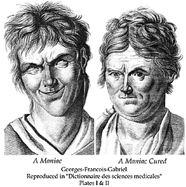
We use the term 'Physiognomy,' when describing the 'science' of the assessment of a person's character or personality from his or her face. Compare this before and after image.

The maniac head is tilted, hair disturbed, everything is more angular, and when 'cured' eyes are level, the mouth is a firm, almost straight line and we feel that all is in balance. 
Perhaps the most powerful body of work on the subject belongs to the artist Messerschmidt, who developed a series of sculpted busts designed to illustrate the range of human emotions. 

Messerschmidt

Lithograph by Toma depicting Messerschmidt’s “Character Heads” (1839)

Basic emotional features and how to draw them were often set out in 'how to' books on drawing.


Superman artist Curt Swan produced model drawings that were used to show other Superman artists how to draw Superman’s face in various emotional states. Notice how no matter how agitated Superman is supposed to be his facial appearance never approaches the formal disturbance of Gabriel's maniac further above, but perhaps the most important issue for me is that because the line drawing quality never changes, non of the expressions feel 'authentic'. Superman comes across as a hollow cypher, he is about physical action rather than emotional range. Compare Kent Williams' drawings of Batman, even though Batman's face is always hidden by a mask, Williams manages to communicate the character's internal emotional conflict by his use of line quality and dramatic dark/light contrast. 


The problem with physiognomy, is that as a species we are very good at deceit . Because we know what works, we can simulate expressions, we know how to use the knowing smile and can shed crocodile tears. You could argue that the best test of whether or not someone understands a language is how good they are at using it to lie. It is common knowledge that many comedians are deep down, seriously distressed people, and by being able to 'put your face on' many of us can then 'face the day'. 


It is not a far stretch of the imagination to argue that Kandinsky must have seen de Superville's diagrams when preparing his book 'From Point to Line to Plane'. 


Henry stated that you could utilise a small degree of sadness in an image by using the correct angle ratio, he also believed that his laws of 'dynamogony' held true in all the arts and that the arts were all related in how they communicated emotion. This brings me to another way to think about visual language, and how it could be translated; that of synesthesia, and Kandinsky is the key figure here as he was a synesthete.

Read:
Cezanne and Modernism: The Poetics of Painting By Joyce Medina p. 72 for text on Henry and his aesthetic protractor 

You will find a image of an aesthetic protector in Seurat and the science of painting by William Innes Homer

Download: