Auerbach: The ability of a paper's surface to withstand erasure is as much a part of the final appearance as the quality of charcoal used, type of eraser and intent of the artist
In one of my posts on erasure I mentioned that I would return
to thinking about papers for drawing again at some point. Artists will often have
a preferred set of papers and paper boards that they use for different media and I think it is
worthwhile looking at why certain paper surfaces are chosen by artists for particular
jobs, even if only to then decide that that is precisely why you would not use
them.
The three basic types of Watercolour papers
There are basic differences between printing, watercolour and drawing papers. I have mentioned Mohs hardness scale before and once again this is important when considering what a paper is for. A drawing paper needs
to have a hardness that will ensure that the graphite or other dry drawing medium will pull off onto what in effect needs to be a harder surface.
I.e. drawing paper for dry materials such as pencils, chalks, crayons etc. needs to have a hard abrasive surface. Watercolour paper
needs to be tough enough to withstand constant wetting, so it needs long fibres,
is usually of a much heavier weight to minimalise warping when wet and is unlike several printing papers not kaolin coated because it needs
to maintain a certain amount of absorbency. Printing papers can be soft and thin,
as they have to be compliant with the surfaces that are laying down the inks
onto them and they tend to be much smoother, which is why they are sometimes kaolin coated. All papers come with their
individual histories, sizes, specific technical specs and associations with
other things, (I have mentioned some of these before), so there is no one paper
that can be singled out as the best ‘art’ paper, but certain papers are used
over and over again by artists, many of which have now become central to the
business of art. The fact that many of these papers are of
archival quality can be very important when it comes to customers looking at a
long term investment. It is up to you as an artist to decide what will be the
determining factor when investing in papers, price being perhaps for a student
a very important issue.
Bristol board
A lot of illustrators and comic book artists like to use smooth Bristol
board. The 500 series, 4-ply, 100%
cotton, smooth Bristol (vellum surface) by Strathmore comes in 23" x 29" sheets and when I costed it today on Amazon
it was £15.59 for one sheet.
Closely related to this is the
Strathmore 500 Series Illustration Board, heavy weight white vellum finish is 20"
x 30" and costs £13.99. There is no information as to why the proportions are
different, I presume there must be some historical significance though. (Read
this post on paper sizes)
Both these surfaces are sold as ideal for
graphite pencil, coloured pencil, charcoal, sketching stick, pen & ink,
marker, soft pastel, mixed media, oil pastel, light wash and collage.
However
Bristol board has two working surfaces, front and back. This quality separates
it from illustration board, which has only a front working surface.
The surface texture of Bristol Board can
be either smooth, plate, semi-smooth
or vellum. Smooth finish is also called hot press, and has a satiny,
hard finish. Plate finish is very smooth, like glass and is excellent for maintaining
the consistent and continuous line flow that you sometimes want when working in
pen and ink; it is particularly good for using technical drawing pens. Vellum (or kid) finish is a medium texture more
appropriate to friction-based media, such as crayon, chalks, or charcoal. Semi-smooth is an in-between surface that isn't as smooth
as smooth, and not as rough as vellum and has come about because of the need
for particular surfaces that suit specialty pens and markers.
An alternative finish, engravers
or wedding, is manufactured for formal engraved wedding invitations.
Bristol and Illustration Boards
provide stiff, strong surfaces to work on without the need for mounting. Bristol
generally describes drawing paper that is pasted together to form multi-ply
sheets. Illustration board has 100% cotton drawing paper mounted on both sides
of a heavyweight board.
Plate Bristol
board is great for scratching details out of ink drawing with a sharp blade,
as it resists gouging and tearing, therefore you can be very sharp and exact
with your removal process. Bristol and illustration boards will withstand a
certain amount of dampness and so you can often get away with not having to
stretch paper when using small controlled amounts of watercolour or ink washes,
but on the whole they are for dry materials, marker pens or pen and ink.
Historically
Bristol board has been used by illustrators and is therefore very good at
sitting in the background when being photographed, something that in a world of
social media is becoming more and more important. However its association with illustration
means that many fine artists don’t use it, simply because they see it as being illustration
specific. This is a very interesting point, one that has a history that goes
back to a time when fine artists were concerned with Greenberg's ideas about media specificity and therefore wanted to distance themselves from illustrators. One of the biggest insults you could at one time give to an artist was to call them an illustrator. Things have hopefully now changed, I’m sure Andy Warhol as both an illustrator and fine artist would
have known exactly how to use Bristol Board and would have used it whenever he
needed to. As it was he used Bristol Paper to print on whenever he could. Some artists would never dream of using what are called 'fine art papers' because of their association with a particular type of thinking about art materials. There are a certain range of qualities that are expected of drawing papers and these often overlap with the papers produced specifically for watercolour or for working on with a range of dry and liquid art materials but, and this is the point that several artists would make, if you use non art papers when you try and make marks on them the very fact that these papers might be non receptive or designed for other uses, might make the marks you can make much more interesting.
If you compare
some more 'fine art' drawing papers to illustration boards, the ‘grain’ of the paper surface will often be much more visible, therefore it will become a
vital part of the look of the final drawing. It is often expected that the fine art artist should have a 'rough' look to their work, as this has at times been associated with the idea of an artist's individual expression and a certain 'raw' look. This is the very reason why some artists don't use these papers because they are too 'hot', too close to the art business. Everything has some sort of meaning and artists that want to tap into less or alternate types of expressive languages may well use commercial papers because of their association with non art languages. For instance some artists only use office stationary to work with, because they want to make a statement about the relationship between what they do and the majority of contemporary work being done in offices. However the older I get the more I use 'art' papers because they have stood the test of time in relation to what they are made to do and I get get less worried about the associations they might have with the fine art tradition and I can afford to. (I have just ordered two sheets of khadi paper that have cost £36.30 each). At some point someone will ask you, "Why are you using that paper?", all I am suggesting is that you need to have thought about it.
When working on
Arches hot-pressed watercolour paper using graphite it has a very tough surface
that can withstand a lot of erasure and is textured enough to hold enough
graphite to ensure blacks are very dense, but smooth enough to ensure that
tonal gradations can be very softly and smoothly gradated. A 9H pencil will
still pull off against its hard surface, so you can use the full range of H and
B hardnesses. 20 sheets of 18 x 24in will cost about £88.00 and you can get
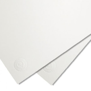
these papers in hot pressed, cold pressed or in rough finishes. Cold Pressed paper is often referred to as NOT paper meaning
it is "not hot pressed". The surface of a Not (Cold Pressed) paper has a moderate texture or tooth in between
rough and hot pressed. (See image near the top of this post)
Rough
and cold pressed papers have bumps and grooves that hold onto water and
pigment. They are therefore a good choice when working in watercolour and if
you want to emphasise texture.
Hot
pressed paper is much smoother. It doesn’t suck up the water as fast as the rough
and cold pressed papers, this gives you more time to re-wet edges of pigment when working in
watercolour, but doesn't allow you to get the same subtle gradation that a more absorbent surface allows for. Therefore if you are working in mixed media such as pencil and watercolour it will be
the combination of how both graphite and watercolour works with the paper that will be important.
Stonehenge hotpressed
watercolour paper in comparison is smoother but softer. It will mark or gouge
if you try and use very hard pencils, and it is harder to work up solid rich blacks when
using graphite, as you need to create several layers to get maximum density.
Its softer surface means that erasure begins to break up the paper and gives
you a fractured surface, which is interesting but not always what you want. However
when it comes to watercolour it is excellent with both wet-on-wet and wet-on-dry
applications. It has a good absorbency that ensures colours stay bright and
watercolour stays damp and sits on the surface long enough to keep blending and
lifting colour off, so that you can eliminate rough edges between washes.
Hotpress surfaces are often used by botanical illustrators, being smooth enough
to hold detail but absorbent enough to get good colour intensity with smooth
gradations. The cold pressed papers are often used by landscape artists, the
constant blending and lifting it allows can lead to very complex subtle and
atmospheric surfaces.
Strathmore 400
series pastel paper has an interesting ‘tooth’ designed to hold pastel but
which can also be used when using graphite. Very dark blacks can be made by building up layers of soft graphite. However because of its very visible
surface it can often mean that when photographed the grain is very apparent and
does not disappear into the background. This may be useful to you or not,
depending on how you want the image to work. This paper has a traditional laid finish that enables you to control
light/dark transitions using the paper surface itself. (These surfaces are 'ribbed' textures imparted into the papers by the manufacturing process of using a regular mesh lifted through a vat of floating dissolved paper) Perhaps the best
historical example of this is Seurat’s use of Michallet laid paper, whereby he uses the
peaks of parallel ridges in the sheet of laid paper to both add
texture and allow for highlights to softly emerge from the paper itself. The
black Conté crayon he used builds gradations of tone embedded into
the textured paper, and by drawing in this way he could minimalise dusting or smudging, which would have taken attention away from the
control of form and into more atmospheric or emotional registers. (Look at the difference between working in a hard Conté crayon on a laid paper and soft charcoal, the crayon is hard and catches the edges of the ridges, but unlike the charcoal, doesn't break up so easily and therefore far less dust is produced, dust which will fall from the edges of each stroke made and will fill in the surrounding paper fibres)

Seurat
Cartridge
paper is of course the paper usually associated with drawing using dry materials. I have posted on this before and will remind you that its ‘meaning’ is not just about whether or
not it is hard enough or rough enough to draw upon. The making of Japanesepapers can at times be associated with an almost spiritual appreciation of both
the processes of making and the various elements that go into the composition
of each paper.
It is time to remind you that from the most high tech industrial papermaking production
methods to hand made papers put together on your kitchen table, paper not only
serves many purposes it carries a wide range of ‘ur’-histories*. For some artists these histories will become more important than the media specificity of paper and you will need at some point to consider whether or not you need to take these types of issues on board. If you do, this can mean a lot of difficult background research. Research can though bring to light facts that can make for fascinating narratives. For instance the Montgolfier brothers who made the first balloon flights were paper manufacturers and they patented one of the first transparent papers. The Montgolfier family firm eventually became known through marriage as "Montgolfier et Canson", then "Canson-Montgolfier", then "Canson"; a name we still associate with fine art papers. "Canson" worked directly with Ingres to produce papers especially for him and many of the most famous artists of the 19th and 20th century used "Canson" papers.
Capitalism is what drives so many of our ways of not only producing but thinking about business. The constant merging and buying up of companies means that it can be hard to keep track of what is going on behind the scenes of the products that we use. This is what has happened to Canson & Montgolfier over the past few years. The Arjomari company acquired Papeteries Canson & Montgolfier in 1976. In 1990, the Arjomari company merged with the Wiggins Teape Appleton group and became the Arjo Wiggins group. In 2006, the group Hamelin acquired Canson with all its subsidiaries. In 2016 Canson was acquired from Hamelin by the Milan based F.I.L.A. Group. The F.I.L.A. Group markets itself as being a leader in the provision of materials for creative expression. They now own brands such as Giotto, DAS, Daler-Rowney, Strathmore and Princeton, together with several others, supplying art materials and school supplies to world wide clients. The present Canson logo is a stylised hot air balloon that has been produced by a design team to symbolise both the history of the firm and its up-to-date Modernist credentials.

The current Canson logo
If you visit the current Canson company website you will find that heritage is very important to the brand and they run prestigious art competitions as well as showcasing a range of videos highlighting contemporary artists using their products. This is all very interesting because the status of the fine arts is in this case transferred to a company manufacturing fine art papers. This status will of course be partly used to justify the high prices of specialist papers. I am not trying to criticise this aspect of today's reality, simply referring to it in as a reminder of the bigger context. But as soon as this context is seen, further questions might be asked, such as, "How environmentally sensitive are Canson's manufacturing processes?". "What is it like to work for the company?" "How do they contribute to the F.I.L.A. Group's overall profit margins?"
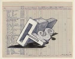
Edward Allington often used papers from old ledgers to work on. The specific nature of those ledgers providing a complex context that reflected his interests in the art of the past, the style of handwriting on old ledgers suggesting the importance of a trained hand for the production of legible script and the inescapable need for everything to be accounted for.
Edward Allington
*Ur-history is a concept developed by Walter Benjamin, whereby all made things have 'material histories'. Every paper will have a great number of people's stories locked into its production, some involved in forestation, some rag picking, some involved in manufacturing, some in distribution, some will be poorly paid, some will be high earning managers etc. etc. each and every person involved will also be locked into an exchange of their time and labour for money. The stories of these people and how they have or have not reaped the various 'rewards' for their involvement in an object's production, ought not to be forgotten.
At the moment I'm using some Indian papers, I like their unpredictability, they are 'hand made' and the amount of size in them varies a lot, even throughout a single sheet, so that as you drag a brush across a large surface you can get very different amounts of bleed. The paper is made from cotton sourced from scraps left over from the manufacture of T-shirts. I like the fact that this cotton was at one time destined to be something to wear.
Obviously I could begin to list hundreds of different papers but that is really the job of a specialist, I'm sure you have got the idea by now that every paper needs to be treated differently, both as a physical object and as an object that has a particular background history. I think that all of these issues can be seen as stories, or narrative threads, and if you begin from this idea, 'once upon a time', you can develop a story by following what happens when you bring together a few different but associated threads. For instance...blue
paper is a term that can refer to a variety of papers. First of all ‘blue
touch paper’ is that paper we all remember from our childhood as being the soft
paper that extruded from the bottom end of fireworks. It was used to make a
slow burning paper fuse by being soaked in saltpetre and then dried. It was always very soft to the touch and I presume this was the result of 'scrunching' the paper, twisting it and untwisting it in order to break the fibres down and make the paper more like cloth.

Blue touch paper
However in
current journalistic writing, a blue paper is now something akin to a
government ‘white’ paper, but it goes into high levels of technical detail. Historically
blue paper as a drawing material has a different set of associations, first of all made and used in
Venice in the 15th century and made from blue cotton and linen rags,
it was often a colour of choice when making prepared paper, especially for
silverpoint and other drawings that would also require fine white highlights. Blue was
associated with spirituality and therefore its other-worldly colour was perfect
for images of saints and other spiritual beings. Making blue the colour of the
ground also serves to give the drawing a particular tonal register and
associated emotional range.
Durer: fine brush drawings on prepared blue paper
By the beginning of the 19th century use
of "variegated" blue papers (made from blue rags) was extensive. There was an expanded
use of uniformly coloured light blue papers (made both by hand and by machine),
especially for elegant writing paper as well as for sketching and watercolours.
Artists and writers such as Turner, Edward Lear, Delacroix and Victor Hugo encouraging their use and maintaining an association of blue paper with the arts and elegance. Writing papers such as Basildon Bond have carried on this tradition; in 1932
Basildon Bond became the bestselling notepaper in the UK and the colour of
choice when it came to signifying an upper class writing paper was pale blue.
Jacqueline Kennedy: Personal letter about paintings for the White House.
When you think of technical drawings you often think of them in ‘blueprint’ form.
The blueprinting process was developed in the mid-1800s, when scientists
discovered that ammonium iron citrate and potassium ferrocyanide
created a photosensitive solution that could be used for reproducing documents. A drawing on transparent paper was placed over a piece of blueprinting
paper, which was coated with a wet mix of ammonium iron citrate and potassium
ferrocyanide and then dried. The paper sandwich was then exposed to a bright light, the two chemicals reacting to form an insoluble compound, blue ferric ferrocyanide (also known as Prussian Blue), except
where the blueprinting paper was covered, and the light blocked, by the lines
of the original drawing. The remaining soluble chemical is then washed away leaving white lines.
Blueprint of technical specs of a Browning handgun
We now use the word 'blueprint' as an idea or plan for something, even though we no longer make 'blueprints'. The photography department in Vernon Street offers introductory sessions in making 'cyanotypes' and the chemical process is virtually identical to the blueprint process, so if you want to experiment with the process just ask a photographic technician.
Paper stained with litmus is used to indicate the acidity or alkalinity of a substance. Blue litmus paper turns red under acid conditions, and red litmus paper turns blue under alkaline conditions, because of this sensitivity litmus paper technology is used in pregnancy test kits.
Litmus 'blue' paper
Blue backed paper is used for billboard posters to stop images underneath from showing through.
It's interesting to now add to this blue paper research that idea we were looking at a couple of posts ago; of making images or developing ideas by bringing together a series of previously unrelated elements. In this case everything is linked to blue paper, but the differing uses and existing meanings are normally unconnected. What type of narrative could a slow burning paper fuse, something that is deeply religious or spiritual, the concept of colour signifying class, a pregnancy test, and the need to cover previously posted up images produce?
You might find that the leap from looking at particular drawing papers and their specific qualities, to trying to stimulate ideas by bringing together different concepts associated with blue papers difficult. But ideas that can be generated by bringing together different historical and conceptual associations are interesting even if only as a disjuncture. Finding connections between things can reveal unpredicted directions for your work to take and may eventually reveal an underlying network of previously invisible connections that lie behind things that we have previously taken for granted. One of the things you can do as an artist is to reveal to others what has always been there but which they have not yet seen.
There are several other posts about paper (see below), read these as well, the clustering together of different strands of blog posts is designed to eventually make for 'chapters' or 'clusters' of ideas that are meant to work together.